Picture this: Your brain, trying to untangle a heap of messy, complex data. Now, imagine transforming that tangle into a masterpiece of clarity with the right tools. Yep, we’re diving headfirst into the dynamic universe of data visualization tools.
The thing is, data’s everywhere. In our tech-driven world, it’s the new gold. But raw numbers? They can be real head-scratchers. That’s where these savvy tools waltz in, turning snooze-worthy spreadsheets into vivid, insightful stories.
We’re talking more than just pretty pictures. It’s the difference between a shrug and a light bulb moment when making those big decisions.
Whether it’s interactive charts sparking life into your quarterly report, or a dashboard that has everyone at the office going “Whoa”, these tools are your secret weapon.
So, what’s in store? By the time you reach the end of this scroll, you’ll be well-acquainted with the must-knows — from Tableau’s wizardry to Google Charts’ simplicity. Get ready to harness the power of data plotting, infographics, and trends visualization. Let’s turn that data chaos into a visual feast that tells a story.
A List of the Best Data Visualization Tools
| Data Visualization Tool | Key Feature | Standout Quality | Ease of Use | Integration Options |
|---|---|---|---|---|
| wpDataTables | Interactive tables and charts | Excel-like editing | User-friendly | Directly integrates with WordPress |
| Tableau | Real-time data analytics | Powerful desktop and mobile functionality | Intuitive drag-and-drop | Multiple data connectors and APIs |
| Infogram | Easy infographic creation | Media-friendly | No design skills required | Embeddable on websites and social media |
| ChartBlocks | Simple chart wizard | High customization | Beginner-friendly | API for custom data sources |
| Datawrapper | Responsive visuals | Journalist’s choice | No installation required | Embeddable, social media integration |
| D3.js | Customizable with code | Creative control | Requires coding knowledge | Works with HTML, SVG, and CSS |
| Google Charts | Wide array of chart types | Seamless Google integration | Easy to pick up | Google product synergy |
| FusionCharts | Extensive chart collection | Interactive and responsive | Moderate learning curve | JavaScript integration |
| Chart.js | Lightweight | Fast and responsive | Simple to implement | HTML5 canvas-based |
| Grafana | Monitoring and metrics | Advanced dashboards | Tech background preferred | Wide database support |
| Chartist.js | Responsive design | Minimalist | Easy API | Simple SVG-based charts |
| Sigmajs | Network graph specialty | For complex relationships | Intermediate proficiency | JavaScript library for web |
| Polymaps | Custom map styling | Geographic storytelling | Some coding required | SVG for web use |
| Microsoft Power BI | AI-powered analytics | Vast data connectivity | User-friendly | Extensive Microsoft ecosystem integration |
| Qlik Sense | Associative analytics engine | Self-service BI | Intuitive interface | Robust API for integration |
| Klipfolio | Real-time updates | Dashboard centric | Moderate learning curve | Numerous connectors and APIs |
| Looker | Data exploration | Embeddable analytics | Moderate to Advanced | In-app data modeling |
| Zoho Analytics | AI features | Cross-functional insights | User-friendly | Wide array of source integrations |
| Domo | Scalable solution | Diverse data connector library | Sleek design | Robust mobile integration |
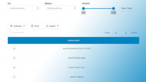
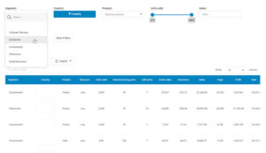
Recommended: wpDataTables
wpDataTables can make it that way. There’s a good reason why it’s the #1 WordPress plugin for creating responsive tables and charts.

And it’s really easy to do something like this:
- You provide the table data
- Configure and customize it
- Publish it in a post or page
And it’s not just pretty, but also practical. You can make large tables with up to millions of rows, or you can use advanced filters and search, or you can go wild and make it editable.
“Yeah, but I just like Excel too much and there’s nothing like that on websites”. Yeah, there is. You can use conditional formatting like in Excel or Google Sheets.
Did I tell you you can create charts too with your data? And that’s only a small part. There are lots of other features for you.
Tableau
Here’s the lowdown on Tableau: it’s a powerhouse. It’s like having a data wizard at your fingertips, transforming confounding numbers into crystal-clear visualizations. Whether you’re in the office or out and about with only your phone, Tableau lets you whip up dashboards that will turn heads.
Features
- Intuitive drag-and-drop interface
- Powerful real-time data analytics
- Collaboration and sharing capabilities
- Accessible on multiple devices
Infogram
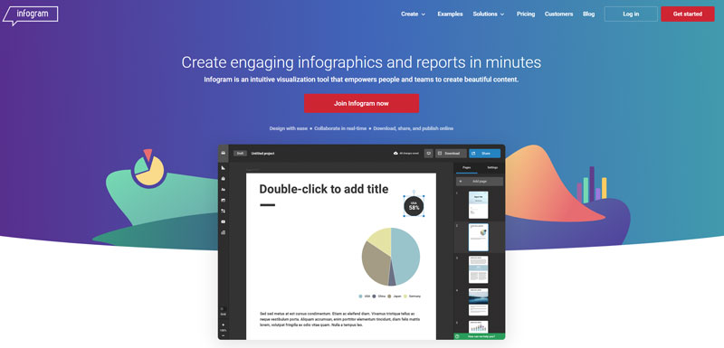
Think of Infogram as your digital paintbrush for data artistry. You’re crafting infographics, reports, and slides that are not only eye-catching but also tell a compelling story. Best bit? No need to wrangle with design software. Infogram is your go-to for no-nonsense visual flare.
Features
- User-friendly editor
- Numerous templates and design elements
- Interactive visualizations
- Integration with social media platforms
ChartBlocks
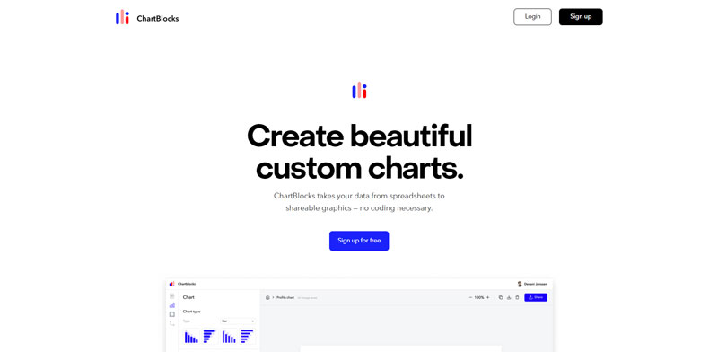
Say hello to ChartBlocks, where creating charts is as easy as pie (charts, that is). No need for crazy coding skills, you can build and customize your charts with a few clicks, then share them with the world or keep them for your eyes only.
Features
- Easy chart building wizard
- Extensive customization options
- Embeddable charts
- Downloadable charts in various formats
Datawrapper
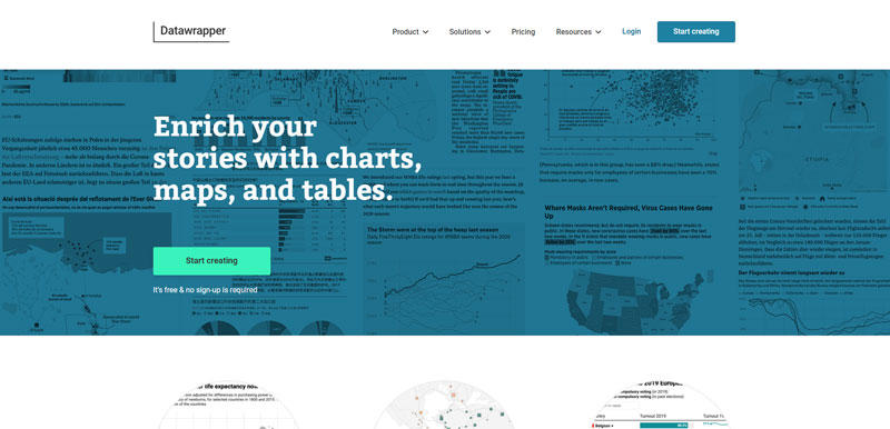
Meet Datawrapper, where your data dons its Sunday best. Ideal for journalists and communicators, it offers easy-to-create charts and maps. Picture your data points going out, hand in hand with elegance and simplicity. Datawrapper likes the limelight, making sure even complex information is stage-ready.
Features
- No software installation required
- Responsive visuals
- A wide array of chart and map types
- Customizable design options
D3.js
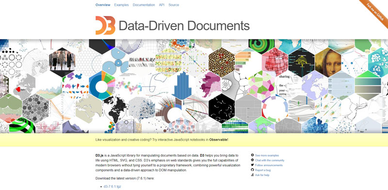
Fancy yourself as a bit of a data visual artist? Then D3.js is your canvas. This JavaScript library is all about bringing data to life with HTML, SVG, and CSS. For those who like to roll up their sleeves and get creative with code, D3.js is a dream.
Features
- Deep customization for the coders
- Supports large datasets
- Immense flexibility (build literally any data visualization)
- Dynamic, interactive visualizations
Google Charts
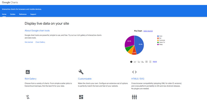
Google Charts is like that friend who never lets you down. It’s familiar, easy to use, and plays well with other Google products. Dive in and you’ll be dishing out sharp graphs and charts that make your data dance, all in a browser.
Features
- Seamless integration with Google products
- A vast array of chart types
- Customizable and interactive charts
- Completely free to use
FusionCharts
Imagine having over 90 charts and 1,000 maps in your toolbox. That’s FusionCharts – a gargantuan library that’s got you covered, no matter how niche your visualization needs. You can hook it up with any tech stack and start crafting some serious masterpieces.
Features
- Extensive collection of charts and maps
- Live example templates
- Interactive and responsive
- Broad cross-browser and cross-platform support
Chart.js
Small package, big punch – that’s Chart.js. It’s a lean, mean charting library that gives you the power to create stunning visualizations with just HTML5 canvas. If you’re into lightweight and want to keep your website zippy, Chart.js should be in your toolkit.
Features
- Open-source goodness
- Simple and flexible
- Supports eight chart types
- Responsive and interactive charts
Grafana
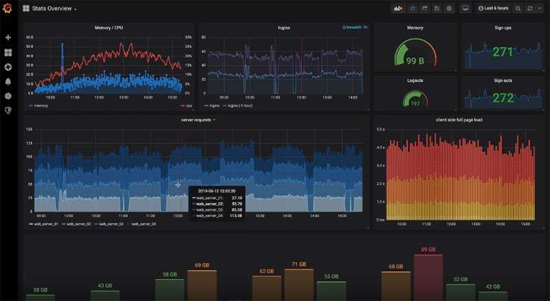
Grafana’s like the control center for your data metrics. It’s a hit with the tech crowd for monitoring operations and crunching time-series analytics. Dashboards here are sleek and packed with features like alerts and annotations, making it easier to keep an eye on what matters.
Features
- Beautiful, customizable dashboards
- Plugin architecture for added functionality
- Alerting and notifications
- Support for a wide range of databases
Chartist.js

Chartist.js believes simplicity is key, offering responsive charts that look sharp on any screen. If you want visualizations that are just the right amount of zesty without overwhelming your audience, take Chartist.js out for a spin. Plus, it’s a cinch to get started!
Features
- Responsive by design
- Simple API structure
- Animations and interactivity
- Lightweight and fast
Sigmajs
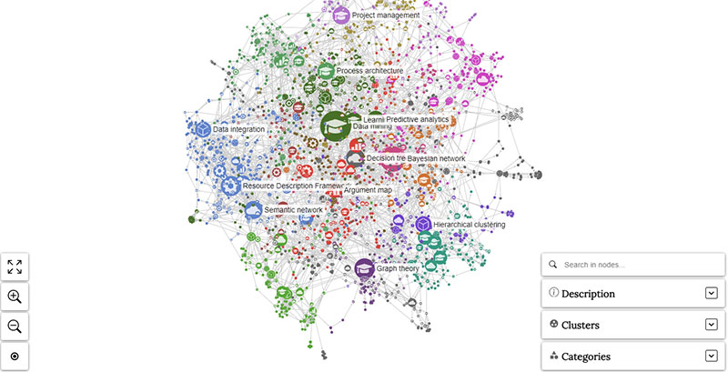
If you’ve got networks and relationships to map out, then Sigmajs is waiting for you. It’s a specialized tool to help you work out the web of connections within your data. It’s perfect for those times when you need to step back and see the big picture.
Features
- Excellent for network graph visualizations
- Highly customizable for complex datasets
- Can handle thousands of nodes
- Interactive and extensible
Polymaps
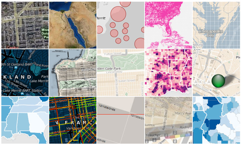
Say you want to go beyond plain old charts and step into the world of maps. Polymaps is a JavaScript library that’ll help you create interactive maps. Geographical data never looked so good! It’s all about revealing stories hidden within coordinates and boundaries.
Features
- Image and vector-tiled maps
- Dynamic visualizations of geographic data
- Highly interactive
- Custom map styling
Microsoft Power BI
Microsoft Power BI is like the VIP of our data visualization party. It’s all about connecting data sources and lighting up insights that can push businesses ahead of the curve. With its intuitive interface, you’ll be turning data points into strategic moves in no time.
Features
- Vast data connectivity options
- AI-powered analytics
- Rich personalization of dashboards
- Secure and robust collaboration
Qlik Sense
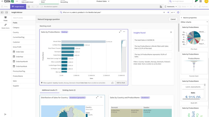
Here’s to Qlik Sense, the intuitive brainiac in the visualization tool gang. It’s all about offering insights you might not even have thought to look for. With its self-service approach, you get analytic power with the simplicity of a consumer app. Nifty, huh?
Features
- Associative analytics engine
- Drag-and-drop visualizations
- Centralized sharing and collaboration
- Scalable architecture
Klipfolio
Picture a dashboard that gives you the lowdown at a glance. Klipfolio does just that, with real-time data visuals that are easy to share with the team. It’s about staying on top of your game without digging through piles of data.
Features
- Real-time dashboard updates
- Plenty of data source integrations
- Customizable visuals
- Sharing and collaboration features
Looker
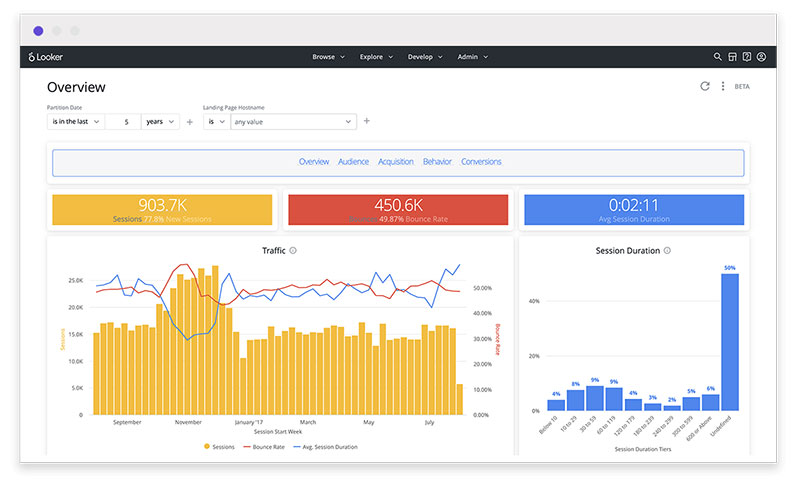
What’s Looker all about? It’s business intelligence cranked to eleven. Dive into your data with powerful exploration, creating visuals that not only look cool but drive decisions. With Looker, data’s not just numbers; it’s the guiding star for your business moves.
Features
- Robust data exploration
- Customizable, embeddable visualizations
- Data modeling layer
- Collaboration and sharing capabilities
Zoho Analytics
Ever dreamt of having a slick assistant for data? Enter Zoho Analytics. It’s a generous lad, offering insights across the board – from sales and marketing to finance and more. With AI features weaving through your data stories, it’s like having a data-savvy pal.
Features
- AI and machine learning capabilities
- Many visualization options such as Charts, KPI widgets, Summary views, and Customizable dashboard themes
- Multi-functional dashboards
- Collaborative analytics
Domo
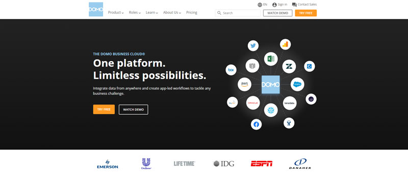
Domo whispers the language of data connectivity. Imagine a platform where every bit of your business data comes to sing in harmony. With its scalable solution, you’re looking at visualizations that aren’t just illustrated numbers but are action calls.
Features
- Massive data connector library
- Interactive dashboards
- Custom app platform
- Mobile-first design for on-the-go analysis
FAQ about data visualization tools
What exactly do data visualization tools do?
They’re the backstage crew that turns raw data into visual stories. Imagine a chef – but instead of ingredients, they have numbers, and they whip up infographics instead of entrees. Tools like Tableau and Power BI help spot patterns, trends, and outliers. They make the complex simple.
How do data visualization tools help businesses?
They’re game-changers, really. They help businesses translate data points into visual strategies. From interactive charts to creating comprehensive dashboards, these tools offer a visual aid for quicker, more informed decision-making. It’s about making data easy-to-digest – a crucial edge in any market.
Can I use data visualization tools without any coding knowledge?
Absolutely! The beauty of tools like Google Charts and Data Studio lies in their user-friendliness. Drag-and-drop interfaces, pre-made templates – no need to be a coding ninja. For those who can code, JavaScript libraries like D3.js can jazz things up a bit more.
What are the best data visualization tools for beginners?
A starter’s kit might feature Google Charts for its simplicity, or Excel for its omnipresence and ease. Dashboards in these are quick to learn. They’re the training wheels of data visualization – highly intuitive, yet powerful enough to make an impact.
Are there free data visualization tools available?
Freebies? You bet. Tools like Tableau Public offer solid functionality without the price tag. Google’s Data Studio won’t cost a dime either. There’s a whole landscape of open-source libraries too – think Plotly or Matplotlib for those who like to tweak and tinker.
How do data visualization tools integrate with big data?
They’re like the Robin to your big data Batman. These tools can handle massive datasets, carving out meaning and connection. They link up with big data technologies, drawing insights from complex patterns, whether it’s predictive analysis or real-time data tracking.
Can I customize dashboards using these tools?
Custom dashboards? That’s where these tools strut their stuff. You design, tailor, and tweak to your heart’s content. Chart generators and dashboard creators in visualization tools like QlikView are all about giving you the reins to personalize and highlight what matters.
How secure are data visualization tools for sensitive information?
Security’s a top priority. Many of these tools come fortified with robust security features to safeguard sensitive data. Options range from role-based access in Tableau to Power BI’s row-level security, ensuring tight control over who sees what.
What’s the learning curve for advanced data visualization tools?
It varies. Tools like D3.js can be a steep climb but worth the view. Tableau and Qlik Sense offer more user-friendly landscapes. Investing in learning these tools can up your data storytelling game to cinematic levels. There are plenty of courses and communities for that.
Do data visualization tools allow collaboration?
Teamwork makes the dream work, right? Many visualization platforms are built for collaboration. It’s like a multiplayer game – share, edit, and publish visual stories together. Live updates, collective data handling – Power BI and Google Charts encourage that team spirit.
The Complete Visual on Data Visualization Tools
We’ve journeyed through the realm of data visualization tools, uncovering their knack for storytelling through numbers. It’s like we’ve been digital wizards, transforming data into visual masterpieces with a flick of a wand. Interactive charts, custom dashboards, and trends visualization – they’ve become our allies in the battle against data overload.
These tools, they’re not just for show. They’re the bridge between raw data and actionable insights. From infographics to business intelligence, the power to inform and persuade is now at our fingertips.
So, whether it’s for presenting a killer business case or making heads turn with a report, remember the champions we’ve talked about. Tableau, Power BI, Google Charts – these are more than just tools; they’re your partners in clarity.
Remember, every number tells a story. It’s on us now to tell it right.
If you liked this article about data visualization tools, you should check out this article about open source data visualization.
There are also similar articles discussing data visualization javascript libraries, WordPress data visualization, interactive data visualization, and misleading data visualization examples.
And let’s not forget about articles on data visualization color palettes, data visualization best practices, data visualization examples, and weather data visualization.