
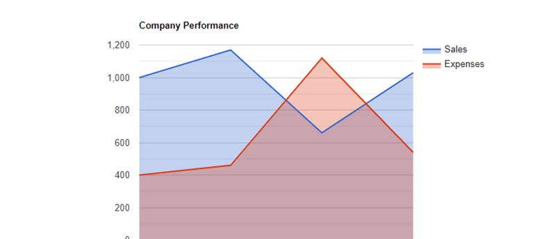
Ever find yourself caught in a maze of data, just craving for a trail of breadcrumbs to guide you through? React chart libraries are those breadcrumbs in the world of web design, transforming numbers into stories through vivid charts and graphs.
Imagine that: crisp lines conveying growth, vibrant bars mapping trends, and colorful pies simplifying complex datasets. It’s more than just good looks; it’s about making sense of the info-overload that bombards us daily.
Within this read, you’ll embark on a voyage across the canvas of interactive React graphs and data-driven React components, where we’ll decode the secrets to illustrating data narratives that stick. You’ll grasp the nuances of selecting the perfect library that renders not just a chart, but insights that resonate.
Get ready to dive into the world where D3.js integrates with React, where responsive design meets real-time data, and where every line, bar, and dot empowers your story. By the end, you’ll not just learn, you’ll craft visual poetry from data points.
Table of Contents
Top React Chart Libraries
| Library Name | Integration Ease | Customizability | Real-Time Data Support | Specific Use-Case | Documentation |
|---|---|---|---|---|---|
| react-google-charts | Easy | Limited | Yes | General | Good |
| D3.js | Advanced | High | Yes | Custom | Good |
| Recharts | Easy | Moderate | Yes | General | Good |
| Visx | Moderate | High | No | Custom | Moderate |
| react-flow-chart | Moderate | High | No | Flow Diagrams | Moderate |
| react-financial-charts | Moderate | High | Yes | Financial | Moderate |
| react-charts | Easy | Moderate | Yes | General | Moderate |
| ant-design-charts | Easy | Moderate | Yes | General | Good |
| MUI charts | Easy | Moderate | No | General | Good |
| react-chartkick | Easy | Limited | No | General | Easy |
| react-chartjs-2 | Easy | Moderate | Yes | General | Good |
| Victory | Moderate | High | No | Custom | Good |
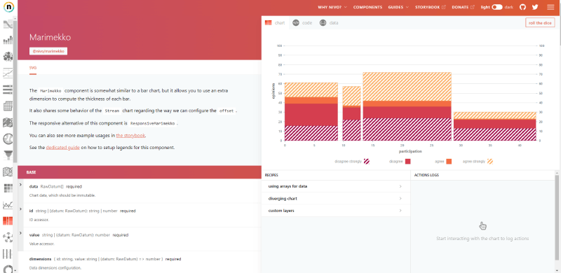
| Nivo | Moderate | High | No | Custom | Good |
| React-Vis | Easy | Moderate | Yes | General | Good |
| ECharts | Moderate | High | Yes | Custom | Good |
react-google-charts
Google charts and React, a match made in heaven for when you need crisp, clean visuals backed by a tech giant. This library lets you wrap those familiar Google Charts smoothly within your React app. It’s like having the power of big data research at your fingertips without needing a PhD to use it.
Best Features:
- Rich gallery of chart types
- Easy data connectivity
- Interactive options
What we like about it: It’s the ease of integration that seals the deal. Packed with features yet so familiar, it’s like running into an old friend in the vast world of data visualization.
D3.js
For the creators who crave control, D3.js is your canvas. It’s not a library that holds your hand; it’s the tool that sets you free. With D3.js, you summon charts from the abyss of raw data with more precision than a poet choosing words.
Best Features:
- Unrivaled flexibility
- Data-driven transformations
- Dynamic, interactive visualizations
What we like about it: It’s the surgical precision in custom visualization creation that makes D3.js stand out. You get to craft the narrative, pixel by pixel, data point by data point.
Recharts
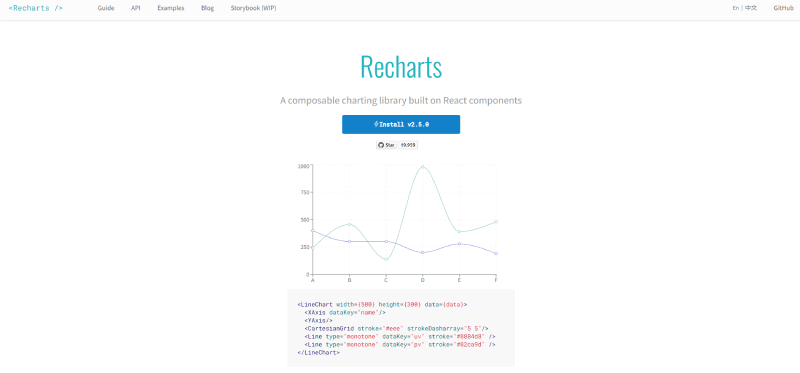
Recharts plays nice with your React components because it’s built with them. Think of it as puzzle pieces that fit together without forcing. It’s the simplicity of charting made with an ethos of React, delivering harmony in your dev routine.
Best Features:
- Component-based design
- Customizable components
- Declarative approach to data visualization
What we like about it: Its component-based nature meshes seamlessly with React’s philosophy, making it a breeze to blend your charts with the rest of your UI elements.
Visx / Airbnb’s Visx
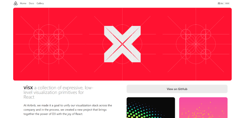
Airbnb’s Visx is like that minimalist, yet stylish friend who knows how to make a statement without shouting. It gives you the building blocks to create custom charts with the subtlety of fine art. It’s low-level magic with high-impact visuals.
Best Features:
- Low-level primitives for building charts
- Combines the power of D3 with the joys of React
- Modular components, so you use only what you need
What we like about it: Its modular approach means you’re not dragging a heavyweight library along. You pick only the tools you need, keeping your project as light as a feather.
Your beautiful data deserves to be online
wpDataTables can make it that way. There’s a good reason why it’s the #1 WordPress plugin for creating responsive tables and charts.

And it’s really easy to do something like this:
- You provide the table data
- Configure and customize it
- Publish it in a post or page
And it’s not just pretty, but also practical. You can make large tables with up to millions of rows, or you can use advanced filters and search, or you can go wild and make it editable.
“Yeah, but I just like Excel too much and there’s nothing like that on websites”. Yeah, there is. You can use conditional formatting like in Excel or Google Sheets.
Did I tell you you can create charts too with your data? And that’s only a small part. There are lots of other features for you.
react-flow-chart
When your data is a story better told through flow and process, react-flow-chart is your go-to scribe. It turns complex workflows into navigable narratives, perfect for when you’re crafting tales of process and progress.
Best Features:
- Customizable nodes and ports
- Easy to implement interactive features
- Pre-built elements for quick assembly
What we like about it: The customizability is top-tier. You shape the flow, chart the course, all with your signature style stamped on each node and connection.
react-financial-charts
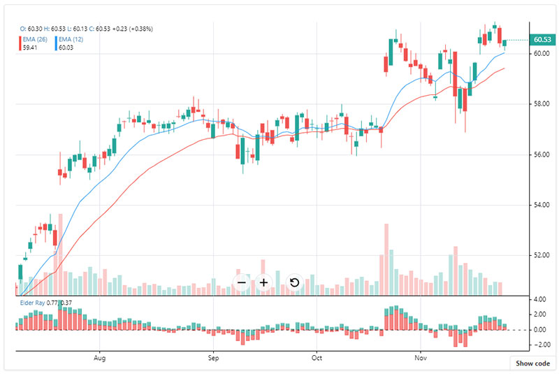
When the stakes are high, and the markets fluctuate faster than a blinking cursor, react-financial-charts is your steady hand. This library’s tailored for the financial wizards, tracking the ebb and flow of markets with the precision of an eagle-eyed trader.
Best Features:
- Built specifically for financial data
- Real-time data support
- Highly custom technical indicators
What we like about it: It speaks Wall Street fluently. With tools sharpened for the rapid, often chaotic world of finance, this library understands the language of bulls and bears.
react-charts
For the days when you want to get in and get out with a chart that just works, react-charts is your silent partner in crime. It provides straightforward charting solutions, so you spend less time wrestling with customization and more time admiring your creation.
Best Features:
- Simple API with powerful outcomes
- Hooks-based architecture
- Lightweight bundle size
What we like about it: The simplicity is its strength. A fuss-free API means you get from A to visual B without detours. It’s charting made so easy it almost feels like cheating.
ant-design-charts
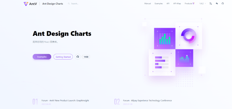
Craving that sleek look? Ant-design-charts delivers it with the grace of a calligrapher’s stroke. Coming from the Ant Design System, it ensures your charts not only tell a story but do it with a visual class that’s hard to overlook.
Best Features:
- Fits neatly within the Ant Design System
- Rich gallery of chart types
- Seamless integration with React
What we like about it: Design continuity—your charts don’t just look good; they look right at home amidst your Ant Design-styled application.
MUI charts
If your app’s already decked out in Material UI, MUI charts will feel like the missing piece of the puzzle. It snugs in so comfortably within the MUI ecosystem; you’ll wonder how you ever charted without it.
Best Features:
- Consistent with Material UI aesthetics
- Responsive and highly customizable charts
- Easy to use within the MUI framework
What we like about it: The design continuity, without a doubt. There’s something about the Material Design charm that makes data seem friendlier, more approachable.
react-chartkick
Whether you’re a code newbie or a time-pinched pro, react-chartkick has got the goods. It’s like your friendly neighborhood baker who knows exactly how you like your pie (charts, in this case). Easy, beautiful, and with zero dependencies, it’s charting for all.
Best Features:
- Great with Rails
- Zero dependencies
- Beautiful defaults
What we like about it: The zero dependencies win hearts. Just like the best stories, sometimes the ones without complex backstories hit the sweet spot.
react-chartjs-2
When you mix the familiarity of Chart.js with the goodness of React, you’re set for a smooth sail. This wrapper library takes the pain out of mixing the two, so you’re left with charting bliss that feels familiar yet fresh.
Best Features:
- Versatile chart types
- Beautiful defaults
- Leveraging Chart.js with a React twist
What we like about it: Familiarity, relaunched. It’s Chart.js, but refashioned for the React dev’s toolkit.
Victory
Aptly named, Victory is for when you require charts as bespoke as a tailor-made suit. From the clever brains at Formidable, it dedicates itself to providing a rich set of tools for the pickiest of charting aficionados.
Best Features:
- Native animation support
- Highly customizable
- Consistent API across platforms
What we like about it: The mad levels of customization mean this isn’t just about data; it’s about personality shining through your numbers.
Nivo
Nivo makes your data pop, sizzle, and all things snappy. It fuses D3’s raw strength with React’s component-based charm, banding together a library that’s both powerful and painless to plug into your project.
Best Features:
- Rich interactive documentation
- Modern and engaging visualizations
- Extensive library of chart types
What we like about it: The balance. It hits the sweet spot between D3’s might and React’s elegance.
React-Vis
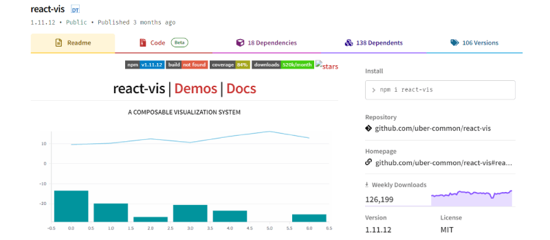
Straight from Uber’s workbench comes React-Vis, a toolkit that’s about getting down to business fast. It’s uncomplicated, it’s robust, and it’s dying to serve up data points in the most digestible visuals.
Best Features:
- Developed by Uber
- Intuitive API
- Set of ready-to-use chart templates
What we like about it: Its no-nonsense attitude. In the sea of charting libraries, it’s the captain that navigates effortlessly.
ECharts
Dip your feet into ECharts for a splashing good time with data. It’s big, with chart types covering more ground than a marathoner and the flexibility to tune every visual element. It’s charting gone global, and it’s inviting you to paint the bigger picture.
Best Features:
- Vast selection of chart options
- Theming and customization galore
- Interactive tweaking with immediate visual feedback
What we like about it: That it’s like a tool chest for data visualization. You think of a chart, and ECharts lays it out for you.
FAQ on React Charts
What are React chart libraries?
They’re like your digital paintbrushes for data. React chart libraries let you turn columns of numbers into visual stories that are interactive, informative, and, yeah, actually kind of beautiful.
How do I pick the right React chart library for my React apps?
When sorting through the garden of chart libraries, you’ve got to know your soil—aka your React app. What’s it need? Fast data refresh for a financial dashboard?
Or maybe something more static but with a punchy, artistic vibe? Look, the right tool fits your app like a glove, matches your style, and meets your users’ expectations. Dig into the details, like whether you want to sprinkle some interactive charts over your React apps, and watch them flourish.
Are React chart libraries difficult to learn?
It’s a spectrum. Some are user-friendly, ready to rock straight out of the box. Others, like harnessing the mighty D3.js within React, might have a steeper learning curve but offer wild customization.
Can I use React chart libraries for commercial projects?
Absolutely. Many are open-source and totally cool for commercial use. Just double-check those licenses to make sure you’re in the clear.
What kind of charts can I create with React chart libraries?
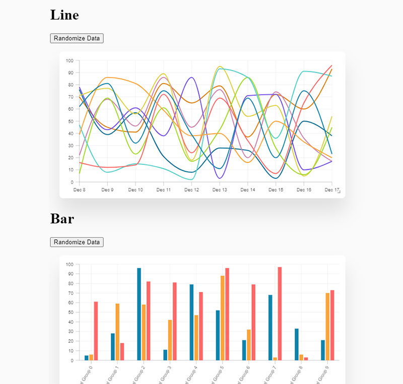
Oh, the variety—you’ve got lines, bars, pies, and… are you sitting down? Even more exotic species: think radars, waterfalls, and heatmaps. There’s a chart type for just about any data set you’ve got. Need inspiration? Check out these examples of good graphs.
Do React chart libraries support server-side rendering?
Yep, some do. React-chartjs-2 plays nice with server-side rendering, as do others. It’s all about delivering that snappy performance, even if your users are rocking a browser that’s seen some miles.
How much do React chart libraries cost?
Mostly, your wallet can breathe easy—they’re free. Open source for the win. Some might have paid versions, but that’s usually for the fancy extra features or enterprise support.
Do React chart libraries work with mobile devices?
Sure thing. Many come ready to tango with any screen size, making your charts look good on everything from phones to desktops. User experience is king, and responsiveness is its crown.
How do I integrate React chart libraries with my existing project?
Mostly, it’s smooth sailing. If you already speak fluent React, sliding in a chart library isn’t a wild ride. It’s like giving your app a new toy—it might need some configuration, but soon it’ll be the life of the party.
Can I animate the charts in React chart libraries?
Get ready for a show—animations are on the table with many libraries. Your charts can bounce, slide, fade, you name it. It can make your users’ experience way more engaging. Dive into libraries that specialize in bringing data to life like animated charts.
Conclusion
So, we’ve ar the end of this article with React chart libraries. Bet you didn’t think lines and bars could get this exciting, huh?
We’ve seen how these nifty tools take the grunt work out of visual stories. It’s like they grab data by the lapels and say, “Hey, let’s make you shine.” Forget yawn-inducing spreadsheets; with React’s magic, we’re talking user experience dialed up to a visual symphony.
- Chart types? A smorgasbord to fit every taste.
- Interactivity? Like talking to the user without saying a word.
- Real-time data? They’ve got that covered faster than you can hit refresh.
Cracking the code on choosing the right library – it’s all about fit. Canvas-based? SVG? API integration? It’s about matching the tool to the task, creating something as unique and compelling as the data story you’re telling.
And just like that, you’re equipped to make data do the heavy talking for you. Welcome to the world of accessible, engaging, and downright cool data visualizations. Ready, set, chart!
If you liked this article about React chart libraries, you should check out this article about financial charts and graphs.
There are also similar articles discussing interactive charts, creating interactive charts, comparison chart makers, and comparison charts.
And let’s not forget about articles on javascript chart libraries, chart generators, examples of good graphs, and animated charts.


