Choosing the right font for tables can make or break readability, especially in data-heavy presentations or reports. When dealing with tabular data, clarity and legibility are paramount.
Picking the best fonts for tables ensures that your information is not just seen but understood. Arial, Helvetica, and Verdana are classic choices known for their clean lines and easy-to-read characters.
These fonts help maintain a professional appearance, whether you’re working in Excel, Google Sheets, or designing a web dashboard.
By the end of this article, you’ll have a clear understanding of which fonts enhance data presentation and how they impact user experience.
We will delve into specific font families, discuss critical factors like font size, weight, and color contrast, and guide you on achieving the perfect balance between style and functionality for your tables. Let’s explore the best fonts for tables and elevate the clarity of your data.
Table of Contents
The Best Fonts For Tables
| Font Name | Font Type | Best Used For | Readability | Recommended Size | Style | Example Use Case |
|---|---|---|---|---|---|---|
| Arial | Sans-serif | General-purpose tables | High | 10 – 12 pt | Clean, Versatile | Business reports |
| Helvetica | Sans-serif | Professional documents | Very High | 10 – 12 pt | Modern, Elegant | Financial statements |
| Verdana | Sans-serif | Screen readability | Very High | 9 – 11 pt | Clear, Legible | Web tables, Dashboards |
| Times New Roman | Serif | Print documents | High | 10 – 12 pt | Traditional | Printed reports |
| Calibri | Sans-serif | Digital presentations | High | 10 – 12 pt | Modern | PowerPoint tables |
| Tahoma | Sans-serif | Technical data | High | 10 – 11 pt | Practical, Clear | Excel spreadsheets |
| Open Sans | Sans-serif | Web tables, digital media | Very High | 10 – 12 pt | Friendly, Legible | Websites, Web apps |
| Roboto | Sans-serif | Digital use, mobile apps | Very High | 10 – 12 pt | Modern, Clean | Mobile app tables |
| Montserrat | Sans-serif | Modern designs | High | 10 – 12 pt | Stylish, Bold | Infographics, Reports |
| Raleway | Sans-serif | Design-focused documents | High | 10 – 12 pt | Elegant, Thin | Marketing materials |
Roboto
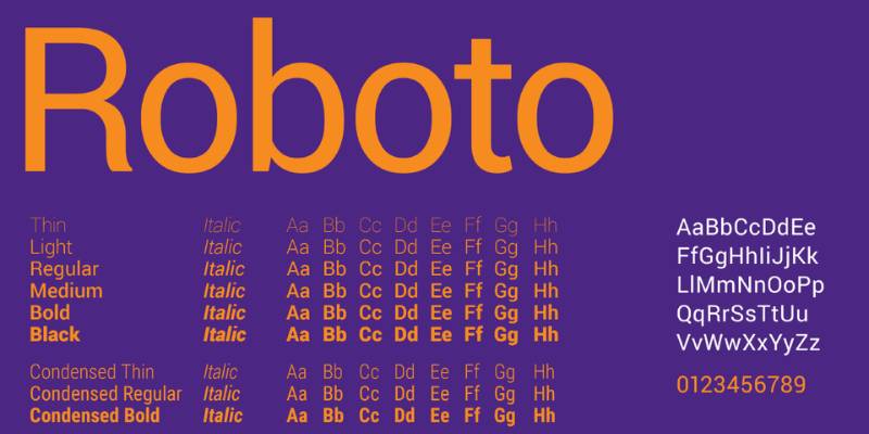
Well, Roboto is a no-brainer, really. It’s a font that breathes simplicity and clarity. For tables, it’s a dream, providing crisp lines and easy readability. The font has its roots in geometric forms, ensuring balance and harmony. A table set in Roboto is like a well-organized kitchen; everything’s in its right place.
Lato
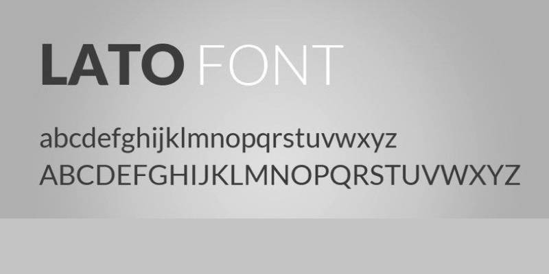
Turning to Lato, we find a font that’s both sleek and warm. Lato’s beauty lies in its semi-rounded details, which give tables a friendly vibe. Despite this warmness, Lato retains a sense of professionalism. It’s like the office’s cool guy who knows how to get the job done.
Open Sans
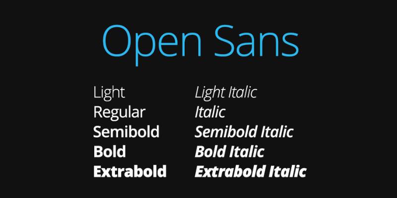
Open Sans is like that pair of reliable jeans you always turn to. Optimized for print, web, and mobile interfaces, this font is as versatile as it gets. For tables, Open Sans is a match made in heaven. It guarantees easy readability and a clean look that doesn’t get old.
Source Sans Pro
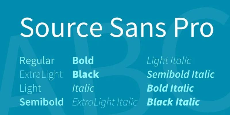
Onward to Source Sans Pro. Here’s a font that was born for digital spaces. Its legibility and variety of weights make it a fantastic choice for tables. Think of Source Sans Pro as a Swiss Army knife, ready to adapt and make your data shine.
Noto Sans
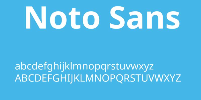
Say hello to Noto Sans. Designed with a goal to support all languages with a harmonious look and feel, it’s a font that screams inclusivity. Tables dressed in Noto Sans are easy on the eye and rich in character. It’s like a melting pot of cultures, but for fonts.
Verdana
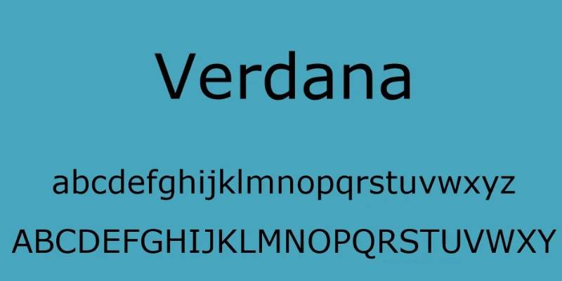
Ah, Verdana. An oldie but a goldie. It’s known for its wide letters and high legibility even at small sizes. If you’re designing tables that require small text, Verdana’s your best bet. It’s the veteran player in the team, always delivering when it matters most.
Georgia
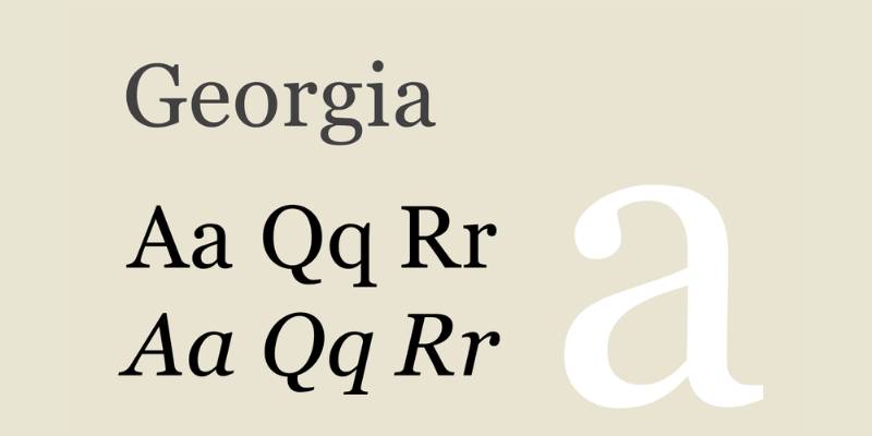
Next up, Georgia. A serif font that’s perfect for those seeking a classical vibe. Its readability is excellent, and the small decorative strokes add a touch of elegance to your tables. Georgia’s like a grand library, sophisticated yet accessible.
Tahoma
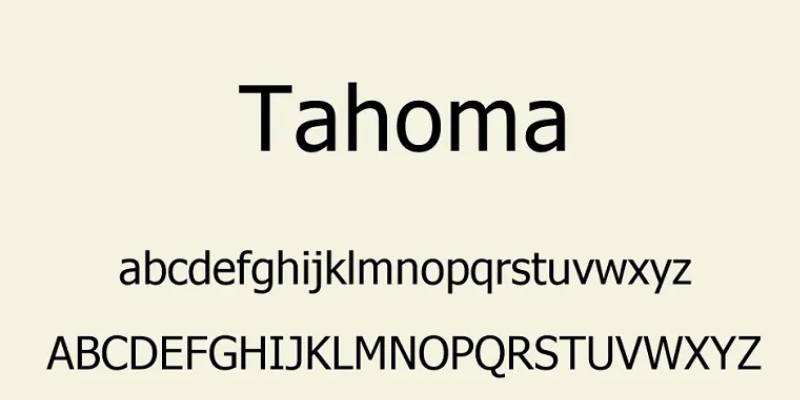
Introducing Tahoma. Here’s a font that balances tight letter spacing with high legibility, creating a fresh and clean look. In table form, Tahoma provides a sharp aesthetic that’s pure pleasure for the eyes. Think of it as the minty fresh breath of the font world.
Myriad Pro
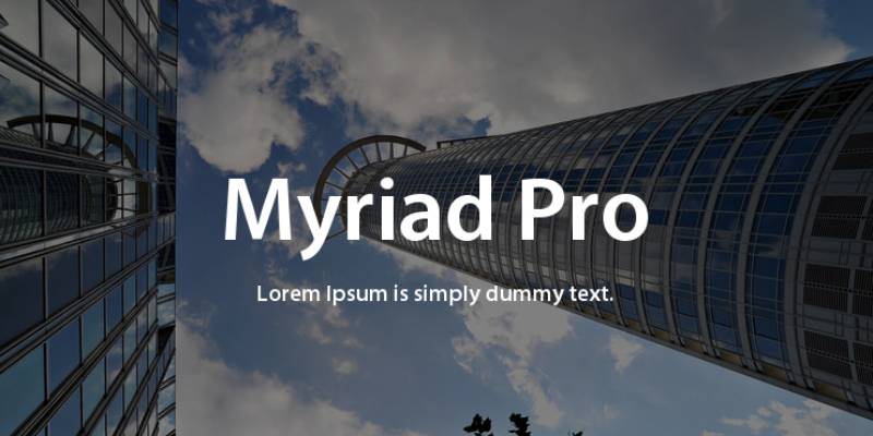
Myriad Pro enters the scene with its friendly and open look. Its professional tone, coupled with a dash of warmth, makes it perfect for table design. Myriad Pro’s like that bubbly friend who also has their life together.
Bell Gothic

Bell Gothic is quite the trendsetter. Originally designed for phone books, it’s excellent for any table that needs to display information concisely. Bell Gothic’s the fashion-forward icon of the font world, always staying one step ahead.
Helvetica
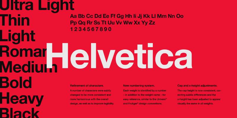
No font list would be complete without Helvetica. It’s simple, clean, and super versatile. It’s the little black dress of fonts, looking great in any situation, including your tables.
Arial
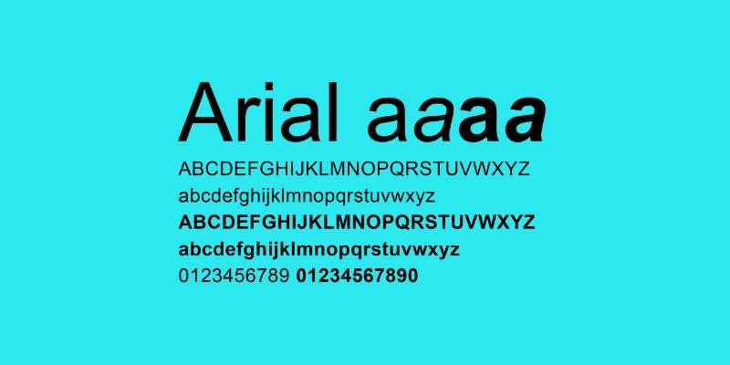
Meet Arial, Helvetica’s cousin. It’s a popular choice for a reason: it’s familiar, friendly, and makes for easy reading. With Arial, your tables are in safe hands. It’s the comfort food of the font family.
PT Sans
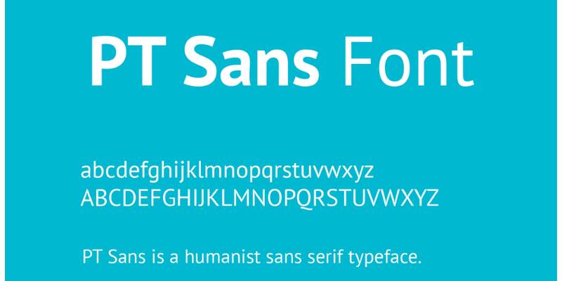
Say hi to PT Sans. It’s a font that feels modern yet rooted in tradition, with its humanist and grotesque styles. PT Sans brings an exciting twist to tables, like a spice that adds a new flavor.
Exo

Here comes Exo. This font takes the future into its own hands, with a techno vibe that feels fresh and innovative. Tables styled with Exo look like they’re from a futuristic sci-fi movie. Buckle up, it’s a font that takes you on a ride.
Exo 2
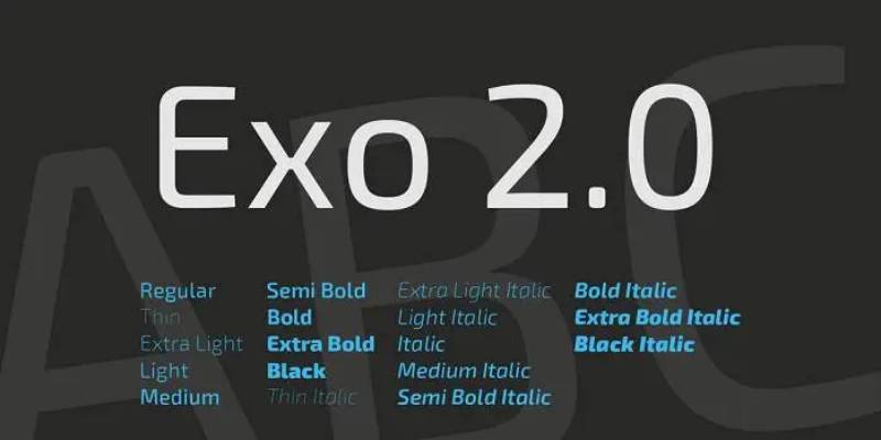
We continue with Exo 2. It’s like Exo’s younger sibling, maintaining the futuristic look but with a more simplified form. For tables, Exo 2 offers a refined and contemporary touch. It’s the kind of font that knows the latest trends.
Ubuntu

And finally, Ubuntu. This font embodies the spirit of its namesake, an African philosophy of interconnectedness. Ubuntu’s rounded letters give tables a harmonious, human touch. It’s the community spirit in font form.
Your beautiful data deserves to be online
wpDataTables can make it that way. There’s a good reason why it’s the #1 WordPress plugin for creating responsive tables and charts.
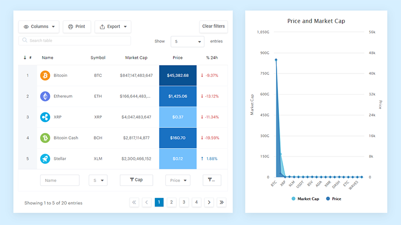
And it’s really easy to do something like this:
- You provide the table data
- Configure and customize it
- Publish it in a post or page
And it’s not just pretty, but also practical. You can make large tables with up to millions of rows, or you can use advanced filters and search, or you can go wild and make it editable.
“Yeah, but I just like Excel too much and there’s nothing like that on websites”. Yeah, there is. You can use conditional formatting like in Excel or Google Sheets.
Did I tell you you can create charts too with your data? And that’s only a small part. There are lots of other features for you.
FAQ on The Best Fonts For Tables
What is the best font for readability in tables?
Arial is my go-to font for table readability. Its clean, straightforward design makes it easy to scan data. Coupled with proper font size and letter spacing, it minimizes strain on the eyes when reading across rows and columns.
What font size should I use for tables?
For most tables, a font size between 10 and 12 points works best. It ensures clarity without overcrowding the data. Adjust based on context: smaller sizes for dense data, larger for presentations.
Are sans-serif fonts better for tables?
Absolutely, sans-serif fonts like Helvetica and Verdana offer superior clarity. Their simple design avoids the visual clutter that sometimes comes with serif fonts, making data easier to read and understand.
How does color contrast affect font readability in tables?
High color contrast between text and background significantly boosts readability. Dark fonts on a light background or vice versa ensure that your data is legible. Prioritize contrast to enhance content clarity in your tables.
Should I use bold fonts in tables?
Using bold fonts can emphasize key data points or headers, enhancing the visual hierarchy. However, overuse can overwhelm the reader. Apply sparingly for the best results in your data presentation.
Can I mix different fonts in one table?
Yes, but with caution. Combining fonts like Arial for body text and Roboto for headings can improve visual emphasis without sacrificing readability. Stick to two fonts to maintain style consistency and avoid a cluttered look.
What are some professional fonts for tables?
Calibri and Tahoma are excellent professional choices. They balance modern aesthetics with readability, making them perfect for business reports, dashboards, and data-heavy documents. Their clean lines ensure your tables look polished.
Why is font weight important in tables?
Font weight influences how data stands out. Lighter weights can make dense data easier to read, while bold weights can highlight important information. Balance is key to ensuring content clarity and visual hierarchy.
How do I make tables look good on screens and print?
Ensure responsive design by choosing web-friendly fonts like Open Sans and setting correct font sizes. For print, prioritize high contrast and print-friendly fonts like Times New Roman to retain readability on paper.
Are some fonts better for digital tables?
For digital tables, web safe fonts like Verdana and Open Sans excel. They’re designed for screen readability, adapting well to different resolutions and browser compatibility. These fonts keep your tables legible across various devices.
Conclusion
Selecting the best fonts for tables is crucial for clarity and readability. Fonts like Arial, Helvetica, and Verdana excel in making data easy to scan and understand. Sans-serif fonts, with their clean lines, are particularly effective in data tables. Optimal font size between 10 and 12 points strikes a balance between compactness and readability.
Color contrast enhances table legibility, making data stand out. Select high-contrast combinations like dark texts on a light background to avoid strain. Using bold fonts strategically can highlight key areas without overwhelming the reader.
Combining fonts, such as Arial for body text and Roboto for headings, can improve visual emphasis while maintaining style consistency. Ensure responsive design for digital tables using web-safe fonts like Verdana and Open Sans.
By integrating these insights, your tables will be both functional and visually appealing, enhancing data presentation and user experience.
If you liked this article about the best fonts for tables, you should check out this article on how to make a table responsive.
There are also similar articles discussing WooCommerce product tables, heatmap tables, how to merge cells in HTML, and WordPress pricing table plugins.
And let’s not forget about articles on how to design a table, JavaScript data table, table UI design, and examples of data tables.
