
Picture this: you’re sifting through a sea of options, wrestling with decisions that could shape the success of your latest project. That’s where the power of comparison charts swoops in—a visual superhero, saving you from the clutches of indecision.
Ever felt swamped by data overload? We’ve all been there. In the digital cosmos, where choices abound and details matter, these charts are your north star. They’re not just organisational tools; they represent clarity in an overwhelming world of information.
In this deep dive, we’re unpacking the arsenal of data visualization marvels that charts offer. Illuminate your path with strategies that transform raw data into a graphical representation—one that speaks volumes. Decipher the nuances behind crafting charts that not only compare but tell a compelling story.
Ready to master the art? By the end of this exploration, you’ll not only grasp the essentials of comparative analysis but wield the savvy to create charts that are as insightful as they are elegant. Let’s chart a course to enlightenment—no compass required, just the right tools and a dash of creativity.
Table of Contents
Top Comparison Chart Types You Should Try
| Comparison Chart Type | Best Use Case | Data Types Supported | Visual Complexity | Dimensionality |
|---|---|---|---|---|
| Bar Charts | Comparing quantities across categories | Categorical, Quantitative | Low | 2D |
| Bubble Charts | Showing relationships between three variables (x, y size) | Quantitative, Categorical (color) | Moderate | 3D |
| Pie Charts | Showing parts of a whole (should sum to 100%) | Categorical, Quantitative | Low | 2D |
| Mosaic or Mekko Charts | Comparative proportions with two or more categories | Categorical, Quantitative | High | 2D |
| Line Charts | Displaying trends over time or ordered categories | Quantitative, Time-Series | Moderate | 2D |
| Radar Charts | Comparing multiple variables for one or more categories | Categorical, Quantitative | High | 2D (Polar) |
| Scatter Plots | Showing relationships and correlation between two variables | Quantitative | Moderate | 2D |
| Box Plot | Displaying distribution and identifying outliers of a dataset | Quantitative | Moderate | 1D (Distribution) |
| Dual-Axis Charts | Comparing trends of two different but related variables | Quantitative, Time-Series | High | 2D |
The following is a list of the most popular comparison charts. Experts in data visualization see them as the most effective charts to communicate key data information.
Bar Charts
Chart generated with wpDataTables
The bar chart is one of the simplest and most straightforward comparison charts. The classic look makes them easy to recognize and easy to understand.
The varying height of each bar represents a number. In most cases, the height is proportionate to a numerical value or percentage. On the other axis, you can compare different values and categories.
The best way to use bar charts is when you have several items to compare. When you have more than ten items, the bar chart works very well. The bar chart is effective because it declutters data visualization. They are easy to make and easy to understand.
Another good thing about them is that you can use them for almost any kind of data. For that reason, they are applicable in many ways in the marketing industry. Here are some examples of numeric data you can represent in a bar chart:
- Group sizes
- Inventories
- Ratings
- Survey results
This type of comparison chart also works well for communicating discrete and categorical data. Applications include sales statistics for products, market share within the industry, et cetera.
You can add a specific dimension by displaying time on the horizontal axis. In that way, you can show a comparison over time or how a certain data set changes over time. Bar charts are useful for analyzing trends, progress tracking, and extracting seasonal patterns.
Bubble Chart
Chart generated with wpDataTables
You can use bubble charts when you want to represent independent values. They make it easy to identify outliers.
Bubble charts are like scatter plots but they add another dimension. In scatter plots, you can only compare two values. Bubble plots allow you to add a third variable by changing the bubble size. If there is little variation in bubble size, you can add labels.
The circle area, or circle size, is the factor you can change to represent a value. Comparing bubble size is not easy for the human eye. So, it is best to use this type of comparison chart when there are clear differences in your data. To make it even clearer, it is recommended to label each bubble with its numerical value.
Size and proportion are two elements that you can represent well in a bubble chart. The bubble size represents its value so you can compare different categories and data points.
Bubble plots have a visual hierarchy which makes them easy to interpret. Your audience will be able to notice differences at a glance.
You can use bubble charts in different settings, like financial analysis. Financial experts use them to compare stocks within their market, prices, trading volume, and so on.
For example, you can use the size to show a company’s market capitalization. On the horizontal axis, you can represent stock price and on the vertical axis trading volume. The overall picture allows investors to identify investment opportunities and market trends.
Pie Charts
Chart generated with wpDataTables
In a pie chart, you can show the composition of a complete data set which makes them excellent for showing percentages and proportions.
Pie charts show how a whole consists of different parts. They make it easy to understand distributions. The size of each category represents the proportion within the whole. Your audience will be able to understand what the relative proportions are and how significant each component is.
Pie charts find many applications because they are so easy to understand. Still, they have certain limitations. You can only use them to explain the composition of a whole.
Designers of marketing content make good use of the characteristics of the pie chart. One such application is in showing the size of market segments. These comparison charts illustrate, for example, how mobile phone manufacturers compare.
Because pie charts work well for showing percentages, many use them for showing budget allocations. You can show how your money is being spent on entertainment, housing, transportation, and other categories.
Another common application in visualizing survey responses, such as multiple-choice questions. Each pie segment represents one of the responses. Audiences can see with ease what the most popular answers are.
As a last example, note how you can use pie charts to show demographic information. You can show the distribution of age groups or the distribution of genders throughout an organization.
Mosaic or Mekko Charts
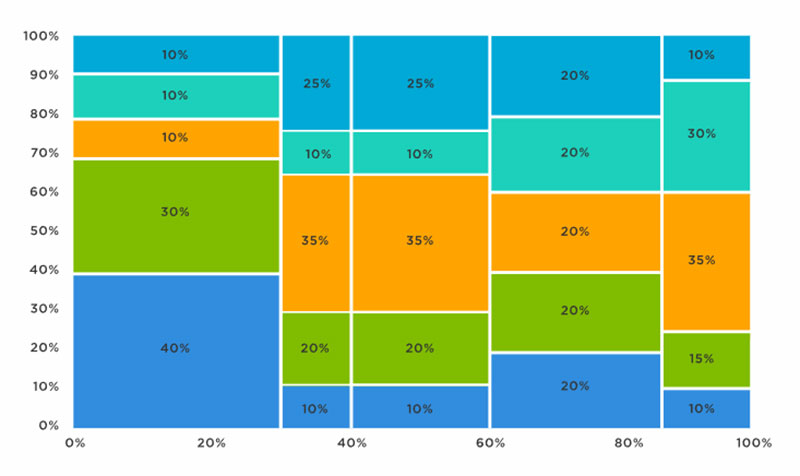
Pie, bar, and bubble charts are great tools for showing a limited number of categories in one plot. Sometimes, you need to show many variables over different categories at the same time. It is even more complicated when the data you want to show is not numerical. How can you do that?
Mosaic, or Mekko, charts, could be a good choice in such situations. A market analyst might want to compare the size of the mobile phone market and the age distribution within each group.
In this case, a mosaic chart is the solution. It allows users to show different variables in a simple and clear manner.
Another example of how to use mosaic charts is for the use of resources over different tasks or projects. You could represent the time or effort for each task on the x-axis. The height could then represent the project’s budget or timeline.
It is clear then, that mosaic charts are excellent tools in project management. They help to get a better understanding of resource distribution and project bottlenecks or imbalances. It is clear then that mosaic charts are excellent tools in project management, helping teams visualize resource distribution, pinpoint bottlenecks, and understand imbalances — and when used within a strategic portfolio management framework, they also help leaders connect project performance to broader strategic priorities, ensuring decisions about resources and investments align with organizational goals.
Line Charts
Chart generated with wpDataTables
In a line chart, you can show how a value changes over a continuous measurement. Time is a very common value on line charts’ x-axis. Line charts easily display when there are positive and negative changes.
Line charts show overall trends and allow viewers to make simple predictions and future projections.
Derivatives of the line chart are the ridgeline plot and the sparkling plot.
Most are familiar with the line plot. Each data point appears as a dot and the dots are connected by a line. It can reveal trends over a certain time span. You can use different colors for different lines.
The main application of line plots is in showing continuous data. The line connection between the data points emphasizes their continuity and flow. You can imagine using line plots for showing performance data, temperature variations, stock prices, and so on. Anything that varies over time you can show in a line plot.
It is not necessary that a line plot’s axis starts at zero. It is important to clarify when the axis does not start at zero. You will still be able to show a trend or comparison. Be aware that some might not understand that the axis starts at a different value.
Radar Charts
Chart generated with wpDataTables
Radar charts are also known as spider or star charts, the radar chart is useful for displaying several variables. You can compare them in a direct manner because they all start from a common origin.
Radar plots show data points in a circular fashion with data points within a series connected by a line. The result is a polygonal shape.
Radar charts offer many opportunities for showing relationships between multiple variables. The great thing is that you can also compare data between different categories and dimensions simultaneously. They highlight patterns, strengths, and opportunities.
A use for radar charts is displaying relative performances or characteristics across entities. By plotting them in one chart you can show the performance of each and compare them with each other.
Another strong point of radar plots is that they make the identification of outliers very easy. Values that have a significant deviation distort the overall pattern of the plots. The audience’s attention will go straight to those outliers.
Sports can compare the performance of athletes using different parameters. You can think here of agility, speed, and strength. Performance experts plot each variable on one of the radial axes to give a holistic view of the athlete’s performance.
Market research is another field that makes ample use of radar plots. Researchers use it to display attributes of different products or services. By presenting them they allow stakeholders to identify strengths and weaknesses which can lead them to make informed decisions.
Scatter Plots
Chart generated with wpDataTables
Two-dimensional scatter plots use two axes and position data points according to their values. Thus, they allow for easy identification of the relationship between variables. They give information about the strength of the correlation and whether the relation is linear or nonlinear. Also, with a glance, you will be able to identify outliers in the plot.
There are several advantages to this kind of comparison chart. They give a simple visual representation of the distribution of the data points. Viewers will identify anomalies, clusters, and trends.
There are many applications for scatter plots. In the finance industry, they are useful for analyzing stock relationships. Each point represents a stock’s price in relation to another stock.
The scatter plot finds use in social science too. They are useful for showing corrections between certain variables.
Marketing intelligence and research is yet another field where people use this type of comparison chart. Applications include highlighting relationships between expenditure and sales figures.
Such comparison charts help marketers see how efficient their marketing campaigns are and allows them to find areas of opportunity.
Box Plot
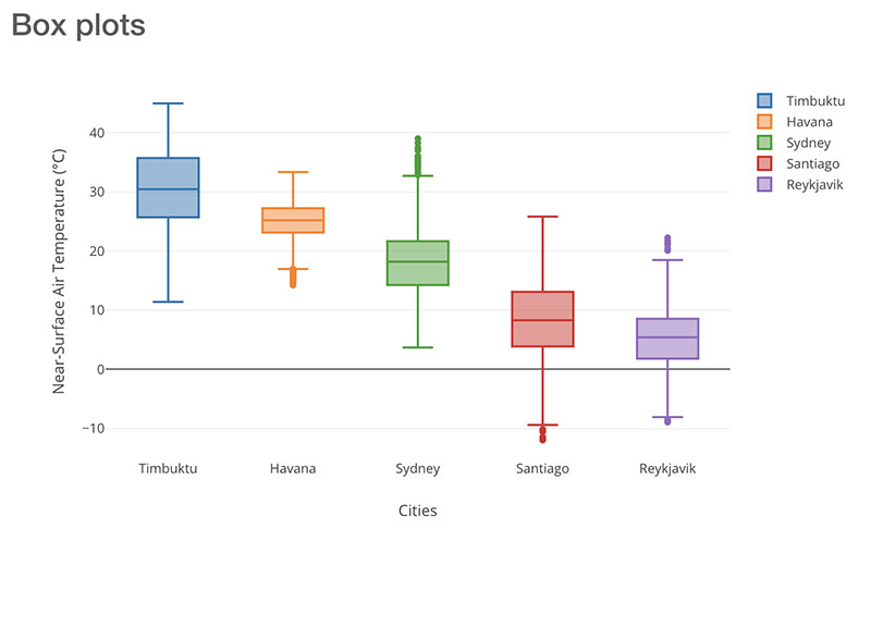
The box plot is one of the less familiar comparison charts. It uses boxes and whiskers to give an overview of values and distributions within data groups. The positioning of the groups shows the location of the majority of data points.
You can use box plots when you have different groups that you want to compare. If you have only one group that you are analyzing, it is better to use a different chart with more detail.
Still, there are various advantages to box plots regarding the comparison of data distribution. They show the distribution and skewness of the data points. Within the boxes, observers can take note of the interquartile range (IQR) and the center of 50% of the data. Such values show trends.
In box plots, you can easily identify outliers. Outliers are the points or whiskers that lie outside the boxes. Identification of the outlier gives insight into specific characteristics. Also, they allow for the identification of anomalies.
Healthcare is one of the areas people use these comparison charts. They find use in comparing patient results across several groups or medical conditions.
They are also useful in market research. Researchers use them for plotting customer ratings and satisfaction across brands and products.
Dual-Axis Charts
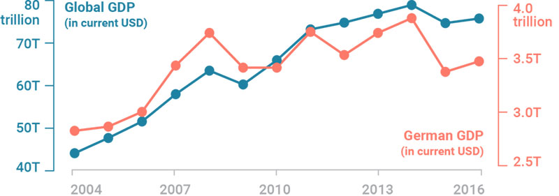
A dual-axis plot has one x-axis and two y-axes. Thus, you can plot three data sets at the same time. One of the data sets is continuous, like time. The others are most suited for displaying groupings by categories.
Dual-axis charts are charts that are useful for highlighting correlations or the lack thereof. They also allow you to easily compare trends.
Companies use this kind of comparison chart to see how many new customers the company gets each month. Another example is to show how much revenue these customers bring in.
There are many things you can compare in a dual-axis chart. Here are some examples:
- Performance of individual sales
- Product prices and volumes
- Sales of units and revenue
- Sales and profit margin
By adding a second y-axis you can combine different charts in one. However, many find these comparison charts confusing. Some avoid them altogether because of their poor design and tendency to mislead the audience.
Within the category of dual-line charts, there are several subcategories:
- Column and line charts
- Dual column charts
- Dual line charts
- Multiple axes charts
FAQ on Comparison Charts
What is a Comparison Chart?
A comparison chart? Think of it as your visual wingman that lays out different options, features, or data points side by side. It’s a snapshot that helps you spot differences and similarities faster than a caffeinated coder on a deadline.
How to create a comparison chart?
The creation of a comparison chart is pretty straightforward, really. You start with your list of items you want to compare. You note down the aspects or features to be compared, and then just plot them out on a grid.
You can use Excel, Google Sheets, or wpDataTables. You fill in the data, and bam, your comparison chart is ready to rock.
What Types of Comparison Charts Are There?
From versatile bar graphs to sleek infographics, there’s a whole palette out there. Got a ton of data? Dive into data visualization tools. Even pie charts have their days. The goal is to match your chart type with the info you wanna share.
When Should I Use a Comparison Chart?
Whenever you need to make sense of the maze that is comparative analysis, throw a chart in the mix. Picking between products, services, or just trying to show trends? Charts are your best bet to present that info digestibly.
What Software Can I Use to Make Comparison Charts?
Software? Where do we start! Microsoft Excel is the old faithful, but if you’re feeling adventurous, look up Tableau or Adobe Illustrator for a fancier finish. Or go browser-based with tools like Canva for something snappy and shareable.
What Makes a Comparison Chart Visually Appealing?
Just like a boutique window display, your chart’s gotta have that ‘come-hither’ look. A balanced layout, a dash of color theory, and honestly, don’t skimp on whitespace. It’s the unsung hero that’ll make your data stand tall.
Why Are Comparison Charts Important in Business and Marketing?
In business, time equals money, right? Well, charts fast-track decision-making. Plus, when you’re marketing, product comparison charts show off your strengths without breaking a sweat.
What Are Common Mistakes to Avoid in Comparison Charts?
Overcrowding it is like being at a loud concert—you can’t focus. Keep data points straightforward, skip jargon, and for goodness’ sake, always double-check your numbers. Accuracy is king.
How Can Comparison Charts Improve Decision Making?
They lay out the maze so you can spot the cheese—fast. Clear visuals cut through noise, simplify your criteria weighting, and help your brain do that magic thing where it just knows the better choice.
Can Comparison Charts Be Biased, and How to Avoid it?
Sure, charts can mislead—if you let ’em. But stick to the facts, present data objectively, and ensure your comparison methodology is transparent. It’s like being a fair referee in a game; call it down the middle.
Conclusion
So, we’ve danced through the details and circled back to where we started, right at the doorstep of decision-making. Comparison charts, they’re not just charts. They’re your guides in this labyrinth called choice.
Here’s what we got:
- A crisp visual that serves up data on a silver platter.
- Those pivotal moments when the penny drops, and the winner takes all, yep, a chart did that.
You’ve seen the arsenal, from the humble pie charts to the detailed benchmarking tools. Snuck a glimpse into the powerhouse software—yes, I’m nodding at Excel and its fancier cousins.
Remember, the trick isn’t just in piling up data. It’s in crafting a story with numbers, creating a visual narrative that whispers sweet somethings in the ears of your decision-making.
So, wield these tools with care. Because next time you’re faced with options aplenty, you won’t just choose well—you’ll choose with confidence. And isn’t that what it’s all about?
If you liked this article about comparison charts, you should check out this article about financial charts and graphs.
There are also similar articles discussing interactive charts, creating interactive charts, comparison chart makers, and React chart libraries.
And let’s not forget about articles on javascript chart libraries, chart generators, examples of good graphs, and animated charts.


