
Imagine data springing to life, leaping off the screen in a symphony of motion—this is the magic of animated charts. It’s not just numbers; it’s a story unfolding before your eyes, and you can craft these visual tales. Whether you’re a seasoned pro or just starting to dabble in the art of data, the right tools can transform static columns into vivid narratives.
By the end of this read, you’ll be adept at the fine craft of data storytelling, equipped with the best tools to create animated charts to captivate your audience. Journey with me as we unveil the secrets to dynamic data representation that resonates and engages.
We’ll cover it all:
- Choosing the perfect visualization tool
- The must-know principles of graphing plugins
- And the magic behind making your data dance with JavaScript charting libraries.
Unlock the full potential of your data, as we dive into the world of HTML5 canvas graphics and beyond. Ready to animate your stats? Let’s get those charts choreographed.
Table of Contents
Awesome tools to create animated charts with
| Tool | Type | Ease of Use | Customization | Export Formats |
|---|---|---|---|---|
| wpDataTables | WordPress plugin | Easy with WordPress integration | High | Excel, CSV, PDF |
| LiveGap Charts | Online chart builder | Very user-friendly | Moderate | Image formats, HTML |
| Visme | All-in-one visual content suite | Intuitive, drag-and-drop | High | JPG, PNG, PDF, HTML5 |
| Chart.js | JavaScript charting library | Technical (requires coding knowledge) | High | Can be converted by saving the webpage or screenshot |
| Datawrapper | Online chart tool | Very user-friendly | Moderate | PNG, PDF, SVG |
| Bar Chart Race | Specialized in bar chart races | User-friendly | Limited | GIF, MP4 |
| Flourish Studio | Data visualization and storytelling platform | User-friendly | High | PNG, SVG, HTML embed |
| Data GIF Maker by Google | Animated data GIF tool | Easy | Limited | GIF |
| Everviz | Online chart and graph maker | User-friendly | Moderate | PNG, JPEG, PDF |
| Tableau | Business intelligence platform | Moderate (learning curve) | Very High | Image formats, PDF, Tableau formats |
Recommended: wpDataTables
wpDataTables can help you create animated charts in WordPress. There’s a good reason why it’s the #1 WordPress plugin for creating responsive tables and charts.

And it’s really easy to do something like this:
- You provide the table data
- Configure and customize it
- Publish it in a post or page
And it’s not just pretty, but also practical. You can make large tables with up to millions of rows, or you can use advanced filters and search, or you can go wild and make it editable.
“Yeah, but I just like Excel too much and there’s nothing like that on websites”. Yeah, there is. You can use conditional formatting like in Excel or Google Sheets.
Did I tell you how you can create charts with your data? And that’s only a small part. There are lots of other features for you.
LiveGap Charts
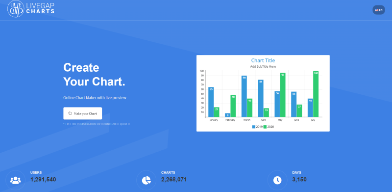
LiveGap Charts is the trusty sidekick for effortless chart crafting. It’s an online oasis where simplicity meets power, serving up charts that are vibrant and engaging without you breaking a sweat. A few clicks here, a few there – bam! – you have a chart that tells the tale.
Best Features:
- User-friendly interface
- Variety of templates
- Customizable colors and fonts
Visme
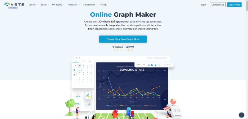
Visme is the superhero tool for slick presentations and snazzy animated charts. It’s the Swiss Army knife in your design toolkit, blending ease of use with stunning visuals. Pie charts that twirl, bar graphs that bounce, Visme makes data dance with flair.
Best Features:
- Rich animation effects
- Interactive content capabilities
- Extensive library of templates
Chart.js
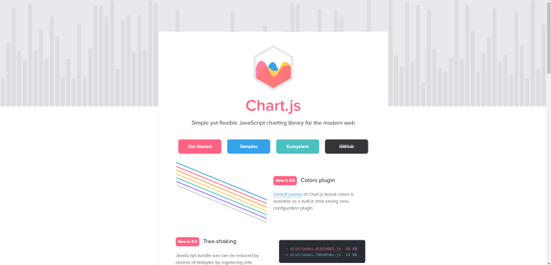
Chart.js is the nimble little library making big waves. Its lightweight approach to dynamic data representation means your pages load fast, keeping everything snappy. A dab of JavaScript here, a pinch of HTML5 canvas there, and you’re dishing out animated delights that web browsers love.
Best Features:
- Open-source and free
- Responsive and flexible
- Supports eight chart types
Datawrapper
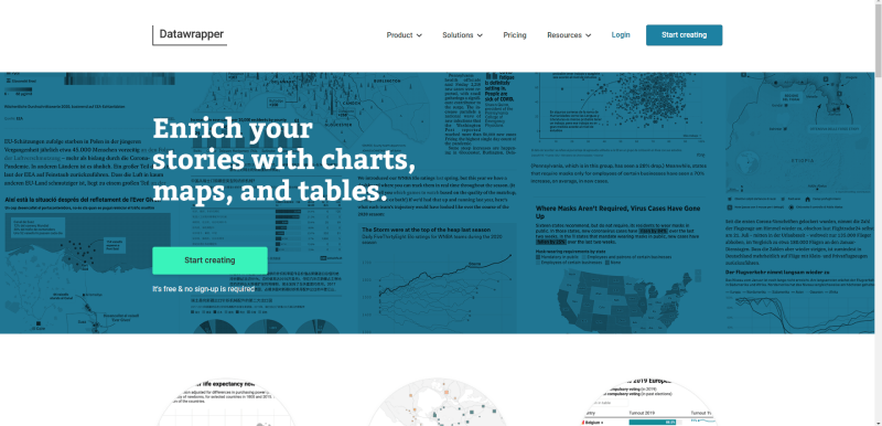
Datawrapper is your no-fuss, no-muss path to visualization stardom. No coding needed; just a zeal for stories told through numbers. Whip up interactive graphs and maps that are as informative as they are gorgeous. For on-point data delivery that sticks, Datawrapper is your go-to.
Best Features:
- Intuitive interface
- Easy embed and share options
- Customizable designs
Bar Chart Race
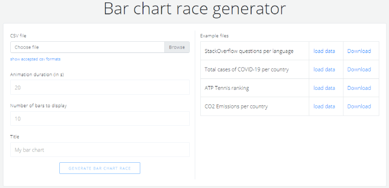
Bar Chart Race is the track where your data competes in a stunning visual sprint. This unique tool brings movement to the mundane, making each bar fight for the top spot over time. Who knew data could be this riveting?
Best Features:
- Engaging animation style
- Customizable race parameters
- Simple setup process
Flourish Studio
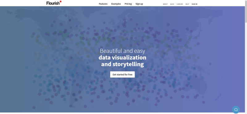
Step into Flourish Studio, where storytelling isn’t just words—it’s dynamic, beautiful data-driven animations. It’s where charts aren’t just charts; they’re miniature epics. Elevate your data to art without coding through this elegant platform.
Best Features:
- An impressive array of templates
- Interactive and responsive designs
- Collaboration and team features
Data GIF Maker by Google
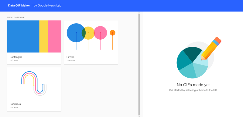
Data GIF Maker by Google sprinkles a bit of fun into the mix, turning those stats into shareable, snackable content—perfect for social media. Break down the barriers of data intimidation with this tool that marries simplicity with Google’s signature sleekness.
Best Features:
- Simple, intuitive process
- GIF format for easy sharing
- Google’s design polish
Everviz
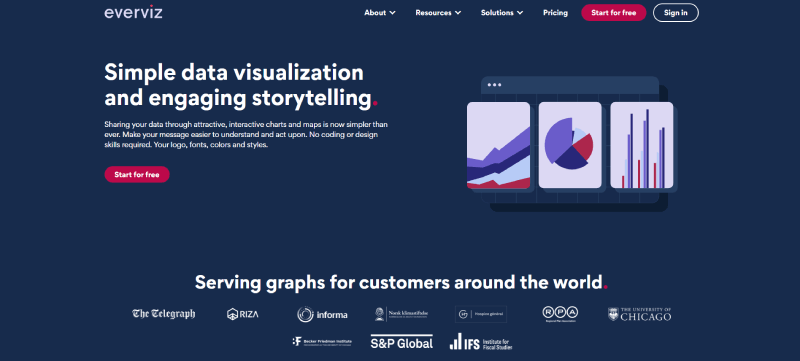
Everviz is the rising star in the chart-making universe. It’s all about visual punch with minimal input. From journalists to educators, if you’ve got a story to tell with data, Everviz is your storyboard.
Best Features:
- Easy data import options
- Professional-looking results
- Integration with other platforms
Tableau
Tableau, the big kahuna of data visualization tools, doesn’t just create charts; it creates a full-on sensory experience. With a buffet of data sources to feed it, Tableau is the chef’s knife carving out intricate data stories with fluidity and depth.
Best Features:
- Robust data connectivity
- Interactivity at its finest
- Versatile dashboard creations
Frequently asked questions about animated charts
What are the best free tools for creating animated charts?
Well, if you’re fishing for some freebies, dive into Chart.js or Google Charts – or you can just use wpDataTables and you have both included . They’re pretty robust for no-cost options, offering a ton of chart types that’ll definitely add some pizzazz to your data game.
Can animated charts be interactive for users?
Heck yes! Interactive charts are the bees’ knees. With the right tool, like Highcharts or some solid D3.js coding, you give your viewers the controls. They can hover, click, and explore to their heart’s content.
How do I ensure my animated charts are mobile-friendly?
Mobile’s the juggernaut you can’t ignore. Opt for responsive design with libraries like CanvasJS or Chartist that adapt your masterpieces to any screen size. Your charts will look sharp on every device.
What’s the learning curve for animated chart tools?
Alright, buckle up if you’re a newbie. Some tools have a steeper hill to climb—D3.js demands your JavaScript chops. But there’s relief, as others, like Tableau, are more forgiving and guide you through with tutorials.
Is there a way to animate charts without coding?
Oh, absolutely! Go for a spin with drag-and-drop interfaces like Adobe Animate or Visme. You can create some slick animations without ever peeking at a single line of code. Ideal for the code-averse, trust me.
Can animated charts handle real-time data?
Sure thing. When your data’s fresher than morning coffee, you want tools like Google Charts and APIs that can hook into live data sources. Watching those numbers dance in real time? Pretty satisfying.
Are there limitations to using animated charts?
Not to burst your bubble, but it’s not all rainbows. Complex data can get messy, and over-animation might send the wrong message. Balance is key—let the story shine without the extra fluff.
Will animated charts improve my presentation’s engagement?
You bet! Dull slideshows are yawn-fests. Sprinkle motion graphics and interactive graphs into the mix, and voilà, your audience is glued to the screen. Just watch the “wow”s roll in.
How do I share or embed animated charts on my website?
Piece of cake. Most tools give you an embeddable code snippet. Pop that into your site’s HTML, and those charts are ready to party online. Check the tool’s sharing options; they’ve got your back.
Are there analytics tools integrated with animated chart software?
For sure, pal. Some tools come with built-in analytics—like Power BI or Tableau—to track how users interact with your charts. It’s a straightforward way to see what’s clicking with your audience.
And there you have it, everything you need to know to become the animated chart guru you’ve always dreamed of!
Conclusion
Alright, there it is. You’ve just surfed through the dynamic world of tools to create animated charts, getting the lowdown on everything from interactive graphs right through to data visualization animation.
Whether it’s dazzling pie charts jazzed up with some CSS animations or bar graphs that practically boogie, the trick is choosing the tool that makes your data not just talk, but sing.
Now, with your head full of chart animation effects and HTML5 canvas graphics, it’s time to ride that wave. Go on, make those data points leap and your audience – whatever their walk of life – they’ll eat it up.
Remember, it’s more than numbers; it’s visual data stories waiting to captivate. Charting libraries are your palette; real-time data is your muse. Go forth, wield these visualization tools with confidence, and elevate those humble stats to star status.
If you liked this article about animated charts, you should check out this article about financial charts and graphs.
There are also similar articles discussing interactive charts, creating interactive charts, comparison chart makers, and comparison charts.
And let’s not forget about articles on React chart libraries, JavaScript chart libraries, chart generators, and examples of good graphs.


