
Data analysts understand the value of practical data visualization skills when interpreting complex data, particularly for a wider audience. If your content is coherent and clearly communicated, your audience will easily grasp it.
Companies who depend on their talent seek after such analysts, not only to review data sets but also, to put together data visualizations that assist in various decision-making processes. These specialists need to look at enhancing two crucial skill sets: first, the capacity to work with data sets, and then, to identify suitable methods that plainly outline the results collected when considering the data.
In order to succeed at what they do, a data analyst needs to develop specialized skills and a keen understanding of technology focused on data analytics. But also focus on acquiring and improving several soft skills.
Table of Contents
The Core Concepts of Data Visualizations
Simply put, data visualization is how you use graphics and other visualization techniques to present data outcomes. It allows non-technical audiences to gain a clear understanding of data-based concepts, even when not having a prior background in data analysis.
More often than not, most roles involving data science call for visualizing data, proving it’s a fundamental skill for any data analyst to have.
If you’re perceptive and have a knack for untangling complex information for others, consider honing your data visualization skills with further training.
Examples of such skills would involve selecting appropriate visual elements to communicate your ideas, determining suitable data sources, and producing relevant, interactive, and illuminating visualizations.
Regarding basic data visualizations, these are straightforward to grasp, and there is a variety of quality instructional material online. It would also be a great idea to enroll in some classes to improve your use of data visualization tools.
Here are seven data visualization skills to help you advance in creating data visualizations.
Skills of the Data Visualization Process
Understand the Data’s Audience and Purpose
When it comes to visualizing data, you need to think like your target audience. What do they prefer? What measures should they take when carrying out their function? You can structure your ideas, making them more practical, by learning as much as you can about those looking to use such ideas.
Ask yourself the following questions:
- Who makes up your audience and what would they like to learn?
- What are the principal concepts you’d like to showcase? What do they need to deliver or implement after considering your data visualization?
- What complementary data is required to get your point across?
The answers to these questions will make the foundation for your visualization. It’s also a useful method for assessing your final product.
What if your audience isn’t very clued up on the subject? A simple data visualization helps to present the information in a way that’s easily understood. However, if the target group knows the subject inside-out, then avoid oversimplifying with basic pie charts or bar graphs.
Proficiency with Data Visualization Software
An excellent way of learning data visualization skills is to gain experience with data visualization software tools. In fact, the secret to creating the right visualization for your audience often comes down to how capable you are with the tools and learning resources available to you.
It’s vital that you figure out how the software tools’ capabilities can best highlight the objectives when presenting data. For instance, you would opt for a basic interactive tool to present the results of an elaborate study by creating a simple bar chart.
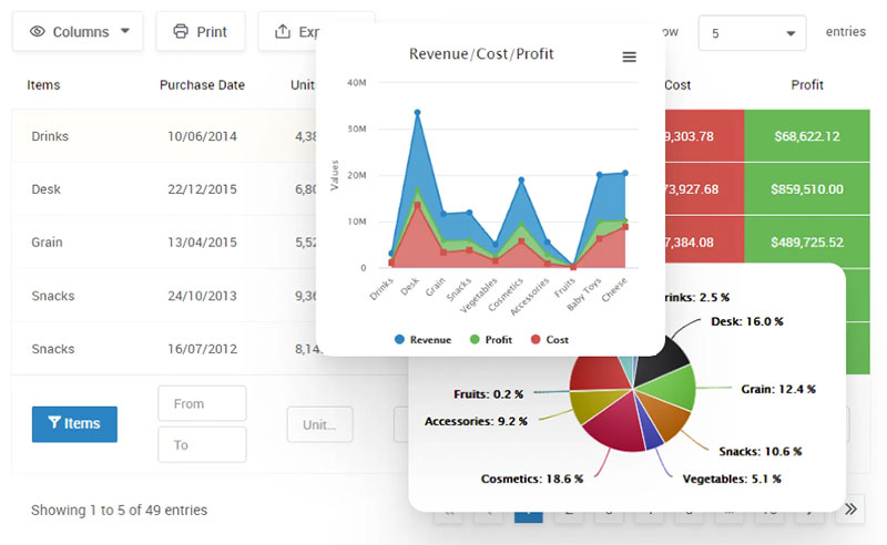
Your beautiful data deserves to be online
wpDataTables can make it that way. There’s a good reason why it’s the #1 WordPress plugin for creating responsive tables and charts.

And it’s really easy to do something like this:
- You provide the table data
- Configure and customize it
- Publish it in a post or page
And it’s not just pretty, but also practical. You can make large tables with up to millions of rows, or you can use advanced filters and search, or you can go wild and make it editable.
“Yeah, but I just like Excel too much and there’s nothing like that on websites”. Yeah, there is. You can use conditional formatting like in Excel or Google Sheets.
Did I tell you you can create charts too with your data? And that’s only a small part. There are lots of other features for you.
Basic Visual Design Skills
Use basic design principles when showcasing your data analysis.
If you’re looking to go from data scientist to data artist, then consider using our Simple Font Framework to create an appealing text. You can understand how color and contrast can elevate your charts and get rid of obscure visual elements like chart junk.
Overall, most visual designers should have:
- typography skills
- font selection skills
- a knack for adhering to branding principles
- RGB and CMYK know-how
- image/photo editing skills
- experience in sourcing stock footage (images and videos)
- expertise in working with a component library
Learning How to Manage Databases
Without a doubt, good data makes for good data visualizations. First, get an understanding of the particular data set that will inspire the graphical representations. Carry out an in-depth data analysis to discover which data points stand out for you. Try to uncover the patterns and phenomena that weave together a story.
Excellent data visualization skills include the ability to gain data and to run various databases. It could involve working with excel spreadsheets to designate columns, explore the database or combine tables. Other vital functions involve running statistical tests and learning how to import data into dashboards.
It’s also crucial to have a firm grasp of the different categories displayed within a database. Consider variables as an example—are they fixed data points (a particular city or state) or are they ranges (numbers between 1 and 50)? Such data can serve as a starting point in establishing important connections between variables, possibly involving an increase over time, a group of rankings, or a deviation from the standard.
A Thorough Understanding of Chart Types
We can use an assortment of graphs and charts when designing a data visualization. If you’re a beginner, why not familiarize yourself with some of the simpler chart types?
Visualizations, such as text and tables, involve investing more time in trying to understand data—verbal perception. However, it’s quicker to interpret graphics that use a variation of colors, shapes or sizes—visual perception. It’s important to take these facts into account when deciding whether to use a table, for example.
Stacked bar graphs, line graphs, and bubble charts are considered more complicated types of charts. By understanding your target audience and their experience with chart types, you’ll be better equipped to create effective visualizations that both inform and interest them.
Use Compelling and Relatable Storytelling
Data scientists looking to connect with their target audience should master how to tell a story using data.
Imagery has played a role throughout the history of human communication and is an effective tool in getting your idea across to others. And data visualization doesn’t have to be dull and stuffy. The ability to explain data science by using narrative elements is an effective data visualization technique.
If you want to explain complex concepts easily, then engage the audience with stories that feature intriguing parables. Improving your public speaking helps to develop your storytelling skills. Your target group will be better equipped to make data-driven decisions if a practical story can guide them through big data concepts.
A Combination of Artistic and Mathematical Skills
Math skills, such as probability and statistics, and numerical and cluster analysis, are valuable in the world of data analytics.
An aptitude for numbers can help you design a relevant visualization that transmits analysis outcomes in a visually appealing way. For this reason, it’s essential that you learn how to apply artistic design techniques involving color theory, geometric layout, and composition to convey your ideas. Additionally, understanding the slope formula and how to calculate it is important for analyzing trends in data and making predictions.
The complicated subject of data visualization is sometimes intimidating for a beginner. But, with some research and computer-based training tools, you can go from a basic to an advanced skill set—and create fascinating data visualizations for your clientele.
How to Improve Your Data Visualization Skills
Take advantage of various visualization tools.
There are plenty of data visualization tools out there, each with its pros and cons. Try to familiarize yourself with most of them to find the best tool to help visualize data.
Practice makes progress.
Like an activity, practice consistently and your data visualization skills will improve by leaps and bounds. Set aside time to create as many data visualization projects as you can to gain experience with several tools.
Collect feedback.
Present your visualizations to others and ask for constructive feedback. An impartial opinion will highlight where you’re going right and where there’s room for improvement.
Sign up for classes.
Have you ever wondered how the green, yellow and red in fever charts measure variables over time? Or how choropleth maps enhance data related to geographic stats? Countless online courses are available to help you learn the fundamental principles of data visualization techniques.
Read books, blogs, and forums.
You can find an abundance of books, blogs, and specialized forums on data visualization. Reviewing such material will help you better comprehend the elements involved in data visualization and how to use them effectively in your projects.
If you liked this article about data visualization skills, you should check out this article about dynamic data visualization.
There are also similar articles discussing text data visualization, table data visualization, infographics and data visualization, and survey data visualization.
And let’s not forget about articles on effective data visualization, visualizing Google Sheets data, misleading statistics, and what data visualization to use.


