Businesses and individuals now find themselves processing more information available than ever before. Most people need help to visualize large amounts of data in order to understand it.
No one wants to read through line after line of numbers. Having a way to visualize data makes it appealing, and easier to understand.
Table data visualization is a great way to help people grasp data. Since it is easier for people to perceive, they can readily identify patterns and trends. This helps them identify outliers and abnormalities.
Table of Contents
Data in a Table
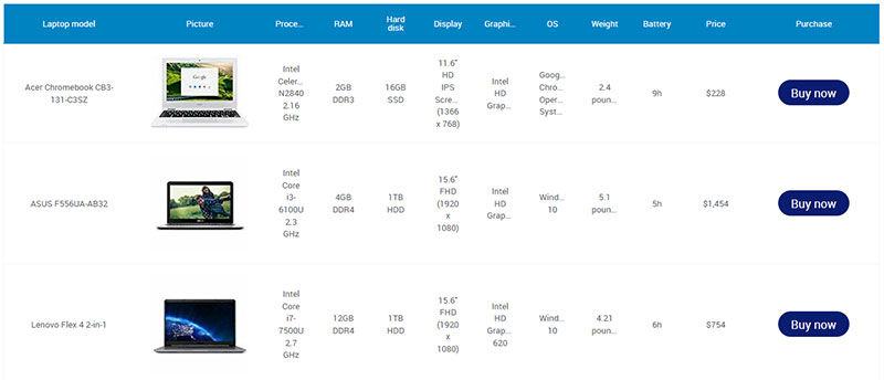
A table data visualization displays information in rows and columns. They record information as words or numbers. Sometimes tables include grid lines.
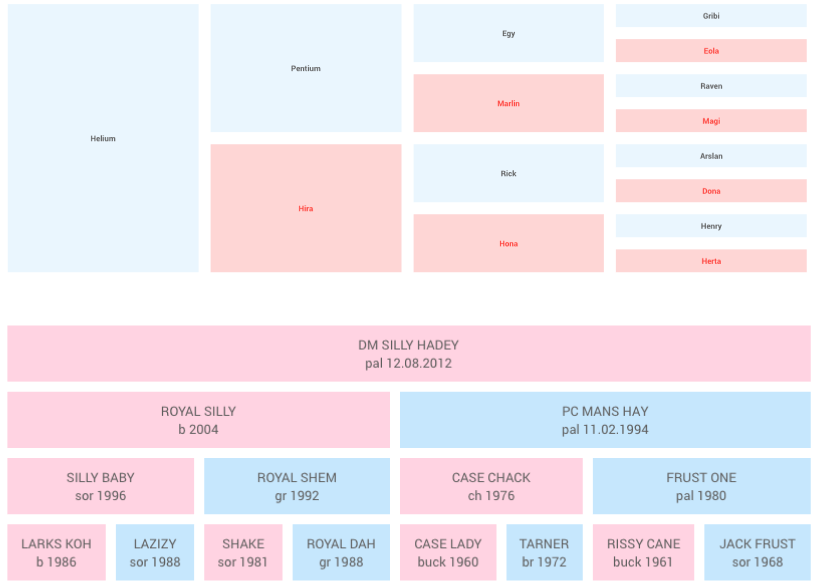
Tables don’t only present quantitative data. They can organize multiple sets of data that relate to each other. For example, people use tables to organize programs and agendas. They may list meeting dates, speakers, locations, and times on the table.
The place where a row and a column intersect is called a cell. Each cell contains a certain value.
Spreadsheet software, like Google Sheets or Microsoft Excel, make it easier for users to enter, store, and change data in a cell. Even when it’s unnecessary, each column has the option to input a unique header. Each row has a unique identifier, stored in the far left column of the table.
You can input two types of data in a table, text data or numeric data. Text data usually relates to a category of information, like race or gender. Numeric data usually conveys quantitative data such as ages or percentages.
When Tables Are Your Best Option For Presenting Data
Here are several reasons you might use a table to represent data instead of a graph:
- One of the greatest strengths of table data visualization is that it presents information that you cannot convey with a graph. For example, numbers with many decimal points (e.g.132.145852) are more accurately represented with a table.
- You can also condense more information in a table. This makes it easier to present large amounts of data.
- Another point in favor of a table is that you can keep multiple units of information together. An example of this is a doctor keeping a patient’s information all. He could include details like heart rate, blood pressure, drugs administered, and the time of anesthesia on the table.
- Tables make it easy to analyze and
- compare data. You can place information side by side in rows and columns. That makes it easier to compare data values.
- Tables are economical to create. It is relatively easy to create a table. It takes very little time and takes up very little space.
- If someone were to carry out a complex financial analysis on, say currency conversion, a table would be useful. A chart would require several visualizations. But a dynamic currency conversion table would be easier to understand.
- If you need to analyze data using dates as a parameter, charts may have trouble showing complex information. Here, too, tables are easier to understand.
One downside of tables is that they take longer to interpret than a graph does. Also, tables are not very useful if you want to study trends in data. It is sometimes difficult to identify and choose important information.
Here are times when it makes sense to use a table to display data:
- You plan to search individual values.
- When you want to compare individual values, instead of the entire table of values.
- You need to share precise values.
- When the information involves multiple units of measure.
- You plan to include summary and detail values.
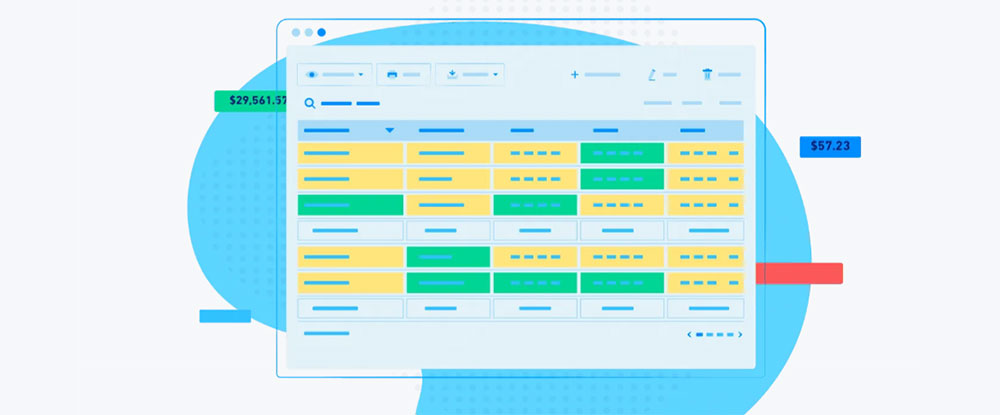
Your beautiful data deserves to be online
wpDataTables can make it that way. There’s a good reason why it’s the #1 WordPress plugin for creating responsive tables and charts.

And it’s really easy to do something like this:
- You provide the table data
- Configure and customize it
- Publish it in a post or page
And it’s not just pretty, but also practical. You can make large tables with up to millions of rows, or you can use advanced filters and search, or you can go wild and make it editable.
“Yeah, but I just like Excel too much and there’s nothing like that on websites”. Yeah, there is. You can use conditional formatting like in Excel or Google Sheets.
Did I tell you you can create charts too with your data? And that’s only a small part. There are lots of other features for you.
Guidelines for Presenting a Table
Data tables are a great way to represent multidimensional information and analytical data. But they are hard to comprehend at a quick glance.
When presented with a table, most people scan it to find the specific information they want. With this in mind, here are 8 points to keep in mind when creating a data table.
Clearly distinguish the headers from the body of the data table
Headers usually make up the first row on data tables. Headers provide context to the information covered in each column.
Make the headers stand out by using a different font or weight. You could also add a horizontal line divider to differentiate between the headers and the rest of the data.
Six by Six
In order for people to understand a table easily, try not to overwhelm them with information. You could follow the Six by Six rule, although there are some people saying that it’s not the best option.
It’s best if a table has no more than six rows and no more than six columns. This keeps the information in reasonable amounts that people can easily understand.
Sort data when appropriate
Sorting the data helps people identify patterns. It also helps people locate a specific data field with ease.
If you are sorting a table with text variables, try organizing the table alphabetically. If you are sorting numeric data, you might organize it based on values. You could even sort data into multiple columns depending on the data you are sharing.
Avoid using grid lines for data tables if possible
To make sure that the table is easy to follow and understand, sometimes you need a fresh perspective. Try removing the grid lines to see if the data is still clear.
Grid lines help when you are entering and editing data, but having all those lines can make the page look cluttered.
To combat visual clutter, increase the white space between the rows and columns. Try adjusting the text indentations to make the data easier to read.
Alignment
Changing the alignment of numeric data and headings can also make your table easier to read. Adjusting the alignment can make it easier for readers to scan the document and find the information they want.
Numeric data usually counts from the number furthest to the right, so try to right-align numeric data. This makes it easier to scan the data, especially if there are numbers with decimal points.
Written English reads left to right, so it is best to align text and headers to the left side of the cell. But some languages read right to left, like Arabic. When you are inputting text for those languages, then it would be best to right-align the text.
Add colors to your table
People cannot glance at a table and immediately comprehend all the information it conveys It takes time and effort for people to process data.
Adding colors to your table can help people identify the information they are looking for. Heat maps also help people with visualizing data.
Embed data visualizations in data tables when applicable
Some spreadsheet programs allow you to embed data visualization tools in a table.
For example, in Microsoft Excel, users can create sparklines and embed them into the table. A sparkline is a mini line graph or bar graph condensed into one cell.
Users can also use conditional formatting to highlight cells with information that they want to stand out.
Conclusion on Table Data Visualization
There is a lot to consider with presenting data. When people are inundated with information, they will walk away confused. Instead, you want people to walk away informed and motivated.
Data visualization is a great way to help people comprehend large amounts of data. Tables do just that. An effective table data visualization helps people turn raw data into something they can understand and act on. possible confusion between patient chart and data chart Illustration is confusing and possibly inaccurate.
If you liked this article about table data visualization, you should check out this article about dynamic data visualization.
There are also similar articles discussing text data visualization, infographics and data visualization, survey data visualization, and effective data visualization.
And let’s not forget about articles on visualizing Google Sheets data, misleading statistics, data visualization skills, and what data visualization to use.


