Ever had that “huh?” moment when stats seem to twist reality like a pretzel? Welcome to the wonky world of misleading statistics.
It’s like a magic show for numbers—things aren’t always as they seem. Spurious correlations masquerading as truth. A wonderland where cherry-picked numbers dance and distorted data sings.
Dive in! We’re unraveling the red herrings tossed into data pools. Think of this as your cheat sheet to not getting duped by slick, statistical shenanigans.
You’re about to level up in spotting biases, decoding manipulated figures, and seeing through that “lies, damn lies” façade.
Here’s the scoop: misinterpreted graphs and biased sampling will have nowhere to hide. Plus, stumble upon the whys behind
Simpson’s paradox and the mischief of p-hacking in research. Ready to turn those “Huh?” moments into “Aha!” ones? Let’s get to it. Your stats X-ray glasses await!
Table of Contents
What Are Misleading Statistics?
Misleading statistics are numerical figures presented in a way that inaccurately portrays data, often to deceive, influence opinions, or support a biased argument. They may involve manipulating data, cherry-picking information, or using flawed research methods.
Statistics are the result of gathering numerical data, analyzing it carefully, and then interpreting it. It’s especially useful to have statistics if you are dealing with a large amount of data, but anything that can be measured can become a statistic. Statistics often reveal a lot about the world and the way it works.
However, when that information is misused, even by accident, it becomes a misleading statistic. Misleading statistics give people false information that deceives them rather than informs them.
When people take a statistic out of context, it loses its value and can cause people to draw incorrect conclusions. The term “misleading statistics” describes any statistical method that represents data incorrectly. Whether it was intentional or not, it would still count as misleading statistics.
When collecting data for a statistic, there are three principle points to keep in mind. An issue with the data analysis could occur during any of these points.
- Collection: While gathering the data
- Processing: When analyzing the data and its implications
- Presentation: When sharing your findings with others
A Quick Example
People rely on statistics to gain important information. In the business world, statistics can be useful for tracking trends, and maximizing productivity. But sometimes statistics can be presented in a misleading way. For example, in 2007 the Advertising Standards Authority (ADA) in the UK received a complaint about a Colgate ad.
The ad famously claims that 80% of dentists recommend using Colgate toothpaste. The complaint the ADA received argued that this was a breach of the advertising rules in the UK. After looking into the matter, the ADA discovered that the ad was using misleading statistics.
It is true that many dentists recommend Colgate toothpaste. But not all of them cited Colgate as their number one recommendation. Most dentists recommended other kinds of toothpaste as well, and Colgate usually came up at some point later on.
This is just one example of how misleading statistics are used. People come across misleading statistics examples in many different areas of life. You can find examples in the news, in advertising, in politics, and even in science. Statistics often reveal a lot about the world and the way it works. For instance, accurate and relevant Coffee Statistics can provide valuable insights into coffee consumption trends and market behavior.
This post will help you learn to recognize misleading statistics and other misleading data. It will discuss how this data misleads people. You will also learn when and how to use data when making critical decisions.
Misleading Statistics Examples
A Small Sample Size
Sample size surveys are one example of creating misleading statistics. Surveys or studies conducted on a sample size audience often produce results that are so misleading that they are unusable.
To illustrate, a survey asks 20 people a yes-or-no question. 19 of the persons respond yes to the survey. So the results show that 95% of people would respond yes to that question. But this is not a good survey because the information is limited.
This statistic has no real value. Now if you ask 1,000 people that same question and 950 said yes, then that is a much more reliable statistic to show that 95% of people would say yes.
To conduct a reliable sample size study, you need to consider three things:
- One: What kind of question are you asking?
- Two: What is the significance of the statistic you are trying to find?
- And three: What statistical technique will you use?
To have reliable results, any sample size quantitative analysis should include at least 200 people.
Loaded Questions

It is important to look for data from a neutral source. Otherwise, the information is slanted. Loaded questions use a controversial or unjustified assumption to manipulate the response. One example of this is asking a question that begins, “What do you love about.” This question does a great job of collecting positive feedback but fails to teach you anything useful. It provides no opportunity for the person to give their honest thoughts and opinions.
Consider the difference in the following two questions:
- Do you support a tax reform that would imply higher taxes?
- Do you support a tax reform that would be beneficial for social redistribution?
The question essentially relates to the same subject, but the results from each of these questions would be quite different. Polls should be conducted in an impartial, unbiased manner. You want to get people’s honest opinions and the full picture of what people think. To achieve that, your questions should not imply the answer nor provoke an emotional response.
Citing Misleading “Averages”
Some people use the term “average” to obscure the truth or lie to make information look better.
This technique is especially useful if someone wants to make a number appear bigger or better than it is. For example, a university wanting to attract new students may provide an “average” annual salary for graduates from their school. But there may only be a handful of students who actually have high salaries. But their salaries make the mean income for all students higher. That looks better for the whole average.
Averages are also useful for hiding inequality. As another example, suppose one company pays $20,000 a year to its 90 employees. But their boss receives $200,000 a year. If you combine the boss’s wage and the employees’ wages, the mean income for each member of the company is $21,978.
On paper, that looks great. But that number fails to tell the whole story because one of the employees (the boss) is making much more than the other workers. So these kinds of results count as misleading statistics.
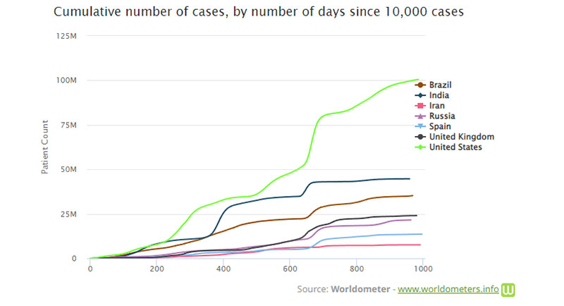
Cumulative vs. Annual Data
Cumulative data tracks information on a graph over time. Each time you input data into the charts, the graph rises.
Annual data presents all the data for a specific year.
Tracking information for each year provides a truer picture of the general trends.
One example of a cumulative graph is the Worldometer COVID-19 graph. During the COVID-19 pandemic, many examples of cumulative graphs have cropped up. They often reflect the cumulative number of COVID cases in a specific area.
Some companies use graphs like this to make sales appear greater than they are. In 2013, Apple’s CEO Tim Cook received criticism for using a presentation showing only the cumulative number of iPhone sales. Many at the time felt he had intentionally done this to hide the fact that iPhone sales were dwindling.
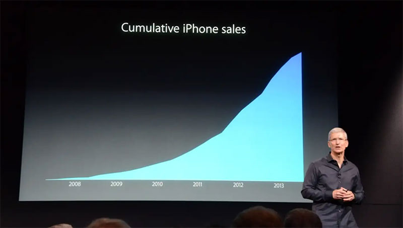
This is not to say that all cumulative data is bad or false. In fact, it can be useful for tracking changes or growth and various totals. But the important thing is to pay attention to changes in the data. Then look deeper into what caused them rather than relying on the chart to tell you everything.
Overgeneralization and Biased Samples
Overgeneralization occurs when someone supposes that what is true for one person must be true for everyone else. Usually, this fallacy occurs when someone conducts a study with a certain group of people. They then assume the results will be true of another, unrelated group of people.
Unrepresentative samples, or biased samples, are surveys that don’t accurately represent the general population.
One example of biased samples occurred during the 1936 presidential elections in the United States of America.
The Literary Digest, a popular magazine at the time, carried out a survey to predict who would win the elections. The results predicted that Alfred Landon would win by a landslide.
This magazine was known for accurately predicting the outcome of elections. This year, however, they were completely wrong. Franklin Roosevelt won with almost double the votes of his opponent.
Some more research revealed that two variables had come into play that skewed the results.
First, most of the participants in the survey were people found in the telephone book and on auto registration lists. So the survey was only conducted with those from a certain socio-economic status.
The second factor was that those who voted for Landon were more willing to respond to the survey than those who chose to vote for Roosevelt. So the results reflected that bias.
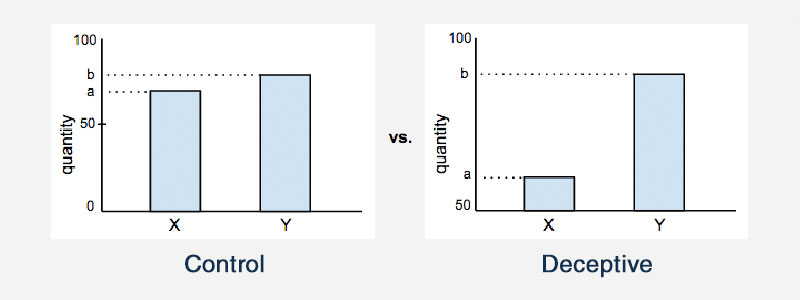
Truncating an Axis
Truncating the axis on a graph is another example of misleading statistics. On most statistical graphs, both the x- and y-axis presumably start from zero. But truncating the axis means that the graph actually starts the axes at some other value. This affects the way that a graph will look, and affect the conclusions that a person will draw.
Here is one example that illustrates this:
Another example of this happened recently in September 2021. On one Fox News broadcast, the anchor used a chart showing the number of Americans who claimed to be Christians. The chart showed that the number of Americans who identified as Christians had dropped drastically over the last 10 years.
In the following graph, we see that in 2009 77% of Americans identified as Christian.
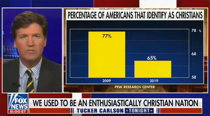
By 2019, the number decreased to 65%. In reality, that is not a huge decrease. But the axis on this chart begins at 58% and stops at 78%. So the 12% decrease from 2009 to 2019 appears far more drastic than it actually is.
Causation and Correlation
It can be easy to assume a connection between two seemingly connected data points. Yet, it is said that correlation does not imply causation. Why is that so?
This graph illustrates why correlation is not the same as causation.
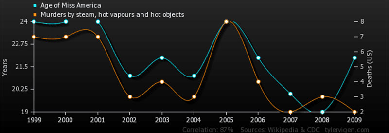
Researchers are often under a lot of pressure to discover new, useful data. So the temptation to jump the gun and draw conclusions prematurely is always there. That’s why it’s important in each situation to look for the actual cause and effect.
Using Percentages to Hide Numbers and Calculations
A percentage can hide exact numbers and make results appear more reputable and reliable than they are.
For example, if two out of three people prefer a certain cleaning product, you could say that 66.667% of people prefer that product. This makes the number look more official, especially with the numbers after the decimal point included.
Here are a few other ways that decimals and percentages can obscure the truth:
- Hiding raw numbers and small sample sizes. Percentages obscure the absolute value of raw numbers. This makes them useful for people who want to hide unflattering numbers or small sample size results.
- Using different bases. Because percentages don’t provide the original numbers they are based on, it can be easy to distort the results. If someone wanted to make one number look better, they could calculate that number off of a different base.
This happened once in a report the New York Times released about union workers. The workers had a 20% pay cut one year, and the next year the Times reported that the union workers received a 5% raise. So the claim was that they got one-fourth of their pay cut returned to them.
However, the workers received a 5% raise based on their current wage, not the wage they had before the pay cut. So even though it looked good on paper, the 20% wage cut and the 5% raise were calculated off of different base numbers. The two numbers didn’t really compare at all.
Cherry Picking/Discarding Unfavorable Data
The term “cherry picking” is based on the idea of picking only the best fruit off of a tree. Anyone who sees that fruit is bound to think all the fruit on the tree is equally healthy. Obviously, that is not necessarily the case.
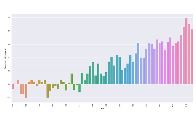
This same principle comes into play in the case of climate change. Many charts limit their data frame to only show climate changes from the years 2000 to 2013.
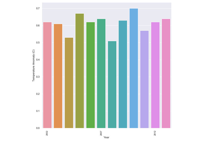
As a result, it appears that temperature changes and anomalies are consistent and don’t change much. When you take a step back and look at the big picture though, it becomes clear where the changes and anomalies are.
This also occurs in the field of veterinary medicine. When vets are asked to present the results from a new trial medicine, they tend to present the best results. Particularly if a pharmaceutical company is backing the trial, they want to see only the best results.
Your beautiful data deserves to be online
wpDataTables can make it that way. There’s a good reason why it’s the #1 WordPress plugin for creating responsive tables and charts.

And it’s really easy to do something like this:
- You provide the table data
- Configure and customize it
- Publish it in a post or page
And it’s not just pretty, but also practical. You can make large tables with up to millions of rows, or you can use advanced filters and search, or you can go wild and make it editable.
“Yeah, but I just like Excel too much and there’s nothing like that on websites”. Yeah, there is. You can use conditional formatting like in Excel or Google Sheets.
Did I tell you you can create charts too with your data? And that’s only a small part. There are lots of other features for you.
Data Fishing
Data fishing, also known as data dredging, is the analysis of large amounts of data with the goal of finding a correlation. However, as discussed earlier in this post, correlation does not imply causation. Insisting that it only results in misleading statistics.
You can see examples of data fishing in industry fields every day. One week a scandal is released about data mining, and a week later it is refuted by an even more outrageous report.
Another problem with this kind of data analysis is that people choose only the data that supports their view and ignore the rest. By omitting contradictory information, they make the results look more convincing.
Confusing Graph and Chart Labels
When the COVID-19 pandemic began, more people than ever turned to data visualizations of the virus’ spread. People who never had to work with a visual representation of statistics were suddenly thrown off the deep end of statistical data.
Besides, organizations often were trying to get people information quickly. Sometimes that meant sacrificing accurate statistics. This caused a spike in misleading statistics and misinterpretation of data.
About five months after COVID-19 began spreading, the U.S. Georgia Department of Public Health released this chart:
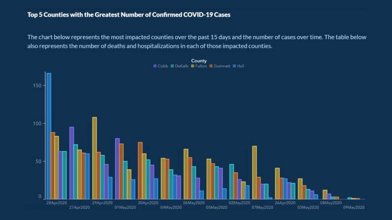
The purpose of the chart was to show the 5 countries with the highest COVID cases over the previous 15 days, and the number of cases over a period of time.
This chart has a few mistakes that make it easy to misunderstand. The x-axis, for example, doesn’t have a label explaining that it represents the progression of cases over time.
Worse still, the dates on the chart are not organized chronologically. The dates for April and May are scattered throughout the chart to make it appear that the number of cases was steadily declining. Each country is also listed in a way to make it appear that the cases were dropping.
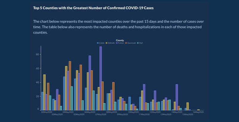
Later on, they republished the chart with better-organized dates and counties:
Inaccurate Numbers
Another example of misleading statistics comes in the form of inaccurate numbers. Notice this statement from an old Reebok campaign.
The ad makes the claim that the shoe works a person’s hamstrings and calves 11% harder and can tone a person’s butt up to 28% more than other sneakers. All the person has to do is walk in the sneakers.
Those numbers make it appear that Reebok had done extensive research into the benefits of the shoe.
The reality was, those numbers were completely made up. The brand received a penalty for using such misleading statistics. They also had to change the statement and remove the fake numbers.
FAQ about Misleading Statistics
How can statistics be misleading?
Statistics, right. They’re like a toolkit. Use them right, and you build understanding. But skew them? That’s where you trip into misleading territory. You see, selecting data that just supports your claim or using graphs that exaggerate differences – voilà, you’ve got yourself some distorted data. It’s not lying, but it’s not the full truth either.
What’s the deal with cherry-picked data?
Ah, cherry-picking, it’s choosing the sweetest fruit and ignoring the rest. Same with data. Some folks handpick that data which makes their case shine and casually overlook what doesn’t. It’s a sneaky trick and a classic example of how reporting can be anything but unbiased. Clever, but deceptive.
Are all misleading statistics created intentionally?
Here’s the twist. Not all skewed data is a grand act of deceit. Sometimes, it’s sloppy work or honest mistakes. It could be unintentional bias in sampling, accidentally misinterpreted graphs, or plain old misunderstandings. Intentions can range from innocent to nefarious; the outcomes, though, are similarly dicey.
Is it possible to completely avoid bias in statistical analysis?
In a perfect world, maybe. But we play the hand we’re dealt, and human hands are all about bias. The key? Strive for honest data representation. Understand and minimize biases as much as humanly possible. No analysis is flawless, but with enough care, we can get pretty darn close to ethical data reporting.
How can I spot misleading graphs and charts?
Double-take on that axis! Is it starting from zero? No? Red flag raised. Check out the scale too, is it consistent or jumpy? Misleading charts love drama; they’ll stretch, squash, and scale to stir up a visual hoopla. The secret? Look closer. Those visuals can be sly.
What are some common statistical fallacies I should know about?
Listen up – you’ve got your garden-variety false causality – just because two things happen together, doesn’t mean one caused the other. Then there’s the base rate fallacy, tripping over the actual prevalence of a feature. And don’t forget the gambler’s fallacy – feeling ‘due’ for a win just because you’ve been losing.
Why do companies use misleading statistics in advertising?
It’s showbiz, baby. Companies are hawking their wares and sometimes play stats like a piano to serenade you. The manipulation of figures to overstate benefits – it’s persuasion, but with a side of data distortion. The bottom line is they’re crafting a narrative, you’re the audience, and the product is the star.
Can misleading statistics affect public policy?
You bet. If policymakers get looped into believing skewed data, the fallout can be real-world policies rooted in false data interpretations. With high stakes like resource distribution and legal reforms on the line, getting the stats straight is more than smart – it’s crucial service.
What is Simpson’s paradox, and how can it lead to misleading conclusions?
Ready for a brain bender? Simpson’s paradox is when a trend appears in separate groups of data but flips on its head when you combine them. Talk about a head-scratcher. It’s a prime example of how spurious correlations can lead to misleading conclusions. Always look at the big picture.
How can I improve my statistical literacy to better understand data?
Roll up those sleeves; it’s time to get your hands data-dirty. Start with the basics: mean, median, modes, and ranges. Grapple with concepts like statistical significance and margins of error. Oh, and consume healthy stats regularly – articles, reports, and credible sources. Before you know it, you’ll be a data ninja.
Conclusion
So, we’ve reached the end of the rabbit hole on misleading statistics. Bet you’ve got that “mind-blown” vibe going on, right? To wrap it up, here’s the real talk: numbers don’t lie, but the way they’re presented? That’s another story.
Remember, always question the context. Check for that data cherry-picking and be wary of statistical manipulation. If you see a graph that’s more dramatic than a reality TV show finale, pause. Is it telling the whole story, or just the juicy bits?
Keep those eyes peeled for that data misrepresentation – it’s sneakier than a fox. Develop your data literacy; it’s your shield. And above all, share the wisdom. Help others see beyond the manipulated figures and spurious correlations. Now, go forth and conquer those stats with confidence and smarts. Here’s to being the savvy reader that doesn’t get played by the numbers game.
If you liked this article about misleading statistics, you should check out this article about dynamic data visualization.
There are also similar articles discussing text data visualization, table data visualization, infographics and data visualization, and survey data visualization.
And let’s not forget about articles on effective data visualization, visualizing Google Sheets data, data visualization skills, and what data visualization to use.


