
Prominent tools include Tableau, Power BI, D3.js, and Plotly. These tools offer robust features for real-time data visualization, including various charting tools, customization options, and integration capabilities with different data sources.Dynamic data visualization is a game-changer. It transforms raw data into interactive charts and real-time dashboards that provide data-driven insights instantly. This technology is essential for anyone dealing with big data analytics or looking for a graphical representation that adapts as information updates.
Dynamic data visualization tools like wpDataTables, Tableau, Power BI, and D3.js make it easier to handle streaming data, offering a visual and intuitive way to interpret complex datasets.
By reading this article, you’ll learn how dynamic data visualization helps to integrate data from multiple sources, including SQL databases and API feeds, and how this leads to more informed decision-making and data storytelling.
We’ll dive into key features such as interactive graphs, visual analytics, and live data feeds, and discuss popular visualization software and frameworks like React and Angular. Towards the end, you’ll understand why dynamic data visualization isn’t just a trend but a necessity in modern data science.
Table of Contents
What is Dynamic Data Visualization?
Dynamic data visualization is the process of creating interactive and real-time visual representations of data. Tools like Tableau and Power BI transform raw data into actionable insights via interactive charts, real-time dashboards, and live data feeds, enabling instant analysis and informed decision-making. These visuals rely on strong data connections to stay current, which is why many teams set up direct pipelines from SQL Server to Tableau to ensure their dashboards reflect live updates and accurate insights.
Dynamic Data Visualization
Static vs. Dynamic Visualization
Data visualizations display your choices regarding four variables: access, processing, representation, and interaction. When visualizing a map or chart, you aim to locate the correlation points between the graphic and its data.
When the chart is static, you yourself must identify these match points. In a dynamic map, they become moving objects.
Static data visualizations are easier to decode because they capture a single moment of information. Contrarily, dynamic charts display many data moments. Thus, they demand that users create filtering variables and processing alternatives.
Still, the most significant difference between these visualizations is their ability to adjust.
What are dynamic charts?
Dynamic charts are tools that display the latest data using interactive resources. They improve visualization and analysis.
These graphs are not dynamic because of motion effects, but because they are based on flexible templates. They constantly adapt to data changes and selected variables, so they do not respond to a fixed layout.
This way, users can visualize and identify patterns that match current trends. Unlike other static charts, dynamic visualizations are highly interactive. Hence, the attributes of the objects displayed are also adjustable.
Interactive vs. Linear Dynamic Visualizations
There are two types of dynamic data visualization: interactive and linear. You can choose between these types based on the data presented and your purpose for the map.
Interactive charts enable users to determine their preferred presentation configurations. They can introduce dynamic features during the visualization process or throughout the analysis.
For example, an interactive dynamic visualization might include animations. It can display customizing options and live-streaming data.
Linear visualizations adjust automatically and do not allow for further alterations. Non-interactive animations are an example of linear data visualizations.
Your beautiful data deserves to be online
wpDataTables can make it that way. There’s a good reason why it’s the #1 WordPress plugin for creating responsive tables and charts.

And it’s really easy to do something like this:
- You provide the table data
- Configure and customize it
- Publish it in a post or page
And it’s not just pretty, but also practical. You can make large tables with up to millions of rows, or you can use advanced filters and search, or you can go wild and make it editable.
“Yeah, but I just like Excel too much and there’s nothing like that on websites”. Yeah, there is. You can use conditional formatting like in Excel or Google Sheets.
Did I tell you you can create charts too with your data? And that’s only a small part. There are lots of other features for you.
The Advantages of Dynamic Visualizations
Access to Real-time Data
Static visualization becomes permanently outdated as information changes. A dynamic graphic processes current data as it changes.
It allows decision-makers to visualize and explore up-to-date information. Which will enable them to provide more efficient guidance.
Facilitated Identification of Trends
Visual data is much less demanding to interpret and analyze for the human brain. Thus, dynamic data visualizations allow business leaders to identify current patterns and trends.
They can understand data relationships and act accordingly.
Simplified Understanding of Complex Data
An interactive map permits a broad simplification of datasets, no matter how large or complex. Introducing tools to enable dynamic visualizing adds value and assists a correct analysis.
Make Fast and Precise Decisions
One of the most significant advantages of interactive visualization is faster decision-making.. The data presented in these graphs is always precise and up to date.
Businesses can use these graphs and make impactful decisions according to current needs and events.
Common Examples of Dynamic Data Visualizations
Demographic Dynamic Visualization Maps
Map by Location
Here you can access a video map to display the evolution of the population in major American cities from 1790 to 2010. The circles that point out the growth of each population center are easy to understand.
The linked example shows how presenting dynamic visualizations surpasses simple graphs.
Map by Region
This second example is a choropleth map that shows data related to crime rates in the United States between 1965 and 2010. It is a video presentation that allows you to identify the values of each state.
The Population Pyramid
The population pyramid is one of the most common demographic diagrams. It is a presentation of the distribution of a population according to gender and age. Thus, it is valuable for governments to monitor population numbers.
The next example contains a collection of bar graphs representing the American population pyramids from 1950 to 2012. This dynamic visualization allows for various types of readings, individually or as a set.
Geographic Dynamic Visualization
Wind Roses
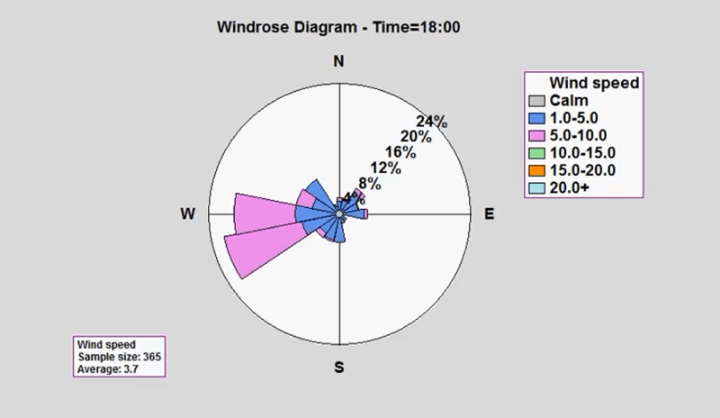
Wind roses are valuable graphic tools to display wind conditions, speed, and direction. They encompass a specific location throughout a given period.
Displayed as circular bar charts, wind roses use changes in position and color to show changes.. They include descriptive captions and help sailors, architects, or meteorologists in decision-making processes.
The example featured includes a detailed wind rose covering 24 hours. You can effortlessly identify the changes throughout the day. This dynamic visualization shows how simple graphs aid research and display vital data.
Economic Dynamic Visualizations
Big Mac Index
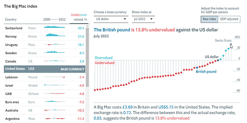
The Big Mac Index is a measurement that evaluates consumer purchase power and market exchange rates. It centers its comparison on the value of a McDonald’s Big Mac burger in different countries.
Using the US dollar as a base value, the dynamic visualizations allow you to see the value for each country on a given date. Then, that value is correlated to the Gross Domestic Product per individual.
The interactive map above shows data from each country and follows its evolution from 2000 to 2022. With this graph, users understand the relationship between major events and currency value in each country.
Check out more than 70 Chart.js examples
Other Data Visualization Examples
Deviation Dashboard
The Deviation Dashboard is one of the most valuable tools to display multiple variables in a single data visualization. These bar charts generate an overview of standard deviations that value below or above their sample means.
The deviation dashboard is a dynamic data visualization that also includes color variations. Variables that reach 1-sigma are in dark green, 1 to 2-sigma in light green, 2 to 3-sigma in yellow, and above 3-sigma in red.
This visual data approach is more suited to processing complex data. It helps analyze relationships between extreme events and the values generated.
The example, in this case, features an in-motion data visualization of deviation boards comprising 40 years. It depicts the fish counts of 13 distinct locations within the Gulf of Maine region.
Nebulous; idea not connected to a point.
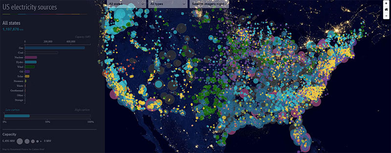
US electricity sources
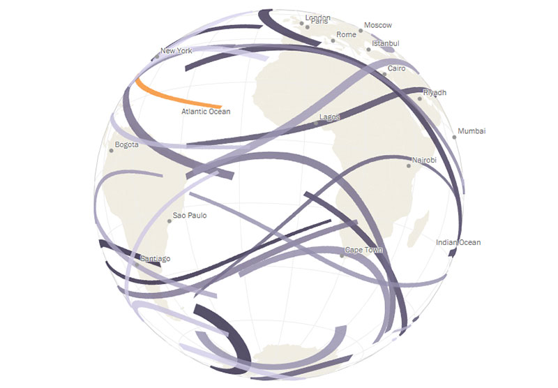
Mapping the World’s Immigration Flows, Country-by-Country
Total solar eclipses
FAQ on Dynamic Data Visualization
How does dynamic data visualization work?
It utilizes visualization software to connect to various data sources like SQL databases or API feeds. These tools then generate interactive graphs and animated charts in real-time. It ensures the visuals are updated instantly, reflecting the most recent information, thus enabling real-time analytics.
What are the benefits of dynamic data visualization?
Dynamic data visualization enables quicker data interpretation, improving decision making. Real-time updates offer timely insights. It also facilitates easier identification of data trends and patterns, enhancing overall data comprehension. The interactive nature promotes user engagement, making it a valuable asset for businesses.
Which tools are best for dynamic data visualization?
Prominent tools include Tableau, Power BI, D3.js, and Plotly. For the design layer, free vector graphic software can also help teams create scalable icons, legends, and dashboard illustrations that make interactive visuals easier to understand. These tools offer robust features for real-time data visualization, including various charting tools, customization options, and integration capabilities with different data sources. They are essential for effectively handling big data analytics.
Can dynamic data visualization handle big data?
Yes, it’s built for big data analytics. Tools like Tableau and Power BI are capable of processing vast amounts of streaming data. They offer visual analytics through interactive and automated data visuals, making it easier to manage and analyze large datasets without performance issues.
What industries benefit from dynamic data visualization?
Industries such as finance, healthcare, marketing, and retail significantly benefit. Data scientists and business analysts use it for precise data analysis and visual storytelling. This technology helps these sectors in predictive analysis, identifying trends, and making data-driven strategic decisions.
What are the components of dynamic data visualization?
Key components include interactive charts, real-time dashboards, visualization libraries, and data sources. Tools like Highcharts and Chart.js provide extensive chart options, while programming languages like Python and JavaScript offer the backend support to manage and visualize the data dynamically.
How do I get started with dynamic data visualization?
Begin by selecting a visualization tool that fits your needs, like Tableau or Power BI. Learn basics of a programming language such as Python or JavaScript for advanced customization. Integrate your data sources—SQL databases or API feeds—and start creating interactive graphs and real-time dashboards to visualize the data.
What are the challenges in dynamic data visualization?
Handling streaming data requires robust tools and infrastructure. Managing data quality and ensuring real-time updates without lag can be challenging. Security of data sources and proper visualization framework are also critical. Familiarity with visualization techniques is essential to avoid misinterpretation of data.
What are the future trends in dynamic data visualization?
Future trends include the integration of machine learning and predictive modeling for more advanced insights. Cloud-based visualization tools will become more prevalent. Enhanced user experience features and more intuitive visualization frameworks are expected to make dynamic data visualization even more powerful and user-friendly.
Conclusion
Dynamic data visualization transforms data analysis through interactive charts and real-time dashboards. It offers a practical solution for interpreting big data. Tools like wpDataTables, Tableau and Power BI enable businesses to gain data-driven insights, harnessing visual analytics for precise decision-making. It’s not just a trend; it’s a necessity.
Core benefits include:
- Immediate insights with live data feeds
- Enhanced data storytelling for better engagement
- Integration capabilities with SQL databases and API feeds
- Automated data visuals that adapt to updates
Incorporating dynamic data visualization technology improves data interpretation and identifies trends effectively. It’s crucial for data scientists, business analysts, and decision-makers across various industries.
Future advancements will likely involve machine learning and predictive modeling, making this technology even more indispensable. Mastering visualization tools and understanding their components is essential for leveraging their full potential.
Dynamic data visualization brings real-time analytics to your fingertips, revolutionizing how we see and use data today and in the future.
If you liked this article about dynamic data visualization, you should check out this article about text data visualization.
There are also similar articles discussing table data visualization, infographics and data visualization, survey data visualization, and effective data visualization.
And let’s not forget about articles on visualizing Google Sheets data, misleading statistics, data visualization skills, and what data visualization to use.


