
Google Sheets is a great tool for data visualization. Users love it because of its clean interface and integration options. Besides, it provides a way of collaboration between different parties.
This tool is easy to use in itself, but there are certain ways in which you can improve its usability.
Google Sheets has data visualization tools that help us create tables, charts, and maps. Then, you can embed these on your web pages and offer your visitors a unique experience. But the best part is that the data visualizations are easy to set up and upgrade automatically.
Here are some advantages of Google Sheets for data analysis:
- No programming skills needed
- Possibility to embed graphs on most websites
- The data set is easy to maintain by a non-technical chart editor
- Possibility to set up the chart to update automatically
With that said, all you have to do is start using these tools. If you need some help, here is some advice on how to visualize Google Sheets data.
Table of Contents
Create Charts
Creating charts helps you turn your data into actionable insights. They’re also a great way to represent information and draw patterns. Moreover, Google Sheets comes with several suggestions to choose the best chart type. Create a bar chart, a pie chart, a trend line, or a heat map seamlessly.
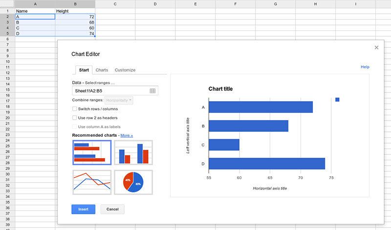
With the following procedure, you can create a chart easily:
- Go to the main bar and choose “Insert”, and then click on “Chart”.
- You’ll see a blank chart with a sidebar. There you’ll have various customization options.
- Click on “Data range” and choose the “chart type” that best suits your spreadsheet.
- Edit the parameters through the “Customize” tab in the chart editor.
Creating a Goal Chart
To create excellent data visualization elements with Google Sheets, follow this rule: charts must be self-explanatory and self-sufficient.
Keeping this in mind ensures that your column chart is easy to understand. It must also have all the necessary information for each metric. In this case, the data visualization must include the “goal”.
So, add a column for the goal and include it in the data range. Then, click on the checkbox “Plot null values” to connect the first and last data points. Once you do this, you’ll see how the column is connected by a solid line. Remember that you’ll find this feature on the “Chart style” option.
All in all, this data visualization tool gives important context to your metrics as people can see how far they are from the target. Thus, it becomes one of the best ways to visualize Google Sheets data.
At this point, our dashboard displays the target number. However, it hasn’t reached its goal. The chart ends with the last data point. Hence, we cannot answer the most important question for any business: are we on target??
The editor must populate the columns for all dates so that the chart shows the entire period. In other words, Google spreadsheets must have a goal column and the date column must be pre-populated.
As a result, you’ll have insightful charts showing the overall view of your business growth. By setting up your chart in two dimensions, you’ll know how far you are from the objective and how much time you have left.
Create Charts for Trend Visualization
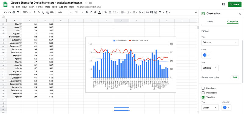
We can put together a very informative chart. This can be a pie chart, a column chart, or any other chart type. However, this doesn’t mean that you successfully displayed the trend. By creating trends we can estimate the installs we’ll have within the selected period.
Google Sheets provides cool data visualization tools, like mathematical extrapolation. Thus, you can predict future behavior. Enable this option by checking the “trendline” field.
Now we can predict that we will not reach the goal in time if we keep the same pace. You can also play around with different interpolations. Keep in mind that this trend-tracking method is primitive but can still be useful in many situations.
Another option is to add more sophisticated visualization tools like “ideal path to goal”. Simply add a new column that describes the ideal progress toward the objective.
Adding Heat Maps Through Conditional Formatting
Turn your Google spreadsheet into a powerful data source. For this, heat maps can be quite helpful as they let you highlight certain values, errors, or outliers.
For example, apply color schemes to indicate lower or higher values. Google Analytics users find this feature to be particularly useful as it helps them identify the most important data sources.
Creating Sparkline Charts to Visualize Google Sheets Data
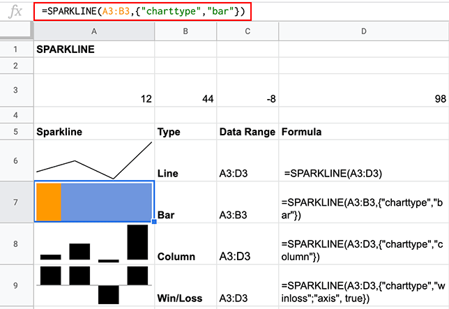
Sparklines are a great option for optimizing spaces. A bar chart, for example, can be too large for a Google spreadsheet and hide important data. By choosing Sparklines instead, you can add a chart to a cell.
Usually, editors choose this tool to visualize Google Sheets data more effectively. Moreover, you can show how numbers are progressing through seasons and economic cycles. Whether you choose a bar chart, a column chart, or other charts, this is a viable option.
Finally, you’ll love to know that adding a sparkline is easy. Simply type the following formula:
=SPARKLINE(data, [options])
Share Your Report with Collaborators
Once your chart is ready, you can convey your message to your colleagues. Help them make informed decisions through your Google sheet. But this will only work if you can share each report easily.
G Suite is a solid solution helping you share visualizations with just a click. Embedding your charts into other apps is also possible. You can easily encourage partners to accept a project by showing them a comprehensive analysis of a given situation. For this, the G Suite ecosystem is of great help, allowing you to embed your charts into Google slides or Google docs.
Turn your report into a powerful data source. For instance, colleagues can filter data visualization as needed. They can draw insights for a particular region within the global sales report. All in all, they can answer any question and resolve all doubts using Google Sheets.
Even so, the best part is that you can save this info on the cloud so that the chart is automatically updated. Since the raw data changes in Google Sheets, users can visualize fresh numbers. Doing this has never been easier: simply click on a button and refresh.
Choosing a Compelling Way to Visualize Google Sheets Data
No matter what data you display or how many visualization tools you use, the presentation must be made accordingly. Visualizations come in a variety of ways, from scatter plots to line graphs. Google Docs comes with 30 chart-type options. Here is a description of the most useful ones:
- Use a scorecard chart if you want to draw attention to KPIs or key metrics. Thus, you can display the total sales number of your company, the best-sold product, and the increase and decrease over a period.
- Choose a waterfall chart to add or subtract from a starting value. You’ll be able to illustrate how restocking and sales efforts brought good results from the previous quarter to the current one.
- A combo chart is ideal to represent different series of data. Illustrate revenue and profit margins with lines within the same chart. This is a good way to assess your company’s financial situation.
If you don’t know which option is best, Google’s machine learning features can help you. All you have to do is highlight the data and click on “chart”. The system will suggest different chart options.
Access the Google Sheets database which includes over 1.5 million charts every week.
Visualizing Google Spreadsheet Data on Your WordPress Website
Here is a step-by-step guide on how to create Google Sheets tables in WordPress. The process is supported by wpDataTables. Once your Google Sheet is ready, go to your WordPress dashboard and create a wpDataTable:
- Choose “Create table” and link it to an existing option.
- Choose a name for the new table.
- Select Google spreadsheet as the data source.
- Paste the link to the spreadsheet to the input file.
- Save changes.
Additional Settings for Your wpDataTable
This data visualization tool allows you to set up the elements for both the table and the columns. You can choose to make it responsive, allow advanced filters, and select the column type.
Here is an example of how to insert a table into a blog or page:
- Create a new post/page or edit an existing one.
- Choose where to insert the table and place the cursor there.
- Click and choose “Insert a wpDataTable” and choose the one that you created in step 1.
Another option is to simply copy and paste the corresponding shortcode. Either way, you’ll see your table or chart when you open your post. This is a simple but effective way to visualize Google Sheets data on your WordPress site.
Chart created with wpDataTables and Google Charts
To sum up, data visualization can be your best friend. Besides analyzing your real financial status, you can assess your team’s performance. Access powerful analytics to make informed decisions and share your insights with co-workers and partners.
If you liked this article about visualizing Google Sheets data, you should check out this article about dynamic data visualization.
There are also similar articles discussing text data visualization, table data visualization, infographics and data visualization, and survey data visualization.
And let’s not forget about articles on effective data visualization, misleading statistics, data visualization skills, and what data visualization to use.


