
We live in a data-driven world. Being able to visualize data and make it understandable is becoming more important every day. This is especially noticeable in the job market, where demands for data skills get stronger each year. Understanding data and data visualization are important at every organizational level.
Effective data visualization is the key to making data more understandable. As an example, one data visualization tool that has gained popularity is dashboards. Many companies now use them to quickly share and analyze information.
Table of Contents
What Is Data Visualization?
In simple words, data visualization is the conversion of numbers and statistics into a visual format. Its purpose is to present complex data in a form that is easier to understand. Many use it in an effective way by highlighting key messages or important parts for the consumers.
Charts, maps, and graphs are all elements of effective data visualization. They allow users to extract important information like patterns, trends, and outliers. This is relevant for people that make decisions based on the data. It is also useful for presenting complex information to non-experts without confusing them.
Data visualization is part of data presentation architecture (DPA). This discipline seeks to deliver, manipulate, locate, format, and identify data in the most efficient way.
Why Is Data Visualization Important?

It is obvious why data visualization is so important. It helps people see, interact more with data, and gain key insights from it. Effective data visualization can make simple and complex data more accessible. So, everyone can understand it whether they are experts or not.
Almost any career type involves data visualization. Teachers, for example, use it to graph student test results, and computer experts use it to track the performance of AI. Executives use it to convey their business performance to their stakeholders. Many big data projects rely on it.
As businesses gather enormous data sets, they need effective methods for visualizing data. Specific data visualization methods are the logical answer to that problem.
Your beautiful data deserves to be online
wpDataTables can make it that way. There’s a good reason why it’s the #1 WordPress plugin for creating responsive tables and charts.

And it’s really easy to do something like this:
- You provide the table data
- Configure and customize it
- Publish it in a post or page
And it’s not just pretty, but also practical. You can make large tables with up to millions of rows, or you can use advanced filters and search, or you can go wild and make it editable.
“Yeah, but I just like Excel too much and there’s nothing like that on websites”. Yeah, there is. You can use conditional formatting like in Excel or Google Sheets.
Did I tell you you can create charts too with your data? And that’s only a small part. There are lots of other features for you.
Questions Before Preparing an Engaging Presentation
If you work in the field of data visualization, you know that you need to find new ways to present data. They need to be fresh, exciting, and dynamic, but also correct and relevant. These qualities are important for both seasoned and new data analysts, because they determine whether the audience will enjoy and understand a presentation or not. Effective data visualization tools can tell an interesting story.
Before preparing a data visualization, it is important to think about what the aim is. That will help to determine what it should include. Some questions to ask yourself are:
- Who makes up my audience?
- What questions would they have?
- What answers can I give them?
- What is my message?
- What logical questions and conversations will result from my data visualization?
Tips for Creating Effective Data Visualizations
Many think that adding a couple of charts to a presentation results in an effective visualization. By doing that, you might actually achieve the opposite. It could be damaging to your image or that of your company.
Here, you will find some tips on how to prepare effective data visualizations. The following list also describes some common pitfalls. By applying the best practices in data presentation you will be better able to get your message across and deliver a stronger call to action.
Have a Clear Purpose and Audience
The objective of making a visual representation of data is communication. The representation should make viewing, understanding, and drawing conclusions faster and easier. Many visualizations fail to achieve that goal because they weren’t made with the audience in mind.
Having a clear purpose in mind prevents you from aimlessly making visualizations of your data. Keep your audience in mind and think of a specific question you want to address. Also, think of follow-up questions, questions that could result from the way you present your data.
Define a Question That the Visualization Should Answer
Rather than clarifying a point, a bad data visualization can obscure or distort an important message. That, in turn, makes decision-making more difficult.
One way in which this could happen is by including too many data points in one graph. Therefore, keep it simple and address one question at a time. Having those specific questions clearly outlined will prevent you from making a figure too complicated.
Use the Right Visualization Type
Chart created with wpDataTables
Not every format works well for every purpose. You want to tell a story, and some formats work better in certain situations than others. You can create posters by using poster templates if you want to promote events, products, or important information, as they allow for creative design and impactful messaging.
On occasion, you want to view the same matter from different angles.
Your ultimate goal is to help others make an informed decision. That requires you to use different formats. Thus, you need to think of the right chart for the right purpose.
This in itself sounds simple but can be rather difficult. The chart that you pick should highlight your message.
As an example, imagine you want to show a certain data distribution. You can show a distribution best in a histogram, violin, or Q-Q plot. Picking the right chart will help get your message across.
Balance the Design
Balancing the design refers to the way you distribute visual elements over a graph.
Where do you add color, texture, white space, and shapes?
You could use an asymmetrical, symmetrical, or radial format, but you need to balance all elements to make it appealing.
Use Patterns for Layouts
Humans, by nature, are creatures that depend on their eyes to take in information. Certain indicators draw our attention. We look for visual patterns. Randomness does not appeal to us, is hard to understand, and is ineffective for data visualization.
In practical terms, this means that you need to present your information in a logical way.
You could use an alphabetical, numeric, sequential order, or something else. Make sure your graphs are consistent and show how they relate to one another. If you fail to do that, you will lose your audience.
Don’t Use Too Many Labels
Labels are useful tools for making certain things clearer. Too many labels will obscure what you are trying to show. Ask yourself whether a label makes something clearer or actually makes it harder to read other information.
Try to imagine what your audience will see, looking at your images as if you saw them for the first time. What do you see first? Does it distract from the main point?
Use Colors to Highlight, Differentiate, or Compare
Monthly summary report table created with wpDataTables
You can use colors to group information. If you present sales data month by month, it is best to use one color.
If you present monthly sales data for several years, you can use colors to differentiate the years. You can also use colors to highlight some important information.
Colors that are very similar, like different tones of gray, are difficult to tell apart. But colors that are too contrasting, like red and green, also don’t result in a pleasant image.
Do Not Mislead
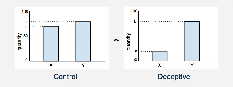
Your intention should never be to mislead an audience. Yet, it is what happens all too often. Presenters display data in a way to skew the message, and that is not fully honest. These presentations lead to wrong conclusions and wrong decisions. Here are some common tricks you should avoid:
- Not starting with 0 on the x- and y-axes
- Changing the visualization’s aspect ratio
- Hiding or obscuring important data
- Cluttered information that is confusing
- Grouping unrelated elements together
Keep It Simple
Chart created with wpDataTables
You can reach your audience in an impactful way by keeping visualizations simple. Simple graphs can do much more in terms of communication. As a rule, avoid using 3D charts. They often distract from the message and skew an interpretation.
Consistency is one way of keeping things simple. A consistent design helps viewers interpret information fast. Whatever chart you decide to use, make it easy for people to understand and extract the correct information from it. Don’t put too much information in one chart. That makes it harder to compare.
Consider Using Infographics
The definition of an infographic is a bit vague. While a figure focuses on models and data representations, infographics include images, text, and other informative elements.
It is best not to use only infographics in a presentation. But including some is a very effective data visualization approach. People score better on memorizing information from infographics. They are more effective than pie charts, bar charts, and similar images.
Conclusion on the Use of Effective Data Visualization
Data visualization is useful and desirable in this data-driven world. It helps people to remember the most important information, and it summarizes data and makes it more understandable.
The human brain works best with organized images. It has difficulties absorbing disorganized information. Effective data visualizations make data understandable and useful. Knowing how to present data in an effective way is an important communication skill, as it helps to give insight and facilitates the decision-making process.
I added this to help tie the mention of dashboards to the overall theme of the article since it seemed to be more of a side note.
If you liked this article about effective data visualization, you should check out this article about dynamic data visualization.
There are also similar articles discussing text data visualization, table data visualization, infographics and data visualization, and survey data visualization.
And let’s not forget about articles on visualizing Google Sheets data, misleading statistics, data visualization skills, and what data visualization to use.


