Understanding what text data visualization can achieve is key to turning complex text data into clear insights. In a world brimming with textual information from social media, surveys, and documents, visualizing this data isn’t just beneficial—it’s essential for effective data interpretation and text analytics.
We’ll dive deep into why this technique matters, exploring various data visualization tools and text analysis software that empower businesses to make informed decisions.
By the end of this article, you’ll grasp the significance of visualizing text data and how it augments data storytelling. We’ll cover critical techniques like word clouds, heatmaps, and network graphs, and discuss applications ranging from sentiment analysis to topic modeling.
With practical examples and tool recommendations, you’ll be equipped to leverage text data visualization in your own projects, gaining deeper insights and actionable data-driven strategies.
Table of Contents
What is Text Data Visualization?
Text data visualization transforms textual information into graphical representations, enhancing comprehension and insight extraction. Utilizing techniques like word clouds, sentiment analysis, and network graphs, it simplifies the data interpretation process.
This approach turns complex textual data into visually digestible formats, supporting effective data-driven decision-making and data storytelling.
Text Visualization 101
Text visualization is a visual way of presenting information—word clouds, graphs, maps, timelines, networks and more, can all be used to visualize text data. Doing so provides a brief understanding of the most important keywords, and sums up and communicates trends and frameworks within a specific text.
By means of such text visualization tools, we can make sense of the main points.
Text Visualization is Useful for:
Condensing a lot of content. Cut down on time spent reading by emphasizing central phrases across multiple texts, grouping content by topic, sentiment and more. Could you imagine having to get through hundreds of client reviews? With a word cloud or bar chart, you can visualize data and instantly make sense of things.
Simplifying text data. Our brains are wired to enjoy and make sense of visual data and it’s proven that we sort through images quicker than we do with the written word. If you’re looking to simplify complex data and transmit those concepts to team managers, then text visualization is the way to go.
Determining insights in qualitative data. Customer feedback is jam-packed with practical insights. You’ll get an effective outline of the products, features and subjects that matter most to your clientele and the opportunity to figure out not only their pain points but where you’re succeeding with them. To streamline the collection and analysis of this feedback, a contact center solution helps centralize customer interactions, making it easier to identify patterns, uncover insights, and respond more effectively to customer needs.
Discover hidden trends. Use text analysis and gradually visualize insights in order to spot easily any inconsistencies and figure out the leading causes.
Text Mining
The fast growth spurt of social media platforms and availability of the internet means that year after year, a massive quantity of unstructured text data is produced. And that’s what text analysis is all about—acquiring insights or assembling this raw data with a view to propelling research, projects, business and other such activities.
A fresh area of research has emerged in the use of machinery to investigate texts—text mining. This is in contrast to the process of data mining used in computer science.
Text mining aims to uncover statistical patterns as it uses machines to analyze data points in a body of content with a large volume of text. Through this procedure, various patterns within a big data system begin to emerge.
Text mining benefits from text visualization tools as it’s so easy to read for both machine and human alike. The most vital bits of information are communicated through easy-to-read visual representations such as a bar chart, word cloud, graph, map, timeline or network.
Why Text Visualizations are Necessary
Makes Text Data Easy to Grasp
Did you know that your brain sorts through visual data 60 000 times faster than words or numbers? Text visualizations make complex data clearer and powerfully transmit ideas to team managers.
Communicates What’s on Your Audience’s Mind
A chart can help you figure out how your audience feels about a certain subject or issue. This chart can also be leveraged to condense data-driven views. First-hand data can be used to summarize any market feedback.
Condenses Big Volumes of Text
Reduce the time you’d spend reading big volumes of text. Instantly emphasize the main terms in a string of texts, categorize content by subject, sentiment or other themes.
A quick scan of a text data visualization or dashboard will update you on all the vital info you want and need to know.
It Captivates
If you take a look at a word cloud, you’ll see that it is both eye-catching and informative. A well-designed chart can be used to start a conversation on an array of interesting topics.
It is Simple and Direct
Creating and reading text visualizations are actually pretty straightforward. Whether it’s a bar chart or a graph, you’ll gain some actionable insights into sizable data sets.
Let’s take a look at some effective examples of text data visualizations in the following part.
Text Data Visualization Examples
No doubt, data is best read and understood when it takes a visual form. Transforming dense tables into a refined and informative visualization requires artistry, especially as it not only gets the sense of the analysis itself but conveys the impact the core idea can make.
There are various text visualization designs, apart from the conventional frequency or distribution charts, which you should consider.
Word Cloud
A word cloud is a grouping of keywords or tags using a particular color and font size to create a representation of a shape or figure you can easily recognize.
It’s considered to be one of the more visually appealing, creative and effective text visualization tools. Word frequency can be highlighted by using an eye-catching font size and color to showcase those specific phrases. It’s no wonder that word cloud plays an important role not only in text analysis but in digital humanities studies as well.
With just one quick look, readers can pinpoint the essential themes and subjects. Blogs and other sites make use of word clouds to communicate ideas more easily with visitors. And this innovative resource is used in data journalism to supplement textual information in news articles.
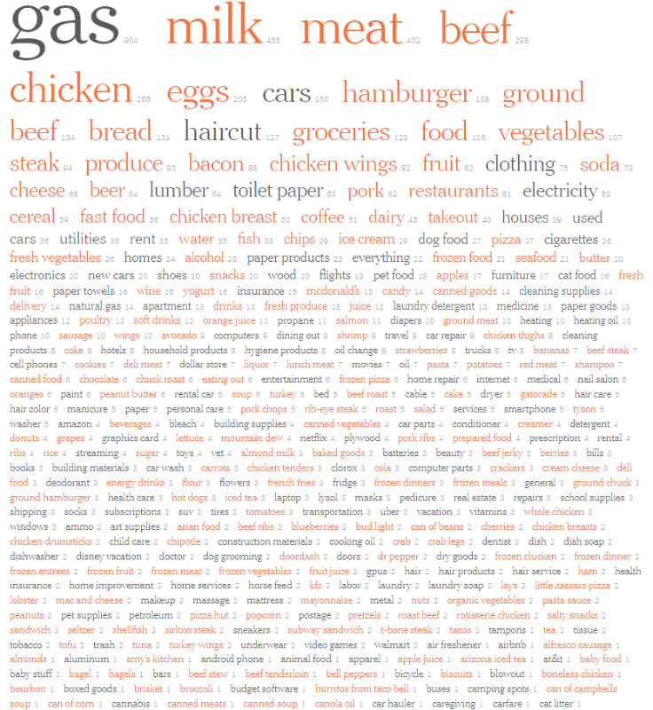
There is a great example in The New York Times article about American inflation. (Badger, E., Bhatia A., and Bui Q. “Bacon, Gas and Essentials: Where 2,200 Americans Have Noticed Inflation.” The New York Times, March 9, 2022) Word clouds were designed using the most recurring words or phrases from the research participant’s open-ended feedback.
The article shows that many participants noted the inflation in most products, but that it was gas and food that concerned them most. Orange is used in the word cloud to represent food categories and shines a light on the importance of the subject.
The shape and color of the word cloud play second to the font size which focuses on word frequency. Counting can be complex, so this text data visualization uses variation in size based on total word frequency rather than the novelty of the words.
Network

A network showcases the relationship between different units that compose an entire network. This text data visualization is often used in literature to generate a network from the various aspects of the literary work and to find a connection between those aspects and the structure of the work.
In this image, a tree structure network is used to understand text data from part one of Kerouac’s On the Road. The reader grasps the main concept by looking over the visualization. By tracing the tree-like structure, the reader starts to identify how one part relates to the next without having to read the content.
Word Art

With Word Art, you can create your own word clouds from a variety of image templates. This is a great resource if you’re looking to be original and creative when designing a word cloud. You can choose your font, size, style and layout and add words straight into the generator.
Collocate Clouds
Collocate clouds are another sort of tag clouds. They are a text data visualization for certain words that often occur alongside each other (collocations). These visualizations are mostly found in the general class of N-gram problems, with bigrams (two) and trigrams (three) becoming increasingly common.
N-grams have various applications in the area of genomics. They are also applied to algorithms related to grammar correction and text compression. Take a look at this bigram of the most recurrent word pairings identified in the README dataset.
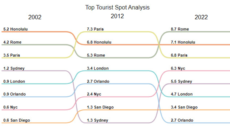
Slope Chart
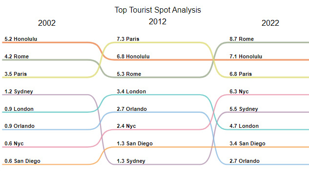
If you’re wanting to highlight transitions, absolute values, rankings and variations in the long term, then slope charts or graphs are the right text data visualization.
Have a look at this chart which explores key variables related to tourist hotspots over a period of time.
Slope charts/graphs are the perfect text visualization example when comparing time periods or other points of reference and want to underline rises and drops across diverse categories between two data points.
Creating concise and accurate slope charts demands perseverance as there are no pre-designed templates to work from.
The type of data you have will determine whether or not a slope chart will be an effective tool. As an example, your chart will not prove as effective if there are many overlapping lines. Instead, your text visualization will appear cluttered, and your idea will be lost.
Your beautiful data deserves to be online
wpDataTables can make it that way. There’s a good reason why it’s the #1 WordPress plugin for creating responsive tables and charts.

And it’s really easy to do something like this:
- You provide the table data
- Configure and customize it
- Publish it in a post or page
And it’s not just pretty, but also practical. You can make large tables with up to millions of rows, or you can use advanced filters and search, or you can go wild and make it editable.
“Yeah, but I just like Excel too much and there’s nothing like that on websites”. Yeah, there is. You can use conditional formatting like in Excel or Google Sheets.
Did I tell you you can create charts too with your data? And that’s only a small part. There are lots of other features for you.
Sankey Chart
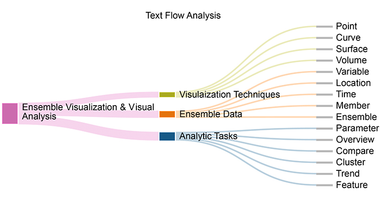
With a Sankey Chart, you can visualize how one group of values flows to the next group. These two interconnected points are called ‘nodes’ and the connections are ‘links’.
Sankey diagrams were first used to create a visual analysis of energy flows, but they emerged as an effective tool for understanding the flow of time, money, and resources. The flow design with the chart can showcase materials, fluids, revenue, energy, and costs.
Complex processes can be untangled using this visualization. It focuses on a particular element or resource that you need to stress and has the advantage of promoting various viewing levels.
FAQ on text data visualization
Why is text data visualization important?
Visualizing text data is crucial because it helps in summarizing voluminous textual data and extracting key insights quickly. It aids in data interpretation and makes complex data storytelling more accessible, thereby enhancing comprehension and supporting predictive analytics.
What tools are commonly used for text data visualization?
Popular text analysis software includes tools like WordClouds, Tableau, and Gephi. Each tool offers unique features such as generating word clouds, creating network graphs, and displaying data trends, providing versatile methods for visualizing text corpus.
How does text data visualization differ from other types of data visualization?
While traditional data visualization focuses on numerical data, text data visualization interprets and represents words, phrases, and themes found within text. Techniques like sentiment analysis and topic extraction are specifically tailored to handle and visualize textual data for better insights.
What are some common techniques for visualizing text data?
Techniques include word clouds for highlighting frequent terms, sentiment analysis for gauging positive or negative emotions, topic modeling for identifying key themes, and heatmaps for visualizing dense areas of interest. These methods make textual patterns readily apparent.
What are the applications of text data visualization?
Applications span across various fields like digital humanities, marketing, and social media analysis. It’s extensively used in content analysis, detecting data patterns, and even in the design of interactive graphs for enhanced user engagement and comprehension.
How does natural language processing (NLP) aid text data visualization?
Natural Language Processing (NLP) breaks down and processes human language data, enabling the extraction of keywords and themes. Its integration with data visualization tools allows for more advanced and insightful visual representation of textual data.
Is text data visualization suitable for big data?
Absolutely, text data visualization scales well with big data sets. Modern tools facilitate data discovery and explorative data analysis even with large volumes of textual data, ensuring comprehensive insights and better understanding of complex data trends.
How can businesses benefit from text data visualization?
Businesses can leverage text data visualization for data-driven decision-making. From market analytics to customer feedback interpretation, it supports qualitative data analysis and uncovers actionable insights, driving more effective strategic planning and execution.
Can text data visualization be used for real-time data analysis?
Yes, many modern data analytics platforms support real-time data aggregation and visualization. This capability is essential for applications that require immediate insights from rapidly changing textual data, such as social media monitoring or live customer feedback analysis.
Conclusion
Text data visualization is essential for translating complex textual data into actionable insights. From word clouds to sentiment analysis, these tools and techniques make data interpretation straightforward and efficient. Businesses leveraging these methods gain significant advantages in data-driven decision-making, enhancing their ability to analyze large volumes of text.
By understanding what is text data visualization, you can unlock the power of textual information. Utilize data visualization tools and text analysis software to draw meaning from text, improve data storytelling, and make informed decisions. Embrace methods like network graphs and heatmaps to visualize text corpus effectively.
Incorporating natural language processing (NLP) and predictive analytics expands the potential of these visualizations, making them indispensable in today’s data-heavy world. Whether for market analysis or customer feedback, text data visualization offers a comprehensive view, ensuring that your decisions are based on robust, well-represented data.
If you liked this article about text data visualization, you should check out this article about dynamic data visualization.
There are also similar articles discussing table data visualization, infographics and data visualization, survey data visualization, and effective data visualization.
And let’s not forget about articles on visualizing Google Sheets data, misleading statistics, data visualization skills, and what data visualization to use.


