Ever found yourself in an endless loop of tabs, juggling a dozen online reviews and retailer sites, all to figure out the best gadget that fits your needs and wallet? You’re not alone. It’s like a riddle wrapped in a mystery inside an enigma—except, maybe, not as dramatic.
Look, picking the right product is no picnic, especially with a bazillion options out there. That’s the whole deal with product comparison pages. They’re a game-changer. Lightbulbs go off when shoppers see products side by side, breaking down the perks and quirks—clearly.
Now, how about we flip the script? Instead of just using these comparison charts, how about building one? That’s right, you’ll learn to craft a page that puts products head-to-head so buyers can make snappy, savvy decisions.
By the end, you’ll know the A to Z of setting up a comparison matrix that’s as easy on the eyes as it is helpful.
Think detailed reviews, pricing strategy, and user testimonials, all in one spot. No tech wizardry, no jargon, just plain talk and practical steps. Ready to unravel the art of the comparison?
Table of Contents
Things to Know About a Product Comparison Page
When creating comparison pages, you should always think outside the box. It doesn’t work simply to present the difference between two products or services, but it also aids in potential client’s decision-making. By placing the product’s or service’s specification side-by-side, you give better ideas on choosing the right one, since these customers have their own preferences.
What is a Comparison Page?
A comparison page is a webpage or document that presents a side-by-side evaluation of different products, services, or ideas, highlighting their features, benefits, and drawbacks to help users make informed decisions.
It explains the two products’ features individually, citing their benefits and relevance to a specific customer. Comparing two products will also cite the better option, backed with evidence and functionalities presented on a page or table.
A Product Comparison is a simpler version of Competitor Analysis. It compares two products in a way that the readers can grasp instantly.
Having a Product Comparison enables you and your visitors to see if your featured items or custom products are better than your competitor companies or businesses.
How to Make an Efficient Product Comparison Page
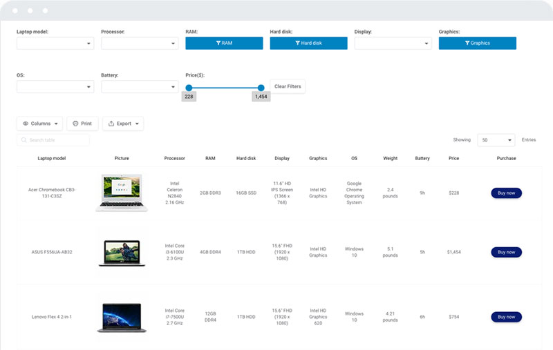
When creating a product comparison page, you need to do it according to your visitors’ preferences. Here are the things to put on a product comparison page to make it more enticing:
- Make a bulleted list to showcase the main characteristics of the product or service.
- The comparable products’ overview of the similarities and differences.
Taking note of these two essential vital factors of a successful product comparison page.
How to Compare Two Different Products
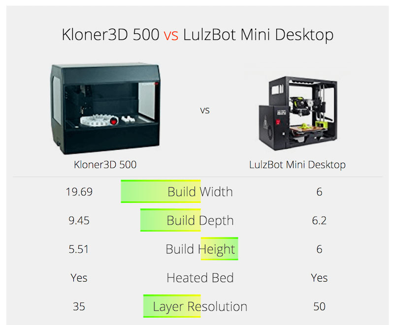
When differentiating two different brands or products, your descriptions should be clear. You have to study the products first, including their features and new updates, to give your web visitors precise details.
Know the deciding factor of your customer, and that’s when you will know the essential characteristics you need to input in a product comparison page. Although it sounds easy, knowing the customers deciding criteria is challenging.
How to Create a Great Product Comparison Page
Use Comparison Tables–The Different Types
Evaluating one product from another can use varied methods. Thus you need to use different strategies, including the different types of comparison tables that will work best for comparing the products.
Product Comparison Checklist
With this type of product comparison table, you can create a list of features in both of the products’ columns and use the check or cross sign to let the people know which of these two products has the features written in the table.
Quantitative Product Comparison Table
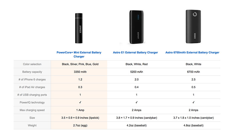
You might want to present a more in-depth comparative report about the product. There’s a hierarchy in the Quantitative Product Comparison Table, wherein you can designate the products to their relative importance. The Product Manager will give scores from 1-10 at the feature level. At the bottom of the table, the Product Manager will total the score from the products from each feature portion.
Qualitative Product Comparison Table
Here is the simpler version of Quantitative. For each feature, the Product Manager will decide the product’s score. The best outcome will receive “1”, while the other products will receive “0”. You need to cite all the features connected to the items you present. The one with the highest number of wins will be the winning product.
Use Only Five Items or Less in Your Comparison Table
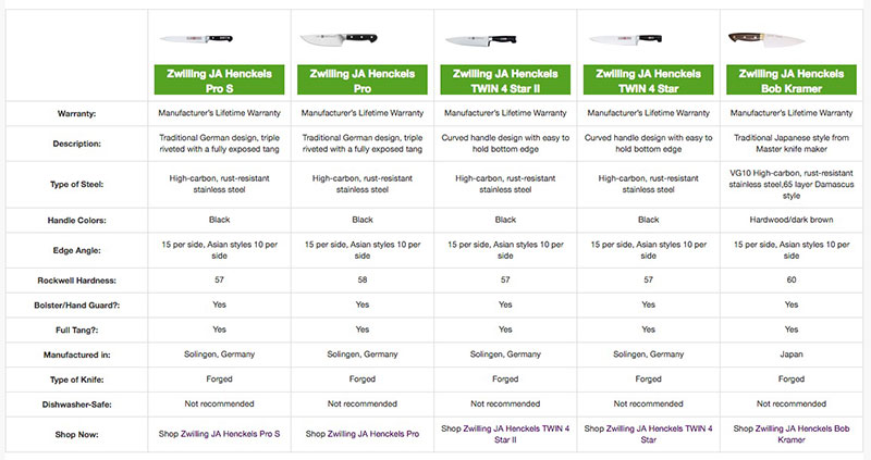
Having more than five items to compare in a comparison table can only lead to confusion. Limit the products or choices to make it easier for the visitors. If you found more than five similar items in different brands, you can narrow them down and evaluate them to make fewer options on a comparison page.
One of the ideal styles of comparison tables or pages is static. It promotes simplicity, and potential customers can see the new features right away. If you have more than five items, then reconsider using a static comparison table.
Using five options can also overwhelm web users. It is better to narrow it down to fewer numbers. Apart from more numbers confusing the customers, it also makes the layout less appealing. With more products on the table, you need to compress the details into a single table.
Consider how the number of items in a table can affect the layout and readability. Most comparison tables nowadays only accept less than five items. Another thing you need to take into consideration is the user’s device or browsers. If you want to make it mobile-friendly, you need to reduce the number to a single table.
Do a Research
Research is a crucial part of Product Comparison as to how it is also vital in Competitor Analysis. You can use online tools or materials to supply your research and make it successful. These marketing tools are marketing collateral and the web.
You cannot review or compare a product without trying it yourself. So, before you start comparing, ensure that you have enough research, supported by many testimonies. Buy the product, or if your website is already well-known, you can ask the company to sponsor you in return for advertising their product.
When you subscribe to a service, you might want to finish the subscription before creating a comparison chart. Trying the subscription or the product firsthand will help you review in being unbiased in comparing one item to another. You can also record them and see how it affects you in the long run.
If you don’t have the luxury of buying all the products you want to compare, you can ask your friends and other individuals who purchased them. Thus you gain the required knowledge of its functions and features.
Research using Google and look for authority websites that review the product. You can use the product’s name and type the ‘vs’ before the competitor’s name. There would be more suggestions, but be careful in looking for the articles because you’ll find paid or sponsored websites.
Take Note of the Formatting
The details or features aren’t the only important things in creating a great product comparison page. Visual appearance is a significant factor in attracting web visitors and customers. However, in the case of the product comparison table, the formatting should be clear and straightforward, rather than adding unnecessary details that would confuse the readers.
Make the texts easier to read and scannable. Don’t present too much of the product’s descriptions, details, and features. Using tables enables you to summarize the characteristics instead of adding more unnecessary words or phrases. One great way to do this is by embedding an informative interactive Flip Book to make the information easily accessible and aesthetically pleasing without being overwhelming.
Here are the pointers in formatting a product comparison page:
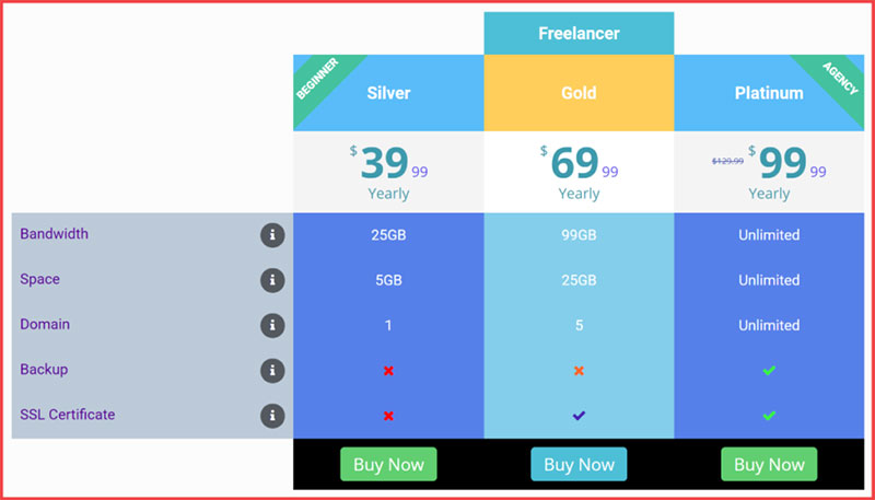
- Make your description clear and concise. Use bullet points to separate features, if necessary.
- Place the similar features on top, followed by the unique and exclusive details about the products.
- Compare products with distinct features, so the buyers will know that they benefit from choosing one item.
- Know the customers’ deciding factor. Research what they need, why purchasing the items can be beneficial to them. Take note that the deciding factors differ from one audience to another.
- Include other essential product details, such as the seals of excellence, ratings, and warranties.
- If you decide to compare two similar products with varying brands, stress how the other item overpowers the competitor brand.
Present Reviews and Real Life Customer Testimonies
Do not fabricate customer testimonies. Instead, look out for these reviews from other users and incorporate them on your product comparison page. When a visitor encounters your website, it is natural to feel skeptical at first. That is why it is crucial to build a foundation and enhance your reputation with potential clients.
You can build trust by having security seals, customer logos, awards, case studies, and customer testimonials.
Two Strategies in Incorporating Customer Testimonials:
Use more generic testimonials.
It’s challenging to find up-to-date testimonials. To make these reviews more sustainable, you need to look for generic reviews than looking for the reviews made two years ago. Crowdsource reviews and statistics from different people, then keep them up-to-date.
Use Targeted Testimonials
On individual comparison, you are comparing the product to its competitor. You can present a real-life situation where a customer transitions from using the competitor’s product to the item you are advertising.
For targeted testimonials, you can partner with influencers who can review your product. This review would reach a massive audience and can also be repurposed as a testimonial. The influencer’s authority adds even more credibility to the testimonial. However, while selecting the influencers, make sure that you use an influencer audit tool to figure out if the influencer has real or fake followers.
It is also important to make sure the influencers have a deep knowledge of your niche and are truly interested in what your business offers. If you are a crypto startup, look for NFT influencer marketing agencies that understand the intricacies of the crypto industry can significantly enhance the effectiveness of your influencer marketing campaigns.
Where to Get Reviews Online:
- External Word of Mouth (WOM): The testimonies located on third-party websites.
- Internal Word of Mouth (WOM): This is the business website’s reviews.
Consistency is The Key
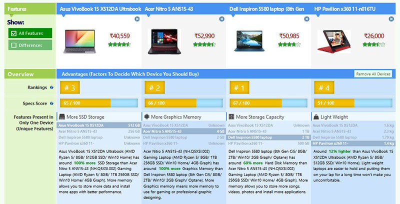
Be consistent in everything you put in the comparison table while ensuring the content is optimized for SEO. Although completing the attribute information should be the priority, designs will make it look visually attractive. For that purpose, you can even use the help of product retouching services.
If you are inconsistent or incomplete in giving details, everything will be useless. This is highly important, especially if you are comparing products with slightly different metadata.
One of the challenging parts of making this comparison table is differentiating one technical product from another. This type of item needs a lot of text, details, features, and specifications. In this case, you need to be consistent in everything you put in the comparison table.
Your table should also have a visually appealing background to entice more customers or clients. Take note of the product’s name and specification, and see how the comparison pages have no empty cells.
Despite the challenge of presenting the products efficiently, do your best in completing and being consistent with the comparisons. As a result, your website will build more credibility.
Let The Clients Focus on The Essential Details
Don’t put too much focus on the less important things. Ensure that the product comparison page supports scannability, allowing the viewers to scan the differences, keywords, and similarities of the products.
You can make this possible by sticking to the standard layouts and designs, which are the attributes as rows, options as columns, row labels on the left, and the column labels above. In each column, only use consistent text alignment.
Texts should be short and concise, giving the main points or features of each item. If possible, only use phrases or single words.
Another strategy to make the table scannable is by using color-coding. You can set a different color for each column’s backgrounds and another shade for the texts of the cells. Maintain the right amount of contrast, so you do not compromise the text readability.
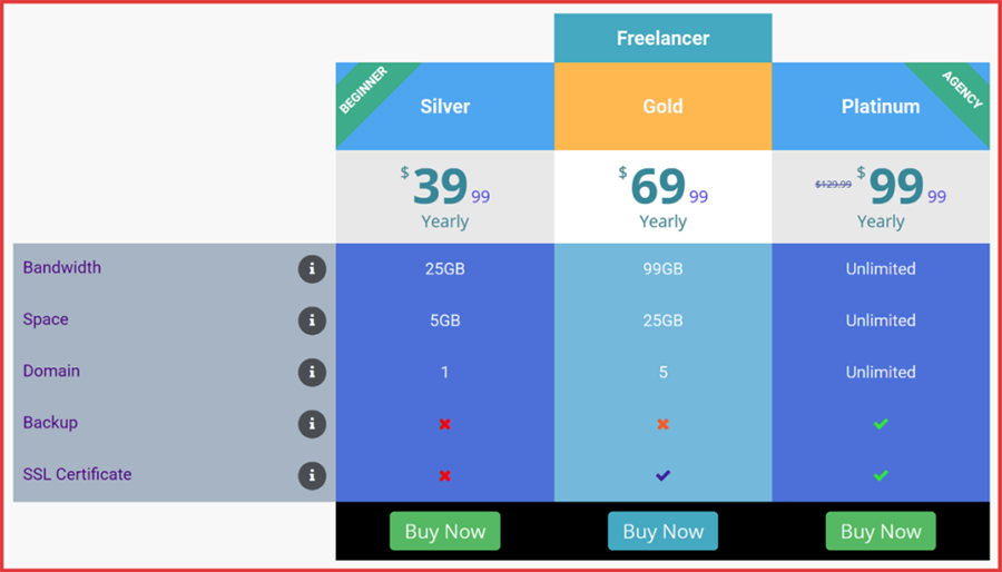
Place the Most Preferred Product or Pricing Option at The Center
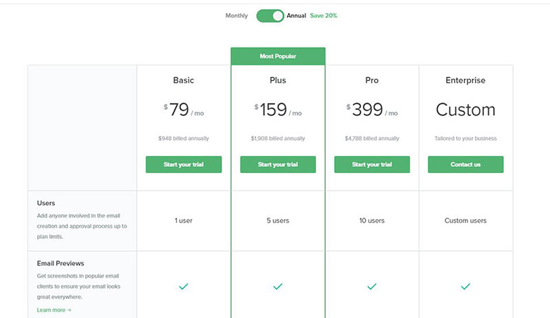
Putting the most preferred product at the center invites interest from the public. It is easier to view, and you can highlight its premium features.
According to the studies, people focus more on things in the middle. This is what they called the “Center Stage Effect”.
When you observe the subscription service, you can see three tiers of options. They are basic, mid-range, and premium. Sometimes, they add more subscription options, which is the business plan. Whichever you want to put in the center of attraction, don’t forget to use the “Center Stage Effect” strategy.
Make Your Product Comparison Page SEO-Friendly
With hundreds of competitors online, your website should stand out from others. When you create a page like this, you need to ensure that people can find it in the search engine results pages.
Keep updated with the new SEO rules and standards. For example, if your keyword is [Your Brand/Product] vs [Your Competitor], then you have to optimize and include them on the following:
- Page Title
- Heading 1
- Meta Description
- Within the first 100 words of the article’s introduction
- Image’s Alt Text
- Meta Description
Create a great first impression by writing an enticing meta description. You can begin by asking a question or starting a phrase that most people are curious about to invite them to see what your page could offer.
Internal Linking
Another SEO technique to optimize your website is internal linking.
Search on the website for pages related to your new comparison page. Examine your Google Analytics reports to see what Google indexes more than others. Understanding the role of internal and external links in SEO can also help build a stronger linking structure, improving crawlability and ensuring that link equity flows naturally across your site.
Link Building
Asking others to link your website in their article or web content can benefit your SEO score. If you have read a particular article discussing your product, service, or page, you can contact the owner and ask to link them to your product comparison page. Alternatively, if this doesn’t work and you want to get quality links, you can outsource this task to an SEO agency.
You can find a discussion regarding your website in Reddit, Quora, Forums, and Blogs. If possible, offer an affiliate program that will give sales percentage to the website owner when some click a link to your comparison page from their articles or content.
Make Your Product Comparison Page Intuitive
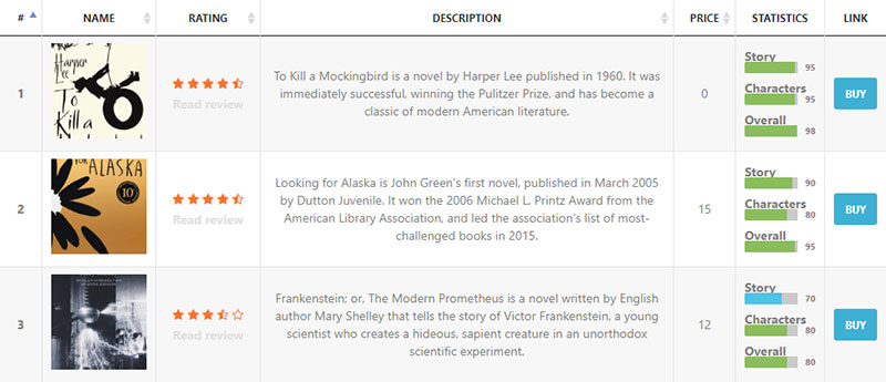
When you make your visitors involved with your website, they will want to scroll through the pages and see your offer’s products and services. If your website has too many attributes, the users will find it hard to compare several products.
As a result, they will go back and forth to find each product or item’s features and specifications. To make it more intuitive, enable them to choose the attributes they want to see in the table. This feature needs collapsible rows to make it possible. You can place another feature, wherein the users can choose to hide similar specifications.
Find out their deciding factor and highlight them on your product comparison page. Remember that you don’t have to put all the product’s features and specifications on the table. Only include those ones that visitors need.
Focus on Your Product Rather Than Your Competitor’s
Here are the things to keep in mind to avoid unknowingly promoting competitors:
Include the Trademark
The trademark will serve as the ownership of the competitor’s company. Don’t skip the R symbol.
Don’t Use Competitor’s Logo.
You can use their brand name rather than their logo. However, make sure that it is in the proper spelling with correct uppercase letters.
Provide Evidence
Link the competitor’s website on the product comparison page to eliminate visitors’ skepticism.
Specify the Comparison’s Date
When you specify the comparison’s date, you will give the readers ideas of when it took place. That will show how updated the information is on your page.
FAQ about product comparison pages
What Elements Are Essential for a Product Comparison Page?
Product comparison pages thrive on simplicity—clear comparison criteria, like price, specs, and user ratings. You need a comparison chart that’s easy to navigate, product photos, direct links to purchase, and QR Codes for quick access to additional product information. Remember, a compelling call-to-action (CTA) can turn a visitor into a buyer, pronto.
How Do I Choose Which Products to Compare?
Start with your target audience. What are they searching for? Pick products that are directly competing or serve similar purposes. Scope out the top-selling items, trending goods, and those with significant user traffic. A mix of popular and niche items can juice up the utility of your page.
Can I Automate Product Comparisons?
Absolutely. There’s software out there that can pull data feeds directly from product databases. These can update your comparison matrix in real-time. But keep an eye out—automation’s neat, but it’s gotta be accurate. Tweaks may be needed to ensure your user testimonials and feature breakdown hit home.
What’s the Best Layout for Comparing Products?
Go for a layout that screams clarity: think side-by-side comparisons or a grid format. Picture this: products on the left, comparison criteria up top—users can eye-scroll down the line and quickly spot differences. Throw in filters for a user-customizable experience and you’ve got winner.
How Can I Make My Comparison Page SEO-Friendly?
Sprinkle some magic SEO dust with detailed reviews, product showdowns, and ranks. Use those SEO entities and LSI keywords like gold dust across your content. A splash of semantically relevant keywords related to your products will help search engines and users find your comparison haven.
How Do I Highlight the Best Choice on a Product Comparison Page?
Light up the best pick with an expert opinion badge or a ‘top choice’ highlight. Visual cues—like a star rating or a contrasting color for the winning features—draw the eye. But remember, keep it unbiased! Users appreciate quality assessments over a hard sell.
What Should I Avoid When Building a Comparison Page?
Keep it tidy. Sidestep clutter. Dodge the technical jargon trap—speak in plain language. Avoid the temptation for a bias or under-the-table brand favors. And hey, too many ads? It’ll swamp your content. Balance is key.
How Do I Ensure the Information on My Comparison Page is Accurate?
Fact-check like a detective. Double-down with manufacturers’ data and verify through reputable sources. Customer feedback loops are solid gold for real-time accuracy. Regularly updating your comparison tool keeps things fresh and dependable.
How Can I Encourage Users to Engage More With the Comparison Page?
Unleash the power of interaction. Embed a tool allowing users to pick their preferences for personalized comparisons. Fuse in some discussion forums, Q&A sections, and user testimonial highlights. Let them have a voice, and they’ll stick around for the conversation.
How Do I Analyze the Success of My Product Comparison Page?
Track, measure, learn. Keep tabs on metrics like page views, bounce rates, and time spent on the page. Dig into conversion rates—how many users click through to purchase after hitting your comparison page. Hitch on A/B testing to finetune and adapt for peak performance.
Conclusion
Alright, let’s wrap this up. We’ve been down the road learning how to build a product comparison page – from nabbing the right features and layout to adding that secret sauce of SEO smarts. You got this. You’re now equipped to make that nifty page where choices pop and decision-making is a breeze.
Picture your page – sleek, easy, and helpful. It’s not just about slapping products next to each other, but crafting a space where value’s clear as day, and buyers nod, thinking, “Yup, that’s the one.”
Bottom line: Keep it up-to-date, make it trustworthy, and user-friendly. That’s the ticket. Keep tweaking, keep shining, and watch as that comparison page becomes the go-to spot for the savvy shopper’s showdown.
So go ahead, launch that comparison chart into the wild. It’s prepped, primed, and ready for the spotlight.
If you liked this article about product comparisons, you should check out this article about how to publish an Excel spreadsheet on the web.
There are also similar articles discussing examples of data tables, how to make a data table, pricing table examples, and statistical tables.
And let’s not forget about articles on weather tables, comparison tables, table UI design, and WordPress Excel spreadsheet plugin.
