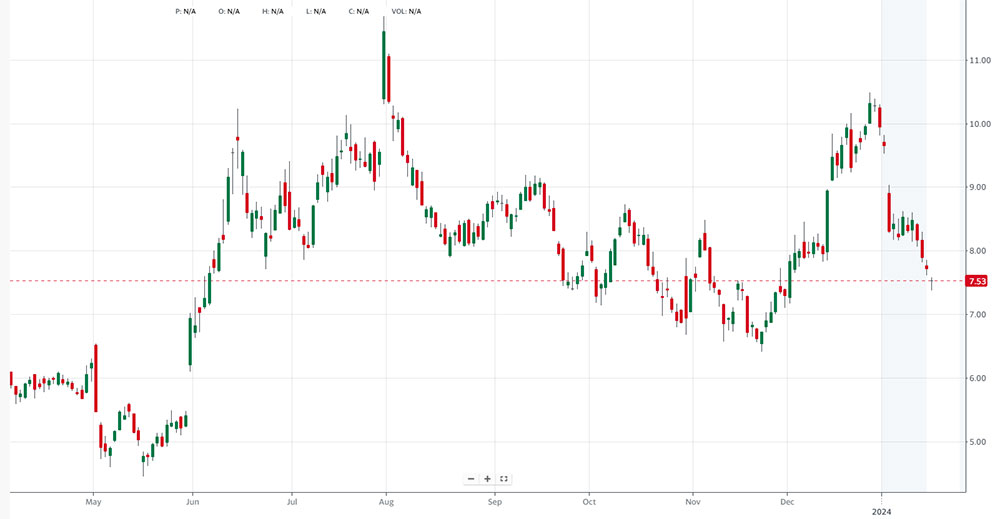
Every price chart tells a story. Candlestick charts tell it better than anything else.
Developed in 18th-century Japan by rice trader Munehisa Homma, this format has become the global standard for reading price action across stocks, forex, crypto, and futures markets.
Each candle packs four data points into one visual: open, high, low, and close. Body size, wick length, color, and pattern sequences all reveal shifts in market sentiment before most traders notice them.
This guide covers everything from basic chart anatomy to single and multi-candlestick patterns, statistical reliability, timeframe selection, indicator combinations, and the most common reading mistakes.
By the end, you will know how to read candlestick charts with enough context to actually use them.
Table of Contents
What is a Candlestick Chart
Chart created with wpDataTables
A candlestick chart is a type of financial chart that displays price movements using individual “candles,” each showing four data points for a specific time period: the open, high, low, and close (OHLC). Traders across stocks, forex, crypto, and futures markets use this format daily to read price action and assess market sentiment at a glance.
Each candle is made of two parts: the real body and the wicks (also called shadows). The body spans the distance between the open and close price. The upper shadow extends from the top of the body to the session high, while the lower shadow extends from the bottom to the session low.
Color tells you direction. A green (or white) candle means the close was higher than the open. A red (or black) candle means the close was lower. That single visual cue is part of why traders prefer this format over plain bar or line charts.
The Anatomy of a Single Candlestick
Real body: The thick rectangular section, representing the open-to-close range.
Upper shadow: The thin line above the body, showing the session’s highest traded price.
Lower shadow: The thin line below the body, showing the session’s lowest traded price.
No wick candles: Called a Marubozu. Price opened at one extreme and closed at the other, showing complete control by either buyers or sellers.
According to Wikipedia, a candle does not need to have both a body and a wick. Some candles have no body (doji) or no wick (Marubozu), depending on how the session played out.
How Color and Body Size Reflect Price Action
Body size is not cosmetic. A long body signals strong conviction. A short body signals indecision or low activity during the period.
From Morpher’s 2025 trading guide: a very long red body indicates aggressive selling driven by fear, while a long green body signals strong optimism and buying pressure. The longer the body, the more intense the trading during that period.
Wick positioning adds another layer. A long upper shadow on a bearish candle tells you buyers tried to push prices higher but got rejected. A long lower shadow on a bullish candle shows sellers pushed prices down but buyers recovered by the close.
How Candlestick Charts Differ from Other Chart Types
Three chart types dominate technical analysis: line charts, bar (OHLC) charts, and candlestick charts. Each shows different amounts of price information. Choosing the wrong one for your timeframe or strategy is a real problem, not a stylistic choice.
| Chart Type | Data Shown | Best Use Case | Weakness |
|---|---|---|---|
| Line | Close price only | Long-term trend, macro overview | Misses intraday volatility |
| Bar (OHLC) | Open, high, low, close | Trendlines, precise zone drawing | Harder to read visually |
| Candlestick | Open, high, low, close + sentiment | Pattern recognition, short-term trading | Can get cluttered on very short timeframes |
Candlestick vs. Line Chart
A line chart vs candlestick comparison comes down to information density. Line charts plot only closing prices. That is useful for spotting a long-term trend, but it hides what happened between open and close.
Candlestick charts show all four price points per candle. For anyone doing short-term trading or pattern recognition, line charts simply do not have enough data. FXSSI notes that line charts are rarely used by active traders working on anything from weekly charts downward.
Candlestick vs. Bar Chart
Bar charts and candlestick charts carry nearly identical data. Both show OHLC. The difference is visual clarity.
Bar charts use a vertical line with small horizontal ticks to show open and close. Candlestick charts use a color-coded body. Most traders find candlesticks easier to scan quickly. That said, some experienced traders still prefer bar charts for drawing trendlines, arguing that the thinner bar structure offers slightly more precision when marking support and resistance zones. Your mileage may vary.
When Line Charts Still Make Sense
There are cases where the simpler format wins. Line charts work well for comparing two assets on the same chart, showing macro economic data (inflation, employment trends), or presenting price data to a non-trading audience.
Candlestick charts are not always the right tool. If you are doing a multi-year portfolio review or presenting data to stakeholders, a clean line chart communicates direction without overwhelming the viewer with candle detail.
How to Read Candlestick Charts
Reading a candlestick chart is not just about recognizing named patterns. It starts with understanding what each individual candle actually says about the balance between buyers and sellers during that session.
A 2021 study on Chinese equities found that using two-day candlestick patterns with machine learning delivered an average annual return of 36.7% and a Sharpe ratio of 0.81, even after transaction costs. That is an impressive number, but the key phrase is “with machine learning” combined with pattern analysis, not patterns alone.
What Body Size Tells You
Long body, small wicks: Strong trend direction. Buyers (green) or sellers (red) dominated from open to close with little pushback.
Short body, long wicks: Indecision. Both sides fought hard but neither won decisively.
Short body near the top of the range: Buyers tried to push lower during the session but bulls recovered. Sign of potential buying pressure returning.
Short body near the bottom of the range: Sellers tried to hold but buyers pushed back. Watch for follow-through.
What Wicks Reveal About Market Rejection
Wicks are where price traveled but could not stay. A long upper wick means buyers pushed prices up but sellers rejected those levels hard before the close. A long lower wick means sellers pushed prices down but buyers refused to let them stay there.
Price rejection is one of the most reliable signals in candlestick reading, especially at known support and resistance zones. A candle with a tiny body and massive wicks on both sides (called a spinning top) shows complete indecision. Neither bulls nor bears could close the session in their favor.
Timeframe matters a lot here. A long upper wick on a 5-minute candle is background noise. The same wick on a weekly candle at a major resistance level is worth paying serious attention to.
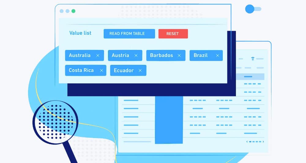
How To Make A Candlestick Chart In WordPress
Candlestick charts are available through two rendering engines in wpDataTables: Google Charts and Highcharts Stock. The setup process is the same across both, but the data requirements and available options differ slightly, so it’s worth knowing which one you’re working with before building your table.
Which Engine Should You Use?
Google Charts candlestick works well for general data visualization, not just financial data. Each candlestick shows four key values: open, high, low, and close. The filled part (the body) represents the difference between open and close, and the lines above and below (the shadows) show the high/low range. Filled or “blue” candlesticks indicate a gain (opening value less than closing value), while hollow ones show a loss.
Highcharts Stock is the better choice for financial charts with time-series data. It requires a date or datetime column for the horizontal axis, while Google Charts accepts a string or date column. Highcharts Stock also isn’t available on the Basic license.
Both require at least 5 columns total.
Prepare Your Data Table First
A candlestick chart needs a minimum of 5 columns: one string or date column (used for the axis) and four numerical columns representing the open, high, low, and close values.
Make sure your wpDataTable is already set up with this structure before opening the chart wizard. The columns need to be in the right order since wpDataTables maps them sequentially.
Open the Chart Creation Wizard
Go to wpDataTables > Create a Chart in your WordPress admin panel.
Give the chart a name, then select your rendering engine. Choose either Google Charts or Highcharts Stock depending on your use case. Once selected, wpDataTables displays the available chart types for that engine. Pick Candlestick Chart from the list, then click Next.
Select the Data Source
On the Data source step, select the wpDataTable that will power the chart using the dropdown. Click Next.
Set the Data Range
This step is where you map your columns to the chart.
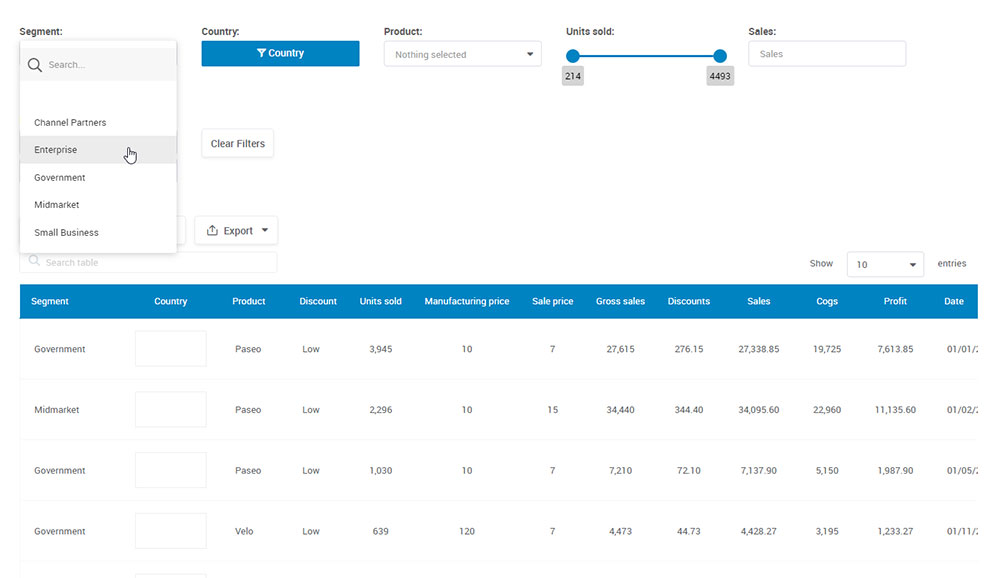
Use the Column range picker to select all five required columns: the date/label column plus the four numerical value columns (open, high, low, close). You can also set the row range here. By default it uses all rows, but you can restrict it if needed.
If you select “All rows,” the Follow table filtering checkbox becomes available. Turning it on means the chart updates dynamically when someone filters the linked table on the front end. Useful for financial dashboards where users need to filter by date range.
Click Next when the range is configured.
Format and Preview
Here you can adjust background color, border width, border color, and border radius. For Highcharts Stock specifically, you also get zoom type and panning options, which are helpful for longer time-series data sets where users need to scroll through historical prices.
The live preview updates as you change settings. If the chart doesn’t look right, go back and check the column selection, since the most common issue is columns being mapped in the wrong order.
Save and Insert the Chart
Once you’re happy with the preview, click Save. wpDataTables generates a shortcode like:
Paste it into any post, page, or widget area. The Gutenberg block, Elementor widget, and Divi module all support wpDataTables charts if you’re working inside a page builder.
A Note on Highcharts Stock Licensing
From wpDataTables version 3.0.4 onward, the Highcharts library including Highcharts Stock is free for commercial use within the plugin. You don’t need to purchase a separate Highcharts license. That said, Highcharts Stock charts are not available on the Basic wpDataTables license tier.
Single Candlestick Patterns
Single-candle formations are the foundation of candlestick pattern recognition. They do not require a sequence of bars to form, but almost all of them need confirmation from the following candle before acting on them.
An IJSRED study on NIFTY-50 stocks covering 2019-2024 found that hammer signals produced roughly 65.2% winners three days after the signal (88 wins out of 135 total signals). That is a useful benchmark but also a reminder that no single-candle pattern is a guaranteed trade setup.
Doji Variations
A doji forms when open and close prices are nearly identical, leaving little or no real body. It signals indecision.
There are three main types worth knowing:
- Standard doji: Small body with wicks on both sides. Neither buyers nor sellers won the session.
- Dragonfly doji: Long lower wick, no upper wick. Sellers pushed hard but buyers fully recovered. Bullish signal, especially at support.
- Gravestone doji: Long upper wick, no lower wick. Buyers pushed prices up but sellers drove them back down. Bearish signal at resistance.
CFA Institute candlestick research shows dragonfly doji patterns carry a success rate of roughly 55-60% when confirmed by strong follow-through candles.
Hammer and Shooting Star
These two patterns share the same shape but appear in opposite contexts.
The hammer forms at the bottom of a downtrend. It has a small body near the top of the range and a long lower wick (at least twice the body length). Sellers pushed the price down aggressively during the session but buyers fought back and closed near the high. IG Group describes this as a sign that bulls may be taking control.
The shooting star is the mirror image and appears at the top of an uptrend. Long upper wick, small body near the session low. Buyers pushed prices up but got rejected hard. Confirmation requires a bearish candle closing below the shooting star’s body on the following session.
Marubozu
No wicks. Price opened at one extreme and closed at the other.
A bullish Marubozu (full green body, no shadows) shows complete buyer domination throughout the entire session. No selling pressure was strong enough to push back at any point. A bearish Marubozu is the opposite. These are the most decisive single-candle signals in terms of market momentum, but they also tend to precede some pullback since the price has moved far without pausing.
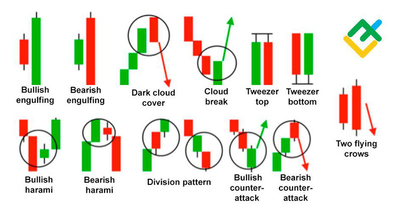
Multi-Candlestick Patterns
Two- and three-candle patterns provide stronger signals than single candles because they show a sequence of behavior, not just a single session snapshot. Confirmation is built into the structure itself.
Pattern reliability still varies considerably. Thomas Bulkowski’s Encyclopedia of Candlestick Charts documented performance statistics across over 100 patterns and found wide variation in success rates depending on market conditions, trend direction, and whether the pattern appears at a relevant price level.
Reversal Patterns
Bullish engulfing: A small bearish candle followed by a larger bullish candle whose body fully engulfs the prior one. Shows buyers taking over from sellers. Works best after a sustained downtrend.
Bearish engulfing: The reverse. A small green candle swallowed by a large red one. Strong bearish signal at the end of an uptrend or at resistance.
Morning star: Three-candle pattern. Red candle, then a small-bodied candle (the star, often a doji), then a strong bullish candle. The middle candle shows indecision after selling pressure, followed by buyers taking control. One of the more reliable reversal setups.
Evening star: The bearish equivalent. Green candle, small-bodied candle, strong red candle. Signals the end of an uptrend.
Continuation Patterns
Not all candlestick patterns signal reversals. Some confirm that an existing trend is pausing briefly before continuing.
- Three white soldiers: Three consecutive long bullish candles, each closing progressively higher. Strong uptrend momentum signal.
- Three black crows: Three consecutive long bearish candles, each closing lower. IG Group describes this as a clear signal of sellers overtaking buyers across three successive sessions.
- Tweezer tops and bottoms: Two candles with matching highs (tops) or lows (bottoms). Shows price rejection at a specific level across multiple sessions.
One thing that gets missed: even well-formed patterns need context. A bearish engulfing pattern that appears mid-range on a weekly chart with no nearby resistance and low volume is not the same setup as one forming right at a known supply zone with high volume behind it. The pattern alone is only half the story.
Candlestick Patterns and Statistical Reliability
This is where most traders get tripped up. Patterns look clean in textbooks. Real markets are messier. The actual statistical performance of candlestick patterns ranges from genuinely useful to barely above coin-flip odds, depending on the pattern, market, and conditions.
A study examining the Stock Exchange of Thailand found that some patterns performed in the opposite direction from what textbooks suggest. The CBM pattern, classified as bearish in standard references, actually showed significant positive returns in that data set. Treating patterns as universal rules is a mistake.
What the Research Actually Shows
Caginalp and Laurent (1998) tested candlestick patterns on all S&P 500 stocks from 1992-1996 and found statistical significance with nearly 1% returns over a 2-day horizon.
Marshall et al. (2006, 2007) later tested patterns on Dow Jones Industrial Average stocks across 1992-2002 and found no forecasting power. Same patterns, different market, different results.
A more recent 2021 study on Chinese equities (2000-2020) using two-day candlestick patterns combined with machine learning found an average annual return of 36.7% (Sharpe ratio 0.81 after transaction costs). That result comes from combining pattern recognition with algorithmic selection, not manual chart reading alone.
Backtesting Candlestick Patterns in Practice
Tools worth knowing for testing whether a pattern holds in your specific market:
- TradingView: Built-in strategy tester with Pine Script for custom pattern backtests
- Amibroker: More advanced, popular among systematic traders
- Python with TA-Lib and pandas: Full control, best for large-scale historical testing
The most common mistake is running a backtest over one market in one time period and treating it as proof of a universal edge. Markets change. What worked in 2010-2015 Forex may not work in 2022-2025 crypto. Test your assumptions, not the textbook’s.
Candlestick Charts Across Different Timeframes
Candlestick patterns form on every timeframe, from 1-minute intraday charts to monthly views. But the timeframe you choose changes how much weight those patterns carry.
TradingView community analysis is consistent on this: daily candlestick patterns tend to be the most reliable across market conditions. Higher timeframes filter out noise. Lower timeframes amplify it.
| Timeframe | Who Uses It | Signal Quality | Key Risk |
|---|---|---|---|
| 1-min / 5-min | Scalpers, day traders | High noise | Many false signals |
| 15-min / 1-hour | Intraday traders | Moderate | Context-dependent |
| 4-hour / Daily | Swing traders | More reliable | Slower entry timing |
| Weekly / Monthly | Position traders, investors | Highest reliability | Limited setups per year |
Intraday Timeframes: The Noise Problem
A 1-minute or 5-minute chart generates a new candle every 60 or 300 seconds. That means a lot of data, and a lot of meaningless patterns.
Day traders using short timeframes need to be especially disciplined about confirmation. A bullish engulfing pattern on a 5-minute Bitcoin chart, for example, can look convincing while the hourly chart is still clearly bearish. Ticker Daily documented exactly this scenario in January 2024, when Bitcoin formed a bullish engulfing on the 4-hour chart near $42,000 but traders who ignored the broader weekly context got stopped out within 3% as price pulled back.
Bottom line: shorter timeframes require more confirmation, not less.
Daily and Weekly Charts: Where Patterns Actually Hold Weight
Bulkowski (2008) found that large-bodied candles with minimal wicks on higher timeframes carry a higher probability of continuation in the same direction.
Weekly candles are especially powerful in volatile markets. Each candle represents five full trading sessions of price action. A shooting star on a weekly chart, forming right at multi-month resistance, is a much stronger signal than the same shape on a 15-minute chart mid-range.
Most experienced traders use at least two timeframes together. The higher timeframe defines context and direction. The lower timeframe refines the entry point.
Multi-Timeframe Analysis in Practice
Macro view (daily / weekly): Identifies the main trend direction and major price levels.
Meso view (4-hour / 1-hour): Pinpoints entry zones within the macro trend. This is where pattern confirmation becomes most useful.
Micro view (15-min / 5-min): Handles precise entry timing and stop-loss placement. Never use this timeframe alone.
VT Markets 2025 research found that traders using multi-timeframe candlestick chart analysis reduced losing trades by 58% compared to those trading from a single timeframe. That number is worth taking seriously.
Using Candlestick Charts with Technical Indicators
Candlestick patterns reflect what happened during a period. Technical indicators provide context about momentum, trend direction, and volume. The combination is where most serious trading setups are built.
A backtest of 56,680 real trades found the most reliable candlestick pattern, the Inverted Hammer, succeeds just 60% of the time with an average return of 1.12% per trade (LiberatedStockTrader). Engulfing patterns are most reliable when volume reaches 2-3 times the average (altFINS). Neither stat is encouraging for traders using patterns in isolation.
Moving Averages as Trend Filters
Moving averages do not generate signals on their own here. They serve as a filter.
A hammer pattern is nearly meaningless if it appears mid-range in a strong downtrend with price well below the 200-day EMA. The same hammer at a key support level, with price starting to reclaim the 50-day SMA, is a much different setup. The pattern is identical. The context is completely different.
Most traders use the SMA 50 and EMA 200 as trend orientation tools. If a bullish reversal pattern forms below both, treat it with skepticism until price reclaims those levels.
RSI Confirmation
RSI (Relative Strength Index) measures momentum on a scale of 0-100. Readings below 30 suggest oversold conditions. Readings above 70 suggest overbought.
A 2023 peer-reviewed study published in PMC/NIH tested a modified RSI strategy across 10 cryptocurrencies from 2018-2022 and found it delivered 773.65% returns versus 275.22% for buy-and-hold over the same period. More relevant here: when RSI confirmation aligns with a candlestick reversal pattern at a known support level, the setup quality increases considerably.
OANDA notes a textbook example: a bullish engulfing candle forming as RSI crosses back above 30 on the XAUUSD (gold) chart preceded a meaningful upside move. The pattern alone was not sufficient. The RSI crossing out of oversold territory at the same moment was the confirmation layer that made it a tradeable setup.
MACD and Volume
MACD golden crosses alone: win roughly 40% of the time in backtests (FMZ).
MACD + RSI confirmation combined: raises the win rate to around 77% (Gate.io, January 2026).
Volume with engulfing patterns: most reliable when volume is 2-3x above average (altFINS).
On-Balance Volume (OBV) is another useful tool. Rising OBV during a consolidation phase, followed by a bullish breakout candle, suggests institutional buying pressure building before the move becomes obvious. Most traders do not check OBV. That is partly why it still works when everything else is crowded.
Candlestick Charts in Different Markets
The core logic of candlestick charts is universal. Price opened here, moved to these extremes, and closed there. Buyer and seller psychology is consistent across markets.
That said, how reliable those patterns are varies considerably by asset class. High volatility and 24-hour trading in crypto, the session-based structure of futures, and the liquidity differences between large-cap stocks and currency pairs all affect pattern behavior.
Stocks
The NYSE and NASDAQ are where daily candlestick charts are most commonly studied. Each candle runs from market open (9:30 AM ET) to close (4:00 PM ET). Gaps between candles are common and often meaningful.
Ticker Daily noted a practical example: when Nvidia (NVDA) posted a massive green candle on May 24, 2023, rising from $416 to $456 on 156% above-average volume after announcing an AI partnership, the small wicks meant buyers held their gains throughout the session. The combination of body size, wick absence, and volume made it one of the clearest continuation setups of that year.
Forex
The forex market runs 24 hours across sessions: Sydney, Tokyo, London, New York. This matters for candlestick interpretation.
There is no true “open” or “close” in the way stock markets have one. Daily candles typically close at 5 PM ET, which creates an artificial session boundary. Gaps are rare in forex compared to stocks, which changes how some gap-based patterns behave. Strike.money notes that candlestick analysis helps forex traders avoid false breakouts and ride strong currency trends, making it particularly valuable for EUR/USD, GBP/USD, and other major pairs where price action is clear and liquid.
Crypto
Crypto runs 24/7, 365 days a year. Bitcoin and Ethereum often form sharp candlestick structures because the market never rests. Shooting stars, three black crows, and engulfing patterns appear frequently and with more extreme wick extensions than in traditional markets.
The challenge is false signals. Crypto prices are driven heavily by sentiment, news, and social media. A 2024 study published in MDPI examining pattern recognition across Bitcoin, Ethereum, and Litecoin from 2013-2024 found patterns are detectable algorithmically, but volatile conditions produce more failed follow-through than in equities. Volume confirmation is even more important here than in stocks or forex.
Futures and Commodities
Gold futures, crude oil, and agricultural commodities use the same candlestick format but trade in sessions tied to exchange hours (CME Group, for example). Overnight gaps are common and can produce large opening candles that render prior-session patterns less relevant.
Traders on CME Group’s futures markets tend to focus on the most liquid sessions and treat candlestick signals formed during thin overnight trading with extra skepticism.
Common Mistakes When Reading Candlestick Charts
Most of these mistakes are not about misidentifying a pattern. They are about misreading context. The pattern is almost never the problem.
Ticker Daily summarizes it clearly: trading patterns without confirmation, across conflicting timeframes, or ignoring volume context are the primary causes of false signals and trading losses. All three are avoidable.
Treating Every Doji as a Reversal
A doji forms constantly in ranging markets. When price is consolidating in a tight range, dojis appear every few candles because neither buyers nor sellers can close decisively. This does not mean a reversal is coming every time.
A doji carries weight when it forms after a sustained trend, at a known support or resistance level, with declining momentum visible in indicators like RSI or MACD. Without those conditions, it is background noise.
Ignoring Trend Direction
Bullish patterns during uptrends achieve around 71% success. The same patterns used to pick bottoms against strong downtrends drop to roughly 48%, according to VT Markets 2025 research.
The practical implication is straightforward. Applying a bullish reversal pattern against a well-established downtrend is a low-probability trade regardless of how clean the formation looks. Trading with the trend is not just good advice. It has measurable statistical support.
Skipping Volume
Volume is the one confirmation tool most beginners skip.
A bearish engulfing pattern formed on below-average volume is weak. The same pattern with 3x average volume suggests institutional positioning, not retail noise. CEX.IO University puts it plainly: candlestick charts show the final result of price action during a period, not the detailed sequence of who was buying and selling and at what size. Volume fills that gap.
Overusing Short Timeframes
This is the most common mistake. Not overreliance on patterns themselves, but on 1-minute and 5-minute charts specifically.
2025 pattern reliability research shows success rates decline 31% during economic announcements and 43% during extreme market indecision periods, both of which show up constantly on short timeframes. Experienced traders typically use lower timeframes only for entry timing after the setup has already been identified on a higher timeframe. Using them as the primary analysis tool produces inconsistent results.
Confirmation Bias
You decided Bitcoin is going up. You opened a long position. Now every pattern you see looks bullish.
This is confirmation bias, and it is widespread. LuxAlgo’s candlestick confirmation guide recommends actively searching for evidence that contradicts your existing position before acting on a pattern. If the bearish case is genuinely weak, you will confirm your trade with more confidence. If the contradictory evidence is strong, you may avoid a bad entry. Either way, looking for the other side of the trade is a better process than looking for reasons your current view is correct.
The fix is simple. Before acting on a pattern, write down what would have to happen for the pattern to fail. If you cannot answer that question, you are not analyzing the chart. You are confirming a bias.
FAQ on Candlestick Charts
What is a candlestick chart?
A candlestick chart is a financial chart that displays price movements using individual candles, each showing the open, high, low, and close (OHLC) for a specific time period. It is the most widely used chart type in technical analysis.
What does each part of a candlestick represent?
The real body shows the range between the open and close price. The upper and lower wicks (shadows) show the session’s highest and lowest traded prices. Body color indicates direction: green means price closed higher, red means lower.
Are candlestick patterns reliable?
Partially. Reliability varies by pattern, market, and context. A backtest of 56,680 trades found the Inverted Hammer succeeds roughly 60% of the time. Most patterns perform better when confirmed by volume and aligned with the prevailing trend.
What is the best timeframe for candlestick charts?
Daily charts offer the best balance of signal quality and noise reduction for most traders. Shorter timeframes like 1-minute or 5-minute charts generate more patterns but also far more false signals. Weekly charts are most reliable for trend reversal signals.
What is the difference between a candlestick chart and a line chart?
A line chart vs candlestick comparison comes down to data. Line charts plot only the closing price. Candlestick charts show open, high, low, and close, giving traders a fuller picture of price action and market sentiment within each session.
What are the most reliable candlestick patterns?
Bullish and bearish engulfing patterns are widely considered among the most reliable, especially when they form at key support or resistance levels with above-average volume. Morning star and evening star three-candle formations also carry strong reversal signals when confirmed.
Can candlestick charts be used in forex and crypto?
Yes. Candlestick patterns apply to any liquid market because they reflect trader psychology, which is consistent across assets. Crypto markets tend to produce more false signals due to high volatility and 24/7 trading, making volume confirmation especially important.
What is a doji candlestick?
A doji forms when the open and close prices are nearly identical, leaving little or no real body. It signals indecision between buyers and sellers. On its own it is a weak signal. At a known support or resistance level after a sustained trend, it carries more weight.
Should candlestick patterns be used with other indicators?
Always. Patterns alone are not enough. Combining them with RSI, MACD, moving averages, and volume analysis significantly improves accuracy. Research shows combining MACD with RSI confirmation raises win rates to around 77%, compared to roughly 40% for MACD crossovers used alone.
What are the most common mistakes when reading candlestick charts?
Treating every doji as a reversal, ignoring trend direction, skipping volume confirmation, and over-relying on short timeframes are the most frequent errors. Trading patterns without context is the root cause. The pattern shape matters far less than where and why it forms.
Conclusion
This conclusion is for an article presenting candlestick charts as one of the most practical tools in technical analysis, covering everything from OHLC data and pattern recognition to multi-timeframe analysis and indicator confirmation.
Reading price action well takes time. But the fundamentals are straightforward: understand what body size and wick length signal, learn which candlestick patterns carry actual statistical weight, and always confirm with volume and trend context.
Whether you trade stocks on the NYSE, currency pairs in the forex market, or Bitcoin on a 4-hour chart, the same principles apply.
Patterns like the bullish engulfing, morning star, and bearish reversal formations only matter in context. Without it, they are shapes on a screen.
Use what you have learned here as a starting point, then backtest your assumptions.