Picture this. You’ve got data. Loads of it. Now, what’s the best way to tell its story? Enter chart generators: the unsung heroes in the narrative of numbers. In today’s digital landscape, where data speaks louder than words, these tools are pivotal. Your audience won’t just see figures; they’ll witness data spring to life.
By the close of this read, expect a clear map to navigate the seas of data visualization. From piecing together perfect pie charts to crafting brilliantly intricate infographics, we’ll delve into the nitty-gritty. You’ll come away with a toolbox for presenting compelling data stories that stick.
I’ll walk you through the essential graphing applications and interactive data representation, give you the lowdown on dashboard creator features, and guide you to making informed decisions between SaaS solutions and more traditional software.
Equipped with insights on dynamic charting and real-time visualization, bidding adieu to cookie-cutter graphs will be a cinch. Your data deserves the spotlight. Let’s make it shine.
Table of Contents
The Best Chart Generators
| Chart Generator Tool | Primary Function | Ease of Use | Integration/Collaboration | Pricing |
|---|---|---|---|---|
| wpDataTables | WordPress plugin to create interactive tables & charts | Very user-friendly, with a focus on WordPress users | WordPress integration | Various pricing tiers, including a lifetime option |
| Lucidchart | Diagramming and data visualization | Intuitive interface, drag-and-drop | Strong collaborative features, integration with many business apps | Free basic plan, paid plans for advanced features |
| FineReport | Reporting tool with chart and table capabilities | Steeper learning curve, powerful enterprise features | Integration with databases and business systems | Requires contact for pricing, designed for enterprises |
| Tableau | Advanced data visualization and business intelligence | Professional level tool, learning curve | Robust data integration, collaboration in Tableau Online or Server | Subscription-based with different price points |
| Venngage | Infographics and data visualization | User-friendly, templates available | Limited integrations, strong for sharing visuals | Free plan available, premium plans for additional features |
| Infogram | Online tool for charts, infographics, and reports | Easy to use with drag-and-drop editor | Web-focused with embedding options, some app integrations | Free plan available, paid plans for private or team use |
| EdrawMax | Versatile diagramming software | Intuitive design, similar to Microsoft Office | Limited collaboration, some file format integrations | Free version available, paid versions offer more features |
| Creately | Diagramming and collaboration tool | Easy to start with, collaborative diagramming | Integrates with popular tools like Google, Confluence | Free plan, paid plans for more features and users |
| ChartBlocks | Chart building tool | Simple and straightforward | Limited integration options | Free tier with basic features, paid plans for advanced tools |
| Datawrapper | Tool for creating charts and maps | No coding required, user-friendly | Embed in websites, limited third-party integrations | Free for basic use, subscription required for advanced features |
| Canva | Graphic design tool with chart-making capabilities | Extremely user-friendly with drag-and-drop | Collaboration features, integrates with social media | Free basic use, paid plans for advanced design elements |
| ChartGo | Simple online chart generator | Very easy to use, no frills | No specific integrations mentioned | Free to use |
| Microsoft Visio | Detailed diagramming tool | Familiar Office interface, learning curve for advanced features | Part of Office 365, Teams integration | No free version, various pricing tiers |
| Visme | Create presentations, infographics, charts | Accessible interface, lots of templates | Good for teams, some integrations | Free basic version, various pricing for additional features |
| FusionCharts | JavaScript charting library for web and mobile | Developer-oriented, coding required | Integration with a variety of tech stacks | No free tier, licensing fee based on usage |
| RAWGraphs | Open source data visualization framework | For users comfortable with data, coding optional | Designed for web developers, no specific integrations | Completely free to use |
| Miro | Online collaborative whiteboarding platform | User-friendly, collaborative focus | Integrates well with apps like Slack, Google Drive | Free basic plan, tiered pricing for advanced features |
Recommended: wpDataTables
wpDataTables also has a free version for its plugin.
The free (lite) version of wpDataTables is still a good option for some users because it provides a number of basic features that can be useful for creating and displaying tables and charts on a WordPress website. Some of these features include:
- Table creation from various data sources: You can create tables from Excel, CSV, Google Sheets, or manual data input.
- Responsive design: The tables created using the lite version are responsive and adjust to different screen sizes, making them suitable for viewing on desktop and mobile devices.
- Customizable appearance: You can customize the appearance of the tables by choosing different colors, fonts styles, and table styles.
- Basic filtering and sorting options: You can sort columns in ascending or descending order, and filter the data based on specific values.
There’s a good reason why it’s the #1 WordPress plugin for creating responsive tables and charts.

And it’s really easy to do something like this:
- You provide the table data
- Configure and customize it
- Publish it in a post or page
And it’s not just pretty, but also practical. You can make large tables with up to millions of rows, or you can use advanced filters and search, or you can go wild and make it editable.
“Yeah, but I just like Excel too much and there’s nothing like that on websites”. Yeah, there is. You can use conditional formatting like in Excel or Google Sheets.
Did I tell you you can create charts too with your data? And that’s only a small part. There are lots of other features for you.
Lucidchart
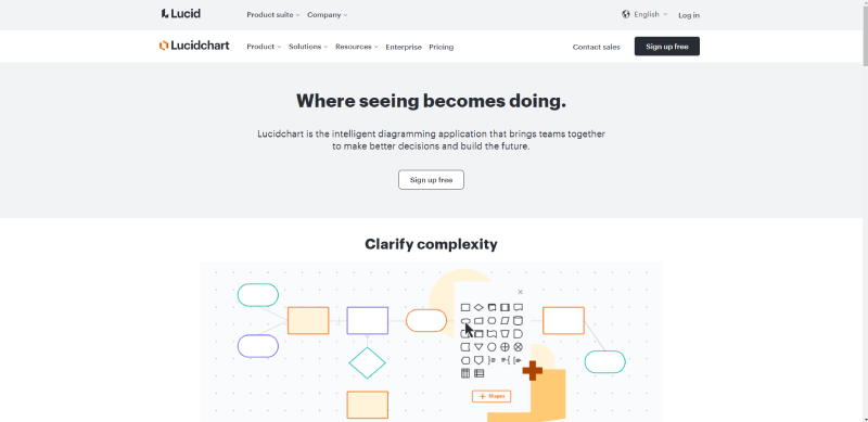
With Lucidchart you can do more than streamline your workflow: you can build beautiful visualizations. Use its diagramming capabilities to convey your message in an innovative way.
Lucidchart brings a unique solution for researchers, helping them retain current viewers while getting new ones.
This software helps you optimize your efficiency by tracking actionable insights. At the same time, you’ll improve your chart design skills.
Strong visualizations like bar charts, donut charts, and line graphs will help your business. They provide an interactive approach that lets you focus on what matters the most for the company.
Features: enhanced clarity, easy styling for shapes, better efficiency through keyboard shortcuts, containers for easy arrangement of charts, and the possibility to insert links.
Pricing: This online chart maker comes with a free plan and paid plans starting at $7.95.
FineReport
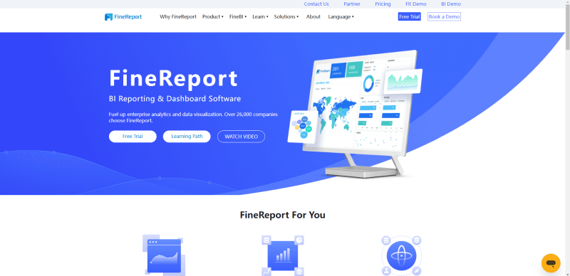
This chart generator allows you to build more than graphs; you can also create dashboards and reports for better results. If you want to create a bar chart, a line chart, or other basic chart types, FineReport is right for you. You can even make more advanced visualizations like Gantt, funnel, bubble, and scatter charts.
This is an excellent chart maker for maps, including heat, flow, and custom maps. It also works with GIS alternatives like Google Maps.
Impress your readers with cool effects like auto-rotation and 3D features.
Showcase your statistics quickly from different data sources. For instance, you can export your information from Excel in batches. Then, export your results to various formats like PNG, PDF, and Excel.
Pricing: Individuals who want to provide professional charts can use FineReport for free. It doesn’t have limitations regarding features and time. Business users can access paid versions based on customized quotations.
Tableau (and Tableau Public)
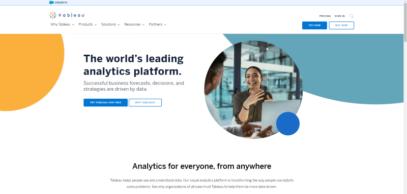
With Tableau, users will find several options. There are different versions of the program, including a server-based platform, an app, and a free option. Feel free to import your data from various sources like Salesforce, Google Ads, and CSV files.
It has the option of multiple chart types and offers plenty of mapping capabilities.
Its public version is free and available for everyone that wants to display their research results through beautiful graphics. Use different settings for clearer visualizations.
You can use Tableau for different purposes, from journalism to personal goals. Either way, this chart maker helps you avoid time-consuming tasks and generate the best graph for your research.
Features: video tutorials, wide mapping capabilities, and nearly 100 different options to import data.
Pricing: Viewer plan for 15, Explorer plan for $42, and Creator plan: $70.
Venngage
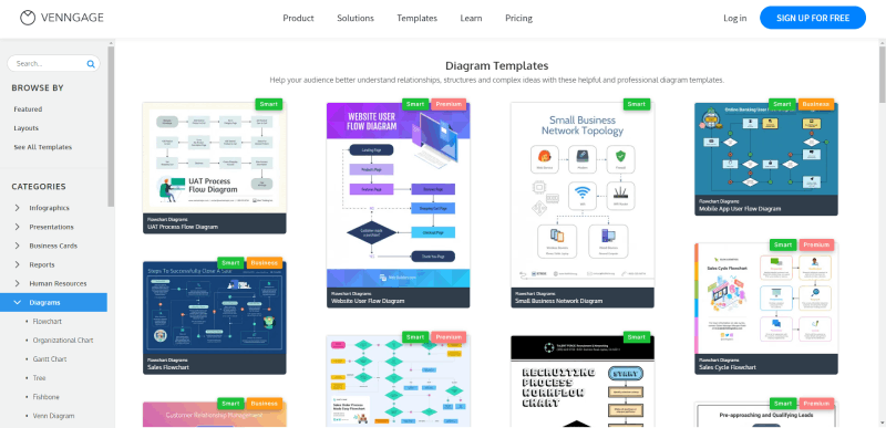
If you’re looking for beautiful chart templates, Venngage is your best choice. Convey complex messages clearly and compellingly. Its templates include options like Gantt charts, flowcharts, Venn diagrams, fishbone diagrams, site maps, and wireframe diagrams.
The array of options to choose from is immense. You’ll find line graphs, maps, pie charts, bubble charts, summary charts, and more.
Visualize your data clearly to provide powerful insights. For this, you have plenty of tools. Illustrations, pictograms, canvas designs, and icons are some examples. Everything will be easy thanks to its drag-and-drop usability. With many customization options, choose your templates and simply have fun with the numbers.
Finally, Venngage has 24/7 customer support, including one-to-one consultations.
Access all these templates through four plans: $39 for a Business plan, $16 for the Premium plan, and $499 for the Enterprise plan. All these fees are paid monthly.
Infogram
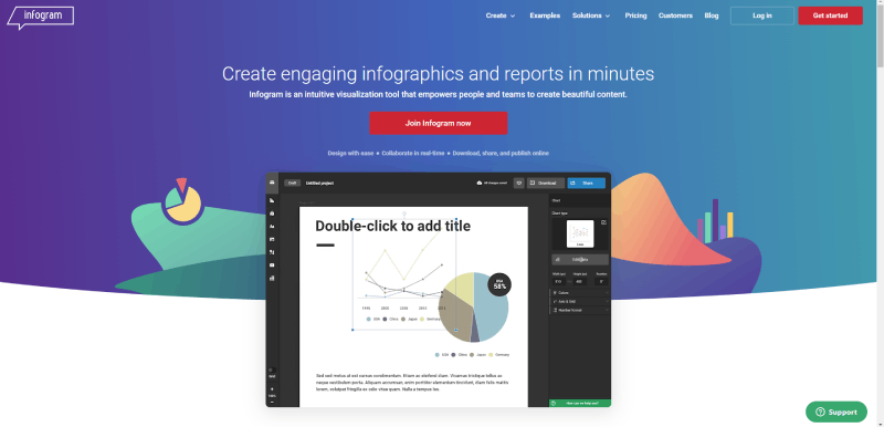
This is another powerful chart maker to create graphs both for your personal use and your business. This free chart generator comes with 30 niche-oriented chart types. Thanks to Infogram, users have created more than 800,000 graphics to date.
One of its best capabilities is the possibility to embed and share your graph so that it reaches the right audience. Your options include slides, maps, reports, dashboards, and social media charts. Responsiveness is one of the key features you should look for in any software. Infogram runs on web platforms and mobile devices.
Pricing: You’ll find a free plan plus three paid ones (from $19 a month to $149 a month).
EdrawMax
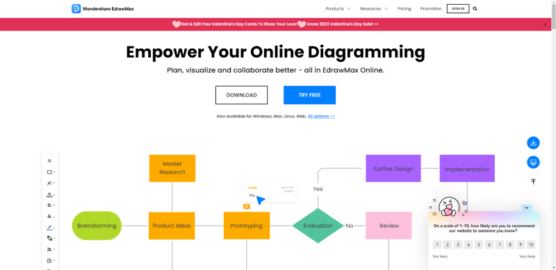
Here is an ideal online chart maker for teamwork. It comes with all the features you need to build beautiful custom charts. Based on functioning workspaces, EdrawMax allows you to work together with your team to prepare your project. Some of the included graphics options are diagrams, Gantt charts, interactive graphs, and infographics. There are over 1,500 beautiful chart templates to choose from. It also comes with 26,000 symbols to customize your visualizations.
Sharing has never been easier thanks to EdrawMax’s social media export capabilities. Let your audience access the information as soon as it’s ready.
Pricing: EdrawMax is based on subscriptions. There are three plans available: Education, Individual, and Team & Business. Also, each of them has a subscription plan with prices starting at $99/year and reaching $245/year.
Creately
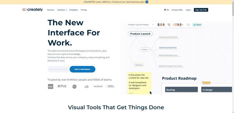
With Creately, you can prepare any type of graph without installations. Build your visualizations in real-time collaboration with this online chart maker. If you want to work offline, you can download Creately’s desktop app.
It integrates seamlessly with the most popular drawing software. These intuitive tools will help you maximize your project and its capabilities.
Features: visualization of your ideas to improve the final result, real-time collaboration with edits and inputs, professional layout, and more than 1,000 chart templates available.
Pricing: Public and free versions plus paid plans. These are the Starter ($5) and the Business plan ($89).
ChartBlocks
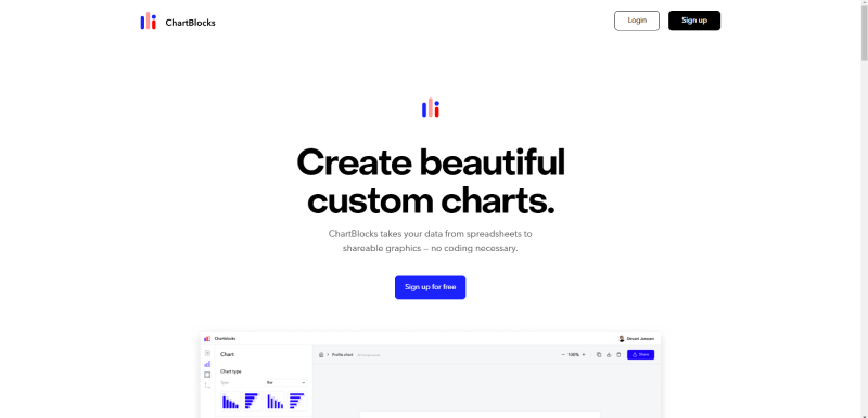
One of the most time-consuming tasks is data import. With this online chart maker, you can import information from various sources, including spreadsheets and APIs. Naturally, there’s also the possibility to enter the data manually. You can output graphs in different formats, such as PDF, PNG, and SVG.
The app comes packed with plenty of customization options to give the final visualization exactly the look that you want and includes a wizard that makes the process easier. Choose the exact data before importing the numbers.
Besides being responsive, ChartBlocks is flexible, allowing you to share your charts easily on Facebook and Twitter. Its embedding capabilities also help you share your project with the right people. And you can adapt your graphs to all types of screens with D3.js.
Pricing: free plan for individuals, $20 plan for professionals, and $65 plan for elite users. The free plan allows you to build up to 50 graphics.
Datawrapper
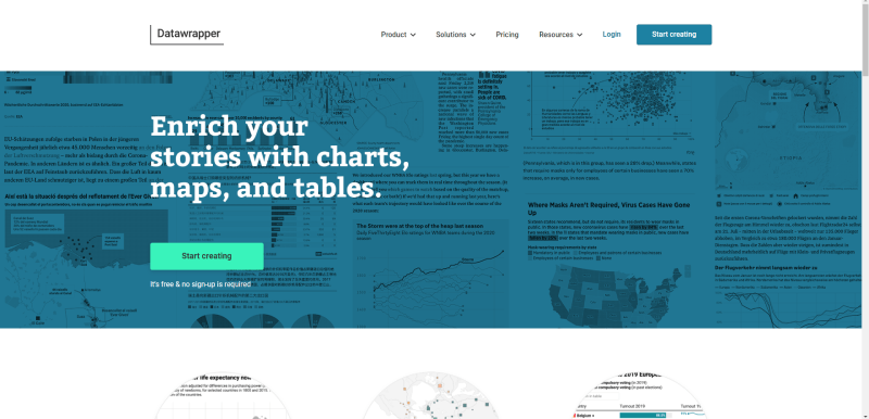
Datawrapper was built for a specific purpose: to add maps and charts to your written stories. These tools were specifically geared so that you can embed them into your news website.
When it comes to data sources, this chart generator is limited, as it only allows you to copy and paste.
But once you enter the data, the rest is easy. With one click you can prepare great graphs. There are different kinds available, including scatter, area, donut, bar, line, and column charts. Also, check out its locator and symbol maps.
The results are similar to what you would find in famous newspapers like The Boston Globe or the New York Times. Actually, popular publications like Fortune, Jones, and The Times use Datawrapper.
Pricing: It has a useful free plan that allows you to embed charts on sites with limited visitors; if you want the full version you’ll have to stretch your budget considerably as it costs $599 a month.
Canva
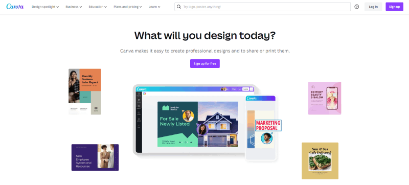
As its name suggests, this chart maker is the perfect option to create beautiful canvas-like visualizations. This is why it includes lots of free beautiful chart templates. Simply enter the information and the platform will automatically develop your graph. What’s most interesting is that this feature is free. The possibility to switch from one chart type to the other is a big plus. Swap between line and bar charts while keeping your data intact.
Its template library is impressive. All you have to do is type “graphs” in the search bar, and you’ll access a wide array of resources. Canva offers lots of template options: Venn diagrams, doughnut charts, pie charts, T-charts, strategy maps, comparison charts, cycle diagrams, SWOT analysis, and more.
Pricing: The free option is ideal for beginners, providing limited access to all tools. The Pro plan for individuals costs $12.99 a month, and the Business version costs $14.99.
ChartGo
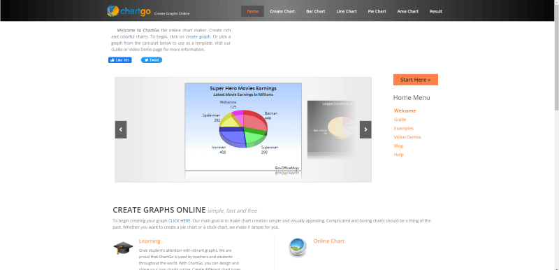
With ChartGo, you can include additional features and colors in each graph. Choose the most suitable template and build your visualizations easily. You can also start from scratch. There are many options, including Excel charts, CSV files, pie charts, and stock charts. Teachers can give ChartGo great use by helping their students understand information more effectively.
With plenty of tools, you can generate powerful visualizations intuitively. Use ChartGo’s guidelines and demo videos to work faster and achieve better results.
Another great feature is the possibility of uploading an Excel document and generating charts.
Pricing: It’s 100% free, allowing you to add multiple features and colors to every creation.
Microsoft Visio
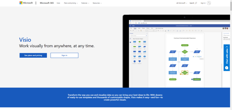
If you’re looking for a simple solution, this is it. Microsoft Visio user-friendly platform where creating diagrams, flowcharts, and floor plans is a walk in the park. Collaboration features are important for teams, and this chart maker won’t disappoint you. Use this tool to work with colleagues in real-time.
Both the browser and the app versions work outstandingly. Either way, you’ll have a great user experience. Its pre-built chart templates will be quite handy. Finally, Visio is available for anyone with its Accessibility Checker, Narrator, and Support.
Pricing is available in two ways: Plan 1 costs you $5 a month and Plan 2 costs $15 a month.
Visme
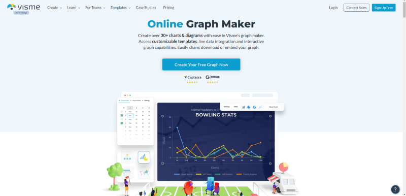
Any non-designer can work with Visme as you don’t need any special knowledge. Its intuitive interface allows you to prepare more than 30 diagrams and charts. Also, you can choose from a variety of chart templates and use interactive features and live data integration. Sharing is easy, and you can download your project with a few clicks.
Thanks to these features, Visme is the ultimate tool to engage your audience. Check out its wide array of infographics and pre-made presentations. A unique feature is on-spot addition or editing which provides a fully immersive experience.
Since safety is important, Visme allows you to download each project to keep it safe. The easy share feature is also a great plus.
Pricing: free version, Standard version ($12.25/month if paid annually), and Pro version ($25/month if paid annually).
FusionCharts
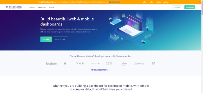
This software is based on JavaScript and runs both on browsers and mobile devices. It comes with more than 1,000 types of maps and 150 charts. It’s quite flexible integrating with various frameworks, too. Possible integrations include React, JQuery, Angular, and Ember, as well as languages like Django, Java, and PHP.
It comes with pre-made codes to apply on each chart or map. Thus, embedding visualizations into a website becomes easy even if you’re not a programmer. FusionCharts is designed to create dashboards rather than simple visualizations. All in all, it’s the most expensive chart generator on this list. However, the features you get in return are top-notch.
Pricing: from $499 to $2499 a year.
RAWGraphs
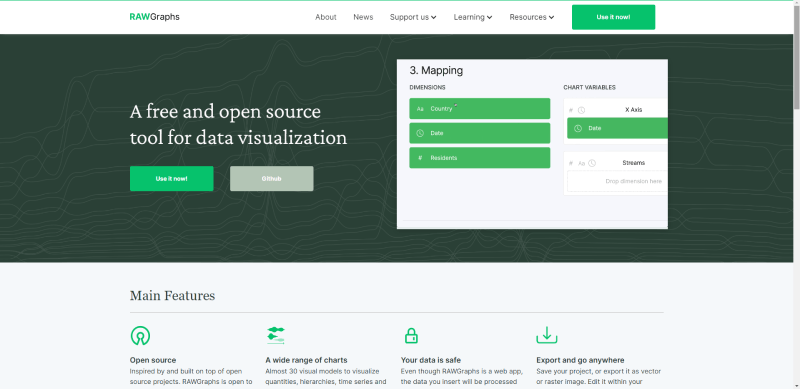
This is a powerful option that allows you to visualize complex pieces of data easily. Create a graph from various sources and customize it. You can choose from Excel, TextEdit, Google Spreadsheets, and others. Try RAWGraphs if you are looking to visualize the data from delimiter-separated values like TSV or CSV files.
Initially designed for visualization enthusiasts and designers, RAWGraphs fills a gap between spreadsheet applications (Apple Numbers, Excel, OpenRefine) and vector editors (Inkscape, Adobe Illustrator, and Figma).
This chart maker lets you work with chart templates or prepare your own. If you have programming knowledge, you can develop and customize different chart types.
Pricing: Available for free.
Miro
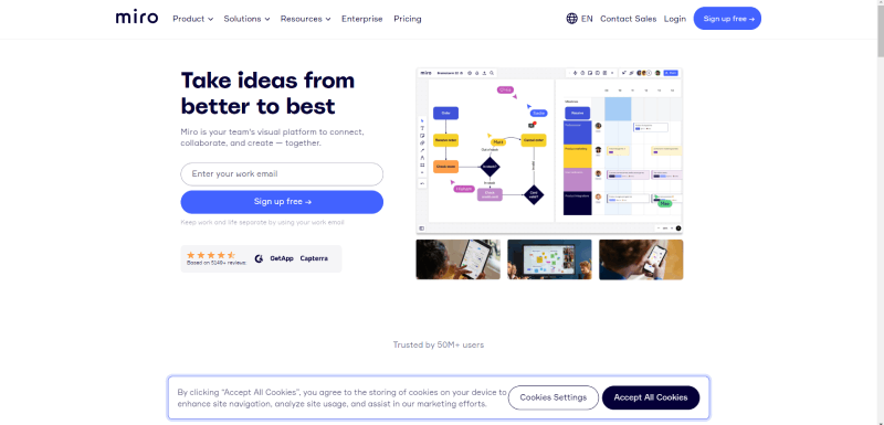
Many designers want their graphs to be not only informative but also beautiful. Miro gives you that special boost so that you can propel your project forward.
It comes with a comprehensive, user-friendly chart builder with plenty of details. Simply choose your template and start working. Thus, Miro helps everyone that wants to present professional charts, including marketers, students, business people, and teachers.
With advanced editing capabilities, Miro improves your storytelling and design. It has managed to build a community where users can find support, and it provides a library of templates. The best part is that you can use Miro without having any special knowledge or previous experience.
All in all, Miro lets you develop anything that you want when it comes to visualizations. Add labels and variables to build strong graphs.
Another plus is the possibility to collaborate with others easily. Its tools allow you to work with multiple users in real-time.
Pricing: one free plan and two paid options ($8 per month and $16 per month).
Google Charts
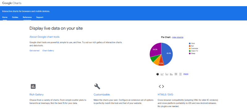
Google Charts is a tool that helps you create interactive chats to embed online. The charts will be rendered in SVG or HTML formats. This assures compatibility across browsers and platforms both for iOS and Android. It comes with VML support for older browsers such as Explorer 6.
Google Charts works with dynamic data using outputs based on SVG and HTML. This allows you to run them in browsers without downloading additional plugins. It also works with the following data sources: SQL, Google Fusion Tables, Salesforce, and Google Spreadsheets.
You can choose from different chart types like scatter, column and bar, area, and pie charts. Histograms, timelines, treemaps, and gauges are also available. There are plenty of customization options through CSS.
Finally, Google Charts is free.
FAQ on Chart Generators
What exactly are chart generator tools?
They’re like your digital Swiss Army knife for data. Picture them as software or online platforms transforming rows of data into visuals faster than you can say “pie chart.” They’re all about turning those mind-numbing spreadsheets into stories through graphs and charts. It’s visualization magic, really.
Can I use chart generators for free?
Absolutely. There’s a treasure trove of them out there. Online graphing platforms often offer free versions, and if you’re okay with basic features, they’ve got you covered. Sometimes, it’s all you need to get the job done without spending a dime.
How do chart generator tools handle my data?
Think of them as protective parents. They take your CSV/JSON/XML data formats, cradle them gently, and turn them into interactive charts. Most use secure methods to ensure your data remains your own. Still, always skim through their privacy policy—better safe than sorry.
Which chart types can I create with these tools?
Your imagination’s the only limit. From bar graphs to line graphs, and the snazzy infographics, you can whip up just about anything. Even the more complex ones, like Gantt charts or scatter plots, are on the menu.
How customizable are charts made with these tools?
As customizable as your favorite pizza. Color it, tweak it, turn it upside down—okay, maybe not that. But from chart design tools to custom chart templates, you can tailor each element to meet the story you want your data to tell.
Do I need to be a designer to use chart generator tools?
No way, José. These data visualization tools are made for everyone. The user interfaces are becoming so intuitive, you might just feel like a pro designer without the degree. And if you do have design chops, even better. Flex those skills!
Can chart generators be integrated with other software?
They’re like the best team players. Most of them offer APIs to play nice with other software. Need to pull in numbers from external sources? You got it. Want to add those snazzy visuals to your presentations? Consider it done.
Is it possible to share or publish charts directly from these tools?
For sure. Hit that publish button and watch your charts take flight. Share straight to your socials, embed them on your blog, or download them to include in your reports. These graphing applications understand the need for sharing because what’s data if not shared, right?
What about the reliability of chart generator tools?
Pretty solid. They run on algorithms that minimize error—you just need to feed them the right numbers. Double-check your data input, though. No tool’s a psychic yet, they can’t guess what you meant to type.
How often do chart generator tools get updated?
Developers know that tech waits for no one. Constant updates are part of the game. You’re not just buying into a tool, you’re getting an evolving partner in your data storytelling journey. Expect new features, smoother interfaces, and better data presentation utilities over time.
Conclusion
And there we have it. A deep dive into the world of chart generators—demystifying them, breaking down their nuts and bolts. It’s been quite the ride, hasn’t it?
Rounding things off, let’s just say these tools are more than a pretty face for your data. They’re the storytellers, giving life to cold hard numbers, making insights pop off the screen—and into the grey matter. Whether it’s a dashboard creator for the data-driven or an infographic maker for the visually inclined, the array of possibilities is as vast as your datasets.
Remember, the right tool doesn’t just present data; it elevates it. It shouldn’t just make sense—it should make a statement. So go ahead. Choose your visual sidekick wisely. Because from the dense forests of big data to the intricate pathways of user experience, it’s the narrative that wins. Always.
If you liked this article about chart generators, you should check out this article about financial charts and graphs.
There are also similar articles discussing interactive charts, creating interactive charts, comparison chart makers, and comparison charts.
And let’s not forget about articles on React chart libraries, javascript chart libraries, examples of good graphs, and animated charts.


