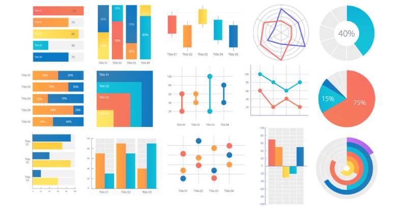
Ever find yourself tangled in data, like a chef in a spaghetti fling-off? Brace yourself, because comparison chart makers are about to whip your data into a Michelin-star masterpiece. Imagine a world where bar graphs echo stories and pie charts sing symphonies; it’s not a daydream—it’s the new norm for presenting information.
Within these digital walls, numbers transform into narratives. I’ll guide you across the minefield of choosing the perfect data visualization tool to colorfully craft comparison graphs that speak volumes.
You’re aboard a voyage to unveil the nuances of these unsung heroes in data analysis tools.
By the finale, expect to be versed in crafting visual aids that ensure your data doesn’t merely whisper but resonates with authority.
I’ll dissect the anatomy of top-tier chart-making software, and you’ll have the savvy to select the ideal one.
Table of Contents
The 11 Best Comparison Chart Template Makers
| Comparison Chart Maker | Ease of Use | Price Range |
|---|---|---|
| wpDataTables | Easy | $59 – $259 |
| ChartExpo | Easy | Starts at $10/mo |
| Lucidchart | Easy to medium | Free – $20+/mo |
| EdrawMax | Medium | Free – $99/yr |
| SmartDraw | Easy | $5.95/mo – $297/yr |
| DesignCap | Easy | Free – $12.99/mo |
| Piktochart | Easy | Free – $99/mo |
| Adobe Express | Easy | Free – $99.99/yr |
| Canva | Very easy | Free – $30/mo |
| Infogram | Easy | Free – $149/mo |
| Visme | Easy | Free – $49/mo |
Plugins
wpDataTables
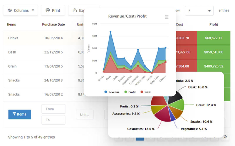
Let’s get this straight. wpDataTables is more than a tool, it’s your new design partner, making chart building a breeze.
- Easy as pie: Drag, drop, boom! Instant chart.
- Speedy Gonzalez: Why waste time when wpDataTables gets it done in a flash?
- Laser sharp: No more blurry charts. wpDataTables keeps it crystal clear.
Hold up, there’s more. Ever tried making changes to a chart only to mess up everything? Yep, we’ve all been there. With wpDataTables, this becomes a thing of the past. Real-time edits are no longer a pipe dream but your new reality. Add a row, change a color, switch the data, all on the fly, and watch your chart evolve before your eyes!
But that’s not all, wpDataTables is like the Swiss army knife of chart makers. It doesn’t just stop at comparison charts. Pie charts, bar charts, line charts – you name it, wpDataTables has it covered!
Worried about the look? Don’t be. Customization options are off the charts (pun intended). Make your chart truly yours – colors, styles, fonts, and more. It’s like a buffet, but better because it’s all yours.
Best part? It’s not going to break the bank. The value you get for your buck here is insane! Quality, convenience, and cost-effective – it’s the whole package!
So here’s the deal. Are you ready to kick manual charting to the curb? Ready to step up your game? If your answer is yes (and it should be), it’s time to let wpDataTables transform your chart game.
Let’s do this.
Grab your copy of wpDataTables and start the revolution!
Go on, you know you want to.
ChartExpo
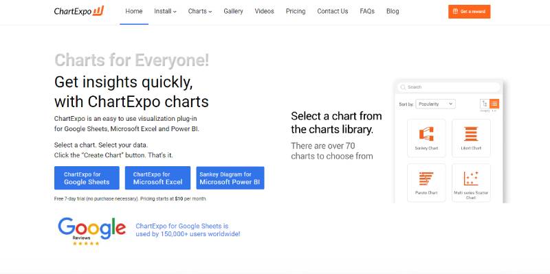
ChartExpo is a visualization plugin. It integrates with Google Sheets, Microsoft Excel, or Power BI to create a comparison chart in three easy steps.
First, pick a template from its varied selection. Then, select the data for the comparison. You can import the data from other platforms. Finally, fill out a quick form to configure your graph and click Create Chart.
Afterward, your comparison graph visualizations stay secure in the tool’s framework. You can share them online or download them as images or PDF files. This process saves time and ensures reliable results.
Not requiring code or design knowledge means ChartExpo is easy to use, but it does not enable users to create templates from scratch. Thus, customization options, like icons and fonts, are limited. It offers a free seven-day trial period, after which you begin paying for a subscription.
Diagramming Applications
Lucidchart
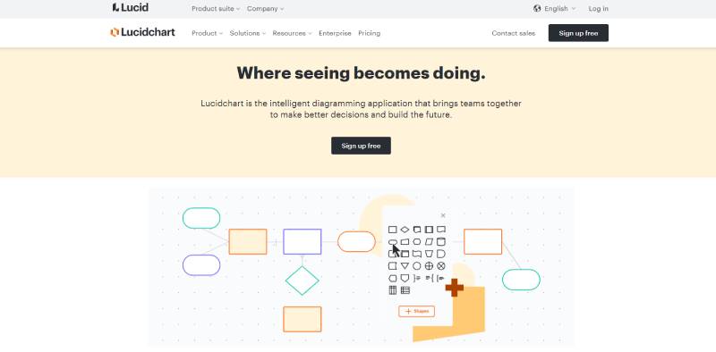
Lucidchart supplies users with team-focused resources to help you make better decisions and build the future. It allows coworkers to map their progress and the next steps for each project. Thus, they are always on the same page and can easily communicate.
This diagramming software has numerous comparison chart templates you can choose from. You can also customize their shapes and colors.
The software integrates with popular teamwork platforms such as Google Drive and Microsoft Teams. It offers valuable help to smooth your adaptation through its learning campus.
You can sign up to use Lucidchart for free. But the features in this version are regrettably insufficient for regular business operations. Hence, you should later subscribe to one of its monthly or yearly plans.
EdrawMax
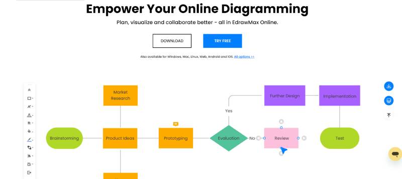
EdrawMax is an all-in-one tool, created by Wondershare, with which you can create your comparison chart online. These are its main advantages
- It has thousands of comparison chart template options and symbols.
- It is user-friendly, with a short learning curve.
- You can easily find the graphic you need with the search options and filters in the library.
- You can create a cloud-based workspace to improve teamwork and communication.
- You can draw in vector art mode, which is the best way to alter template size without losing image quality.
- It integrates with popular platforms to publish your graphics.
- It keeps track of insightful template metrics, such as views and likes.
EdrawMax is not economical, but it delivers versatile plans. It does not allow you to save your diagrams in the cloud in real-time. Unlike other tools, you can not outline a project and divide it into stages for better management.
SmartDraw
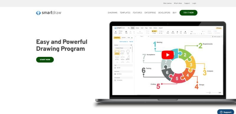
SmartDraw introduces itself as an easy and powerful chart maker. It is a versatile tool with customization and collaboration resources. Among other advantages, it delivers
- A quick start: With its automatic formatting and vast diagram library, you can easily create a comparison
- Integration with other tools: Whether you work alone or collaborate with a team, you can use SmartDraw’s integrations. It merges with Google Workspace, One Drive, Atlassian, Microsoft Office, and other platforms.
- Automation: With its functional extensions, you can build and enhance any template through automation.
- A comprehensive software solution: This tool is valuable for independent professionals and enterprises. It even allows you to import Visio or Lucidchart files.
Users note that SmartDraw has lightweight sharing and collaboration capabilities. You can use its free online app to experiment with the tool and create a comparison chart online. Still, there is no free subscription plan available for this software.
Graphic Design Software
DesignCap
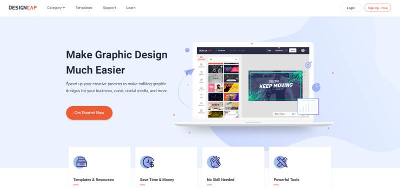
DesignCap is one of the most accessible comparison chart builder options on this list. It has three available subscription plans, including a free one with limited features. With its vast library of versatile templates, you can create content for your audience, from infographics to flyers.
It also helps you build presentations and social media posts. You will find different ideas for your graphics in its learning center. Plus, premium subscribers can upload the brand fonts they want in their comparison chart designs.
You can use DesignCap and customize your contrast maps regardless of having previous training. The tool has a smooth learning curve and many helpful resources.
Still, it shows some limitations as a chart maker software because of its focus on marketing. Users mention its narrow image bank and challenges in creating more complex graphics.
Piktochart
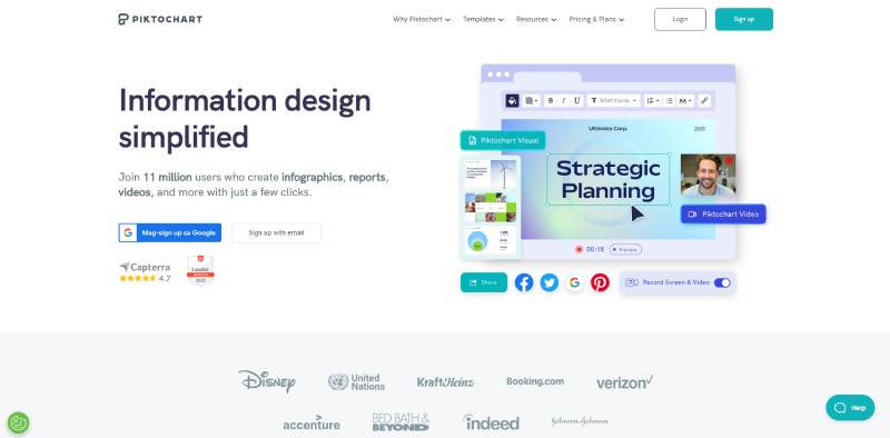
With millions of users worldwide, Piktochart brings a dynamic visual and video creation approach. Unlike other design platforms and apps, it has a smooth learning curve.
Its drag-and-drop editor allows you to start designing within an hour. With templates to fit a variety of situations, it is an excellent choice as a comparison chart maker. It includes
- A broad selection of templates while maintaining the possibility to build your own.
- Variety of graphic types and styles to inspire you when you create a comparison chart.
- Premium subscriptions get extra security resources and customization options.
- Several ways to download and share, such as PNG and PDF for images and PPT for video.
Like other tools, it offers a free subscription plan.
It has limited resources to help starters improve their visual communication.
It does not allow you to use your brand fonts and colors, and storage is minimal. You also won’t have access to Single-Sign-On (SSO) and scant exporting options.
Other Online Platforms
Adobe Express
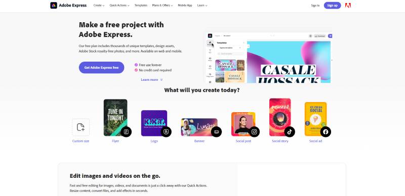
Adobe Express is an online and mobile app for creating a comparison chart to fit any situation. It is an excellent choice for comparing product differences on multiple e-commerce sites. Its most predominant benefit is flexibility, which is noticeable in various aspects, such as
- Pricing: It offers a variety of subscription possibilities. It ensures you get the features you need while keeping expenses low. Plus, its free plan is one of the most comprehensive plans available.
- Design: Adobe Express has thousands of comparison chart templates, so you do not have to start from a blank canvas. You can customize your graphics in-depth or through its Quick Actions
- Publishing: Convert any file to your desired format and post it online or download it.
However, Adobe Express has some faults as a video editor, which can be an issue if you use video presentations often. It also displays a low image rendering quality.
Canva
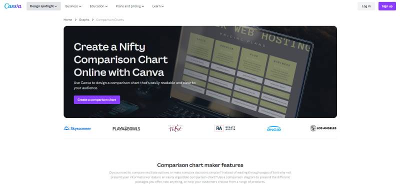
Canva is a renowned online design platform. It provides extensive resources for original posts, icons, and mockup images. Even if you are not a designer, you can use it to bring your concepts and ideas directly to your audience.
One of its many applications is comparison graph creation. These are some of its most significant advantages:
- A short learning curve, with an active and supportive community to handle any challenges that arise
- Native comparison chart template designs to facilitate construction
- A streamlined chart-creating process in a single website
- A share button for team projects and the ability to download, send, or publish your work from the Canva site
- Chart embedment options for your reports, website, and presentations
Anyone can sign up for a free account with restricted resource access or opt for a paid subscription. Canva’s storage capacity and accessibility are limited. If you experience Internet issues or the website is down, you must wait to access your comparison charts.
Infogram
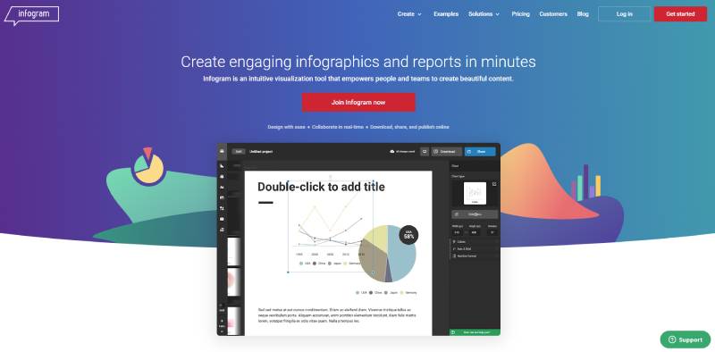
Infogram describes itself as an intuitive visualization tool that helps create beautiful content. As such, it emphasizes engagement and efficiency to capture your audience’s attention and improve understanding. With it, you can
- Strengthen your brand by including your brand fonts, logo, and colors.
- Collaborate with your team members in real-time and access project version history. You can set up permissions by role and track the progress of the assigned colleagues.
- Customize your graphics to fit your specific needs.
- Animate your visualizations and include interactive elements to enhance them.
- Measure your comparison chart online performance with insightful analytics.
- Share your content online on social media or through the software plugin.
Infogram offers a wide range of monthly or yearly subscription possibilities. It has a free basic plan, but its resources are scarce. The tool also lacks support for mobile usage and has no developer-friendly features.
Visme
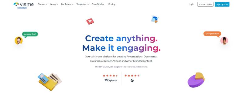
Visme is an all-in-one platform for creating documents, visualizations, and other branded content. Besides highlighting visual appeal, it also emphasizes interactivity.
This software uses a drag-and-drop building system to facilitate design. It has comprehensive solutions for teamwork, customization, downloading, and publishing.
Thus, this tool ensures your ideas and concepts efficiently reach your audience. Visme streamlines your creation processes on an organized interface that helps you manage your assets. It also integrates with other platforms.
You can subscribe to Visme Basic for free, but its features are scarce. It has low storage space and no charts and data widgets. Another drawback is the restrained collaboration resources for most paid plans.
FAQ on Comparison Chart Makers
What are comparison chart makers?
These are digital tools that let you create easy-to-understand visuals, showcasing comparisons between different items or concepts.
Think of them as simplified infographics, focusing mainly on comparisons. They’re super handy in presentations, reports, or even on websites. Whether you’re comparing products, showing data variations, or demonstrating changes over time, they’ve got you covered.
They are particularly effective in conveying complex information in a straightforward manner, making it easier to track and analyze KPIs (Key Performance Indicators) for informed decision-making.
What’s the difference between a bar graph and a comparison chart?
Bar graphs serve up data on a platter of vertical or horizontal bars—simple, efficient, no frills. A comparison chart? That’s your Swiss Army knife—bar graphs, pie charts, Venn diagrams, the works. It compares multiple variables, not just tossing them out there but intertwining their tales.
Can I create comparison charts online without any design experience?
Absolutely. Dive into user-friendly chart creation tools and you won’t need a design degree. These platforms often have drag-and-drop interfaces and a stash of customizable chart templates; it’s data artistry minus the art school debt.
How do comparison chart makers improve data presentation?
Data visualization software turns rows of snooze-worthy numbers into interactive, eye-catching stories. It’s like turning a lecture into a blockbuster movie—suddenly, everyone’s all eyes and ears. Interactive charts are where it happens, turning static numbers into engaging narratives.
What should I look for when choosing a comparison chart maker?
Fancy a tool that sings your data’s tune? Hunt for ease of use, functionality, and snazzy design quality. Peek at user reviews—they’re the breadcrumbs leading to a stellar tool. Opt for one with variety—bar graph generators, pie makers, and flowchart software all in one.
Can I collaborate with my team using a comparison chart maker?
Teamwork makes the dream work, and the dreamiest data visualization software includes real-time collaboration. It’s like all getting your hands in the clay on the pottery wheel—making, molding, and editing together for a polished final piece.
Are the charts created with these tools exportable in multiple formats?
You bet. A solid comparison chart maker knows variety is the spice of life—it offers export options galore. Whether you’re after a sleek PDF or a crisp PNG, you’re sorted. Some even do the interactive web chart dance, bringing those visuals to life online.
How do comparison chart tools handle data security?
Think of them as your digital Fort Knox for numbers. Credible comparison chart makers come strapped with security measures tighter than a drum. Data privacy? Check. GDPR compliance? Double-check. They treat your data with the secrecy of a royal recipe.
Can I customize charts to fit my branding?
Oh, it’s a branding bonanza with these tools. Customize away—color palettes, fonts, even your logo slapped on for that chef’s kiss. Turn a chart into your brand ambassador—visual storytelling with a business suit on.
What are the best free comparison chart makers available?
While freebies won’t always rock the bells and whistles, they’re great for a test drive. You’ve got Google Sheets for simplicity and Chart.js for those with a coding itch. You can get crafty without cracking the wallet open.
How can I make my comparison charts more accessible to viewers?
Think of accessibility as the VIP pass—everyone gets one. Pair readability with a clean design. Keep it simple, captioned, and color considerate. A visual comparison tool that allows for alternative text and readable fonts? That’s the golden ticket.
Conclusion
We’ve dissected comparison chart makers with the precision of a sommelier sampling a complex vintage. The journey? Enlightening. Choosing the ultimate tool to forge visual comparisons is akin to picking a paintbrush; it’s personal, evocative, wholly about what shades your narrative best.
- Fluidity in creating interactive charts,
- A library of customizable chart templates,
- And export options that play nice with your preferred formats.
These are the bedrock of stellar data visualization software, the canvas waiting for that splash of data.
So keep your course steady, navigating the waters of graph plotting applications and online chart editors. Let your narrative flourish visually with the infographic maker that resonates—echoing the melody of your data’s message.
And when the time comes to share your masterpieces—bar graphs, pie charts, or any comparison visualization—remember that in the alchemy of numbers and design, you’re the maestro, wielding the baton that orchestrates clarity from chaos.
If you liked this article about comparison chart makers, you should check out this article about financial charts and graphs.
There are also similar articles discussing interactive charts, creating interactive charts, comparison charts, and React chart libraries.
And let’s not forget about articles on javascript chart libraries, chart generators, examples of good graphs, and animated charts.


