Data visualization trends are reshaping how businesses extract insights from data. Each year, advancements like augmented analytics and real-time data visualization revolutionize how we interpret complex information. With tools such as wpDataTables, Tableau, Power BI, and D3.js, creating compelling data stories has never been more accessible.
The importance of data-driven decision-making cannot be overstated. As visualization techniques like heatmaps and visual data discovery become more sophisticated, organizations are better equipped to handle big data and predictive analytics. Industries such as healthcare analytics, financial analytics, and marketing metrics are leveraging these trends to drive performance and make informed choices.
In this article, we’ll explore the latest trends in data visualization, highlighting innovations, best practices, and key tools that are leading the charge. By the end, you’ll be equipped with the knowledge to enhance your data storytelling and visualization capabilities, ensuring you’re at the forefront of this rapidly evolving field.
Table of Contents
Thirteen Data Visualization Trends You Need to Know
Accessibility
Accessibility does not apply only to physical spaces; it must also extend to technological and digital tools.
Among data visualization trends, this is one of the most impactful. It ensures that all people get to understand and use these visual resources.
There are some measures to take when it comes to implementing accessibility. One of the most easily applicable steps is including alternative or descriptive text for visual analytics.
Another way to make your visualizations more accessible is to create proper sound accompaniment. You can also adopt colors that are clearer for those with visual disabilities.
Allowing User Interface (UI) Design to Shape Business Intelligence
Aesthetics are crucial in all business communications, especially in data visualization. So companies have allowed UI design to shape their business intelligence layout.
This approach has many benefits. It enables an in-depth application of brand identity to make data visualization an even more valuable and versatile tool.
An easy-to-use interface allows for clear reading, to highlight critical information and current events. In addition, it guides users throughout navigation, allowing for functional and enriching interactiveness.
Another advantage lies in the effective use of color to accentuate data rankings and direct information to the right user.
Artificial Intelligence (AI)
Leveraging the power of artificial intelligence not only enhances automated processes but also addresses complex data patterns with minimal manual intervention. That’s why companies are increasingly relying on artificial intelligence apps, as it makes handling complex data much easier especially when combined with agentic workflows. AI-driven tools streamline interpreting vast datasets, transforming them into comprehensible visuals effortlessly. Integrating the advancements seen in artificial intelligence courses offered by DataCamp can further optimize these capabilities. Such courses delve into machine learning and natural language processing innovations that are crucial for future-proofing data visualization techniques.
The best data visualization software can automatically process complicated data. So companies do not need to maintain staff dedicated solely to filtering and rendering raw data.
Instead, they save time and manual labor by eliminating tasks susceptible to human error. According to the type of visualization chosen, they unlock big data results with little effort.
This makes implementing even the most complex solutions much cheaper because there’s no need for hiring staff and dealing with their further movement in the future. Asking another company even for full-fledged big data development services is much easier and more profitable in most cases.
This approach is valuable for quantitative data analytics. It supplies information to business users, consultants, and existing or potential customers.
Building a Reporting Ecosystem Through Application Integration
One of the biggest trends for the upcoming year is merging data visualization tools. Application integration allows businesses to achieve better results through a complex reporting ecosystem.
In turn, such a system can facilitate responding to routine demands of data processing and analysis. Besides this, it simplifies on-demand operations.
Therefore, companies can share their progress with customers, stockholders, and third parties. They additionally get to track performance indicators, which promotes faster growth.
Creating Mobile-friendly Data Visualizations
Creating graphics that are accessible through mobile devices is not a new idea. However, with the increase in the daily use of these devices, this is now a significant data visualization trend.
Many people spend most of their time on their smartphones. They are constant users, whether to check social media or their email inboxes.
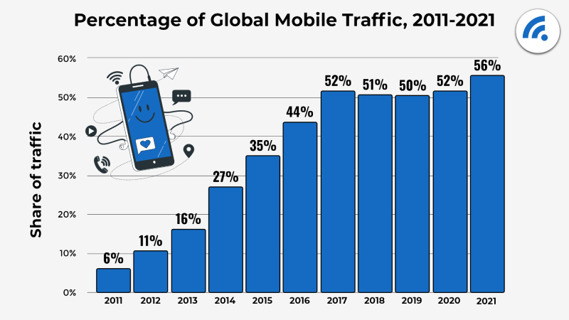
Notice this 2022 research by Broadband Search showing that over 55% of all internet traffic in 2021 came from mobile phones. Thus, companies seek to create data visualizations compatible with their configurations.
Replacing data-driven documents with actionable data for mobile devices increases engagement. It takes effort and specific skills to construct engaging emails, interactive posts, and webpages.
Even so, this attracts new customers, improves their experience, and boosts the chances of client retention.
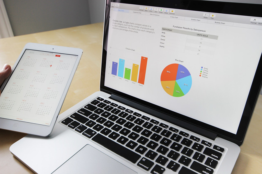
Your beautiful data deserves to look good on any device
wpDataTables can make it that way. There’s a good reason why it’s the #1 WordPress plugin for creating responsive tables and charts.

And it’s really easy to do something like this:
- You provide the table data
- Configure and customize it
- Publish it in a post or page
And it’s not just pretty, but also practical. You can make large tables with up to millions of rows, or you can use advanced filters and search, or you can go wild and make it editable.
“Yeah, but I just like Excel too much and there’s nothing like that on websites”. Yeah, there is. You can use conditional formatting like in Excel or Google Sheets.
Did I tell you you can create charts too with your data? And that’s only a small part. There are lots of other features for you.
Data Visualization for Social Media
Within the last few years, social media users have increased significantly. Hence, data visualization experts consider their valuable marketing tools for businesses. Instagram has a monthly user base of over 2.3 billion active users, highlighting its substantial influence in the realm of social media.
Social media visualizations reach broad audiences and can profoundly impact viewers. They allow businesses to teach, get customer feedback, or incite action with a single image or video.
Since social data visualization is a graphical representation, it makes for the perfect post. It will share information like business insights with users without demanding much thought or effort. Also, by incorporating social data visualization into your marketing strategy, you can effectively communicate complex business insights and create a memorable and impactful brand experience.
One way to use social data visualization into your marketing strategy is to create engaging visuals for social media ads and posts. Whether you create Facebook lead ads or Instagram carousel posts, incorporating social data visualization can capture attention and convey information more effectively.
To accurately measure the effectiveness of these posts and optimize your strategy, use Facebook analytics tools, they offer valuable insights into performance metrics such as engagement rates, audience demographics, and overall reach.
Developing a Data Culture
One of the best ways to develop your company is to build a sound community of followers, those who value and resort to data when making decisions.
But constructing a culture requires more than just using data visualization tools to make it available to people. Instead, you should help them see the importance of including data in their daily routines.
You can build a solid data culture by maintaining it as a constant conversation topic. Whether in a professional or casual setting, you must adapt the information to each discussion and those involved.
Since the goal is to promote regular data usage, it is crucial to invest in data literacy, especially within the workplace. You can also take the initiative to share them with others.
As a final measure to build a data culture, you can seek to inspire by highlighting how versatile and functional data visualizations are.
Following Principles in Artificial Intelligence (AI) and Analytics
Data is, in short, information regarding individuals, groups, or entire populations. So it is necessary to ensure that all people feel represented by such data.
There are five basic principles that AI and analytics should follow:
- Inclusivity. According to the information depicted, data visualizations must implicate an inclusive analysis.
- Protection of human rights. All humans have rights as to their personal information that businesses must keep.
- Respect and safeguarding of user data. Operations collecting user data must keep it safe and protect privacy.
- Accuracy and responsibility. All data should be accurate and should represent real situations. Operations are accountable for how they apply AI and analytics.
- Impartiality. All users should feel represented in what they are reading.
With the increasing awareness of social and moral issues, companies must follow these and other principles. It is crucial to remember that AI and analytics are only as valuable as the principles they consist of.
Illustrations
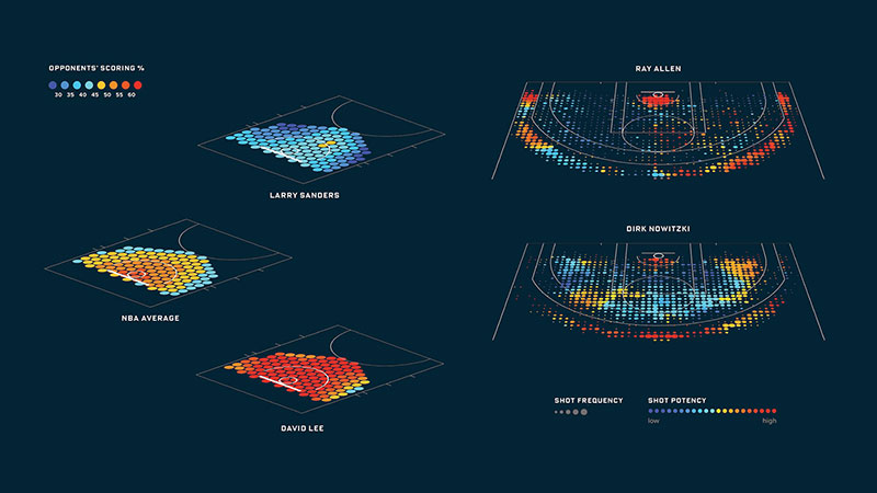
Illustrating data is one of the latest data visualization trends. With the rise of visual media through digital platforms, illustrations have developed into excellent means to convey information.
As a matter of fact, interactive visualizations are more successful in transmitting complex data. On the contrary, static visuals are becoming less appealing to the general public.
Additionally, emerging technologies have generated data visualization techniques that create stories. They are engaging, and they ease comprehension of valuable insight.
It is astounding how flexible and versatile illustrations can be. They can adapt to communications for children or adults of all lines of work and ages.
This visualization solution offers a unique feel of human interaction while being exclusively digital. As an example, consider the Planet Earth children’s book designed by Frederica Fragapane.
Implementing Data Democratization
In the past, creating data visualizations required data scientists to spend much time sorting and depicting data. Thus, they had to develop advanced coding skills.
Now, the best data visualization tools have brought on the latest trend by data democratization. This way, anyone can read, understand, and transmit data without significant effort. As these tools evolve, they are increasingly incorporating AI decisioning capabilities that not only show what the data is but also recommend the most logical next steps for the business.
There are numerous programs companies can access to benefit their operation and work teams. If everyone can keep up to date with data-driven insights, they will be more motivated to act accordingly.
This also contributes to workers becoming better prepared to deal with oncoming challenges. Plus, specialized employees can focus on crucial and more rewarding tasks.
Prioritizing User Experience (UX)
Business communications are changing and becoming more people-centered. Right now, if you present simple bar charts that don’t meet user needs or have a story behind them, chances are engagement will be low.
Hence, to improve data retention, you must focus on user experience. There are many benefits to adopting a user-centered approach.
It allows you to understand company goals, standards, and performance metrics. This way, you will create a data visualization that meets the company’s needs.
Another advantage lies in developing simple but organized layouts, designs, and structures. These assist in efficient reading, comprehension, and the decision-making process.
It will also ensure that your data visualizations are more accessible and impactful.
Real-time Data Visualization
Being up to date with vital information and progress is crucial for those who work in the business world. So, real-time data visualization provides critical insights, which support sound and positive decisions.
Especially when there are unexpected issues, the ability to visualize data instantly is paramount. With no previous preparation, making informed decisions at once is vital.
Another benefit of real-time data is that anyone with internet access can see and understand that complex information. It allows them to interpret and identify patterns in nuanced data sets. Hence, it strengthens departments and teams, helping them work as one.
Video and Storytelling
Despite including crucial, complex data, data visualizations lose value by themselves. They must do more than inform readers by having the power to engage and incite action.
Interactive narratives go much further than simple data analytics graphs like statistical charts. So it is vital to give data a clear and convincing voice.
Hence, story and video infographics are making their way to becoming some of the biggest data visualization trends. And it is becoming critical for data visualizers to understand and employ data journalism techniques.
This data storytelling approach allows companies to follow progress over time. So, presentations are more effective and comprehensive.
Following this trend will ensure you are not just creating pie charts. Instead, you will be telling moving stories that help your business grow.
FAQ on Data Visualization Trends
What are the latest trends in data visualization?
Augmented analytics and real-time data visualization are game-changers. Tools like Tableau and Power BI now integrate AI features. Users expect more from visualization techniques with advancing technologies. Introducing natural language processing (NLP) and machine learning into visualization makes data insights more dynamic and user-friendly.
Why is data visualization important for businesses?
Data visualization transforms raw data into actionable insights. Businesses leverage visualization techniques to interpret complex datasets, enabling data-driven decisions. It’s essential in areas like marketing metrics, financial analytics, and healthcare analytics. Clear graphical reports and dashboards drive better operational decisions and strategic planning.
What tools are popular for data visualization today?
Leading tools include wpDataTables, Tableau, Power BI, and D3.js. These platforms offer robust features, from creating heatmaps to interactive dashboards. Tools like Google Data Studio and QlikView also provide intuitive interfaces for data storytelling and visual analytics, making comprehensive data interpretation accessible to everyone.
How does real-time data visualization work?
Real-time data visualization involves displaying updated data as it flows in. This technique drives instant insights, crucial for sectors like financial analytics and performance dashboards. Using advanced data pipelines and cloud-based analytics ensures data accuracy and timely updates, benefiting decision support systems immensely.
What is the impact of AI on data visualization?
AI enhances visualization by automating data aggregation and representing complex patterns. Machine learning algorithms identify trends, while AI-powered dashboards enable predictive analytics. It transforms visual storytelling, making data more intuitive. The integration of AI and data visualization tools offers unparalleled business intelligence.
Are there specific industries benefiting from data visualization?
Absolutely. Healthcare analytics, financial analytics, and marketing metrics rely heavily on data visualization. It helps in understanding patient data, financial trends, and consumer behavior. Industries can tailor visual data discovery and statistical analysis to meet specific needs. The ability to visualize data accelerates informed decisions.
How do data visualization trends influence decision-making?
Visualization provides clarity, turning data into understandable graphics. This clear presentation supports data-driven decision-making. For example, interactive dashboards and performance metrics support KPIs tracking, driving strategic choices. A well-designed data chart or infographic can reveal insights that raw numbers alone can’t convey.
What are the best practices in data visualization?
Start with data accuracy and integrity. Use clear visualization techniques like heatmaps and scatter plots. Tools such as Tableau and Power BI offer advanced options for design. Focus on user-centric designs and incorporate best practices in visual analytics to ensure effective data storytelling.
How do you choose the right data visualization tool?
Consider your needs. For intricate data storytelling, Tableau and Power BI excel. D3.js is perfect for custom visualizations. For ease of use, Google Data Studio is excellent. Evaluate features like real-time visualization and interactive dashboards to find the best fit for your organization.
What role does user experience (UX) play in data visualization?
UX is critical. A well-designed dashboard or infographic is not only visually appealing but also functional. Transparency in performance metrics and easy navigation enhances the user experience. Remember, effective visual analytics should simplify complex data, making insights accessible for all stakeholders.
Conclusion
Data visualization trends are essential for transforming raw information into actionable insights. Embracing tools like Tableau, Power BI, and D3.js, businesses can leverage advanced visualization techniques, from interactive dashboards to real-time data updates. These tools enable effective data storytelling, revealing patterns and trends that drive informed decisions.
Industries such as healthcare analytics, financial analytics, and marketing metrics benefit significantly from these trends, utilizing visualization for better data interpretation and strategy formulation. Key features like augmented analytics, AI integration, and machine learning facilitate deeper insights and predictive analytics, further enhancing business intelligence.
Understanding and implementing best practices in data visualization, such as ensuring data accuracy, choosing the right tool, and focusing on user experience, is crucial. By doing so, organizations can maximize the value of their data, making complex information accessible and comprehensible to all stakeholders.
Staying ahead of data visualization trends ensures your business remains competitive, innovative, and data-driven.
If you liked this article about data visualization trends, you should check out this article about data visualization blogs.
There are also similar articles discussing scientific data visualization, data visualization challenges, data visualization for marketers, and data storytelling examples.
And let’s not forget about articles on data journalism examples, big data visualization, visualizing large data sets, and financial data visualization tools.