Ever find yourself staring at a dataset, feeling like you’re decoding an ancient language? Data visualization is our Rosetta Stone—an intuitive bridge from numbers to knowledge.
Picture this: pie chart and bar chart locked in an epic showdown, vying to illuminate your spreadsheet saga. That’s right—we’re diving headfirst into the pie chart vs bar chart debate.
Dial down the anxiety of choice; I’ll be your guide to selecting the visual ally that best champions your data’s story. Whether it’s a part-to-whole comparison or a contrast among varying categories, by the article’s end, clarity will be yours.
Expect to unearth:
- The nitty-gritty of pie chart slices versus bar graph bars.
- Insights on chart readability that’ll wow and persuade.
- Skills to tailor your charts to the audience like a data whisperer.
Harness the power to transform raw data into compelling tales. Let’s chart a course through the essence of data representation methods—because in the world of graphs and infographics design, picking the right visualization isn’t just smart; it’s strategic.
Table of Contents
Understanding Pie Charts
Chart created with wpDataTables
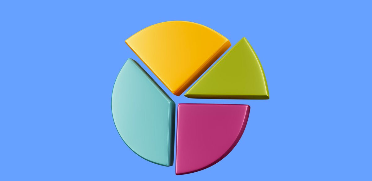
So, what’s the deal with pie charts? Imagine taking a pizza and slicing it up based on who ate how much—that’s your pie chart. It’s all about visual representation of parts to a whole. Each slice of the pie shows a piece of the data pie, and the size of that slice changes depending on how big or small the number it represents is.
Now, let’s get a little artsy. The design is key. You want each slice to stand out, make its point without throwing elbows. That means you need colors that pop but don’t overpower. You’re trying to make a point, not a Jackson Pollock.
When to Use Pie Charts
Pie chart vs bar chart—it’s not just about what’s more fun to say. It’s like choosing between sneakers and sandals; you gotta know when to wear ’em.
- Ideal scenarios for pie chart utilization: When you’re looking at a simple situation. Let’s say you’ve got a bunch of data points that add up to a single whole—like that pizza we mentioned. It’s your best bet when the numbers are few and easy, like a snapshot of how your day’s tasks break down.
- Advantages of using pie charts in data presentation: They’re the doughnuts of data depiction—easy to digest. With a quick glance, anyone can get the gist of what’s going on. No Ph.D. required. Snap a look, and you see which categories are hogging the limelight and which ones are just nibbling at the edges.
Here’s the rub: simplicity rules. The more you toss in, the messier it gets—like a data visualization blender without the lid. Keep it to a few slices, and pie charts can be your cherry on top.
Understanding Bar Charts
Chart created with wpDataTables
Let’s shift gears—enter the world of bar charts. Think of bar charts like the city skyline, where each building is a different size, telling its own story against the backdrop of the horizon. That’s how bar charts work; they stand tall, side by side, showing data as skyscrapers in an urban jungle of numbers.
You’ve got your horizontal vs. vertical orientation. Sometimes you lay the bars out flat like a red carpet; that’s when you’re looking at timelines or wanting that easy, left-to-right read. Other times they’re reaching for the stars, standing up tall. That’s classic, and perfect when you’re stacking up different categories, making it a cinch to measure one against the other.
When to Use Bar Charts
Chart created with wpDataTables
So, pie chart vs bar chart—how do we pick the champ? It’s like flip-flops versus boots. Context is everything.
Bar charts are all-stars when you need to compare things, like how many coffee cups you’re knocking back each day of the week. The differences jump out, no squinting required.
- Suitable scenarios for bar chart application: Consider breaking out the bars when your data is looking more like a guest list than a tight-knit crew. They’re data set heroes, especially when you got a stack of categories or the picture you’re painting spans over time.
- Benefits of choosing bar charts over other visualizations: They nail it with precision. Each bar is a ruler, measuring out the details so you can spot the highs and lows at a glance. It’s the difference between getting the gist and getting the details, the pixels over the big picture.
Now, don’t go thinking it’s all about number-crunching and serious biz. Slap some shades on these bars, and they’re just as snazzy as any pie chart slices. But, like any outfit, it’s all about dressing for the occasion. Got a complex story made of figures and trends stretched over time? Bar charts are your best buds.
Comparative Analysis of Pie Charts and Bar Charts
Let’s break it down: pie chart vs bar chart. They’re like the tortoise and the hare of data visualization—each has its own race to win, depending on the track.
Key Differences
Ever wondered why choose one over the other? Think of a pie chart as a party circle—everyone gets a slice, and at a glance, you see who’s hogging the most of the cake. Now imagine faces in the crowd as the slices. Easy to spot big differences, right? But start slicing too thin, and who can tell Aunt Sue from Uncle Bob?
Now swap to bar charts. It’s like lining up our partygoers by height against a wall—it’s crystal clear who towers over the crowd and who’s playing it cool down low. It’s all about precision and scale, where you can count the inches.
Visual comparison and the implications for data interpretation—that’s the crux. Pie charts are the go-to for a quick bite of who’s got what in the whole pie. Bar charts come off the bench when you want to show data changes over time, get into the weeds, and dig deep into those comparisons.
Pros and Cons
Every superhero has their kryptonite, right?
Advantages and limitations of pie charts: Pie charts are fab for a small guest list, I mean data categories. They dance well at the party when there’s plenty of punch for everyone, and the differences between them are obvious. But throw in a crowd, and suddenly it’s a blur of colors and lines.
Advantages and limitations of bar charts: Bar charts? Legends when you’re diving into the gritty details. They can handle the crowd, no sweat. But dress them up too fancy, cram in a ton of info, and they might just lose their charm.
Choosing Between Pie Charts and Bar Charts
Slide into this section like it’s decision time, and you’re all about that informed life.
Factors to Consider
Are you a whole picture kind of person, or do you crave the step-by-step? A pie chart wraps it up in a single tasty visual—think, like, Instagram perfect. Bar charts? They’re your detailed blog post, spelling it out one bar at a time.
Nature of the data (categorical vs. quantitative), who your audience is, and the story you want to tell with your data—it’s a choose-your-own-adventure kind of deal.
Scenarios Favoring Pie Charts
Keep it simple, keep it pie.
- Representing a simple part-to-whole relationship: Like divvying up that pizza at your squad hangout.
- When data categories are few and distinct: You could count ’em on one hand and still have a finger for scrolling.
Scenarios Favoring Bar Charts
Now let’s get down to business.
- Comparing quantities across different categories: Like tracking your screen time vs. your nap time.
- Visualizing changes over time or complex datasets: For when life’s a whole series and not just the trailer.
Choosing Between Pie Charts and Bar Charts
When it’s crunch time for presenting data, the spotlight swings to the chart. Pie or bar? It’s the silent question that echoes through the room—or at least in my head. But hey, let’s walk through this together.
Factors to Consider
Life’s full of choices—paper or plastic, cream or sugar, and in the land of data, pie chart vs bar chart. Here’s what to chew on:
- Nature of the data: Are we summing it up in one big happy family, or are we breaking things down, category by category? Pie charts prefer the whole gang in one place. Bar charts, on the other hand, are all about celebrating individuality.
- The story you want to tell with your data: Is it a snapshot story or a long-running series? Choose the chart that feels like the right narrator for your data’s tale.
Imagine your data’s like your weekend plans. Simplicity screams pie; complexity calls for bars. Let’s not mix up a chill brunch with an action-packed schedule, right?
Scenarios Favoring Pie Charts
Pie charts have their moment under the sun when:
- You want to show how a single slice of the day—say, meditation or work—fits into the 24-hour pie. It’s about seeing the whole, at a peaceful glance.
- It’s a small hangout, not a party. Fewer pieces mean each one gets the attention it deserves, no overwhelming the senses with a rainbow of slices.
Scenarios Favoring Bar Charts
Now, bar charts step up to bat when:
- You’re the type who likes to compare—maybe how much coffee you downed today versus yesterday. You like the details tall, bold, and unmistakable.
- Time’s in the mix. Want to show how your side hustle’s been growing month by month? Bar charts take you on that journey, step by progressive step.
Best Practices in Data Visualization
Let’s wrap our heads around the do’s and don’ts:
Enhancing Clarity and Comprehension
- Tips for making pie charts more interpretable: Like a minimalist tattoo, keep it simple and your message is clear. Colors? Think complementary, not competing in a color run.
- Strategies for maximizing the impact of bar charts: Keep them organized like your closet after a Marie Kondo visit—arranged and spaced just right.
Avoiding Common Pitfalls
- Slip-ups with pie charts: Too many slices and you’ve got a data mosaic rather than a chart. Remember, it’s pie, not confetti.
- Fumbling with bar charts: Piling on the data like you’re arm-loading at a buffet will just leave a mess. Keep the items on your plate—er, chart—to a gracious minimum.
So, what’ll it be? A pie chart’s embrace or a bar chart’s firm handshake? Let the data whisper its needs, and the story you’re burning to tell, guide you to that golden chart choice.
FAQ on Pie Charts vs Bar Charts
When should I use a pie chart instead of a bar chart?
Pie charts shine when you’re dishing up parts of a whole. You know, like showing your personal budget with slices for rent, food, and so on. It’s a snap to see which part eats up most of your cash. Stick to a few slices though; too many and it’s just a blur.
What makes bar charts a better choice in data visualization?
Bar charts are champs for the long haul. They line up your info like dominos—great for tracking progress over time or digging into nitty-gritty comparisons. When you’ve got more stats than a baseball card collection, bar charts keep things straight.
Can pie charts display multiple data series effectively?
Frankly, pie charts aren’t the best multi-taskers. Toss in too many series, and it’s like a TV with split screens—chaotic. One series, a clear focus, that’s the pie chart’s home turf. They’re the solo act, not a choir.
How do I decide how many slices my pie chart should have?
Keep it to a handful—think less than seven. Each slice should be a comfy size, easy on the eyes. More than that, and you’re squinting, trying to tell them apart. It’s about instant understanding.
Is it okay to use 3D effects in pie or bar charts?
3D’s flashy, sure, but it’s also the fog in your clarity. It can warp how you judge the size of slices or bars, like a funhouse mirror at the fair. Stay flat, stay true—2D’s how you keep it real and readable.
What’s the best way to label a pie chart?
Direct and to the point—label on or next to the slice, like pointing out folks in a group photo. Legends work, but they make eyes dart back and forth. Color code and keep those labels brief; it’s not storytime.
How can I represent negative values in a bar chart?
Bar charts have this cool trick—negative values can dip below the baseline, like roots under a tree. They show the ups and downs, literally. It’s visual honesty: gains rise, losses fall.
In bar charts, when should I use horizontal bars over vertical?
It’s like scrolling through a playlist. Horizontal’s the way when you’ve got long labels or a story unfolding over time. Vertical’s solid when you’re stacking categories or if it’s a numbers game—height becomes might.
Can I compare multiple datasets with bar charts?
Absolutely, it’s their party trick. Stack them side by side, make them duke it out, or cuddle up in a stacked bar—that’s when you see who’s kingpin across different datasets. It’s a head-to-head that clears the fog.
Are pie charts or bar charts better for presentations?
Depends on your jam. Presenting part-to-whole relationships? Slide in a pie chart. Got more details or comparing stuff? Flip to a bar chart. It’s about matching your data vibe with the chart that speaks it best.
Conclusion
And so, we wrap up our deep dive into the world where pie charts vs bar charts battle it out for the title of Supreme Data Showcaser.
When we talk pie, we envision that sweet, straightforward snapshot, a circle of understanding in a glance. It’s telling us about parts and wholes, like how your day divides into work, play, and the pursuit of the next coffee.
Flip the script to bars, where the story stretches longer, the details sharper. They’re about change, about comparisons laid out in a lineup where each has its place under the spotlight.
- Visual analytics crafted through careful selection between pie and bar charts boost the power of our data storytelling.
- By choosing wisely, we turn numbers into narratives that stick.
In the end, it’s about the tale you’re telling and the audience you’re sharing it with. Whether you gravitate to the elegant simplicity of pie or the detailed clarity of bar, it’s your data, your design—make it count.
If you liked this article about pie charts vs bar charts, you should check out this article about line charts vs candlesticks.
There are also similar articles discussing box plots, scatter plots, funnel charts, and pie charts vs donut charts.
And let’s not forget about articles on scatter charts, gauge charts, histograms, and how to choose the right chart for your data.


