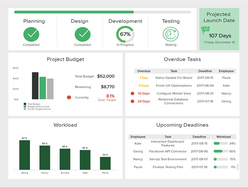
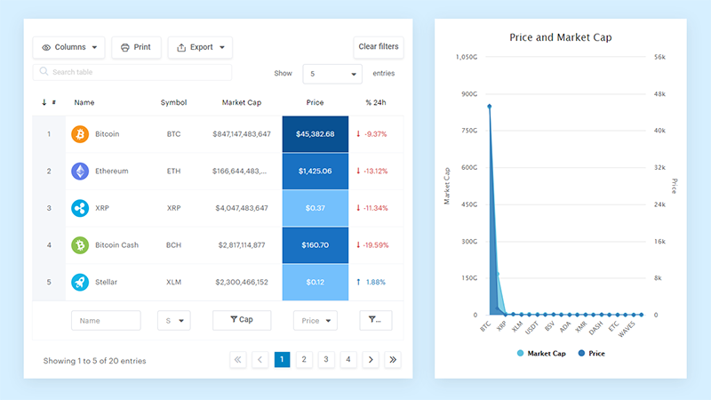
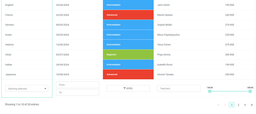
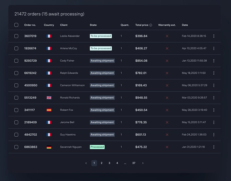
Real-time data visualization is like watching a high-speed train of data, but you’re the conductor, seeing everything in live action. It’s not just numbers and charts; it’s about bringing data to life.
Think about all the different places you see data. In businesses, real-time data visualization is like a superhero. It swoops in and shows what’s happening at that very second. It’s super useful in healthcare, finance, and heck, even sports! Imagine doctors tracking patient stats in real-time or businesses monitoring sales during a big promo. It’s all about making quick, smart decisions.
Decision-making? More like decision-nailing with real-time data visualization. It’s like having a crystal ball, but for data. You see trends, patterns, and whoopsies as they happen. No waiting around. You spot an issue, and bam, you’re on it like lightning!
Now, this is where it gets even cooler. Interactive dashboards and live data analytics are like playgrounds for your fingers. Swipe, tap, zoom – you’re exploring data like never before. It’s not just looking; it’s discovering stories hidden in the numbers.
Table of Contents
- Principles of Effective Data Visualization
- Design Considerations for Real-Time Dashboards
- Technologies and Tools for Real-Time Visualization
- Types of Visualizations for Real-Time Data
- Best Practices in Real-Time Data Visualization
Table of Contents
Principles of Effective Data Visualization
Alright, diving into how to make these data visuals pop and not flop.
Defining Clear Objectives
First up, know what you’re after. Each chart, graph, or flashy meter has a job.
Are you tracking sales, monitoring performance metrics, or checking out the latest social media trends? Your goal guides your design, simple as that.
Tailoring Visualizations to Audience Needs
Who’s checking out your visuals? Tech geniuses, busy CEOs, or maybe students? Your design needs to speak their language.
Simplicity for some, detail for others. It’s all about hitting that sweet spot.
Understanding the Purpose of Each Visualization
Each element on your dashboard is like a character in a story. Does it add to the narrative or just take up space?
Whether it’s a dynamic data display or a pie chart, it needs to tell part of your data story.
Choosing the Right Visualization Techniques
Picking the perfect chart or graph is like choosing the right outfit. It needs to fit and look good.
A bar chart for comparisons, a line graph for trends over time, or maybe a heatmap for spotting hotspots in your data.
Selecting Appropriate Chart Types
It’s not just about pretty pictures. The right chart type can make or break your visualization. It’s about clarity, my friend.
Importance of Simplicity and Clarity
Ever seen a chart that looks like a puzzle?
Yeah, let’s avoid that. Keep it clean, straightforward, and, most importantly, easy to understand.
Storytelling with Data
Contextualizing Data with Narrative
Every number has a backstory. It’s not just about what’s happening; it’s about the why.
That’s where your narrative skills come in.
Using Visuals to Enhance the Story
Your visuals are the supporting cast to your data’s lead role. They should highlight the key points, set the scene, and maybe add a bit of drama.
It’s about creating a visual journey that captures and holds attention.
Design Considerations for Real-Time Dashboards
Designing a real-time dashboard? It’s like setting up a high-tech command center.
You’ve got to think about who’s using it, what they need from it, and how to make it super snappy and responsive. Let’s break it down.
User Interaction and Performance

Okay, think big. Your dashboard might start small, but it could grow, like a lot. It needs to handle more data, more users, without turning into a slowpoke.
So, scalability is key. And responsiveness? Absolutely non-negotiable. Imagine clicking something and waiting… and waiting. Nope, not cool. Your dashboard needs to be quick, reacting in real-time, giving those live data analytics without missing a beat.
Common Mistakes in Dashboard Design
Avoiding Over-Complexity and Clutter
Keep it simple, clean. You don’t want users to feel like they’re solving a puzzle.
Each element, whether it’s a bar chart, line graph, or something fancy like an interactive heatmap, it should make sense, be easy to understand, and not make the user scratch their head in confusion.
Ensuring Data Accuracy and Relevance
Accuracy? Non-negotiable. Imagine making decisions based on wrong data. Yikes!
So, double-check, triple-check that data source. And relevance – oh boy, it’s crucial. Keep the data fresh, up-to-date. Nobody wants yesterday’s news.
Tools for Real-Time Visualization
No-Code/Low-Code Platforms
Tableau, Power BI, Looker Studio
These are the big guns in the world of data visualization. Think of them as the easy-peasy lemon squeezy way to create dashboards and charts. You don’t need to be a coding wizard.
Drag, drop, and voila – stunning visuals at your fingertips. wpDataTables, Tableau, Power BI, Looker Studio – they’re like the Avengers of real-time data visualization tools. Each has its own superpower, whether it’s user-friendliness, advanced analytics, or sleek design options.
Data Visualization Libraries
Python Libraries (Matplotlib, Seaborn, Bokeh)
Alright, for those who like to code, Python libraries are where it’s at. You’ve got Matplotlib for the basics, Seaborn for the fancy stuff, and Bokeh for when you want to get interactive.
It’s like choosing your flavor of ice cream – each one has its own taste and style but, in the end, they all make your data look delicious.
JavaScript Libraries (D3.js, Chart.js)
Now, if you’re more into web development, JavaScript libraries are your playground. D3.js is like the Swiss Army knife – super versatile but a bit complex. Chart.js? More like the friendly neighbor. Easy to get along with and does a darn good job of making nice-looking charts.
R Packages (ggplot2, Highcharter)
For the stats folks, R packages are the way to go. ggplot2 is the legend – it’s all about layers and customization. Highcharter adds a bit of pizzazz, especially if you’re into interactive and dynamic data displays.
Choosing the Right Tool for Your Needs
Considerations for Tool Selection
Choosing the right tool is like picking the right outfit for a party. What’s the occasion (project)? Who’s going to be there (audience)?
Integrating Tools with Data Sources
Last but not least, make sure your tool and data sources are BFFs. They need to talk to each other smoothly, with no drama.
Whether it’s live data feeds, databases, or even simple Excel sheets, seamless integration is key for that flawless real-time data visualization experience.
Types of Visualizations for Real-Time Data
Bar Charts, Line Graphs, and Scatter Plots
Bar Charts
Chart created with wpDataTables
Imagine you’re stacking blocks. That’s a bar chart for you. Simple, straightforward, and super effective for comparing things.
Like, how many pizzas did you sell today versus yesterday? Bam, bar chart it and see the difference in real-time.
Line Graphs
Chart created with wpDataTables
Now, picture a rollercoaster track. That’s your line graph. It’s perfect for showing trends over time. Like, how’s your website traffic moving throughout the day?
A line graph makes it easy to spot those ups and downs as they happen.
Scatter Plots
Chart created with wpDataTables
Think of a starry night sky. Each star is a data point. That’s your scatter plot. Great for showing relationships between two things.
Maybe you’re checking how temperature affects ice cream sales. Scatter plot those points and see the pattern in real-time.
Advanced Visualizations
Heatmaps and Interactive Elements
See the Pen
Heat Map by Nayakv46 (@Nayakv46)
on CodePen.
Heatmaps are like thermal images – showing you the hotspots. Where are people clicking on your site? Light it up with a heatmap. To do so, you can use Python libraries. You can even use Python Screenshot APIs to streamline the process of capturing and integrating visual elements into your heatmap analysis, providing a comprehensive view of your data.
Add some interactive elements, and you’ve got a dashboard that’s not just informative but also engaging. It’s like giving your users a joystick to explore the data.
Real-Time Updates and Animations
Picture a live sports scoreboard, constantly updating. That’s the vibe with real-time updates and animations in real-time data visualization.
It keeps your data fresh and alive, like it’s got a heartbeat. Every second counts, and every update changes the game.
Your beautiful data deserves to be online
wpDataTables can make it that way. There’s a good reason why it’s the #1 WordPress plugin for creating responsive tables and charts.

And it’s really easy to do something like this:
- You provide the table data
- Configure and customize it
- Publish it in a post or page
And it’s not just pretty, but also practical. You can make large tables with up to millions of rows, or you can use advanced filters and search, or you can go wild and make it editable.
And there’s also the cool feature of creating tables in WordPress from nested JSON data with/without JSON authentication.
“Yeah, but I just like Excel too much and there’s nothing like that on websites”. Yeah, there is. You can use conditional formatting like in Excel or Google Sheets.
Did I tell you you can create charts too with your data? And that’s only a small part. There are lots of other features for you.
Best Practices in Real-Time Data Visualization
Ensuring Data Quality and Integrity
Cleaning and Preprocessing Data
First things first, your data needs a good scrub. Like washing veggies before cooking. Get rid of the dirt (useless info) and chop it up nice and neat (organize it).
Clean data means your visualizations will not only look good but also make sense.
Using Up-to-Date and Relevant Data
Stale data in real-time visualization? Big no-no. You want the freshest of the fresh. Like sushi-grade fresh.
Keep your data updated. It’s the difference between showing yesterday’s weather and today’s – one’s useful, the other, not so much.
Accessibility and Inclusivity
Designing for Diverse Audiences
Your visuals aren’t just for data geeks. They’re for everyone – the boss, the intern, the random guy who stumbled into the meeting.
Make it so everyone gets it. Simple, clear, no jargon. Think of it as explaining your favorite movie to someone who’s never seen it.
Considering Color Choices and Legibility
Ever seen a color combo that made your eyes scream? Let’s avoid that. Use colors that are easy on the eyes and make sense.
Red for danger, green for good – you get the drift. And make sure everyone can read it, even your color-blind cousin.
Iterative Design and User Feedback
Continuous Improvement Based on Feedback
Launch, listen, tweak, repeat. It’s like a video game – you want to keep leveling up. Get feedback, make changes, and keep making your dashboard better. After all, the first pancake is never the best, right?
Testing and Refining Visualizations
Test it like a NASA launch. Check every button, every graph, every tiny detail.
Make sure it’s not just pretty but also practical and accurate. It’s like proofreading your text before hitting send – saves you from embarrassing typos.
FAQ on Real-Time Data Visualization
What is Real-Time Data Visualization?
Real-time data visualization is like a live concert of your data. It’s about seeing your data perform in the moment, no delays.
Imagine watching stock prices fluctuate or website traffic surge, right as it happens. It turns numbers into a dynamic, visual story, helping you make quick, informed decisions.
Why is Real-Time Data Visualization Important?
It’s crucial because it’s all about now. In a world where things change in a blink, being up-to-date is key.
Think business decisions during a sale or monitoring social media trends. It’s not just nice to have; it’s a must-have for staying relevant and responsive.
What Tools are Used for Real-Time Data Visualization?
Tools like wpDataTables, Tableau, Power BI, and Looker Studio are big players. They’re like the Swiss Army knives of data visualization, easy to use with powerful features.
For the coders, Python libraries like Matplotlib and JavaScript libraries like D3.js offer more customizability. It’s all about choosing the right tool for your needs.
How Does Real-Time Data Visualization Aid Decision-Making?
It’s a game-changer for decision-making. Imagine having a crystal ball that shows what’s happening now, not yesterday.
It allows businesses to react swiftly, adjust strategies on the fly, and resolve issues before they become problems. It’s like having a superpower for decision-making.
What are Common Challenges in Real-Time Data Visualization?
Keeping it real-time is tricky. Data needs to be fresh, accurate, and processed quickly.
Plus, designing dashboards that are both informative and easy to understand can be a fine art. It’s balancing the need for speed and clarity, all while ensuring data integrity.
How Do You Ensure Data Accuracy in Real-Time Visualizations?
Data accuracy is non-negotiable. It starts with clean, well-structured data sources. Regular checks and updates are crucial.
It’s like being a data detective, always on the lookout for errors or anomalies to keep your data truthful and trustworthy.
What Makes a Good Real-Time Data Visualization Dashboard?
A stellar dashboard is clear, intuitive, and informative. It’s about presenting data in a way that’s easy to digest at a glance.
Think minimal clutter, meaningful visuals like interactive elements, and ensuring it’s tailored to the audience’s needs. It’s the art of making complex data look simple.
How Can Real-Time Data Visualization Be Made More Accessible?
To make it accessible, think about color choices, legibility, and simplicity. It should speak to everyone, not just data experts.
Incorporate features for those with disabilities, like color-blind friendly palettes. It’s about inclusivity, making sure everyone can join the data party.
What Are the Future Trends in Real-Time Data Visualization?
The future’s all about more interactivity, AI integration, and maybe even VR/AR experiences.
Imagine diving into your data in a virtual world or having AI predict trends on the fly. It’s heading towards more immersive, intelligent, and interactive experiences.
How Do You Keep Up with Rapidly Changing Data in Real-Time Visualization?
Staying on top of rapid changes requires a robust backend and smooth data integration.
Think of it as a high-speed data highway; it needs to be fast and free of roadblocks. Regular updates and scalable technologies are key to keeping your visualizations accurate and timely.
Conclusion
From interactive dashboards to dynamic data displays, the tools and technologies we’ve explored are reshaping how we interact with data.
Whether it’s in business, healthcare, or any field drowning in numbers, these real-time insights are like a lighthouse in a sea of information.
They cut through the noise, highlight what’s important, and help navigate the complex world of data with ease.
If you liked this article about real-time data visualization, you should check out this article about categorical data examples.
There are also similar articles discussing nominal vs ordinal data, discrete vs continuous data examples, descriptive statistics, and different types of data.
And let’s not forget about articles on how to present data visually, primary data vs secondary data, advantages of secondary data, and data visualization principles.


