wpDataTables sits at the top of this list for one reason: it builds its charts from live database queries instead of a spreadsheet someone re-uploads by hand every time a number changes.
These plugins take data sitting in a spreadsheet, a CSV file, or a database, and turn it into an interactive chart that actually renders on the page rather than sitting there as a flat picture.
Anyone running a WooCommerce catalog, an internal reporting dashboard, or a research-heavy blog tends to reach for one of these rather than writing a charting library from scratch by hand, which is doable, but rarely worth the hours.
wpDataTables carries over 70,000 active installations and a 4.5-star average across roughly 450 WordPress.org reviews, based on the plugin’s current WordPress.org listing (August 2026).
Table of Contents
The Best WordPress Charts Plugins, Ranked
wpDataTables takes the top spot because it treats charts as something that comes out of a real data table engine, not a separate widget bolted on afterward. Everything below it is ordered by overall strength rather than split into price tiers or use-case buckets, since that’s closer to what someone typing “best WordPress charts plugins” into Google actually wants.
| Plugin | Rendering engine | Best for |
|---|---|---|
| wpDataTables | Chart.js, Google Charts, HighCharts, ApexCharts | Large or database-driven datasets |
| Visualizer | Google Charts, Chart.js (HTML5/SVG) | Fast, AI-assisted chart building |
| TablePress | None built-in (table only) | Free, no-frills data tables |
| Ninja Tables | None built-in (table only) | Lightweight drag-and-drop tables |
| Graphina | ApexCharts | Elementor dashboards |
wpDataTables – Best for large, database-driven datasets
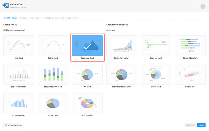
wpDataTables is a tables-and-charts manager built for sites pulling data from MySQL, Excel, CSV, JSON, or a live API. Once a dataset gets big or updates often, this tends to be the tool that holds up, instead of a static list someone typed once and forgot about.
It’s aimed at agencies and data-heavy sites managing WooCommerce catalogs, reports, or anything database-driven, and the standout part is that charts get built directly from MySQL queries, external databases, or Google Sheets. Filter the table and the chart tied to it redraws on its own, no extra step required.
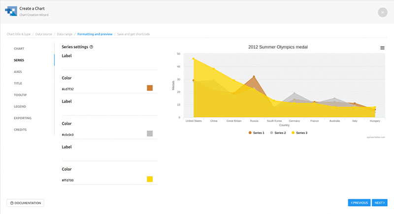
A few things worth knowing about what’s included:
- Unlimited tables and charts on the Starter tier
- Rendering through Chart.js, Google Charts, and, on higher tiers, HighCharts
- Server-side processing for large row counts
- Front-end editing and Excel-like back-end editing on Standard tier and above
There’s a free Lite version on WordPress.org. Paid tiers, Starter, Standard, Pro, and Developer, run as annual or lifetime licenses, and the vendor backs them with a 15-day money-back guarantee confirmed on its own pricing page.
Exact single-site pricing shifts a fair bit depending on which promo is running, so treat any number here as a snapshot rather than gospel. Recent third-party pricing roundups put the entry-level annual plan somewhere around $59 to $99, with lifetime licenses starting near $199. Worth checking the live pricing page directly, since wpDataTables runs frequent limited-time discounts.
On the plus side:
- Handles genuinely large datasets without the front end slowing down
- Charts inherit table filters automatically, so one dataset drives both views
- Four separate charting engines to choose from instead of one fixed style
The free Lite version is capped at simple, linked tables, so anything database-driven or query-built needs a paid tier. And if you’ve never built a filtered or query-based table before, there’s a real learning curve here. Not brutal, but not a five-minute setup either.
Worth repeating: wpDataTables carries over 70,000 active installations and a 4.5-star average across roughly 450 WordPress.org reviews, per the plugin’s current WordPress.org listing (August 2026). One buyer running internal reporting dashboards mentioned staff being able to filter and export live views without touching the database directly, which tracks with what the server-side processing feature is actually built for (wpDataTables customer review, 2026).
Most roundups treat wpDataTables as just another table plugin that happens to have chart options bolted on. That undersells it. The charts aren’t a separate module sitting on top of a table, they read live from the same query, so a chart tied to a MySQL query updates the moment the underlying data changes, without anyone touching the chart settings again.
And here are some of the unique charts you can create with it (Google Charts examples below)
Google Column Chart
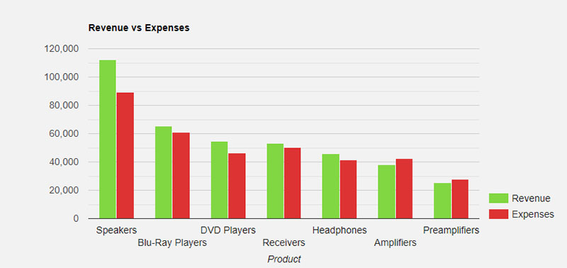
A column chart is a basic chart where series are rendered in simple vertical columns.
Google Histogram Chart
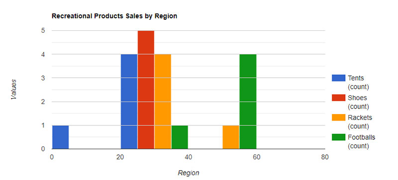
As Google explains: A histogram is a chart that groups numeric data into bins and displays the bins as segmented columns. They’re used to depict the distribution of a dataset: i.e., how often values fall into ranges.
Google Area Chart
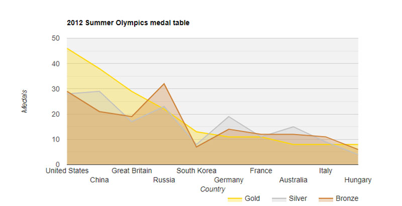
An area chart is similar to a Line chart, but the area below a series line is colored.
Google Pie Chart
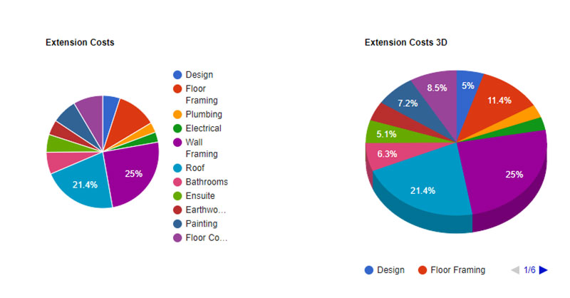
The Pie Chart renders the data in a “sliced pie” format, where each slice stands for one series entry(left pie chart).If you turn on option 3D, your pie chart will be drawn as though it has three dimensions (right pie chart).
Google Stacked Bar Chart
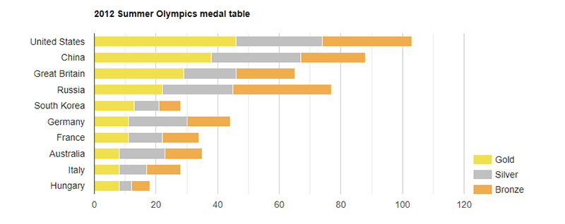
This chart type is similar to a basic bar chart, but the series values are “stacked” to the right of each other in the horizontal bars.
Google Bar Chart
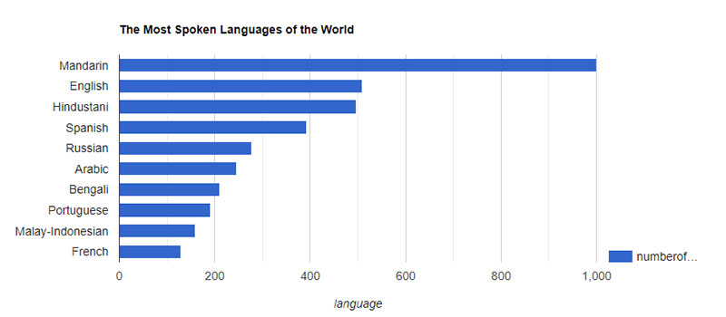
And lots more. You can check them out on our Google Charts examples page.
If that didn’t convince you to try wpDataTables, you can check out the other WordPress chart plugins from this article.
Visualizer – Best for fast, AI-assisted chart building
Visualizer, from Themeisle, is the pick for anyone who wants a chart live in minutes rather than learning a query builder first. It’s built around manual entry, CSV import, or, and this is the interesting part, a built-in AI generator that turns a plain-language prompt into a finished chart.
Bloggers, educators, and small businesses wanting something done in one sitting are the target user here. The free AI chart builder is the standout, no API key required, no extra setup.
What you get out of the box:
- Line, pie, bar, and table charts in the free version, with scatter, area, and geo charts unlocked in Pro
- Rendering through Google Charts and Chart.js on pure HTML5/SVG, so no extra libraries are needed
- Manual entry, CSV import, or Google Sheets as data sources
- Prompt-based AI chart generation, free at activation
The core plugin is free on WordPress.org. Pro comes in three annual tiers, Personal, Plus, and Infinite, listed at $99, $199, and $399 per year on Themeisle’s own pricing page (confirmed current as of August 2026), backed by a 30-day money-back guarantee.
The AI builder genuinely cuts out the manual setup step for a first chart, which sounds small until you’ve actually sat there configuring axis labels by hand. The free version already covers the four chart types most posts need. And the output is clean HTML5/SVG with no jQuery dependency dragging things down.
The free tier caps out at those same four chart types, line, pie, bar, table, so anything beyond that needs Pro. It’s also not built to connect to a live database the way a dedicated table plugin is, which matters if that’s actually the job.
Themeisle’s own current listing puts Visualizer at over 20,000 active installations and a 4.4-star rating based on 225+ WordPress.org reviews (Themeisle, August 2026).
The AI generator deserves more than a footnote mention. Most “AI chart” features in this category sit behind a paywall or need an external API key typed in somewhere. This one ships free and works the moment the plugin activates, which most competing roundups skip right over.
TablePress – Best for free, no-frills data tables
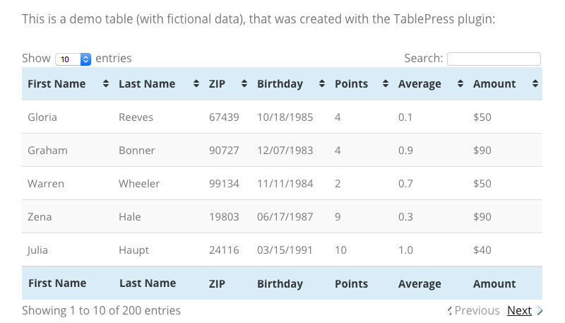
TablePress doesn’t generate charts on its own. Worth saying upfront, because it only makes sense to reach for this one if the actual goal is a clean table rather than a visual.
It’s a free, open-source plugin for building Excel-like data tables in WordPress, with sorting, searching, and pagination handled automatically on the front end.
Budget-conscious site owners who need a table and nothing more tend to land here. The appeal is that it costs nothing and still gives you a fully functional, searchable, sortable table without an upsell screen getting in the way.
- Spreadsheet-style back-end editor, closer to a WordPress Excel spreadsheet plugin than a chart tool
- Automatic sorting, searching, and pagination via the DataTables JavaScript library
- Import from CSV, Excel, HTML, and JSON
- Shortcode-based embedding in any post or page
Completely free at its core. A separate TablePress Pro extension exists for extended import and export options plus design tweaks, sold outside the free WordPress.org listing.
There’s no cost barrier for the core feature set, it’s the oldest and most battle-tested plugin in this category, and updates come frequently with a large support community behind it. The catch is no native charting, so turning a TablePress table into a chart means bringing in a separate plugin or doing it by hand. A few reviewers have also flagged more aggressive upselling toward the paid tier in recent versions, along with complaints about features that used to be free.
TablePress carries more than 700,000 active installations, by far the highest adoption number in this category (Patchstack, 2025, citing WordPress.org; figure still current as of August 2026).
Most “best charts plugin” lists don’t say plainly that TablePress isn’t a charts plugin at all. It earns its spot anyway, because so many sites pair it with a separate charting tool for the visual layer while keeping TablePress for the raw data underneath. Leaving it off would miss how a lot of real WordPress data setups actually get built.
Ninja Tables – Best for lightweight, drag-and-drop tables
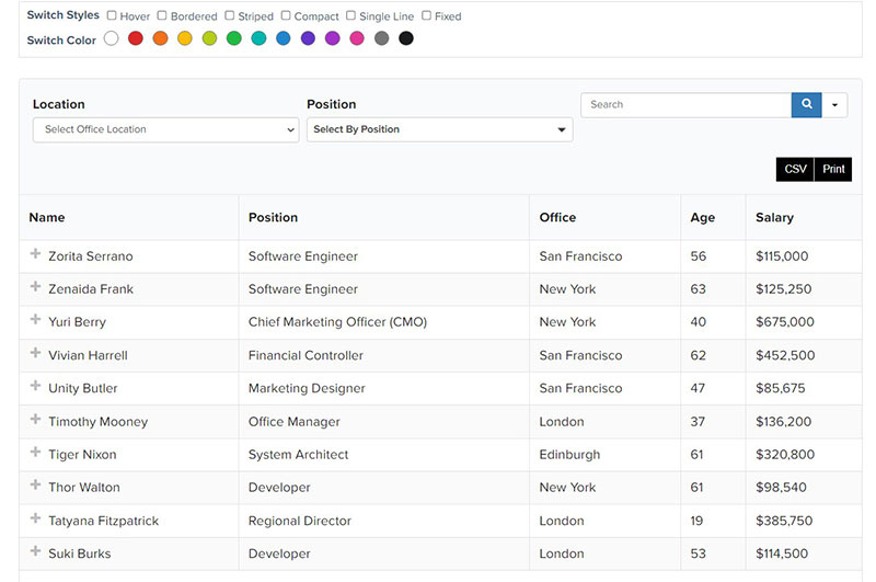
Speed is the whole pitch with Ninja Tables.
It’s a drag-and-drop table builder aimed at fast setup and fast page loads. Charts aren’t really the focus here, this one earns its place through structured tables that pair well with a separate charting tool when a chart is actually needed.
WooCommerce stores and comparison sites that need fast-loading, structured tables are the natural fit. The standout is a front-end footprint that’s noticeably lighter than some of the heavier table-and-chart suites.
- Drag-and-drop column and row builder
- Merge cells and conditional formatting on Pro
- WooCommerce product table support for stores that need sortable, filterable catalogs
- Import from CSV, Excel, and Google Sheets
The core plugin is free on WordPress.org. Paid tiers unlock WooCommerce integration and advanced filtering, sold directly through the developer’s site.
Setup is fast and genuinely visual, the WooCommerce product table support is strong, and page-load impact stays noticeably lighter than some competitors. On the downside, like TablePress, there’s no built-in charting engine, and advanced filtering plus the WooCommerce features sit behind the paid tier.
Ninja Tables shows around 80,000 active installations and a 4.6-star rating, consistent across both WordPress.org’s own listing and third-party trackers (AutomagicWP, 2026).
Load time is the detail most reviews skip over. Heavier table-and-chart suites can add real weight to a page, especially with large datasets, and Ninja Tables was built with that specific complaint in mind. It’s why sites juggling a lot of product tables on one page tend to reach for it over something heavier.
Graphina – Best for Elementor dashboards built on ApexCharts
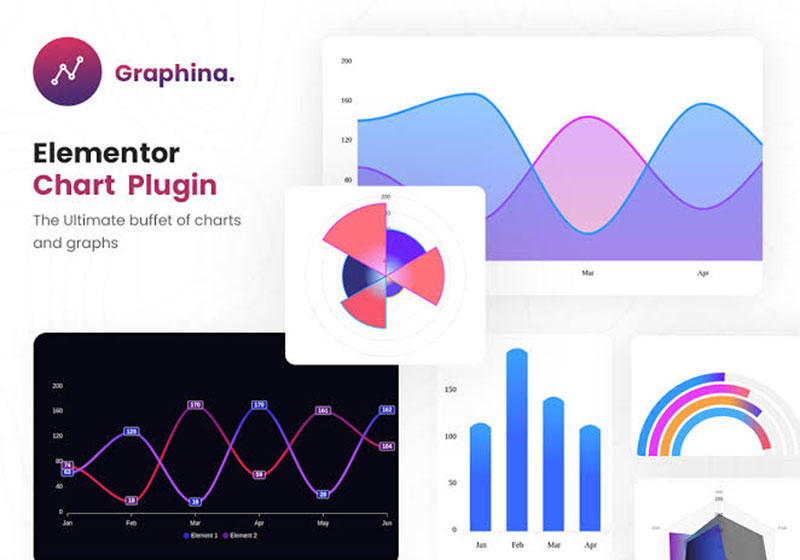
Graphina only works if Elementor is already part of the stack. That’s the tradeoff to know before anything else.
It’s an Elementor-only charting addon built on the ApexCharts library, with 14 or more chart types and over 1,000 style variations. For Elementor users who want dashboard-style charts configured entirely inside the page builder, no shortcodes involved, it’s a solid fit.
Elementor sites wanting visually rich, dynamic charts without leaving the builder are the target. The standout capability is configuring every chart element, colors, fonts, grid, legend position, right inside Elementor’s own interface.
- 14+ chart types built on ApexCharts, including line, column, nested column, and area charts
- AJAX data loading so charts don’t slow down page speed
- Pro version adds dynamic data from Google Sheets, CSV, and APIs
- Five dedicated Elementor widgets in the Pro version
There’s a free version on WordPress.org, though it requires Elementor to run. GraphinaPro is sold separately with a 60-day money-back guarantee, though a fixed public price wasn’t listed on the vendor’s current pages.
- Deep chart-type variety for an Elementor-native tool
- Fully visual configuration, no code or shortcodes needed
- Responsive by default across breakpoints
The hard dependency on Elementor means it’s not usable at all without that page builder active. Some long-time users have also reported specific chart types, simple pie charts especially, breaking after certain plugin updates.
Graphina’s own WordPress.org listing claims 14+ chart types with more than 1,000 total variations, built on the ApexCharts engine (Graphina, 2026).
The trade-off worth naming plainly is the Elementor lock-in. Every other plugin on this list can run on a stock WordPress editor or Gutenberg. Graphina can’t, which makes it the strongest option for an existing Elementor build and a non-starter for anyone without one.
Data Tables Generator by Supsystic – Best for a combined tables-with-charts workflow

Data Tables Generator builds interactive tables with charts and graphs pulled straight from the same table data, plus export to PDF, CSV, Excel, and print. It suits teams who’d rather keep one plugin handling both the raw table and its visual summary instead of stitching two tools together.
Teams that need a table and its chart summary staying in sync from one data entry point are the right audience. The standout part is generating charts directly from existing table data rather than treating tables and charts as two separate objects to maintain.
- Charts and graphs pulled straight from table data
- Table pagination, sorting, and searching on the free tier
- Export to PDF, CSV, Excel, print, and copy
- A newer WooCommerce Product Table type, added mid-2026
Free on WordPress.org. Premium plans are sold through Supsystic’s own site, and no fixed public figure was listed at the time of writing.
- Table and chart stay linked to one dataset by default
- Broad export options out of the box, even on free
- Actively maintained, with recent updates targeting WordPress 7.0 compatibility
Collapsible rows and front-end editing sit behind the Pro tier, and chart styling options run noticeably shallower than a dedicated charting plugin like Visualizer or Graphina.
The plugin holds more than 20,000 active installations and a 4.7-out-of-5 rating across roughly 494 reviews (BrandWell, 2025, citing WordPress.org; figures still consistent with the plugin’s current WordPress.org listing).
A detail competing lists rarely mention: the plugin’s recent MCP integration lets AI assistants like Claude or ChatGPT query table data directly, average of column B, rows below a threshold, that sort of thing, instead of someone reading the table by hand.
amCharts – Best for embedding pre-built charts and maps via shortcode
amCharts: Charts and Maps is a free plugin that embeds charts and interactive maps designed in amCharts’ separate Live Editor, dropped in through a simple shortcode. It suits anyone chasing that polished, animated amCharts look without building each chart from inside WordPress itself.
Sites wanting pre-designed charts or interactive maps without a WordPress-native chart builder fit best here. What stands out is full access to the amCharts library, one of the more established JavaScript chart libraries on the web, without writing a single line of code.
- Chart and map creation happens in the separate amCharts Live Editor, then gets pasted in as a URL or shortcode
- TinyMCE editor button for quick insertion
- Choice of CDN-hosted or locally stored chart libraries
- Support for both interactive charts and geographic maps
The plugin itself is entirely free. It loads the amCharts JavaScript library from a free CDN, and the only condition is a small attribution credit shown on generated charts (amCharts, 2026).
Access to a genuinely mature charting library at no cost is the big win, and it’s a good fit for maps specifically, something most WordPress chart plugins on this list don’t handle at all. It’s developed and maintained directly by the amCharts team too. On the other side, chart design happens outside WordPress in that separate Live Editor, which adds a workflow step the others here skip, and active installations run modest next to category leaders, with comparatively light support activity in the WordPress.org forums.
The plugin is developed directly by amCharts staff rather than a third party, and its shortcode approach, [amcharts id="chart-1"], has stayed stable across major library version jumps (amCharts documentation, 2026).
Mapping is the angle other roundups underweight. Almost every other plugin here is chart-only. amCharts is one of the few free options that also handles interactive geographic maps, which matters for anything with a location or regional-data component.
WP Charts and Graphs – Best for a single, no-frills chart
One job, done simply. That’s WP Charts and Graphs in a sentence: type in titles and values, pick a chart type, get a shortcode.
It’s the right pick when a page needs exactly one simple chart and nothing more elaborate than that.
Small sites or single posts needing one quick chart, not a full data-visualization system, are the target. The live preview directly in wp-admin before anything gets published is the nice touch here.
- Pie, polar, doughnut, radar, bar, and line chart types
- Built-in chart generator with live preview in the admin dashboard
- Unlimited charts, even on the free tier
- Responsive output sized to its container element
Free on WordPress.org. An upgraded version runs a one-time $44 (GravityKit, 2024; price unchanged as of current checks).
- About as fast as chart creation gets in WordPress: type values, generate, paste shortcode
- Live preview removes the guesswork before publishing
- Six chart types cover most simple use cases
There are no data-source integrations at all, every value gets typed in by hand, which doesn’t scale past a handful of charts. Some users note the default font sizing and legend spacing need manual CSS tweaks before it looks properly polished.
The plugin holds a 4.8-star rating, though active installations sit in the low thousands, a small footprint next to category leaders (WordPress.org, 2025).
Its narrowness is actually the selling point most lists frame as a weakness. For a single chart on a single page, spinning up a full table-and-chart manager is overkill. This plugin exists specifically for that smaller job and skips the setup overhead of the bigger tools higher up this list.
Charts by The Plus Addons for Elementor – Best for Elementor users

Charts by The Plus Addons isn’t really a dedicated charting plugin. It’s one widget inside a much larger Elementor addon pack of 120-plus widgets, and that framing matters for whether it’s the right pick.
It fits best when the goal isn’t a standalone charts plugin at all, but a single addon suite that happens to include solid charting alongside everything else, layout, forms, content widgets, the works.
- Flexible charting tools positioned by the vendor as its strongest widget for data display
- Native Elementor drag-and-drop configuration
- Part of a broader suite covering layout, forms, and content widgets, not charts alone
- Regular monthly feature updates, including recent MCP integration across widgets
Charting comes bundled inside The Plus Addons for Elementor’s paid tiers rather than sold as a standalone charting product.
One plugin covering charts plus dozens of other Elementor needs is convenient, the update cadence is frequent (WordPress 7.0 compatibility shipped quickly after release), and there’s no separate license to manage just for charting. That said, charts aren’t the plugin’s core focus, so dedicated tools like Graphina or Visualizer go deeper on chart-specific options, and installing a 120-widget suite just for its charting widget is heavier than necessary if charts are all you actually need.
The vendor itself frames the charting widget as its standout pick within the suite, worth treating as a vendor position rather than independent verification (The Plus Addons, 2026).
The trade-off worth spelling out is bundling versus specialization. A site already committed to The Plus Addons for its layout widgets gets charting for free, functionally speaking. A site that only needs charts is better served by a dedicated plugin further up this list.
Chart by Nexter – Best for Gutenberg-only workflows
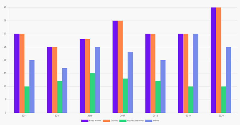
Chart by Nexter builds advanced, customizable charts and graphs directly inside the Gutenberg block editor, no page builder or extra tool required.
It’s aimed at sites that deliberately skip Elementor or similar builders and want native block-editor charting instead.
- Advanced, customizable chart designs built as a native Gutenberg block
- Part of the Nexter Blocks suite of 90-plus Gutenberg blocks
- No extra tools or separate builder needed to configure a chart
- Regular monthly updates alongside the wider Nexter ecosystem
Charting is bundled inside the Nexter Blocks and Nexter Extension plans rather than priced as a standalone chart plugin.
The true Gutenberg-native workflow means no page builder dependency and no conflict risk with a separate page builder plugin, and it sits inside a broader, actively maintained block suite. Elementor or Divi users don’t gain anything extra by choosing this over a page-builder-native option like Graphina though, and since it’s part of a bundled suite, standalone chart-specific pricing and feature depth are harder to judge on their own.
Nexter’s own May 2026 changelog reports 84 new WP Abilities shipped across its Extension and Blocks suite, alongside WordPress 7.0 compatibility, which points to active, ongoing development rather than a stalled add-on (Nexter, 2026).
Most charts-plugin roundups quietly assume Elementor as the default page builder. Chart by Nexter is a reminder that Gutenberg-only sites, an increasingly common setup since full-site editing matured, have a native charting option too, rather than being forced into installing a page builder just to get a chart widget.
What Is a WordPress Charts Plugin?
Turning raw numbers into a bar, line, or pie chart without writing chart code by hand, that’s the whole job a WordPress charts plugin does. It reads data from wherever it lives, typed in manually, imported, or pulled live, and renders it as a chart on the front end.
A few things tend to get replaced once a plugin like this is in place.
- Static chart images exported from Excel and re-uploaded every time the numbers change
- Hand-coded HTML and CSS tables styled from scratch
- Separate infographic tools disconnected from the site’s actual data
WordPress runs 40.7% of all websites on the internet as of August 2026 (W3Techs, 2026), which is the kind of scale that makes a dedicated charts plugin worth the setup time instead of a one-off image export.
The category sits inside the wider field of WordPress data visualization, alongside table plugins, dashboard widgets, and reporting tools.
Charts Plugin vs Table Plugin: What’s the Difference?
A table plugin’s job stops at showing rows and columns, sortable and searchable, without generating any visual summary on its own. Charts go a step further and turn that same data into something like a bar or line graph.
Some tools only do one of these two jobs. Others, wpDataTables and Data Tables Generator by Supsystic among them, do both from a single dataset.
- A plain table plugin gives rows and columns, sortable and searchable, with no visual summary generated automatically.
- A charts plugin builds a single visual, bar, line, or pie, from a dataset, usually with no underlying table shown at all.
- A combined tool feeds both a table and a chart from one dataset, and the chart updates automatically the moment the table gets filtered.
That last category matters more than most comparisons let on. Table-to-chart linking means a visitor filtering a table by region or date sees the attached chart redraw itself, with no separate chart to maintain on the back end.
This is also what separates a narrow charting tool from the wider category of WordPress table plugins, several of which added charting as a secondary feature rather than a starting point.
What to Look For in a WordPress Charts Plugin
Pricing isn’t actually the first thing that decides whether a plugin fits a site. Chart type range, customization depth, front-end interactivity, and how flexible the data sourcing is, those come first.
- Chart type range covering pie, bar, line, area, donut, scatter, and gauge charts handles most needs, though several free tiers cap out at four basic types.
- Customization depth, colors, fonts, legend placement, axis labels, responsive breakpoints, decides whether the chart matches the site’s design or looks bolted on.
- Front-end interactivity like sorting, filtering, search, pagination, and export to PDF or CSV matters for anyone consuming the data, not just glancing at it.
- Data source flexibility, manual entry versus CSV, Google Sheets, or a live database connection, determines how much manual upkeep the chart needs later.
Reviewing the full range of types of charts a plugin supports before installing avoids a common trap: picking a tool, building a dashboard, then finding out the one chart type the project actually needs sits behind a paywall.
The same goes for layout. A plugin marketed as flexible but weak on responsive tables and charts shows that weakness fast, usually the first time someone opens the page on a phone.
Chart.js vs Google Charts vs Highcharts vs ApexCharts: Which Rendering Engine Powers the Chart
The plugin is just the interface. Whatever’s actually drawing the chart underneath is a separate rendering library, and that choice affects licensing cost as much as visual style.
A handful of libraries power most WordPress charts plugins, and licensing is where they really start to differ.
| Library | License | Typical style | Used by |
|---|---|---|---|
| Chart.js | Free, MIT | Clean, canvas-based, minimal animation | wpDataTables, Visualizer |
| Google Charts | Free | HTML5/SVG, wide browser support | Visualizer, wpDataTables |
| Highcharts | Commercial for business use | Polished, animation-heavy, enterprise dashboards | wpDataTables (Standard tier+) |
| ApexCharts | Free, MIT | Modern gradients, smooth transitions | Graphina, wpDataTables (Standard tier+) |
Chart.js is the most widely installed dedicated JavaScript charting library, at roughly 54 million npm downloads a month (ApexCharts, 2026). That kind of scale explains why it shows up as the default engine across so many free-tier WordPress chart plugins.
Highcharts sits at the other end of the cost spectrum. Commercial licenses through an authorized reseller start around $416.50 per developer (ComponentSource, 2026), which is a big part of why it typically shows up only on a plugin’s paid tiers rather than the free version.
Google Charts and ApexCharts stay free regardless of commercial use, which is why they’re common on entry-level plans even when a plugin also offers Highcharts as an upgrade.
How Do These Plugins Get Their Data?
Where the data comes from tends to track pretty closely with how much setup effort a chart takes. Typing values in by hand is fastest. A live database connection takes the most work to configure but needs the least babysitting afterward.
Manual entry means typing values directly into an admin screen, the fastest option when it’s just one small chart.
CSV and Excel import covers a one-time or repeatable upload, and it’s the baseline nearly every plugin in this category supports, including a straightforward path for JSON data rendered as an HTML table when a CSV isn’t available.
Google Sheets sync sets up a live or scheduled connection, useful when a spreadsheet already exists as the source of truth. There’s more detail on this when working out how to visualize Google Sheets data directly inside WordPress.
MySQL, external databases, and APIs make up the advanced tier, where a chart reads live from a query instead of a static file, the same approach covered when learning how to fetch data from a database in a WordPress page.
Live syncing has a ceiling worth knowing about before building a whole workflow around it. Google’s own developer documentation caps the Sheets API at 300 read requests per minute per project, and requests past that return a 429 error (Google for Developers, 2026).
That limit rarely matters for a single chart refreshing now and then. It matters a lot more for a dashboard pulling from many sheets on every page load, which is why heavier data sources tend to move toward a cached database connection instead of a live spreadsheet sync once traffic grows.
FAQ on WordPress Charts Plugins
Do WordPress charts plugins require coding?
Most WordPress charts plugins need no coding at all. Chart type, data source, and styling all get configured through a visual editor or a shortcode. Custom behavior, conditional formatting on a formula column, say, occasionally needs a short CSS snippet, but that’s the exception, not the rule.
Do charts update automatically when the source data changes?
It depends on where the data comes from. A chart built from a live database query or a synced Google Sheet refreshes once the cached data updates. A chart built from typed values or a one-time CSV import just sits there until someone re-imports it.
Is wpDataTables really better than Visualizer or TablePress?
Depends what the job actually is. wpDataTables wins for database-driven datasets and WooCommerce catalogs. Visualizer wins when the goal is a fast, AI-assisted single chart. TablePress wins when what’s needed is a free table with no charting at all.
Is a dedicated plugin necessary, or can you hand-code a chart?
Not strictly necessary, no. A developer can enqueue Chart.js or Google Charts manually and write the configuration by hand. Most site owners skip that route anyway, since a plugin handles data import, responsive sizing, and updates without anyone touching code.
Are WordPress charts plugins accessible and mobile-responsive?
Most modern ones render responsively, resizing to fit their container on smaller screens. Accessibility is more of a mixed bag. Some plugins add ARIA labels and keyboard navigation for tables, but screen reader support for the charts themselves stays inconsistent across the category.
Can you build charts in WordPress without any plugin at all?
Yes. A theme’s functions.php file can enqueue a JavaScript charting library directly and output a chart through a custom template or shortcode. It just means data updates, styling, and browser compatibility become something to maintain by hand instead of through an admin screen.
Choosing a WordPress Charts Plugin for Your Site
The right WordPress charts plugin for a given site comes down to how well its data source, editor compatibility, and dataset size line up with what that plugin was actually built to handle, not whichever tool tops a review page.
Dataset size and source come first, editor or page-builder compatibility second, budget and license tier last.
Dataset size decides the most out of the three. Client-side rendering holds up cleanly below 10,000 rows, and server-side processing becomes necessary above 100,000, per DataTables’ own documentation (DataTables, 2026), the library underneath wpDataTables, TablePress, and Ninja Tables.
Ranking dataset size first means accepting fewer chart styles on database-heavy picks, since plugins built for large, database-driven tables rarely lead on chart variety too.
From there, the next step is matching a shortlist against how to choose the right chart type for your data, since one dataset can call for a bar chart in one context and a line chart in another.