Table of Contents
Video tutorial
wpDataTable advanced filtering
Advanced filtering is a special wpDataTables feature that enables frontend table users to filter the data in the tables by the values of each individual column; e.g., to get only the records where a price is between two values; or where a name contains a substring. Multiple advanced filters can be combined, making it possible to use wpDataTables as a filterable catalog. An advanced filter provides multiple input types with different behaviors for end-user convenience. Since filtering logic can be combined, you can filter by several columns at once, building complicated queries like: “Get all the rows where the price is between 1000 and 5000 and the starting date is between 01/01/2014 and 01/03/2015, and the continent is either Asia or Africa”.
Enabling advanced filter
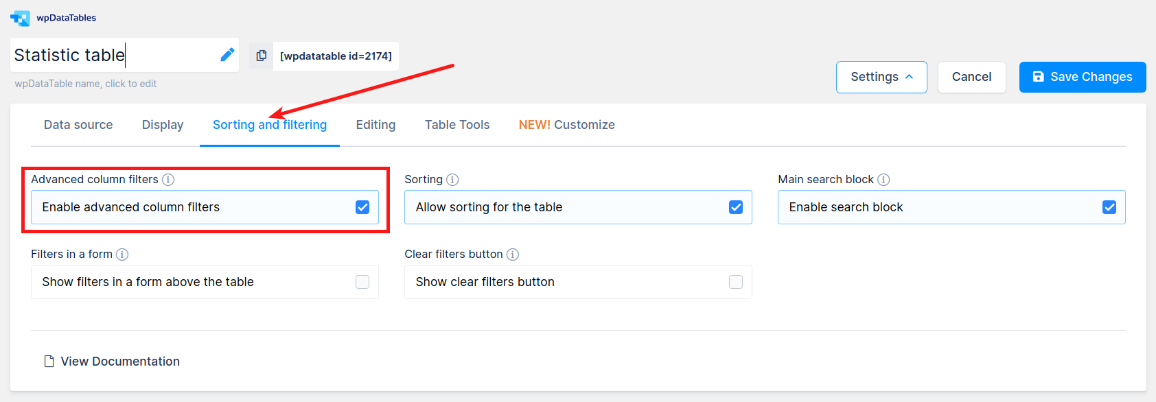
To enable advanced filtering for a wpDataTable, you need to tick the “Advanced filtering” checkbox in the “Sorting and Filtering” tab of the table settings (it is preselected by default, it is also enabled by default for tables created with Table Constructor).
When this checkbox is checked, it is possible to define a filter type for each of the columns’ settings. Different filter types produce different filtering behavior. We will go through these in detail.
Text filter
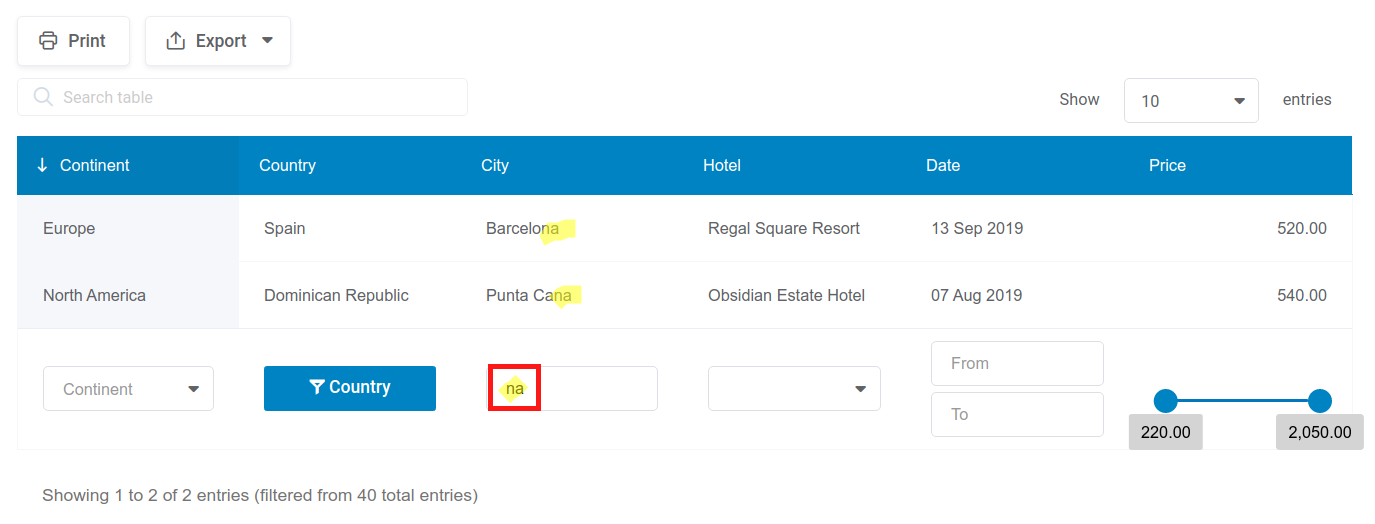
The Text filter type is a basic type: it will perform the search based on at fragment of text you enter. Only those rows where the text in the cell of this column contains the entered text will be shown in the table:
In this example, the “City” column has a text filter type assigned. When we enter the “na” fragment, only the rows that contain this fragment in the city names will be shown (i.e., Barcelona, Punta Cana). All other rows are filtered out.
If you need an exact match and do not want to show values containing a substring, enable the ‘Exact match‘ checkbox for this filter in the column settings on the ‘filtering’ tab.
Number filter

The Number filter is another basic filter type. It allows you to enter a number in the filter, upon which only the rows in which this column has precisely the same number will be displayed:
In this example “Price” column has a number filter type, “250” is entered, and only one row is shown because only this row has the “250” value of this cell.
Number range filter
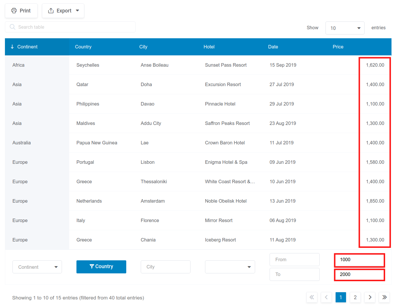
The Number Range filter type should be used when you want table users to be able to filter the table by the values of some column within ranges of numbers: e.g., “values between 3 and 7″, or “greater than 3”, and so on. It will output two inputs: “from” and “to”.
In this example, the “Price” column has the number range filter enabled. 1000 is put as the lower limit, and 2000 as the higher limit; so only the rows that have the “Price” values between these two limits are shown (limit values are included as well).
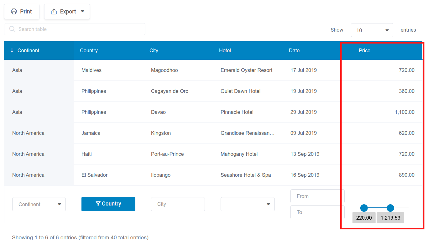
The Number Range filter also allows you to enable the Number range slider as a filtering option for Integer and Float columns.
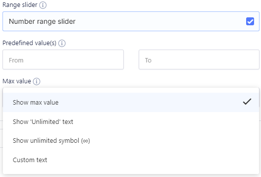
With it (in Integer or Float column settings), you can include a customizable “Unlimited” option. By default, the “Show max value” option is enabled, but you can also set the slider to show the “Unlimited” text, to show the unlimited symbol (∞), or to show custom text.
Date range filter
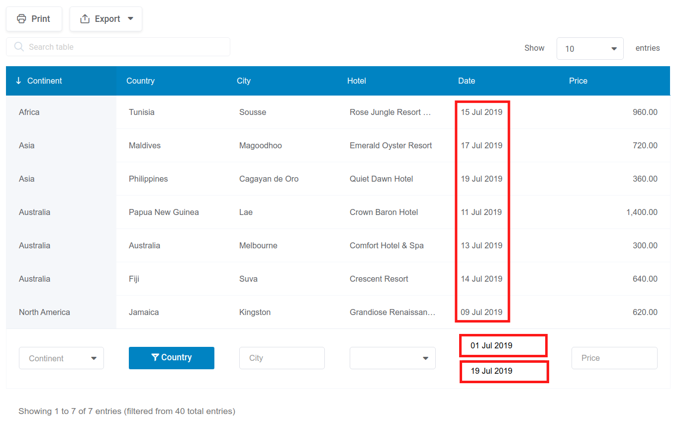
The Date range filter type should only be used when the column has a date type, and when you want your users to be able to filter the table data by ranges of dates, e.g., “later than 1st June”, or “between 1st May and 15th of August”, etc.:
In this example, the “Date” column has a Date Range filter, where the “From” value is set to 01/07/2019, and the “To” value to “19/07/2019”. So, only the rows where cells in the “Date” column have a date value between these 2 are shown.
DateTime range filter

The DateTime range filter type should only be used only when the column is a DateTime type, and when you want your users to be able to filter the table data by some ranges of date-times, e.g. “later than 1st June 14:00”, or “between 1st May 10:00 and 15th of August 21:00”, etc.
In this example the “Order Date” column has a Datetime Range filter type, where the “From” value is set to 22/04/2019 1:00 PM, and the “To” value to “22/04/2019 5:00 PM”. So, only the rows, where cells in the “Order Date” column have values between these 2 are shown.
Time range filter
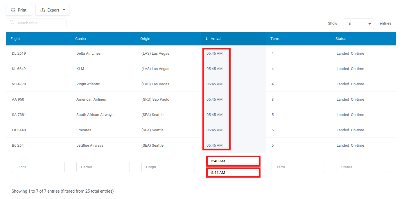
The Time range filter type should be only used when the column is a time type, and when you would like your users to be able to filter the table data by some ranges of times, e.g., “later than 8:00 AM”, or “10:00 AM and 10:00 PM”, etc.
In this example, the “Arrival” column has a Time Range filter type, where the “From” value is set to“5:40 AM”, and the “To” value to “5:45 AM”. So, only the rows where cells in the “Arrival” column have the time value between these 2 are shown.
Select box filter
The Selectbox filter type is a very convenient filter, that allows front-end users to select one of the pre-defined values for some of the columns, and the table data will be filtered based on this value.
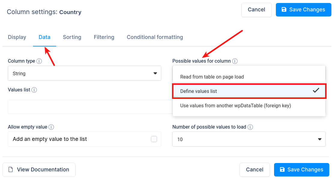
If you want to define possible values list for the select box, you must first go to the column settings for the desired column. In the “Data” tab and for “Possible values for column” select “Define values list“.
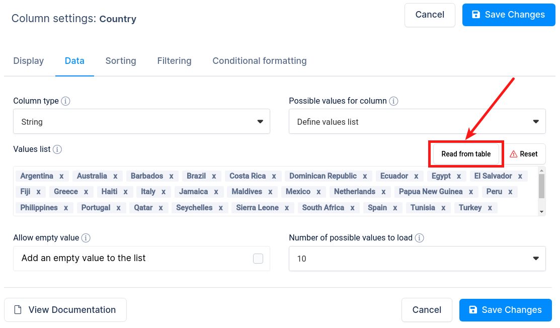
Click on the “Read from table” button, and you will see that all values from that column are added to the select box.
You can also enter the field you want to be displayed as selectbox values in the Values list.
For example, if you need to filter by the “Fruits” column, you can put this example in the input field:
Apple, Peach, Lemon, Orange
You can also override the default generated values with this input field if you want them to display in a different order from their order of appearance in the table.
This same field is used for possible cell options in editable tables.
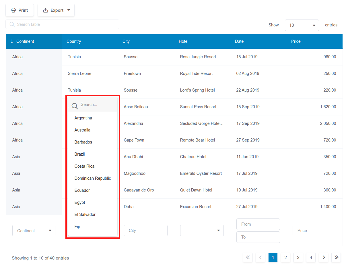
The filter is rendered on the front-end as a dropdown selectbox:
When a user chooses one of the values in the dropdown, the table is filtered, and only the rows that contain the selected value in the column will be displayed.
Multiselectbox
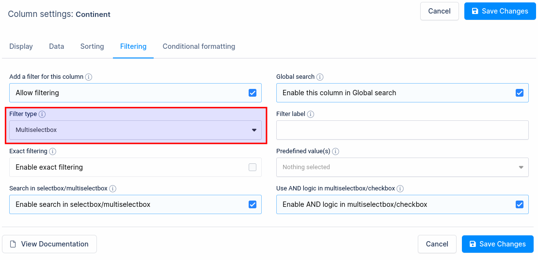
The Multiselectbox filter type allows front-end users to select more than one of the pre-defined values for some of the columns, and the table data will be filtered based on these selected values.
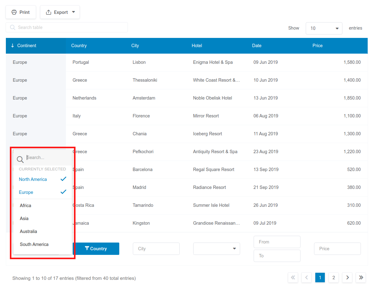
Layout of the multi select-box filter in table
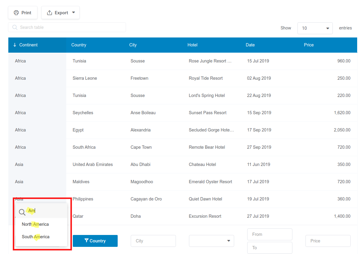
You can also use search in select-box and multiselectbox filter types if the option “Number of possible values to load” on the “Data” tab in column settings is set to anything except for “All“. Once you choose select-box or multiselectbox as filter type, open the filter, and you will see a place to enter your search.
If this option is set to “All“, then all possible values will be rendered in this select-box and the search field will not be presented.

Multiselectbox filter also supports the AND Logic where the data and the results must match all of the selected examples so, as in the example on the left if you look for “Asia” and “North America”, the results will pull only the rows where both are in the same cell.
Checkbox filter
The Checkbox filter is a convenient way to filter a table by more than one value of a column. If you want users to be able to filter the rows in the table with logic like “Show all the rows where the continent is either Asia or Africa or America”, the Checkbox filter is the right option to use.
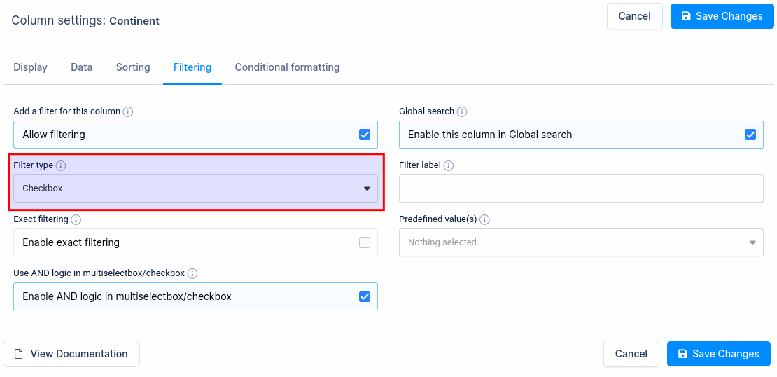
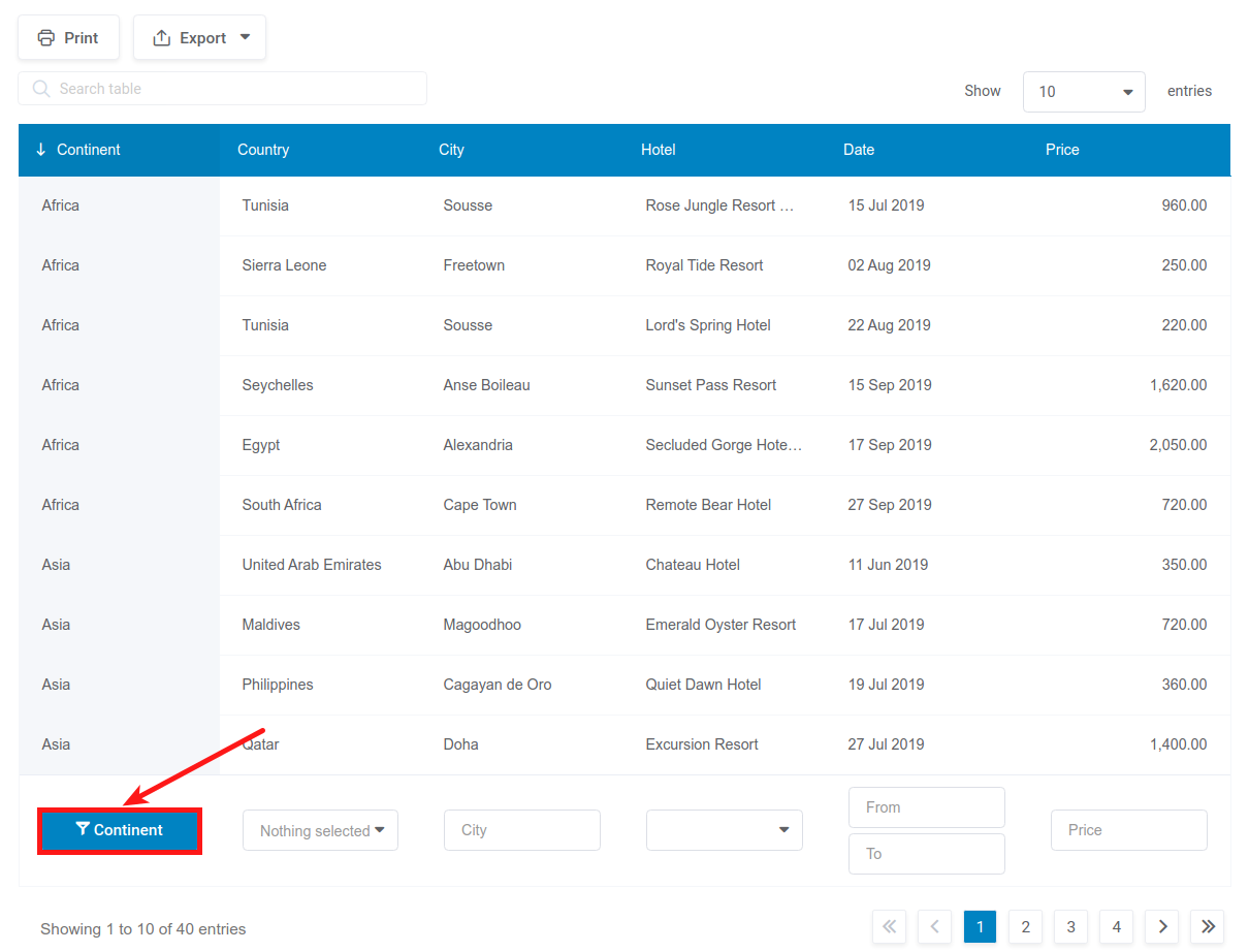
To use this filter, you need to set the “Filter Type” setting as “Checkbox” and optionally define the possible values. If the option “Filters in the form” is turned on and the option “Render in modal” on the “Filtering” tab in column settings for the column is turned on as well, then the checkbox filter will be shown as a button above the table.
On the front-end, users will get a button under this column.
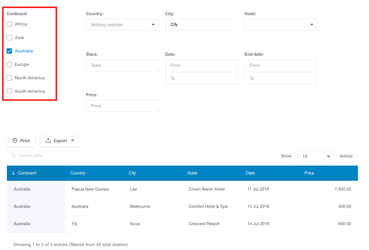
If option “Filters in form” is turned on and option “Render in modal” on the Filtering tab in column settings is turned off for the column, then the checkbox option will be rendered one under another like on the left image.
The Checkbox filter also supports the AND Logic just like the Multiselectbox filter above.
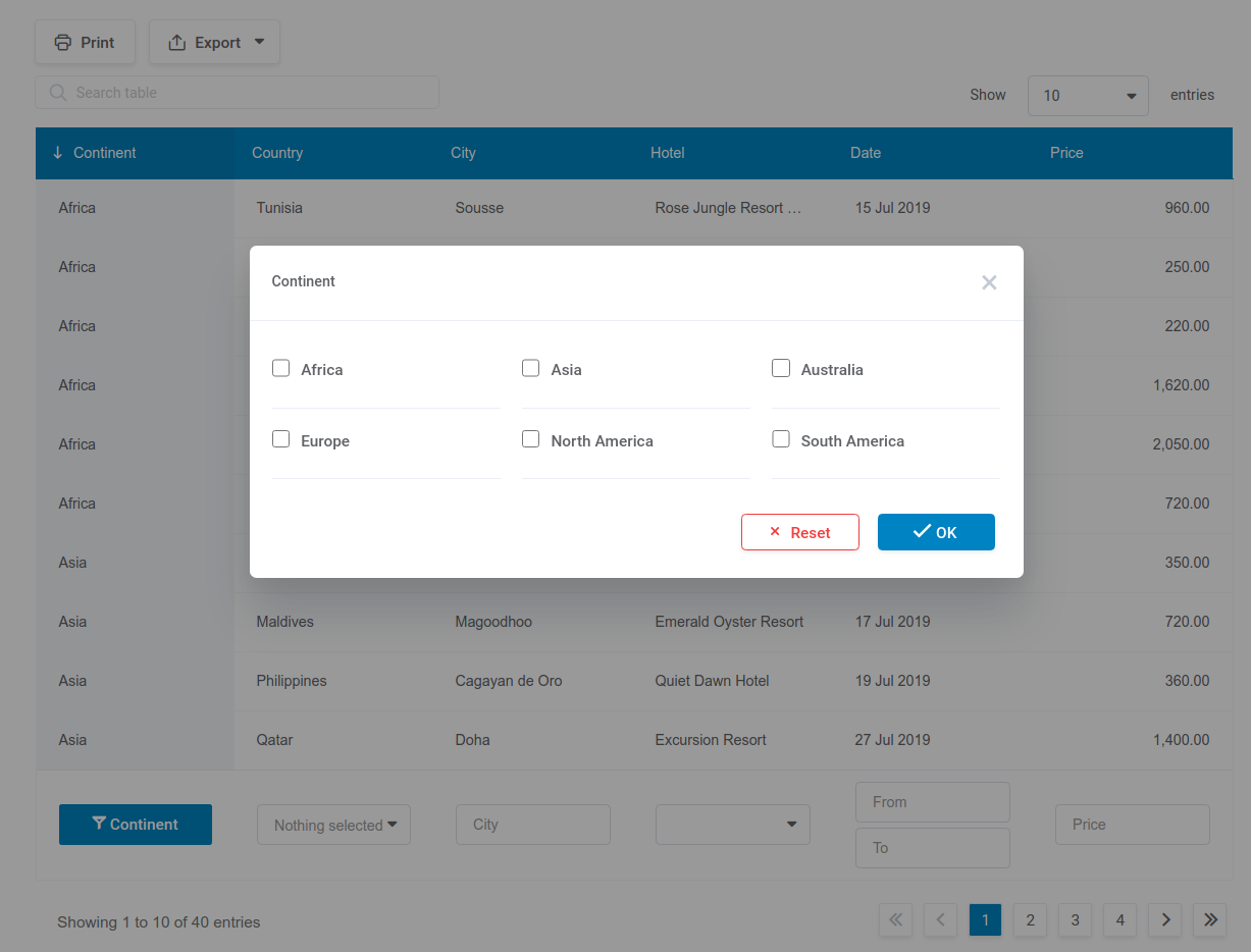
When users click on this button, a pop-up appears, in which all the possible values of this column are listed with checkboxes:
When a user ticks any of the checkboxes, the table will be rendered simultaneously, and only the rows that contain the selected values in the column will be displayed.
The “OK” button closes the popup, and the “Reset” button unticks all the checkboxes.
The checkbox filter can appear in a popup, when the filter is rendered above the table, instead of rendering checkboxes directly on the page.
Exact filtering
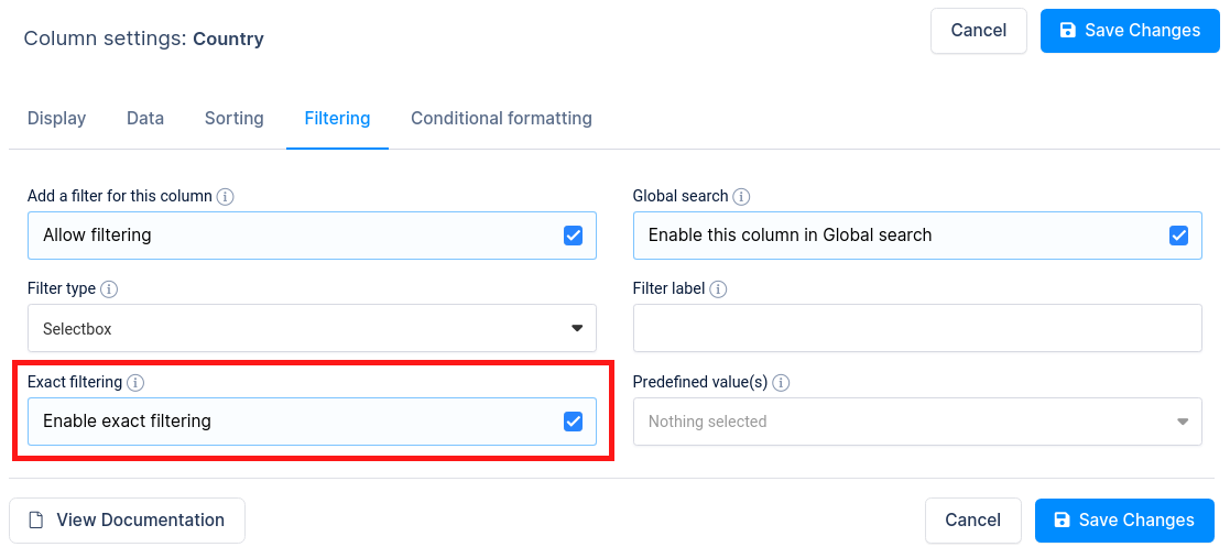
Sometimes, you will need to find the exact match for certain column in your table.
For example, if a multi-select field has possible values of Room 1, Room 2, Room3, … Room 10, Room 12, and someone selects filter value “Room 1” – it will return all records for Rooms that have number 1 in the first place.
To disable this, you can use Exact filtering option.
You can select Exact filtering if you want to allow an exact search to use exact match logic for filtering and disabling a partial match.
Disabling the filter for a column

Sometimes, you may not want to allow your users to filter the table by all the columns, since some columns are less significant, and it makes sense to hide the advanced filter capability for them.
For this, you can click on the Filtering tab in the column settings and disable the filtering with the switch.
By doing so, this column will not have a filter on the front-end.
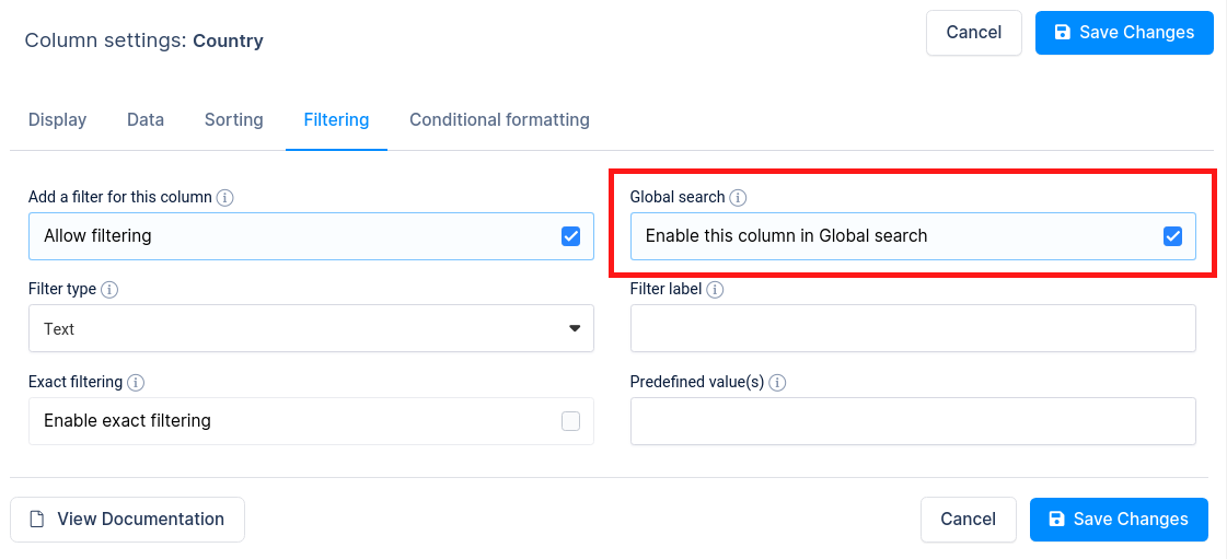
Sometimes, you may not want to allow your users to filter the table by column filters, since users want to filter table only with one Global search.
For this, you can click on the Filtering tab in each column settings and enable/disable option “Enable this column in Global search“. Like this you can remove some column data to be find in Global search above the table.
Clear filters button

Additional settings when “Advanced filters” option is turn on is option “Clear filters button“. After clicking on this button all filters in table will be reset.
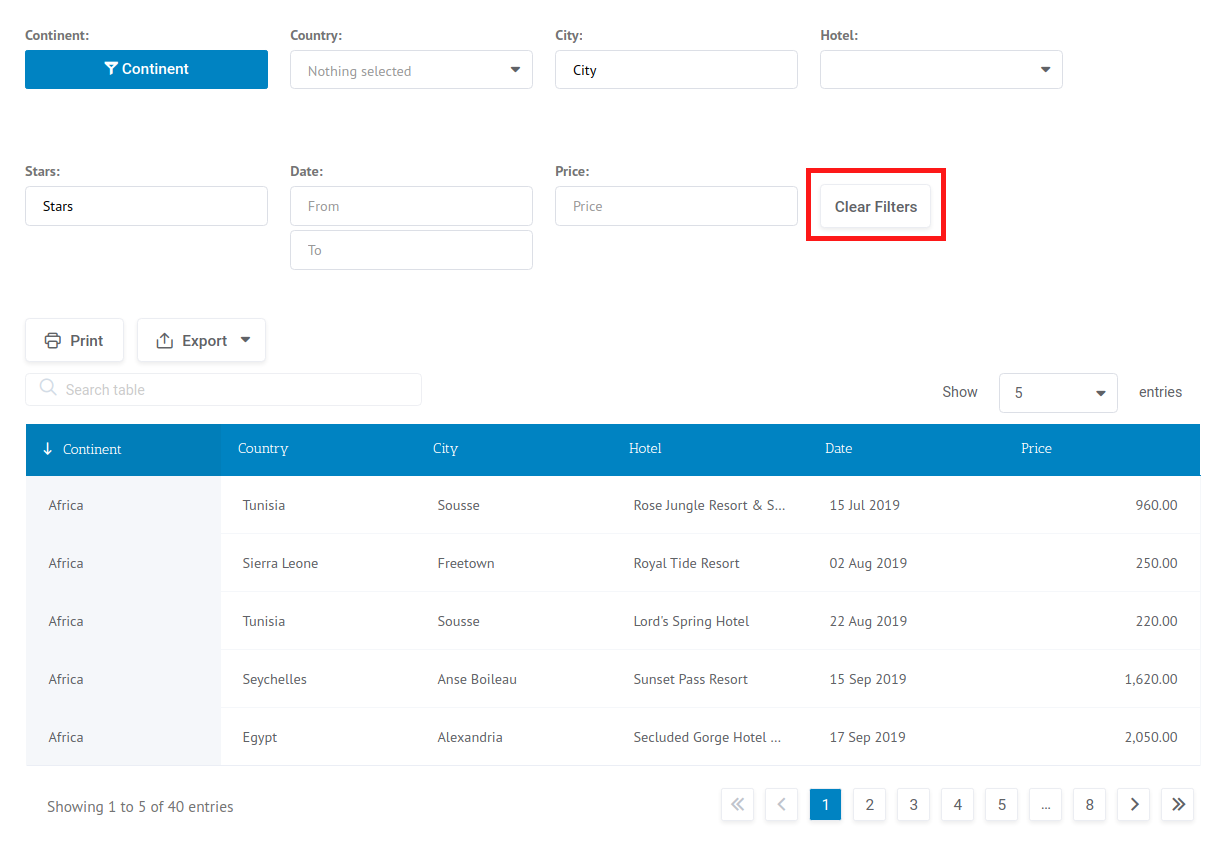
If is turn on option “Filters in form” , this clear button will be shown above after last filter. If this option is not turn on then “Clear filters” will be shown above the table beside Export buttons.
Advanced filter in a form

Having an advanced filter below each column is a convenience, although that is not necessarily true for all cases; if there are many columns, or if you would like to filter by invisible columns, it makes sense to have the filter separated from the table itself. This is supported by wpDataTables with the “filter in form” feature. To use it you need to go to the “Sorting and Filtering” tab in the table settings, first enable “Advanced column filters“, and then enable the “Filter in form”:
All the other settings for filters are the same. Keep in mind that you can also define filter types for invisible columns. The columns will not be visible in the table, but the filtering block will appear in the filtering form, so you can extend the filtering functionality without overloading the table. Also keep in mind that having too many invisible columns is not good for overall performance.
When this checkbox is checked, and the table is saved, the front-end look of the table will change and a filtering form will appear above the table. See the example:
Advanced filter in a widget (in WordPress sidebar)

WordPress has a built-in functionality of widgets and sidebars. wpDataTables uses this functionality for the filtering feature. This way, you can define the region of the page where to render the filtering form. To use this filtering function you need to follow these rules:
- Enable the checkbox “Filter in form” on the table settings:
- Place the wpDataTable in a page or post which has some of the registered sidebars defined in the template.
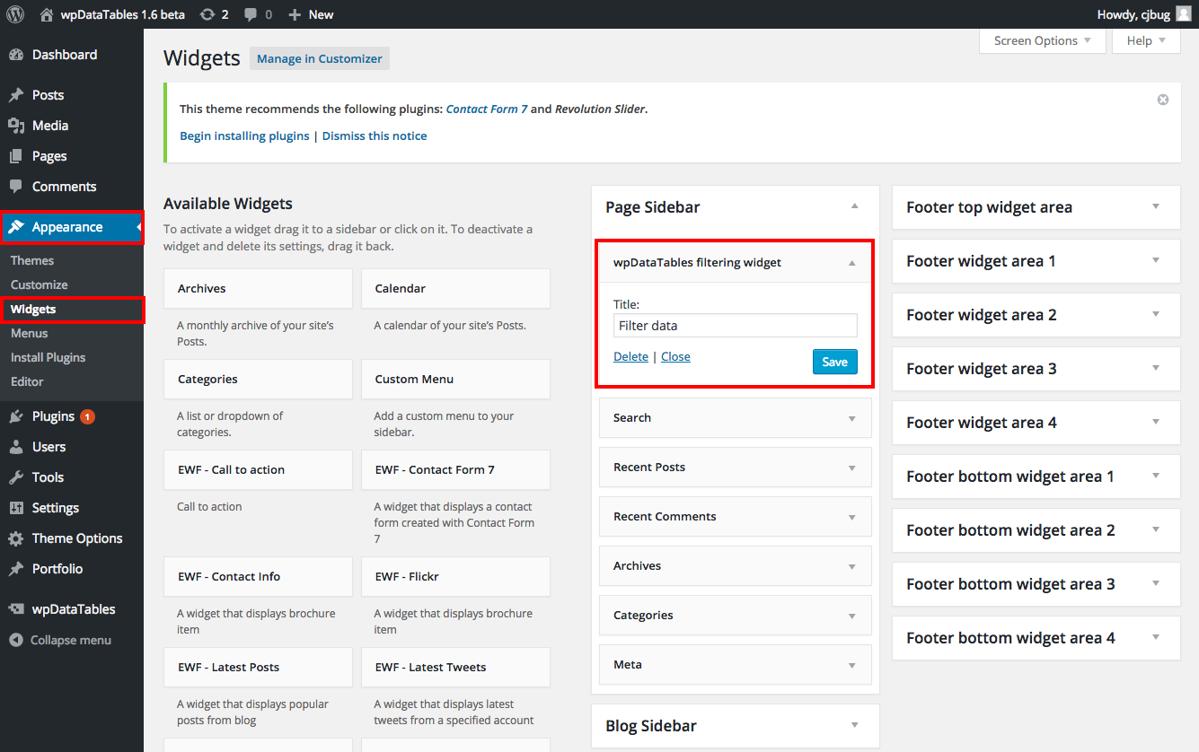
- In the “Appearance” -> “Widgets” area of the admin panel, drag the “wpDataTables filtering widget” widget to the sidebar block of the page you used to paste the shortcode. There, you can define the title for this widget:
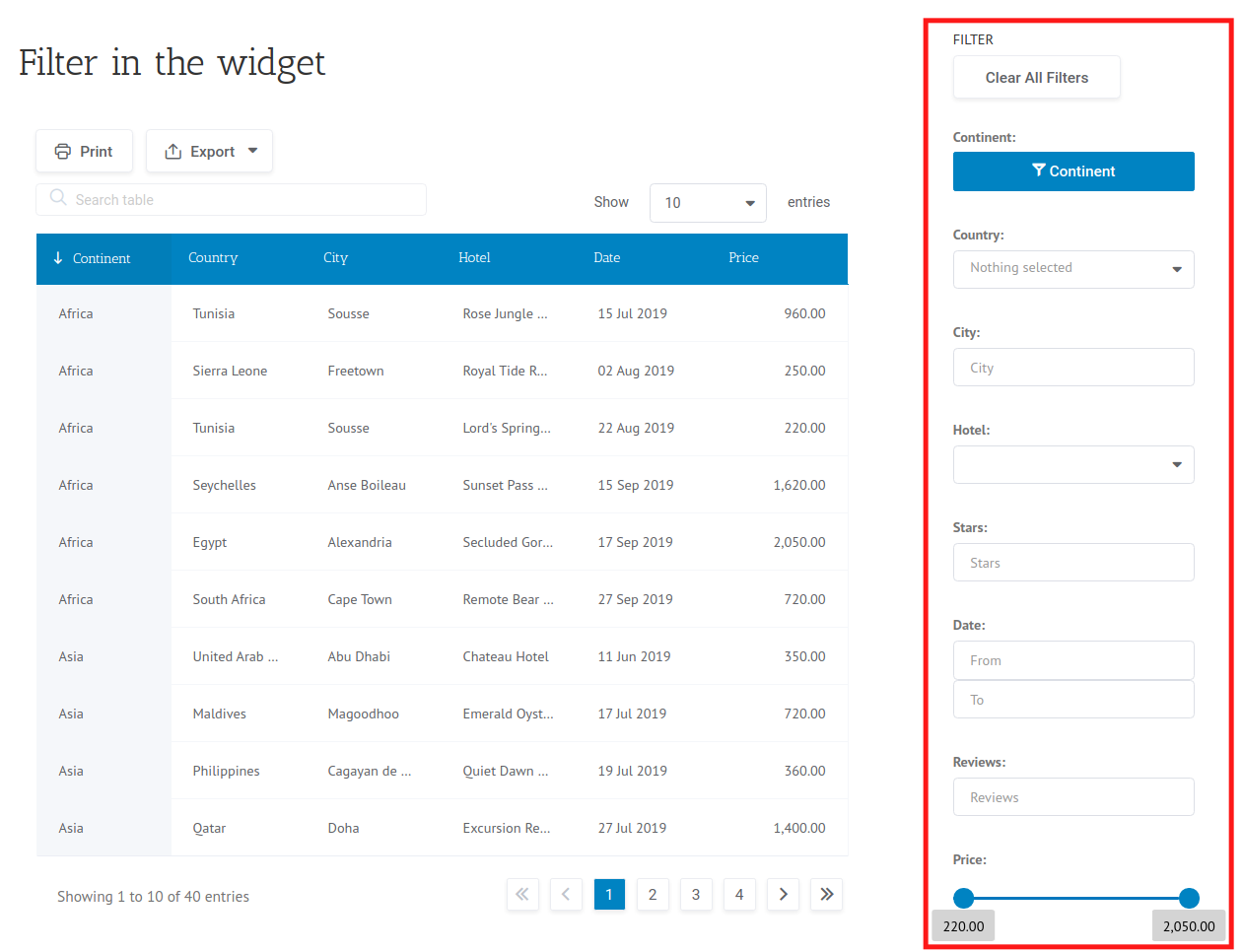
Once this is done, the filter will be moved to the sidebar section of your website (or another region you have chosen for it):
Advanced filter in a widget also has a “Clear filters” button which can be used to refresh the filter set.
Predefined default filter values
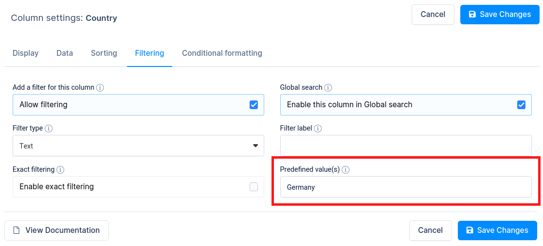
If you want to load the page with several predefined settings for the filters, you can make use of the “Predefined values” input. Values from this input will be used as the predefined filter values upon page load, and also in the front-end editor, if the table is editable.
You can use all placeholders (%VAR1%, %VAR2%, %VAR3%, %CURRENT_USER_ID%…) in this input. See this documentation section for more information on placeholders.
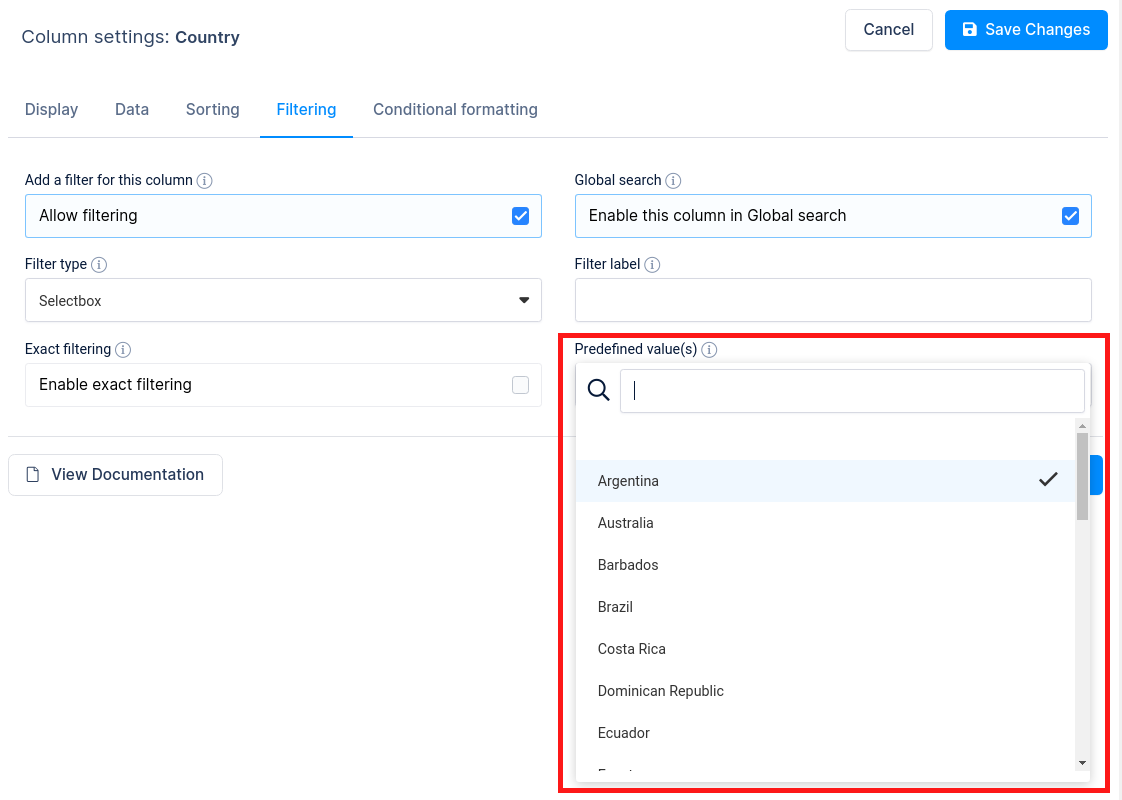
For the select-box filters, it will be shown select-box where you can choose predefined value.
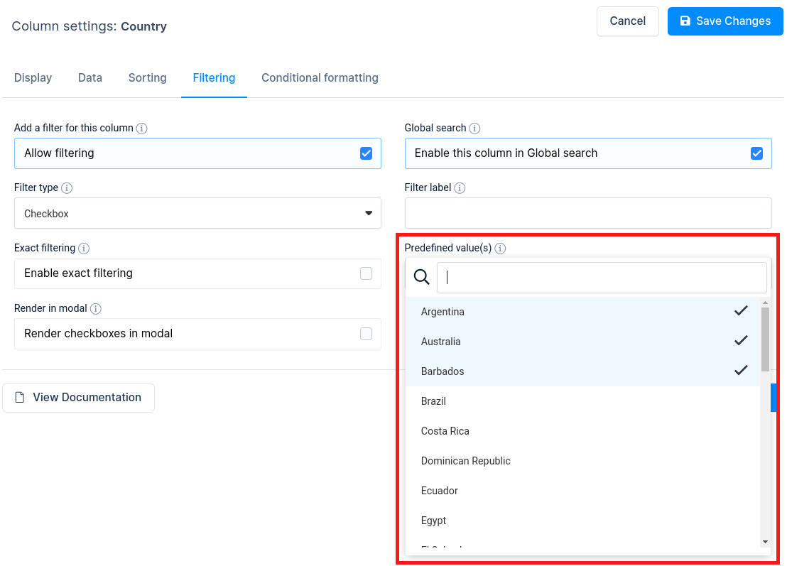
For the checkbox/multi select-box filters, you can predefine several preselected values, by selecting them from the list.
Defining filter values in the URL
You can also predefine filter values for the table in the URL, which may come in handy when you would for example, want to send your client a deeplink with some info from your catalog that is already filtered for him. The URL key that will be parsed by the wpDataTables is “wdt_column_filter[KEY]” where the KEY is either a zero-based numerical index of the column you would like to filter, or an initial header of the column (header or the CSV or Excel table, or MySQL column header for MySQL-based column header). E.g.
(see the URL part after “?” and check the table output)
The values parsed from this URL will be used as default filter values.
You can read more about at Pre-filtering tables through URL.
Read more
- Creating editable tables and filling the table data manually
- Creating non-editable tables from Excel files
- Creating non-editable tables from Google Spreadsheets
- Responsive design
- Conditional formatting
- Sorting tables
- Row grouping
- Using Placeholders – Adjusting MySQL queries dynamically based on shortcode attributes
- Pre-filtering tables through URL
- Calculating totals for columns, sum row
- Table Layout, Word Wrap
- Table data export tools
- WPBakery Page Builder
