Table of Contents
Video tutorial
Creating Simple data tables from WordPress admin
From version 3.1 a new table type is introduced in wpDataTables – creating simple data tables from scratch. These datatables can be anything but simple, though, as you can now merge cells, style each cell differently, add star ratings to cells, and so much more.
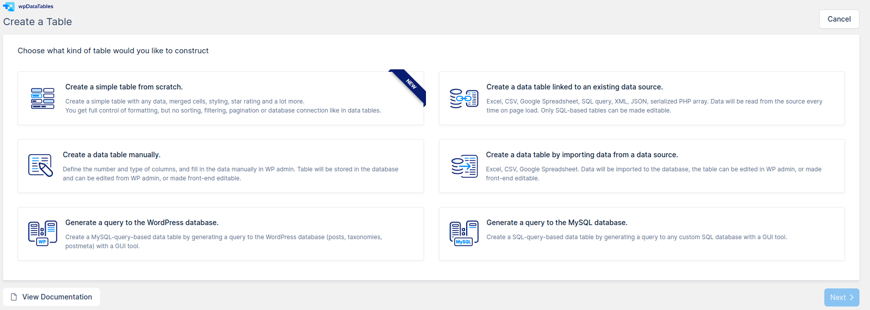
Until now, creating manual data tables was the simplest process in our WordPress plugin – you would choose the number of columns, column types, editor input type, predefined values, and so on.
With simple data tables, we’ve simplified the process, so to create this table you need to choose the first option on the list – „Create a simple table from scratch“, and click on Next in the bottom right corner.
The next step is to define the table’s name, number of columns and number of rows.
Unlike Manual tables, you don’t need to define column types or choose editor input types for these tables, as Simple tables accept everything, and you’re able to rearrange columns and rows with a simple drag and drop feature. We’ll get to that later on.

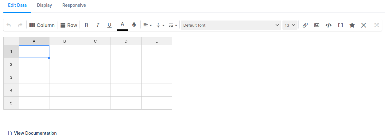
After you choose your data table’s name and set up the number of columns and rows, simply click on „Generate table“ button, and you’ll be taken to your new, empty table, like the one you see on the left.
You’re welcome to style the data table as you want, even before adding content in it, but for this example, we’ll add some AMD and Intel processors’ specifications.
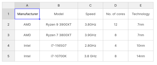
Table Preview – Below every table, you will see how the table will look like on front-end on desktops, tablets and mobile devices. Previews are not live, so when you format the table, you’ll need to click on “Save Changes” in the top right section of the screen in order to see the changes in the preview windows.

Table settings
Just like all other table types, Simple tables have table settings tabs above the table: Edit Data, Display, and Responsive. This new table type doesn’t have many settings in there (that’s partly why we named them “Simple” tables), but we’ll introduce each tab to you, one by one, in the section below.
Edit Data
Edit Data tab is where you edit the table’s contents, formatting and style. Above the table, you can see available table tools. Most of you understand these tools, but we’ll break them down real quick, in order to help all newbies diving into tables.

Please use the tabs below to see what each tool does.
Undo – reverts the previous action(s). You can undo through multiple changes you previously made to the data table.
Redo – repeats the previous action.
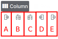
Column – clicking on this button expands the section:
A: add a column to the left of the table
B: add a column before the highlighted section
C: add a column after the highlighted section
D: add a column to the right of the table
E: delete the selected column(s)
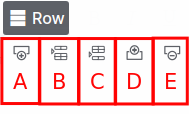
Row – just like the “Column” button, it expands the selection:
A: add a row on top of the table
B: add a row above the highlighted section
C: add a row below the highlighted section
D: add a row below the table
E: delete the selected row(s)
Bold the selected text, cell, row or a column (depends on the selection).
Make the text italic in the selection.
Underline the selected text.
Change or reset with clear button the text color of selected text, column(s), row(s).
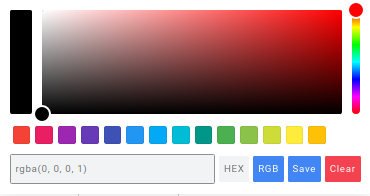
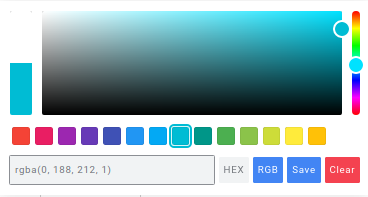
Change or reset with clear button the background color of the current selection.
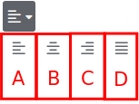
Choose the horizontal alignment of a section:
A: Align to the left
B: Align in the middle
C: Align to the right
D: Justify
Choose the vertical alignment of the selection:
A: Align in the middle
B: Top alignment
C: Bottom alignment
Let’s stop there for a bit and apply some of these table settings in the table we just created. We’ll apply bold text and set colors you see above to the first row, and we’ll underline the manufacturer in the first column.
CPU Types
| Manufacturer | Model | Speed | No. of cores | Technology |
| AMD | Ryzen 9 3900XT | 3.8GHz | 12 | 7nm |
| AMD | Ryzen 7 3800XT | 3.9GHz | 8 | 7nm |
| Intel | i7-1165G7 | 2.8GHz | 4 | 10nm |
| Intel | i7-10700K | 3.8 GHz | 8 | 14nm |
There are no limitations to this, so you can play around with background and text colors – formatting each cell individually:
| Manufacturer | Model | Speed | No. of cores | Technology |
|---|---|---|---|---|
| AMD | Ryzen 9 3900XT | 3.8GHz | 12 | 7nm |
| AMD | Ryzen 7 3800XT | 3.9GHz | 8 | 7nm |
| Intel | i7-1165G7 | 2.8GHz | 4 | 10nm |
| Intel | i7-10700K | 3.8 GHz | 8 | 14nm |
Also, as you can see in the table above, all cells are currently aligned to the middle both vertically and horizontally, so let’s continue explaining available table tools.
A: Word wrap into new lines of the same cell
B: Overflow over next cell(s)
C: Clip – cut off the text when it reaches the cell’s border with …
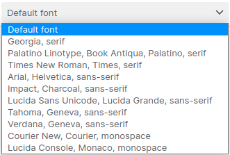
Change the font of the current selection (single cell, a range of cells or multiple selected cells)
Change the size of the fonts in the current selection (single cell, a range of cells, multiple selected cells).
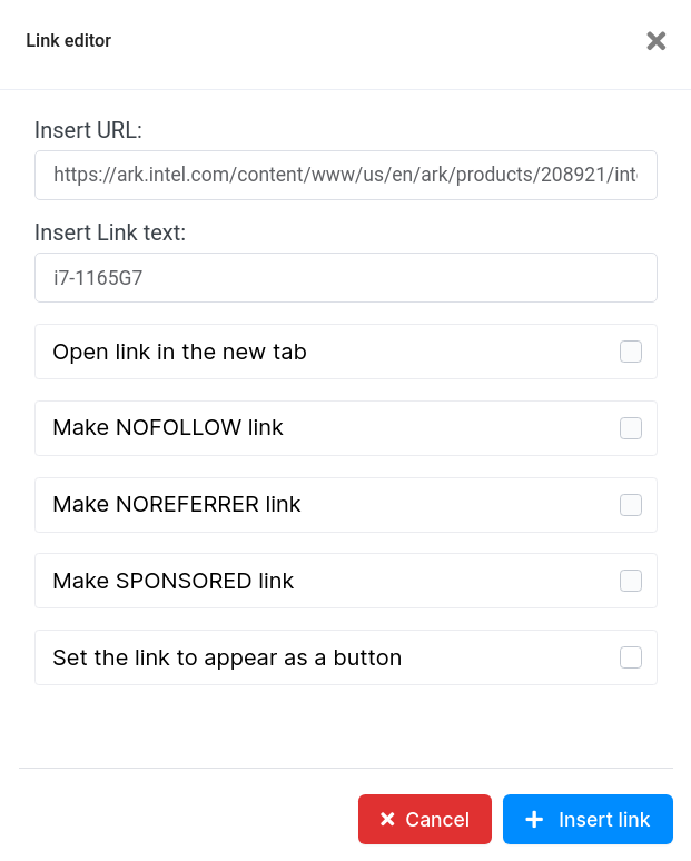
When you click on this, a new modal will appear, where you can add a link, and text to hyperlink the link. You can also choose if the link will open in a new tab, make “nofollow”,”noreferrer” or “sponsored” link, and if it is going to appear as a button.
This allows you to add files (images, PDF, Word, zip files…) to the table.
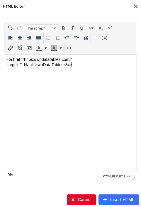
With this tool, you can add HTML code to the table.
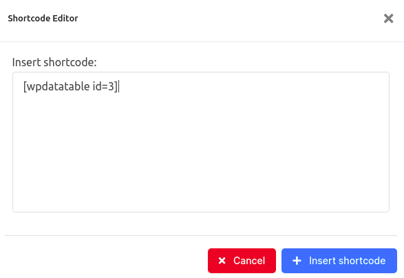
Add shortcodes from wpDataTables, wpDataCharts or other plugins into table’s cells.
Add Star rating to the table.
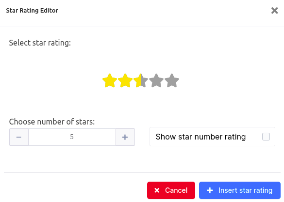
Here, we first used the tool 4D (added a new column at the end of the table), and then clicked on “Star Rating” tool button to add star rating, as seen below:
CPU
| Manufacturer | Model | Speed | No. of cores | Technology | Rating |
| AMD | Ryzen 9 3900XT | 3.8GHz | 12 | 7nm | |
| AMD | Ryzen 7 3800XT | 3.9GHz | 8 | 7nm | |
| Intel | i7-1165G7 | 2.8GHz | 4 | 10nm | |
| Intel | i7-10700K | 3.8 GHz | 8 | 14nm |
Clear all data from the table. This action deletes all data, and clears all formatting from the table.
The long-awaited merge cells feature. For example, in our little table, we can merge the CPU manufacturers.
CPU
| Manufacturer | Model | Speed | No. of cores | Technology | Rating |
| AMD | Ryzen 9 3900XT | 3.8GHz | 12 | 7nm | |
| Ryzen 7 3800XT | 3.9GHz | 8 | 7nm | ||
| Intel | i7-1165G7 | 2.8GHz | 4 | 10nm | |
| i7-10700K | 3.8 GHz | 8 | 14nm |
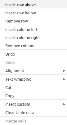
Most tools are also available if you right-click on the table.
An advantage of this table type is the ability to reorder and resize rows and columns freely. To reorder them, simply click on rows or columns you wish to move, and you’ll see the cursor change to a hand. Then you can drag and drop the selection, as shown in the GIF below:

The simple data table can be navigated through using keyboard shortcuts as well:
Navigation:
Arrow Up ↑ – move to the cell above the current active cell (if it exists)
Arrow Down ↓ – move to the cell below the current active cell (if it exists)
Arrow Left ← – move to the cell on the left of the current active cell (if it exists)
Arrow Right → – move to the cell on the right of the current active cell (if it exists)
Tab – move to the cell on the right side of the current active cell (if it exists)
Tab + Shift – move to the cell on the left side of the current active cell (if it exists)
Home – Move to the first cell in a row
End – Move to the last cell in a row
Ctrl + Home – move to the first cell in a column
Ctrl + End – move to the last cell in a column
Selection:
Ctrl + A – select all
Shift + Arrow Up ↑ – extend selection of the cell above
Shift + Arrow Down ↓ – extend selection of the cell underneath
Shift + Arrow Right → – extend selection of the cell on the right
Shift + Arrow Left ← – extend selection of the cell on the left
Shift + Home – select all cells in the row to the left, including the current cell
Shift + End – select all cells in the row to the right, including the current cell
Ctrl + Shift + Home – select all cells in the column to the top including the current cell
Ctrl + Shift + End – select all cells in the column to the bottom including the current cell
Editor:
Enter – open/close cell editor
F2 – open cell editor
Esc – cancel editing and close cell editor
Backspace – empty cell
Delete – empty cell
Ctrl + C – copy cell‘s content
Ctrl + X – cut cell‘s content
Ctrl + V – paste cell‘s content
Ctrl + Enter – fill all selected cells with edited cell‘s value
Ctrl + Z – undo
Ctrl + Y – redo
Display
The “Display” tab provides 7 options.

- Table Title check-box allows you to have the title of the table displayed above it, and it is enabled by default. You can see “CPU” in the star-rating example above, which represents the table’s title above the page.
- Header checkbox, when enabled, marks the first row of your table as columns’ header. Its default background color is set to light-gray, but you can change that freely using the table tools above the table.
If you have merged cells in first and second column, this option will become unavailable automatically. - Stripe Table checkbox paints odd rows in light gray, so it’s easier to follow columns through a row. That feature is enabled by default in other table types, but with Simple tables, you can choose whether you’re going to use it.
- Cell Padding (in px). Here you can set the padding inside all cells. The default value is 10px.
- Remove borders checkbox, when enabled, it will remove all borders from the table. It is turned off by default.
- Border collapse. Whether table borders should collapse into a single border or be separated as in standard HTML. By default is set to collapse.
- Border spacing. When you choose to borders be separate, here you can set border spacing. Default value is 0.
Responsive
The “Responsive” tab also provides 4 options.

Enabling the responsive mode basically pivots columns into rows. If you don’t enable the option to use the first row as table header, each cell will be located in a separate row.
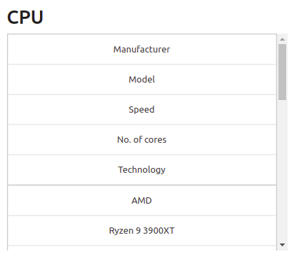
When column headers are enabled, on tablets and mobiles the table is split into 2 columns and as many rows as there are columns, only repeated for every new row in the table. For example, when Responsive mode and column headers are enabled, the table will look like this on tablets and mobiles.
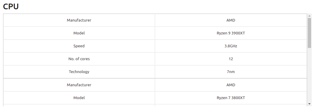
Also, when this is enabled, „Scrollable“ and „Limit table width“ check-boxes will be disabled. These two features work just like in any other wpDataTable, so if you enable „Scrollable“, „Limit table width“ will disappear, and if you enable „Limit table width“ a new option – „Word Wrap“ will be enabled, and „Scrollable“ will disappear from the page.
Horizontal scroll allows you to scroll through the table horizontally, which may come in handy for larger tables.
Limit Table Width sets the table’s width to fit the page, widget or the container in which the table is added.
When vertical scroll is enabled, you will be able to set its height on the page.

The number defined here is in pixels, so there‘s no need to add „px“ at the end.
Additional Notes
To add these simple data tables on front-end, you can use the shortcode next to the title:

To add wpDataTable shortcodes on the page, please check out the section for Adding wpDataTables shortcodes on the page.
