Table of Contents
Video tutorial on table configuration page
Table settings block (Header)

The Table Settings block header, in the table configuration page, contains the following tools and buttons:
- Table name input – to change the name of wpDataTable.
- Table shortcode button – when the table is saved, a shortcode is generated. Click this button to copy the table shortcode.
- Collapse table settings button – by clicking this button, you can show or hide the table settings block. This button can be used to keep the table settings block from getting in the way when you are editing the table data.
- Cancel button – by clicking this button, you can cancel all unsaved changes and redirect to the Browse Tables page.
- Save Changes button – by clicking this button you can apply all changes to see how they affect the table.
- Description – the description of the table.
Table Settings (Data Source)
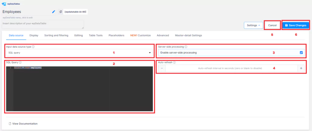
The Data source tab of the Table Configuration page contains the settings which allow you to define from where the data will be read (MySQL query, Excel file, CSV file, Google Spreadsheet, URL for JSON, XML or Serialized PHP array), and some additional attributes as applicable.
- Data source type selector – Use this selectbox to choose which kind of data source you want to use for this table.
- MySQL query (for MySQL-based tables) – This is the field where you enter the query which returns the data you want to display in wpDataTable. You can read the full instructions on creating MySQL-based tables here.
- Server-Side Processing, or Lazy Loading – This switch defines whether the complete table data will be included in the page all at once, or if it will be loaded on request, with the sorting/filtering to be processed by server. You can read more information about this feature here and here.
- Auto-refresh interval – If set to a value different from 0, tables will auto-refresh after each XX seconds interval.
- Cancel changes and close – By clicking this button, you can cancel all the unsaved changes and go to the Browse Tables page.
- Apply – This button applies all changes and refreshes the table preview – or indicates if you are initially creating the table.

For non-MySQL table types, the only difference is that on the right-hand side, you will get an input for the file upload, or a URL to paste.
Excel or CSV files should be uploaded to the server. JSON, XML, Google Spreadsheet and Serialized PHP arrays require a remote URL to be placed in this field.
Table Settings (Display)
The Display tab of the table settings block allows a user to define all the parameters related to the table’s appearance. You can hover above the help icon near the elements to get inline help and/or illustrations of each feature.

1. Show table title – If this is turned on, the table title will appear above the table in an H3 element.
2. Show table description – If this is turned on, the table description will appear above the table.
3. Responsiveness – This switch defines whether the table will be responsive. When turned on, it defines which columns need to be collapsed on mobiles and tablets. Read here about the responsive feature.
4. Hide until loaded – This defines whether to show the table data while the front-end page is still initializing.
5. Default rows per page – This defines how many rows will be visible in the table by default.
6. Custom rows per page – This defines which options will be visible in Default rows per page.
7. Rows per page – This switch defines whether the control for changing the number of rows per page will be shown above the table.
8. Scrollable – This defines whether to add a scrollbar in the container; this is useful for large multi-column tables. It also disables the “Limit table width” switch.
9. Info block – This switch determines whether the information about the number of entries will be shown below the table.
10. Limit table width – If this switch is turned on, the table width will be limited to the container width. Otherwise, it will stretch outside of the container.
11. Word Wrap – This appears when “Limit table width” is on, and defines whether to show all words in cells in one line or to wrap them to multiple lines.
12. Pagination – This switch defines whether the pagination will be shown under the table.
13. Pagination Alignment – This defines the pagination position under the table. It can be right, left, or center.
14. Pagination Layout – This defines the layout of the pagination. There are six different available.
15. Pagination Layout for mobile – This defines the layout of the pagination for mobile devices. There are six different available.
Table Settings (Sorting and Filtering)

The sorting and Filtering tab contains the settings related to the search, global sort, and advanced per-column filters.
- Advanced column filters – This setting enables or disables the per-column filters that can appear in the table header, footer, or in a form above the table. If this setting is enabled, you can configure filters per column in the column settings. Read more about advanced filtering here.
- Filters in form (appears if ‘Advanced column filters’ is turned on) – If this setting is enabled, the filter will appear in a form above the table, and will not be integrated in the table itself (the default condition).
- Sorting – This setting defines whether sorting will work for the table globally. If sorting is enabled, you can still disable sorting for individual columns. If it is disabled, no columns will be sortable.
- Clear filters button – If this setting is enabled, a ‘Clear filters’ button will be added in the Table Tools block, or in the filtering form.
- Main search block – This setting defines whether the ‘global’ search block, which searches the entire table, will appear on the top right above the table.
Table Settings (Editing)
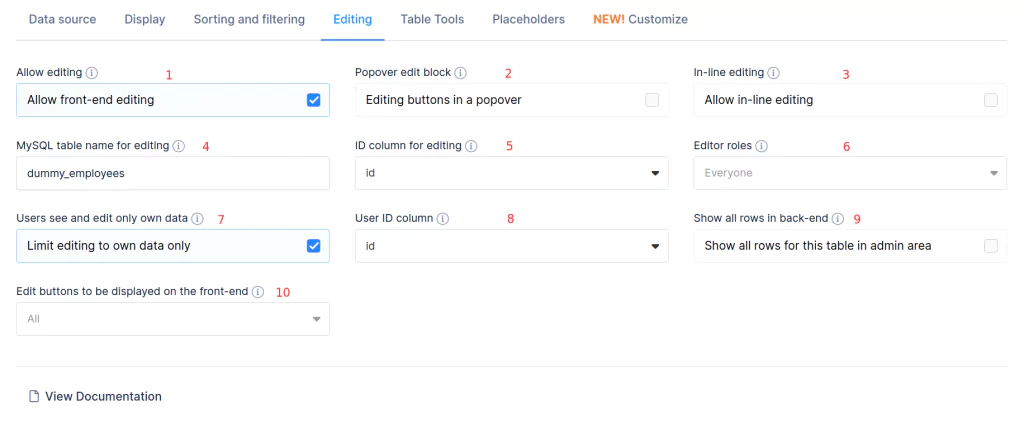
On the Editing tab you can enable front-end editing and configure the relevant parameters. Please note that this tab appears only for MySQL-based tables, and for tables created manually from wpDataTables.
- Allow editing – This tab enables or disables front-end editing for the table. If it is disabled, no other controls will be visible on this tab.
- Popover edit block – By default, the editing buttons (New, Edit, Delete) will appear in the Table Tools block above the table. If the ‘Popover edit block’ switch is enabled, the buttons will not appear there, but will popover above any row when you click it.
- In-line editing – If this switch is enabled, you will be able to edit the table not only with a popup editor, but also by double-clicking any cell, and editing the data inline.
- MySQL table name for editing – The name of the table on MySQL side is displayed. It will be altered by the MySQL server when you edit the table in front-end. wpDataTables ‘guesses’ the name of the table by default – but make sure to double check that it is guessed correctly.
- ID Column for editing – This defines which column values will be used as a unique identifier of the row. It should be an auto-increment integer on the MySQL side.
- Editor roles – This allows you to select which WordPress user roles will be allowed to edit this table.
- Users see and edit only their own data – If this switch is enabled, every user will see only the rows that he/she entered. Read here full information about this feature.
- User ID column (appears if the previous one is enabled) – This defines which column will store the User ID to distinguish the row owners.
- Show all rows in the back-end – If this is enabled, users will see all data for this table in the admin area.
- Edit buttons to be displayed on the front-end – If you want to include only certain editing buttons on the front-end, select them from this dropdown. Leave unchecked to show all buttons.
Read here for more info about editable tables in wpDataTables.
Table Settings (Table Tools)

The table Tools tab allows you to configure the Table export tools block – the ‘toolbar’ on the top right of the table.
- Enable Table Tools – This switch enables or disables the Table Tools block for a table.
- Table Tools selector – Here you can pick which buttons will and won’t appear in the Table Tools block.
You can read the full manual on how the Table Tools works here.
Table Settings (Placeholders)
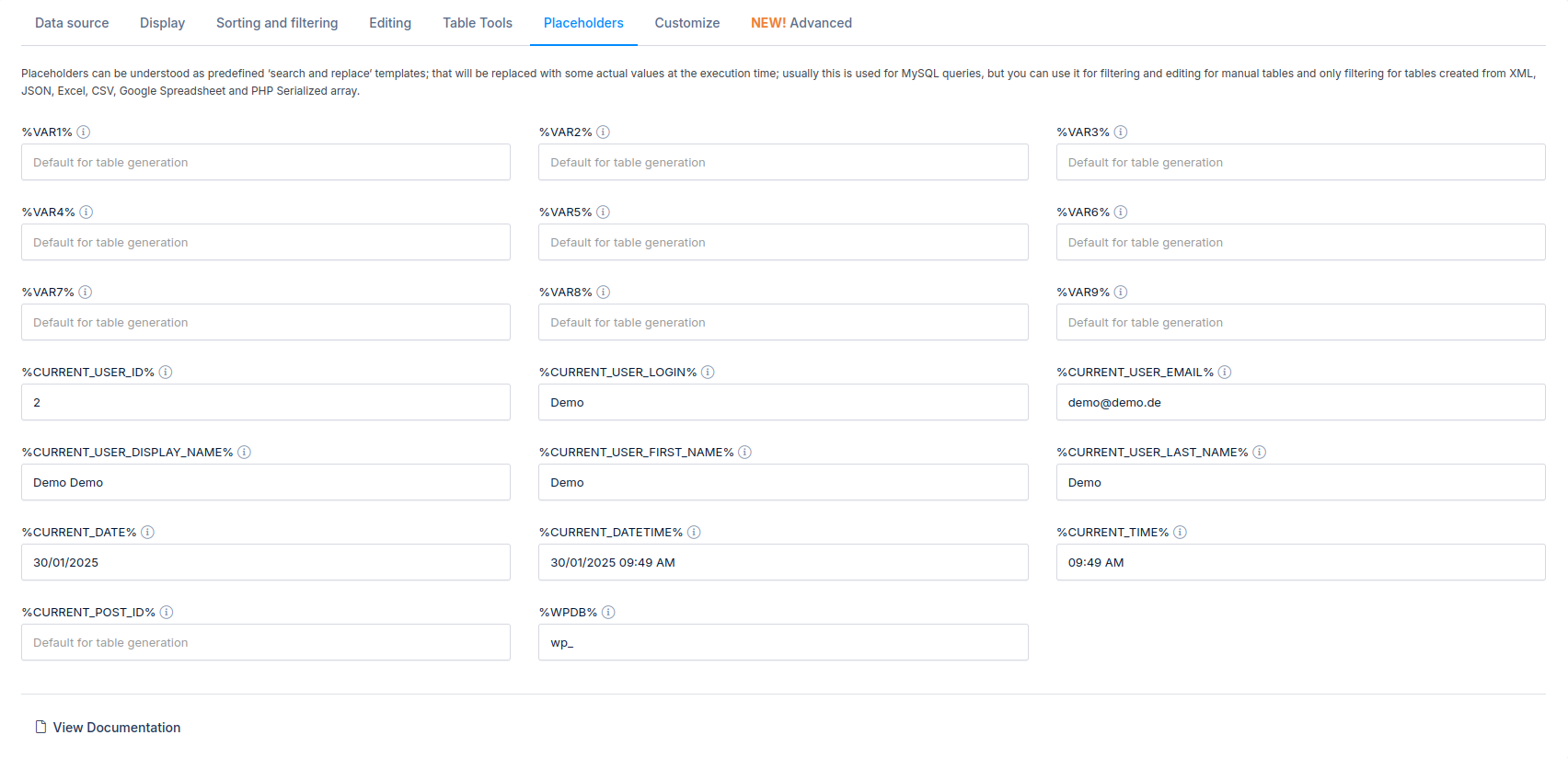
The placeholders tab allows you to configure dynamic variables that can be used in MySQL queries to build the tables, and adjust from shortcodes to use the same table in different pages to present different data. You can read the full tutorial on using placeholders here.
- %VAR1%, %VAR2%, %VAR3% … %VAR9% – These are custom dynamic variables you can use in the WHERE clause of your query. You can define the defaults here that will be used when no other values are provided in the shortcode at the moment of initial table creation.
- %CURRENT_USER_ID% – When used in the query at the moment of table generation it will be always replaced with the ID of the currently logged-in user (0 for logged-out users). You can override your current ID here for the table generation if necessary (e.g., if your ID is 1, and there are no entries in this table where USER_ID = 1).
- %CURRENT_USER_LOGIN% – When used in the query at the moment of table generation it will always be replaced with the Login of the currently logged-in user (empty string for logged-out users). You can override your current login here for the table generation if necessary (e.g., your login is ‘admin’ and there are no entries in this table where user_login = ‘admin’).
- %CURRENT_USER_EMAIL% – This placeholder will be replaced with the Email of the currently logged-in user.
- %CURRENT_POST_ID% – When used in the query, it will be always replaced by the ID of the post or page where the table is inserted. You can set the default ID here.
- %CURRENT_USER_FIRST_NAME% -When used in the query at the moment of table generation it will always be will be replaced with the First Name of the currently logged in user(empty string for logged-out users )
- %CURRENT_USER_LAST_NAME% -When used in the query at the moment of table generation it will always be will be replaced with the Last Name of the currently logged in user(empty string for logged-out users )
- %CURRENT_DATE% – This placeholder will be replaced with the current date.
- %CURRENT_DATETIME% – This placeholder will be replaced with the current date-time.
- %CURRENT_TIME% – This placeholder will be replaced with the current time.
- %WPDB% – This will be replaced by the prefix of the currently used database, by default ‘wp_’. You can override the default here.
Table Settings (Customize)

From version 3.4 it is implemented a new Customize tab for each table. From now on you are able for each table to set different skin, font, background, colors, and a lot more. Settings are separated into tabs: Main, Font, Header, Table border, Row color, Cell color, Pagination, and Custom CSS. For more about each option in tables check out this link.
Table Settings (Advanced)

From version 5.6 headers and columns can be fixed inside a table. For this, we’ve added a new “Advanced” tab where you can configure the fixed header and/or columns for your table.
Table Settings (Table Preview and Column Settings)
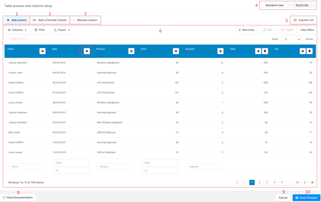
The Table Preview and Column Settings block is the section of the Table Configuration page where you can see a real-time preview of how the table will look and function in the front-end, and where you can also edit the table data. Every change you make to the table settings or column settings will be reflected here after you click “Save Changes“. The elements of this section are:
- Add a column button. Available only in manually created tables or imported tables.
- Add a formula column button. By clicking this button, you can open a formula generator dialog, in which you can configure formula (calculated) columns. Read here for full information about this type of column.
- Remove column button. Available only in manually created tables or imported tables. If you click this button, you will see a dialog where you can choose a column and delete it. Please note that deleting a column cannot be undone.
- Editor type switch. Available only in manually created or imported columns. Here you can change the style of how the table editor will be displayed: the standard (DataTables-based) look, or “Excel-like”/Spreadsheet style (Handsontable-based). Read here for full information about the Excel-like editor.
- Complete Columns List button. By clicking on this button, you can open a dialog (Complete Columns List popup) with a full list of the columns that exist in the table including the invisible columns. In this dialog, you can quickly toggle the column’s visibility, rename columns, go to the column settings, and toggle the configuration for responsiveness to indicate – whether each column will be shown or collapsed on tablets and mobiles. Also, you can easily change the column order by dragging and dropping the column blocks in this dialog. From version 2.4 you can quickly toggle filtering, sorting, global serach, and editing for each column.
- Table preview section. Here you will see the table preview (with editing capabilities for supporting tables), approximately as it will appear in the site’s front-end.
- Column settings button. This button is rendered for all the columns (only in the preview, however. It doesn’t appear on the site’s front-end). It opens the column settings sidebar for the column.
- View Documentation button. Opens related documentation in a new tab.
- Cancel button. Resets all unsaved changes and redirects to the browse tab.
- Save Changes button. Saves all changes and refreshes the table preview.
Column Settings (Display tab)
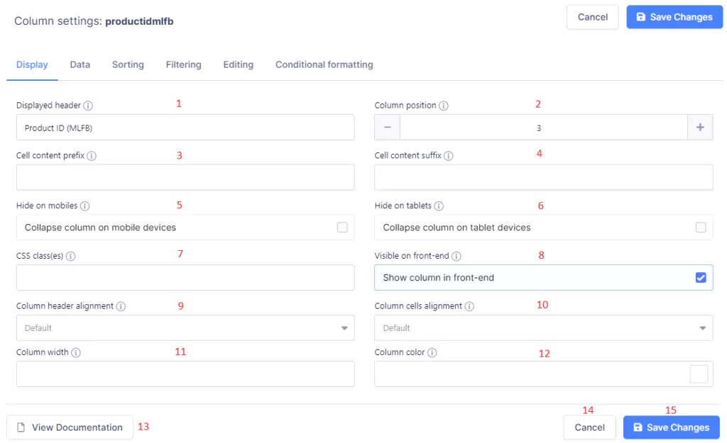
The Display tab of the Column Settings sliding panel contains all the settings that are relevant to the basic visual attributes of the column. It is the same for all column types.
- Displayed header – Here, you can redefine the header of the current column which will be shown to the user (the original header from the data source is always visible in the label at the very top of the panel). You can also change it from the Columns List Popup.
- Column position – This shows the current position of the column in the table (including the hidden columns). It can be changed here (all other column indexes will be altered as well), but the easier way of reordering columns is by dragging and dropping the column blocks in the Columns List Popup.
- Cell content prefix (or, ‘Display Text Before’) – Any text entered in here will be shown before the content of every non-empty cell in this column (e.g., $ sign). This does not influence sorting and filtering.
- Cell content suffix (or, ‘Display Text After’) – Any text entered in here will be shown after the content of every non-empty cell in this column (e.g., % sign). This does not influence sorting and filtering.
- Hide on mobiles (only for tables where Responsiveness is enabled) – This defines whether the selected column will be collapsed on Mobile devices. It also can be toggled in the Complete Columns List popup. Read more about Responsive features here.
- Hide on tablets (only for tables where Responsiveness is enabled) – This defines whether the column will be collapsed on Tablet devices. It can also be easily toggled in the Complete Columns List popup. Read more about Responsive features here.
- CSS class(es) – If you would like to add some additional CSS styling to the cells in this column, you can define an additional class here (e.g., ‘my-class’), and it will be added to all the cells in this column – so you will be able to style them (e.g., by using the selector ‘table td.my-class, table th.my-class’).
- Visible on front-end – This setting toggles the column visibility in the front-end (invisible columns are still present on the page). This can also be toggled in the Complete Columns List popup.
- Column Header Alignment – This allows you to choose the alignment of the header of a column (right, left, or center).
- Column Cells Alignment – This allows you to choose the alignment of data in the cells of a column (right, left, or center).
- Column width – This setting toggles the input width for the column in percent or pixels. Leave it blank if you want to leave auto-width. (This setting is shown only after you enable Limit Table Width in the Display tab above the table)
- Column color – here you can choose the color for the column. Please note that if you want to color the cells, rows, or columns based on their values, you should use the Conditional formatting feature.
- View Documentation button – This button opens the related documentation section.
- Cancel button – This button resets all unsaved settings and closes the column settings sliding panel.
- Save Changes button – This button applies all changes, closes the column settings panel, and refreshes the table preview.
Column Settings (Data)
The Data tab of the column settings block contains the config controls relating to how the data is displayed and/or transformed, if necessary. The controls that are present on this page will depend on the column type you choose.
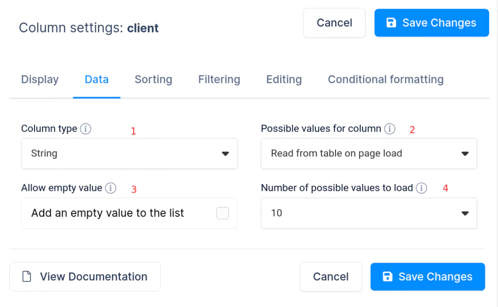
- Column type selectbox – Here you can input which type of data will be displayed in this column. Column type defines the rules of sorting, filtering, data display and storage; different column types are compatible with different filter and editor inputs. You can read more about String, Integer, Float, Date, DateTime, Time, Image, URL Link, E-mail link, Currency/Price, and Formula (calculated) columns on the provided links.
- Possible values for column – This input defines how the possible values for this column are to be listed. Possible values are used in the filters (selectbox, checkbox) and in the editor inputs for editable tables. The options are:
- Read from table on page load (default) – This default option fetches possible values for the column from the table every time the table is open in the front-end. This action will work fine if all the values are already there, but it may not be the best solution, and may work slow for large tables, since it performs a full table read every time.
- Define values list – This option opens an additional tag-like input where you can manually enter all the possible values for this column, separated by comma or “Enter”. This input also allows you to read the existing values from the table.
- Use values from another table (Foreign key) – This allows configuring a relation to another wpDataTable, e.g., to show user names from a users table, instead of user ids. Please read the full tutorial on configuring table relations / foreign keys to see how this works.
- Allow empty value – If this is turned on, an empty field will be added to the possible value list if you want to allow blank cells in this column.
- Number of possible values to load – Here you can define how many possible values per page will be loaded in selectbox filter and editor inputs. It is recommended not to be set for All if you have more than 50 possible values for this column.
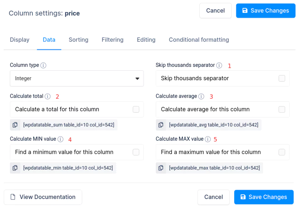
- Skip thousands separator (Integer columns only) – If this is enabled, the thousands separator will be omitted for the cells in this column, i.e., it will show 1000 instead of 1.000, 1000000 instead of 1.000.000, etc. This option is useful when the integer is referring to years, IDs, SKUs, and other values where formatting is not necessary or required.
- Calculate total (Integer and Float columns only) – If this is enabled, a total value for all the cells in this column will be calculated and shown in the column’s footer. Totals will be re-calculated every time you filter the table to show correct values. It is possible to show the totals outside of the table by placing a shortcode which is shown under the switch. You can click to copy it. Read here full documentation about using calculation functions.
- Calculate average (Integer and Float columns only) – If this is enabled, an average value for all the cells in this column will be calculated and shown in the column’s footer. An average value will be re-calculated every time you filter the table to show correct values. It is possible to show the average value outside of the table by placing a shortcode which is shown under the switch. You can click to copy it. Read here full documentation about using calculation functions.
- Calculate MIN (Integer and Float columns only) – If this is enabled, a minimum within all the cells in this column will be found and shown in the column’s footer. Minimums will be re-calculated every time you filter the table to show correct values. It is possible to show the minimums outside of the table by placing a shortcode which is shown under the switch. You can click to copy it. Read here full documentation about using calculation functions.
- Calculate MAX (Integer and Float columns only) – If this is enabled, a maximum within all the cells in this column will be found and shown in the column’s footer. Maximums will be re-calculated every time you filter the table to show correct values. It is possible to show the maximums outside of the table by placing a shortcode which is shown under the switch. You can click to copy it. Read here full documentation about using calculation functions.

For Float columns, the only setting which is different from Integer columns (except for the ‘skip thousands separator’, which isn’t available here) is the ‘Decimal places‘ setting. It allows you to configure at the column level, how many decimal places will be shown for the floats in this table overriding the default value which can be set in the global plugin settings.
Column Settings (Sorting)
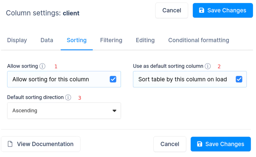
The Sorting tab of the column settings block is available when sorting is allowed globally for this table. It enables the sorting parameters to be configured for a specific column. Read more about sorting in wpDataTables here.
- Allow sorting – If this is disabled, sorting will not be accessible for this column, and clicking on the column header will not sort it.
- Use as default sorting column – If this is enabled, the table will be sorted by this column upon loading. Note that turning this switch on will disable this sorting function for any other column where it was enabled.
- Default sorting direction – This switch defines whether the default sorting will be performed on an ascending (A, B, C) or descending (C, B, A) basis.
Column Settings (Filtering)
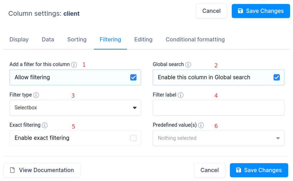
The Filtering tab of the column settings block is visible if Advanced Filtering is enabled globally for this table. It allows parameters related to the filtering rules to be configured and sets the behavior for a specific column.
- Allow filtering – If disabled, the filter for this column will not appear in the advanced filter (whether it is rendered above the table or inside).
- Global search – If this option is turned off, the column data will not appear in your global search results. The filtering option will also be disabled.
- Filter type – Here, you can choose one of the possible filtering inputs for this column: Text, Number, Number range, Date range, DateTime range, Time range, Selectbox, or Checkbox. Read the full information about advanced filtering, and the differences between different filter types here.
- Filter label – Use this input to redefine the default label for a filtering input.
- Exact filtering – If this is enabled, the filter will always look for an exact search – e.g., if ‘valid’ is entered in the filter, only rows having ‘valid’ in this column will be shown. If disabled, a ‘fuzzy’/partial match will be used. Rows that have ‘invalid’ in this column will show up. Different usage cases require different rules.
- Predefined value(s) – Here, you can input a single value, or two values in the case of range filters, which will be pre-set in the filter every time you open the page. This is useful if you want to initially show some default ‘narrowed’ datasets.
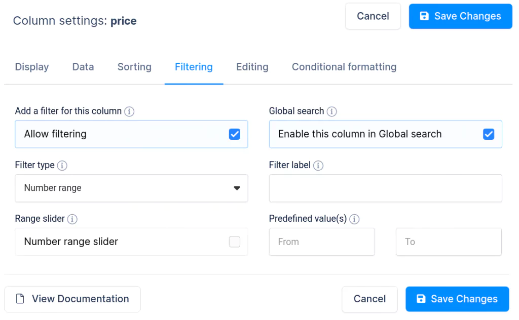
For number columns (integer or floats) you can set Filter type as “Number range” and you have additional settings for the number range slider. You can read more about this on this link.
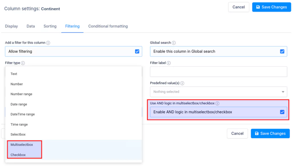
With Multiselectbox and Checkbox filters, you can also enable the AND filtering logic. wpDataTables uses the OR logic by default, so the results need to match only one of the selected conditions, while the AND logic filters the data and the results must match all of the selected examples.
Column Settings (Editing)
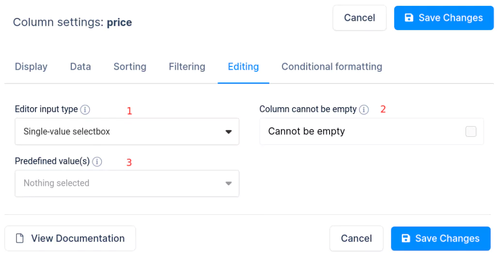
The Editing tab of the column settings block will be visible if the table is editable. It allows you to configure the editing logic for this specific column. You can read the full instructions about using the Editing tab here.
- Editor input type – This setting allows you to choose which editor input will be rendered for this column: None (no editing), One-line editor, Multi-line editor, HTML editor, Single-value selectbox, Multi-value selectbox, Date, DateTime, Time, URL Link, E-mail link, Attachment.
- Column cannot be empty – If this switch is enabled, the editor will not allow a blank value in this cell.
- Predefined value(s) – Here is where a default pre-selected value for the editor can be defined (or several values if the editor input type is a multi-value selectbox). This can be useful if in most of the cases the cell should have some default value.
Column Settings (Conditional Formatting)
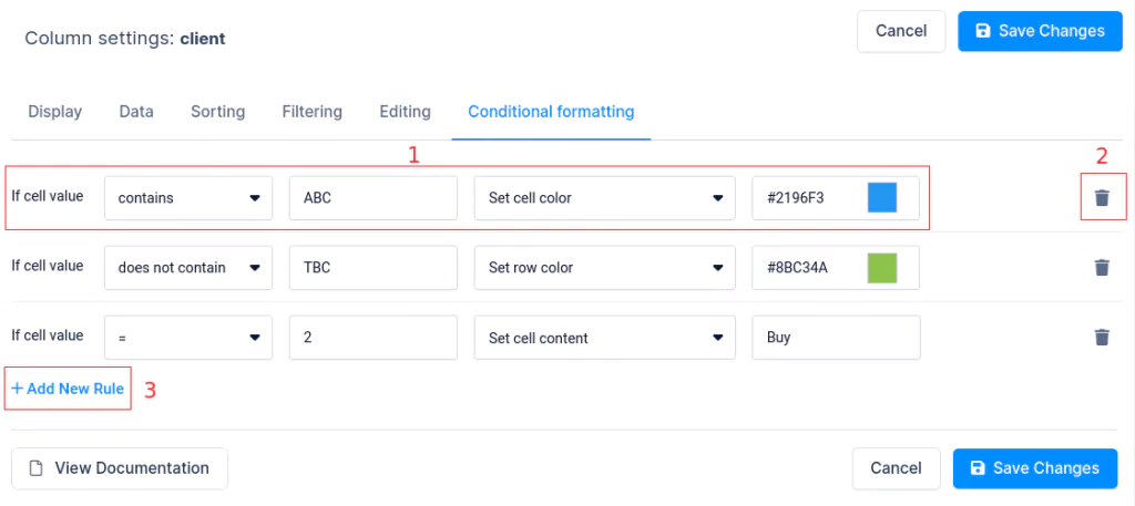
The Conditional Formatting tab of the column settings block enables you to configure the conditional formatting rules for this specific column (e.g., to color cells or rows depending on the cell value). Click here to access the full tutorial on how to use Conditional Formatting in wpDataTables.
- Conditional formatting rule – Designates the rule to be applied to the column: value, comparison operator, action.
- Delete rule button – By clicking this button, you can remove the conditional formatting rule.
- Add rule button – By clicking this button, you can add another conditional formatting rule. You can add an unlimited number of rules, but note that specifying too many rules can slow down the table.
Column Settings (Transform Value)
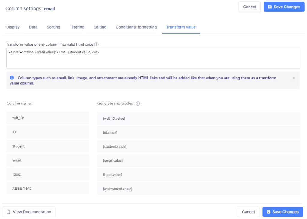

The Transform Value tab of the column settings block allows you to transform the value of any column into valid HTML code (for example, to send out an email by clicking on the cell value and automatically pull the name of the person that will receive the email).
- The HTML box – This is where the HTML needs to be entered. In there, you can use the placeholders listed below.
- Column Name – This is a visual representation of the column name, so you see which column value you’re using.
- Generate shortcodes – These are the placeholders that you can use in the HTML. When you start typing the HTML, and you click on one of these placeholders, they will automatically be added to the position where your cursor is.
In this example, the regular (string) Email field is transformed into a clickable hyperlink that will trigger your default mailing application and you’ll be able to email the user.
