Table of Contents
Video tutorial
Table elements overview

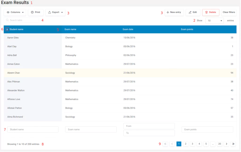
- Table title. If you have set a title on the table edit page, you will see it here as
<h3> HTML element. You can show or hide the title from the page by enabling or disabling the corresponding switch in the ‘display’ tab of table settings. - Selector for number of entries. This is a dropdown selectbox, from which the front-end user can choose the number of rows he/she wants to have in the table. If you specify a given number of rows in the table edit page in the plugin back-end, this number will be pre-selected by default.
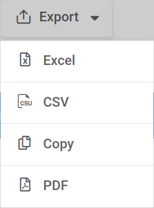
- TableTools block. This Table tools block contains buttons for Column Visibility toggling, CSV, Excel, PDF export, the copy to clipboard function, and print view. See the section below for more details regarding the TableTools extension. If the table is editable, the Add new, Edit, and Delete buttons are also present in this block. If “Clear filters” feature is enabled, the Clear filters button will render as well.
- Global table search field. This input field allows front-end users to filter the table contents by a given value. The algorithm searches within every cell, and displays only the rows in which at least one of the cells contains the value entered in the search field.
- Active (sorted) column. The slightly highlighted column is the current active column, which means the table data is sorted by the values from this column in ascending or descending order. You can see the direction of the small triangle near the column heading: up means ascending order, down means descending order. Sorting rules depend on the column type that you have provided. (See documentation section 6 for more info on column types and features.)
- Sorting trigger button. The same triangle can be used to activate the sorting on a different column, or to change the sorting direction. If you press “Control” when clicking on the sorting trigger button you can sort by two columns.
- Advanced filtering block. The advanced filtering block is visible if you’ve enabled advanced filtering for the table in the back-end (see this documentation section for more details on the table setup). Each column receives a separate filtering input, which allows users to filter the table data by the values in this column. See this documentation section for detailed overview of the advanced filtering block.
- Info section. In this section you can see how many rows the table has, and which rows are currently shown.
- Pagination controls. The user can use these controls to navigate through the pages. Each page contains as many rows as the user defines for each table.
Table Tools


Table tools are a set of useful features built on a set of JS libraries, which allow users to have some extras on the table frontend: toggle columns visibility, copy the table content to the clipboard, export the table content to a PDF, CSV or an Excel file, or hide everything except the table on the page, and get a print view. See this documentation section for more info about TableTools library. When you create an editable table, the editing controls are also rendered in the TableTools block. See this documentation section for more info on editable tables.
Front-end editor
The front-end editor is available only for MySQL-based tables with front-end editing and server-side processing features enabled. If you configure front-end editing for the table, you’ll get additional tables in the TableTools block: Edit, New and Delete buttons. You can also select rows in the table by clicking on them.
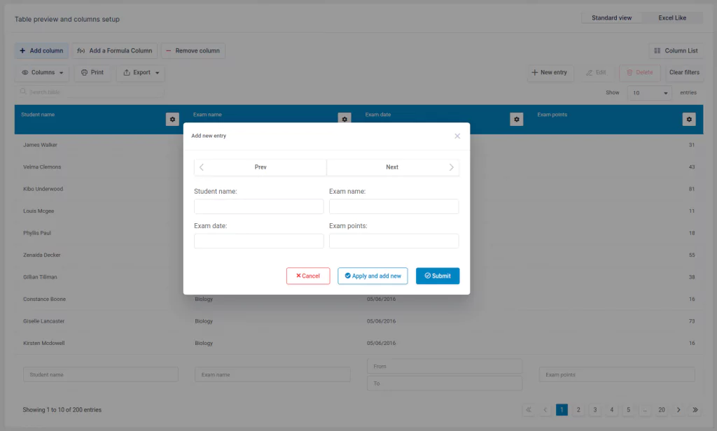
When a row is selected, or when you click on the “New” button, the editor popup apears. The exact look of the popup will depend on the table you created and configured.
- Column names – in the left side you will see the column names. For each column a separate entry will be rendered.
- Editor inputs – to the right of each column name, the editor inputs will be rendered. The exact look of each input will depend on the configuration you defined for it. Please see documentation chapter 7 for detailed information and instructions on all the possible input types and front-end table editing commands and options.
- Front-end editor navigation and control – in this area, users can view the different buttons that allow them to navigate through table entries and control the editing process:
- Cancel: revert all changes, and close the editing dialog
- Prev & Next: navigate between the rows in the table. This command also switches the pages of the table.
- Apply and add new: saves the entry, but does not close the dialog.
- Submit/OK: saves the entry, and closes the editing dialog.
Please note that in addition to editing through a popup dialog, wpDataTables also supports inline editing and Spreadsheet / Excel-like editing.

Charts
Charts (wpDataCharts) are also a part of the wpDataTables front-end. There are only a few elements, and they are:
- Title – you can remove it from the page if you don’t need it.
- Axes – the chart axes (Date, Hits for this example) are customizable, and you can define your own labels for them.
- Series – series are the main data representing elements of charts. Their characteristics depends on the rendering engine and the chart type you choose – they can be columns, bars, lines, areas, pie slices, etc.
- Legend – legend shows the chart series names, and can also be used to toggle them for the Highcharts rendering engine. Legend can be removed in the chart settings.
- Grid. Grid below the axes can be toggled in the chart settings.
There are also other features in charts that can be customized (depending on the library you choose) – see the documentation on creating charts for more details.
