Table of Contents
Video tutorial
Responsive Tables with wpDataTables plugin
Responsiveness (in web design) is a feature that allows presenting the same content differently depending on the display size of device that is used to view it. In other words, the same website can be presented differently on a laptop, mobile phone or a tablet.
Any wpDataTable can be responsive, it doesn’t matter which data source do you use – MySQL, Excel, or any other. In this WordPress responsive table plugin you can choose which columns do you want to be visible or hidden on tablets and/or mobiles. The hidden columns data will be still available for the users that would like to see it in a dropdown; it will collapse under an expandable block in the first visible column. Let’s go through the process of creating a responsive wpDataTable:
Create a wpDataTable and enable responsiveness
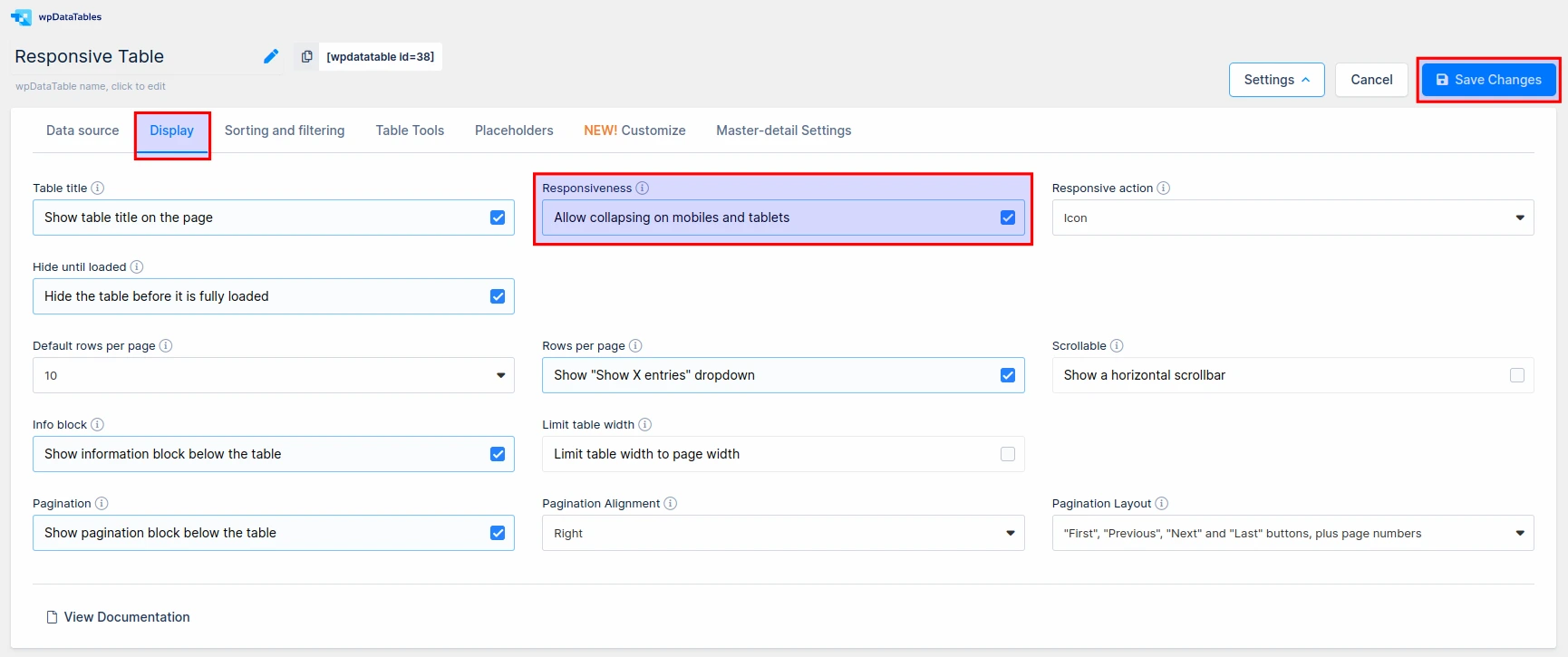
After the table is created, open the configuration page, go to the “Display” tab, find the “Responsiveness” switch, and enable it.
Then click the “Apply” button.
Define visibility for each column on mobile and tablet devices
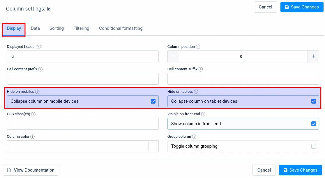
In the column properties for each column you will see two switches:
- “Hide on tablets”: Enabling this switch will mean that the cells of this column won’t be visible on tablets; and the corresponding data will be available only after clicking on the “+” button which appears on the first visible column of each row.
- “Hide on mobiles”: Enabling this switch will make the cells from this column invisible on mobile phone screens, but the data will be available after clicking on the “+” button which will be on the first visible column of each row.
You can also access the Hide on Mobile/Tablet options by clicking on the yellow icon in the table settings.

The editor will indicate where you can select which one will be displayed/hidden on smart phone or tablets.
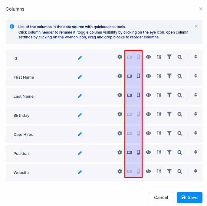
Do not forget to leave at least one column visible both for mobiles and tablets!
When you configure which columns will be visible, and which will be hidden on different types of devices, you can save the table, publish the shortcode on a post or page, and open the page in your site front-end. Then, you can resize your browser’s window to see the responsive mode in action:
Full-size (Desktop):
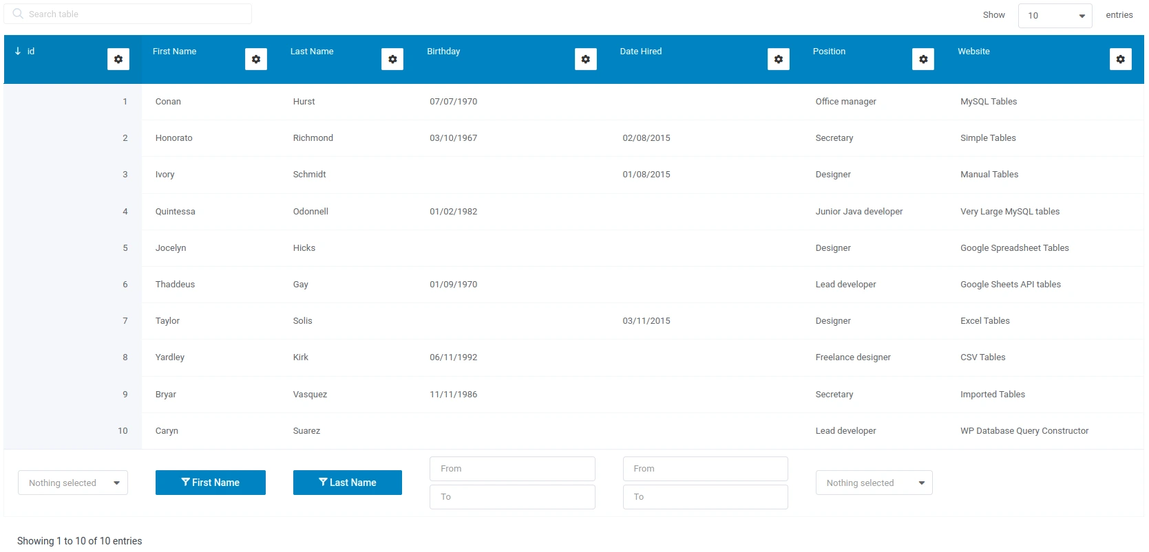
Tablet size: note that some of the cells are hidden, but are available in a dropdown when we click on the expand button
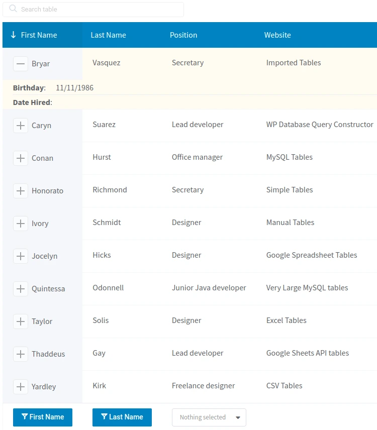
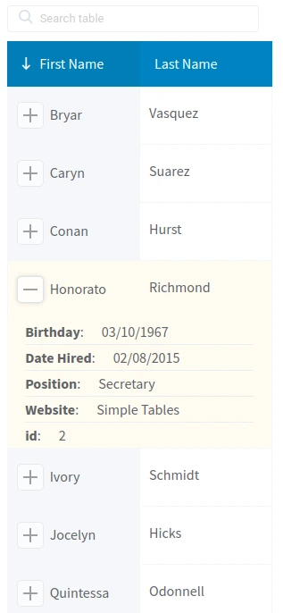
Mobile size: note that only some of the cells are visible for all the rows, but all the others are available in a dropdown when we click on the expand button
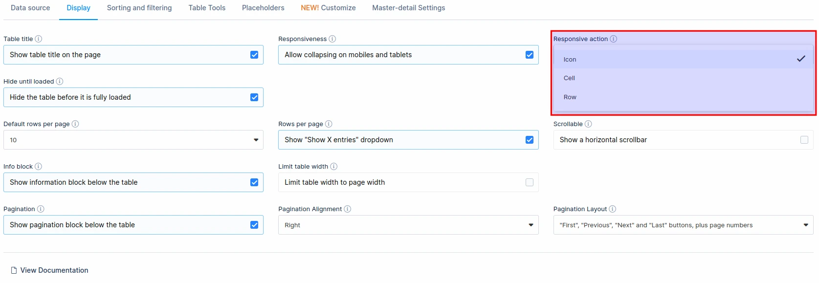
From version 4.4 you can change the responsive action. This refers to the manner in which the hidden columns (rows) are expanded. Previously, only the +/- button was available but we also included the “Row click” and the “Cell click”. This can be configured in the Display tab above the table, once you enable the “Responsiveness” feature.
Read more
- Creating editable tables and filling the table data manually
- Creating non-editable tables from Excel files
- Creating non-editable tables from Google Spreadsheets
- Conditional formatting (highlighting) in tables
- Sorting in tables
- Individual column filters (multi-criteria filtering)
- Row grouping
- Using Placeholders – Adjusting MySQL queries dynamically based on shortcode attributes
- Pre-filtering tables through URL
- Calculating totals for columns, sum row
- Table Layout, Word Wrap
- Table data export tools
- WPBakery Page Builder
